About
Randy Krum
President of InfoNewt.
Data Visualization and Infographic Design

Infographic Design

Infographics Design | Presentations
Consulting | Data Visualizations

DFW DataViz Meetup

Join the DFW Data Visualization and Infographics Meetup Group if you're in the Dallas/Fort Worth area!

Search the Cool Infographics site

Custom Search

Subscriptions:


Feedburner

The Cool Infographics® Gallery:

How to add the
Cool Infographics button to your:

Cool Infographics iOS icon

- iPhone
- iPad
- iPod Touch


Read on Flipboard for iPad and iPhone

Featured in the Tech & Science category

Flipboard icon

Twitter Feed
From the Bookstore

Caffeine Poster

The Caffeine Poster infographic

Entries in space (46)

Tuesday
Jun252013

Planets in Orbit Around Earth!

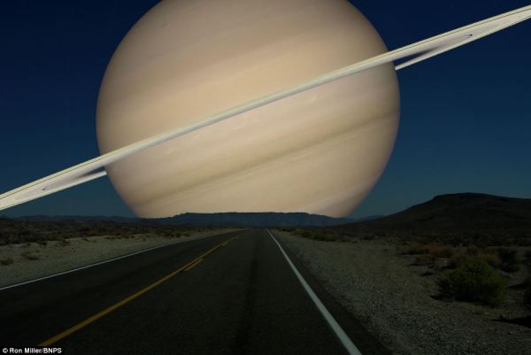
What if we had a planet instead of a Moon? Saturn

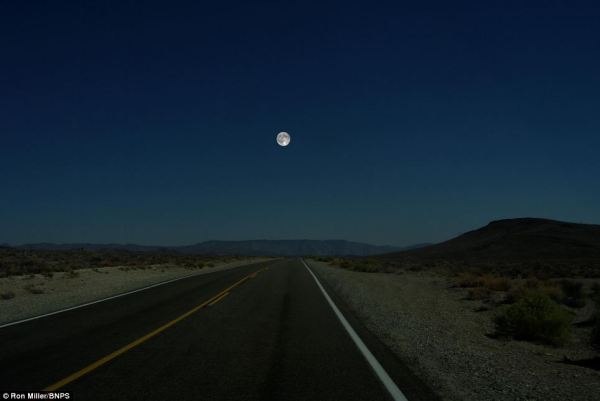
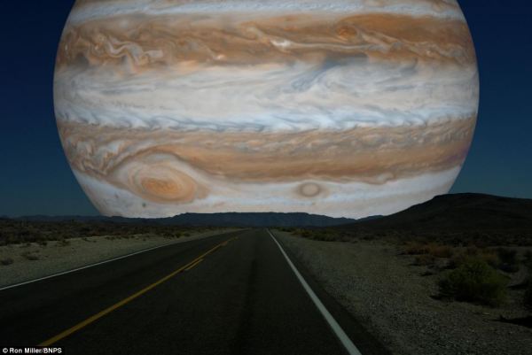
What if we had a planet instead of a Moon?  Photographer, space artist, illustrator and former art director for the National Air & Space Museum’s Albert Einstein Planetarium, Ron Miller, created a series of very cool images that visualize how the rest of the planets in our solar system would appear if they orbited Earth at the same distance as the Moon.  

I’ve posted a number of different data visualizations and infographics that help visualize the sizes of the different planets, and this is a very cool approach that might make the relative sizes more relevant and understandable to a bigger audience that is already used to seeing the Moon in our sky.  For comparison, here is the original photo of the Moon:

What if we had a planet instead of a Moon?

From Ron’s description:

At a distance of about 240,000 miles, the Moon occupies a space in the night sky about half a degree wide. By sheer coincidence, this is almost exactly the same size the sun appears, which is why we occasionally get total solar eclipses.

But it’s interesting to imagine what the night sky might look like if one of the Solar System’s planets were to replace our moon. (We’d have to ignore things like tides and gravitation, but that’s the advantage of doing things in the mind’s eye.)  Saturn would be an astonishing sight. Almost 35 times larger than the Moon, this golden globe would cover nearly 18 degrees of the sky. We’d be a little further away from Saturn than its satellite Dione. In fact, we’d be more likely to be a satellite of Saturn ourselves than the other way around. The rings would stretch nearly from horizon to horizon.

Of course, the gas giant Jupiter is downright scary!

What if we had a planet instead of a Moon? Jupiter

View all of the full size images in Ron’s post on io9!

Found on My Modern Met and The Daily Mail

Friday
May242013

How Many Alien Civilizations are there in the Galaxy?

How May Alien Civilizations are There in the Galaxy? infographic

Very cool!  The How Many Alien Civilizations are there in the Galaxy? infographic from BBC was designed by Information is Beautiful to illustrate the Drake equation. The Drake equation is an equation used to calculate how many potential aliens may exist in the Milky Way Galaxy.

Today, we live in an age of exploration, where robots on Mars and planet-hunting telescopes are beginning to allow us to edge closer to an answer.

While we wait to establish contact, one technique we can use back on Earth is an equation that American astronomer Frank Drake formulated in the 1960s to calculate the number of detectable extraterrestrial civilizations may exist in the Milky Way galaxy.

It is not a rigorous equation, offering a wide range of possible answers. Instead it is more a tool used to help understand how many worlds might be out there and how those estimates change as missions like Kepler, a telescope that is currently searching for Earth-like planets, begin to discover more about our universe.

Until ground-based observations, space telescopes and planet-roving robots uncover any tell-tale signs of life, what better way to speculate on how many intelligent alien civilizations may exist than to explore the universe with our interactive version of the equation.

It’s actually an interactive infographic because it let’s the user change the assumptions and recalculate the results.  So if you only believe there is a 50% chance of plant life developing, change the assumption value and recalculate.

Found on FastCo Design.

Thursday
Apr042013

How Far is it to Mars?

How Far is it to Mars? motion infographic

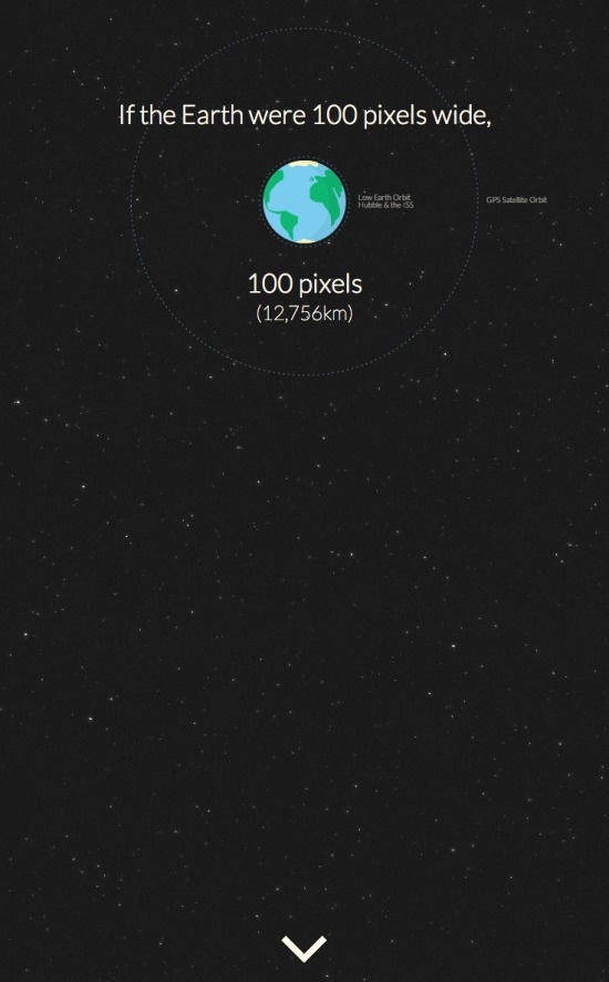
How Far is it to Mars? by David Paliwoda is a fantastic animated, interactive infographic website that shows the viewer the scale of the distance to the Moon and to Mars as measured in pixels.  David calls this a motion-infographic.

Click the image above to see the animated site.  Very cool! 

Found on Daring Fireball

Thursday
Mar282013

Asteroids!

Asteroids Close Encounters infographic

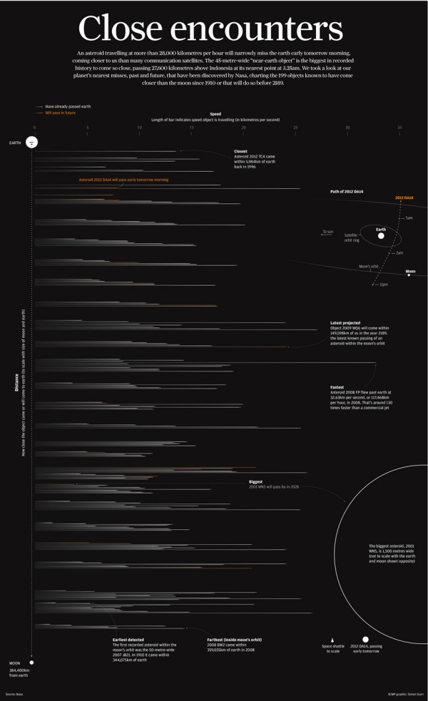
Simon Scarr is doing some great work as the Graphics Director at the South China Morning Post in Hong Kong.  Last month he designed Close Encounters, the full-page visualization of the Near-Earth-Objects that have passed within the Moon’s orbit (or will pass by) from 1910-2189.

A 45-metre-wide asteroid came remarkably close to Earth on Friday, even closer than communication and weather satellites. It was be the nearest known close miss for an object of its size.   

When this story was first mentioned in the newsroom, a few days before the incident, it sparked debate. People were intrigued as to how close these objects come to Earth. How many pass by? And how fast or large are they? A perfect opportunity for an interesting graphic.    

As usual, NASA had every piece of information we needed. Their Near-Earth Object Program was established in 1998 to help coordinate, and provide a focal point for the study of comets and asteroids that can approach the Earth’s orbit. They have data sets on all close approaches to Earth since 1900 and projected forward to 2200.    

This is a beautiful design that shows the distances to scale by placing them in between the Earth and the Moon, and the horizontal lines show the relative speeds of all the objects.  Orange lines are future, predicted passes.

Simon has posted more behind the scenes information about putting this infographic design together on his own blog.  I highly recommend the post, and you can check out his other work.

Found on Visual Loop.


Wednesday
Dec262012

Star Trek: The Original Series

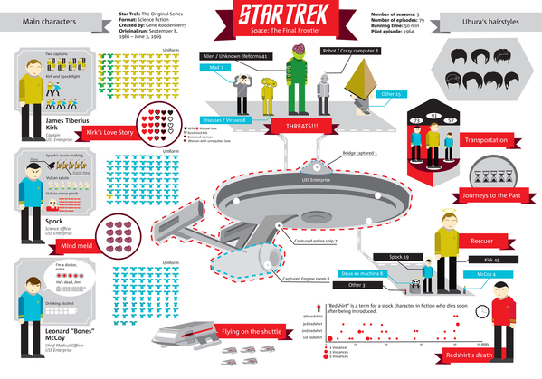
The Star Trek infographic designed by Natalya Platonova was originally designed in Russian for Svinovik.ru. This infographic is a visual overview of some quirky statistics from the complete original series (three seasons).

Overall, very well done!  As a Trekkie myself, the visualizations are fun facts about the series, and well designed.  I like that the quantitative values (like the uniforms worn) are shown as the actual numbers and not scaled. 

A couple of framing pieces of information would have been helpful.  The original design is published along with a text article, but some introductory text in the infographic itself would be nice because the image file gets shared without any of the text from the article.  The fotter should include some type of copyright or Creative Commons license and the URL for readers to be able to find the original, full-size versions.

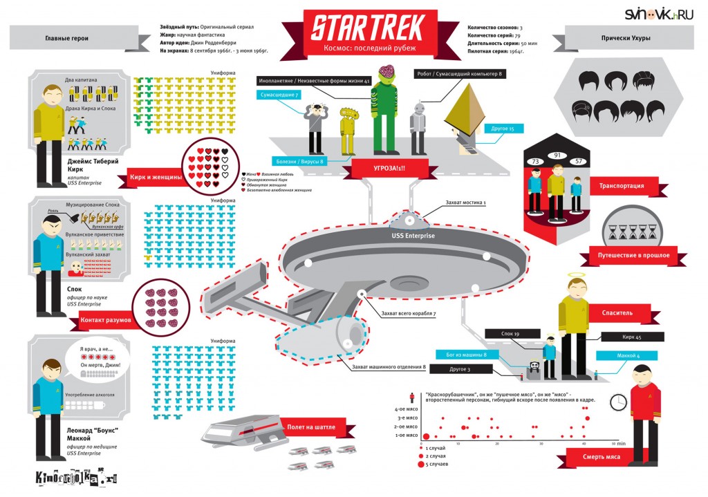
Here’s the original version in Russian:

Found on Visual Loop!

Friday
Jul132012

Exoplanets: 786 Known Planets

Exoplanets infographic

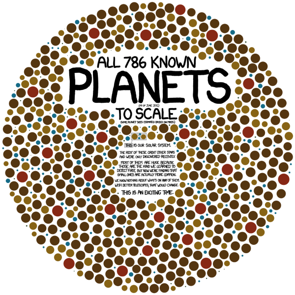
Exoplanets is a great infographic that tells one story really well by focusing on one data visualization for the whole story.  Randall Munroe at xkcd.com occasionally mixes in some great data visualizations and infographic designs with his comics.

All 786 known planets (as of June 2012) to scale (some planet sizes estimated based on mass).  

[Our solar system planets are shown in the middle]

The rest of these orbit other stars and were only discovered recently.  Most of them are huge because those are the kind we learned to detect first, but now we’re finding that small ones are actually more common.  We know nothing about what’s on any of them.  With better telescopes, that would change.  This is an exciting time.

This visual is so powerful.  You could write in text that we have found 786 extra-solar planet, but the visual helps the reader wrap their head around the scale of that large number and adds the size of the planets as a second level of information.

It’s also a clean design that focuses on communicating the scale of how many planets we have found, and doesn’t try to add all of the other information we know like which stars they orbit, what are their names, when were they discovered, which telescope found them, and who was the team or individual that discovered each one.  Just because we have more information doesn’t mean it should all be included in the infographic.  The story is cleaner and easier to understand without the clutter of too much information.

Cudos to Randall!

Tuesday
Aug302011

18 Things You Didn't Know About Firefly


You can’t stop the signal…

As a Browncoat, I had to post this new infographic: 18 Things You Didn’t Know About Firefly from CarSort.com.

Firefly has quickly become a cult classic, after it was cancelled by Fox in 2002, after airing only 11 episodes (out of order). Firefly was created by Joss Whedon who is best known for creating Buffy the Vampire Slayer and is set to direct and write The Avengers movie set for release in the summer of 2012. Firefly is a space western set in the 25th century where the renegade crew of the Serenity try to stay one step ahead of the long arm of the Alliance.

CarSort.com has put together a fun infographic with little known facts about Firefly and Serenity.

  • Did you know that Neil Patrick Harris was turned down for the role of Simon
  • Some people believe that Firefly was a rip off of an amine series called Outlaw Star
  • Some of the sets were recycled from Power Rangers
  • Zac Efron made his TV debut on Firefly…

Certainly not the best infographic design I’ve ever seen

  • WAY too much text!  This is really a text list with some images.
  • No data visulizations for the body counts
  • Should have included a visual size comparison of Serenity to the ISS or the Battlestar Galactica when either of them was mentioned
  • No data sources listed.  Where did these facts come from?  Are they really true?
  • No license listed on the infographic (Copyright or Creative Commons)?

But the infomation is cool, and I learned a few things I didn’t know.  Joss, you can hit that red button any day now…

Thanks to Brenden for sending in the link!

Thursday
Jul072011

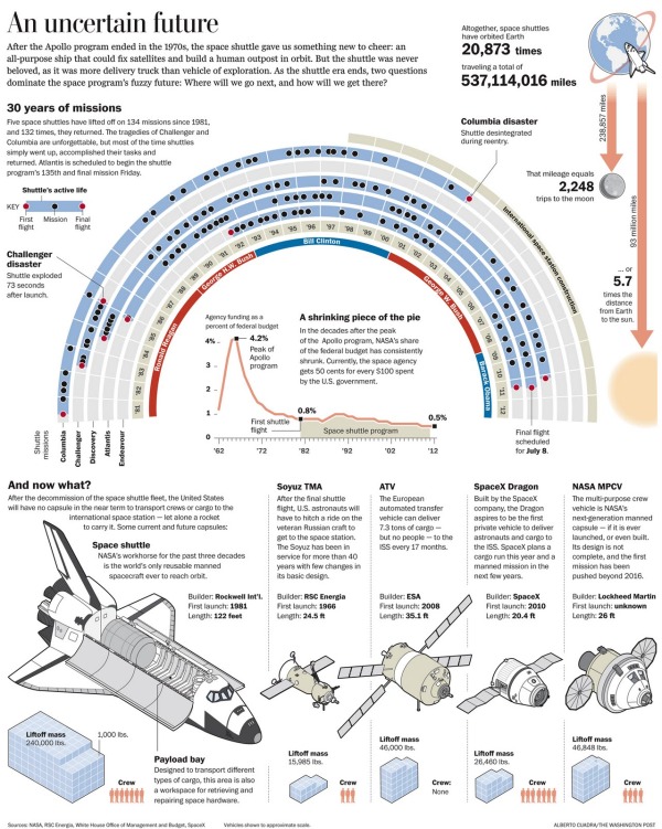
Bye Bye Space Shuttle infographic

I really like An Uncertain Future, a tribute infographic for the Space Shuttle program’s last launch of Atlantis scheduled for Friday.

Designed by for the Washington Post

Last week I published what could be my very last Space Shuttle infographic. As a space exploration enthusiast and a professional visual artist, NASA’s spacecraft will be sorely missed. Over the years, the Shuttle was the focal point in many of the most fun projects I’ve been involved, directly or indirectly.

I really like the arc timeline.  Not only is it a different design than you usually see, but it also indirectly implies the flight paths of the shuttles up into space and back down to Earth.

Found on Visual Loop

Tuesday
Aug312010

30 Years of Asteroid Discoveries Animated

This is a very cool video animation, Asteroid Discovery From 1980 - 2010, of asteroid discoveries over the last 30 years.  Not only does it show the orbits of the asteroids in relation to the inner planets, it highlights them over time as they were identified and colors them according to how close to Earth their orbits will come.

The only visual inaccuracy is the size of the asteroids.  Since the asteroids have to be at least one pixel wide to appear in the animation, they are represented much larger compared to the planets than they really are.

View of the solar system showing the locations of all the asteroids starting in 1980, as asteroids are discovered they are added to the map and highlighted white so you can pick out the new ones. 
The final colour of an asteroids indicates how closely it comes to the inner solar system. 
Earth Crossers are Red
Earth Approachers (Perihelion less than 1.3AU) are Yellow
All Others are Green

Notice now the pattern of discovery follows the Earth around its orbit, most discoveries are made in the region directly opposite the Sun. You’ll also notice some clusters of discoveries on the line between Earth and Jupiter, these are the result of surveys looking for Jovian moons. Similar clusters of discoveries can be tied to the other outer planets, but those are not visible in this video.

As the video moves into the mid 1990’s we see much higher discovery rates as automated sky scanning systems come online. Most of the surveys are imaging the sky directly opposite the sun and you’ll see a region of high discovery rates aligned in this manner.

At the beginning of 2010 a new discovery pattern becomes evident, with discovery zones in a line perpendicular to the Sun-Earth vector. These new observations are the result of the WISE (Widefield Infrared Survey Explorer) which is a space mission that’s tasked with imaging the entire sky in infrared wavelengths. 

Currently we have observed over half a million minor planets, and the discovery rates show no sign that we’re running out of undiscovered objects.

Orbital elements were taken from the ‘astorb.dat’ data created by Ted Bowell and associates at 
http://www.naic.edu/~nolan/astorb.html

Music is ‘Transgenic’ by Trifonic: 
http://www.amazon.com/Emergence-Trifo…

Quite a few journalists, bloggers and tweeters are attributing this to NASA or Arecibo Observatory - while they do fine work they had nothing to do with this. If you write a story you can credit it to Scott Manley.

Found on FlowingData and VizWorld 

Wednesday
Feb242010

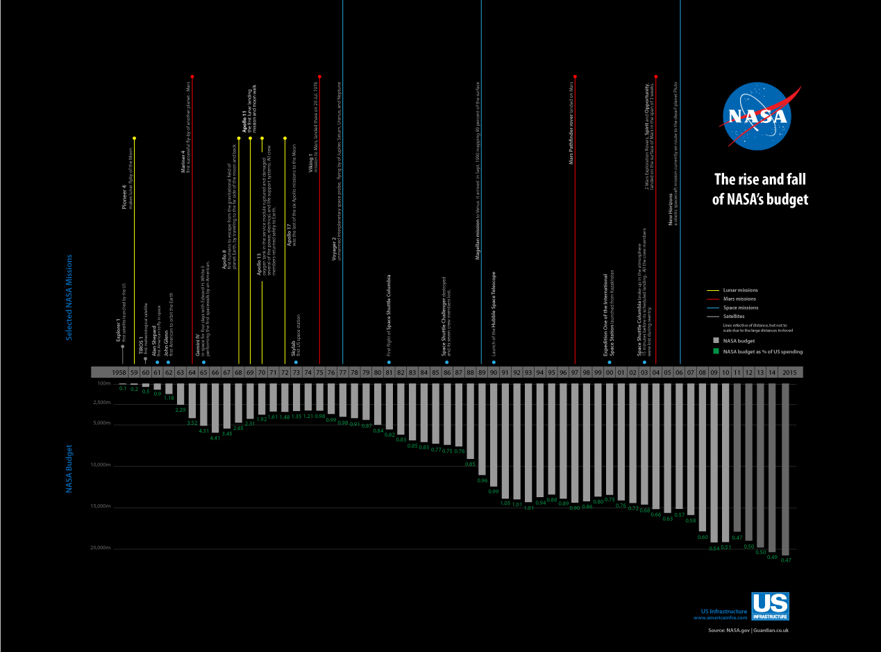
NASA's budget timeline [infographic]


Another great timeline of NASA’s budget every year from 1958 through 2015 in Obama’s new budget proposal that cuts NASA funding.  This one designed by Robin Richards (ripetungi) for an article in U.S. Infrastructure magazine.

Looking at every budget throughout the history of NASA, comparing this with its space missions for that year.

You can see Robin’s site and follow him on Twitter.