About
Randy Krum
President of InfoNewt.
Data Visualization and Infographic Design

Infographic Design

Infographics Design | Presentations
Consulting | Data Visualizations

DFW DataViz Meetup

Join the DFW Data Visualization and Infographics Meetup Group if you're in the Dallas/Fort Worth area!

Search the Cool Infographics site

Custom Search

Subscriptions:


Feedburner

The Cool Infographics® Gallery:

How to add the
Cool Infographics button to your:

Cool Infographics iOS icon

- iPhone
- iPad
- iPod Touch


Read on Flipboard for iPad and iPhone

Featured in the Tech & Science category

Flipboard icon

Twitter Feed
From the Bookstore

Caffeine Poster

The Caffeine Poster infographic

Entries in statistics (21)

Wednesday
Oct012014

Star Wars Commander

Star Wars Commander infographic

The Star Wars Commander infographic created by Disney Interactive highlights the new mobile game of the Star Wars saga. Since it’s launch on August 21st, 5 million players have chosen a side. May the Force be with you!

This morning we received word that The Empire is holding strong in the Galactic Civil War against Rebel Forces in Star Wars: Commander. Five million players globally are now engaged in the epic battle, with Imperial forces gaining ground quickly. Below is an infographic recovered from Bothan spies that details troop deployment and battle statistics (a high-res version of the image can be found here).

Highlights from the intercept include:

  • Five million players have now joined the war (downloaded Star Wars: Commander since its launch on August 21).
  • With more than 57 percent of its players representing the Empire, Russia is one of the strongest Empire strongholds. Other nations that have fallen to the Emperor include Austria, Germany, Finland and the Ukraine.
  • India stands out as a strong member of the Rebel Alliance, as are most countries across South America and Africa.
  • The United States is nearly unanimous in its following of the Dark Side, with the single exception of North Dakota. The force is strong in North Dakota.
  • Half a billion troops have been deployed across both factions.

One of my current favorite games!  I’m a Rebel!

It’s great seeing some major companies like the LucasArts division of Disney starting to use more infographics to promote their properties.  They have all of this data gathered internally about people playing the game, and it’s a great way to share some of these statistics.

The graphics are beautiful, the separation between factions is easy to understand with the color-coding, and the overall design is instantly recognizable as part of the Star Wars brand.

There’s no key to the scale in the Troops Deployed section at the bottom, and it’s not intuitive. I think each character represents roughly 500,000 troops in the first few, but then it gets weird because the Rebel Troopers, Stormtroopers and Banthas don’t make any sense. The Rebel Troopers would have to represent just over 700,000 troops for each icon. Beautiful design, but they got the math wrong so the visualizations don’t all match the data.

Also, the longer rows of characters are indecipherable. We can understand rows of 10 icons, but these varying rows of 7, 12 and even 20 icons across are not easy for readers to grasp.

It was very difficult to track down the original posting (thanks Bex!).  The footer should include the URL link back to the infographic landing page so readers can find the original, full-size version. You also want the infographic to help drive traffic back to your site, and most people that share infographics do NOT link back to the original. Include the link in the infographic so readers can always find their way to your site.

Found on: The Disney Blog

Thursday
Mar272014

Visualizing NBA Passing Frequency Data

Visualizing NBA Passing Frequency Data infographic

NBA Passing by Andrew Bergmann was designed for NBA.com.  By analyzing data gathered by SportVU technology cameras installed in NBA arenas, the line thickness represents the average number of passes per game between specific players.

Here’s a look at how starters on all 30 NBA teams share the basketball.

The thickness of the gray lines on the accompanying chart represents the average number of passes per game between two players.

A very clear picture emerges on which teams distribute the ball more evenly between players, such as the Nets, Bulls and Cavaliers. On the flip side, Chris Paul and Blake Griffin dominate passing for the Clippers, and likewise for Kevin Love and Ricky Rubio of the Timberwolves.

This is a great way to visualize this data set.  The visualization method is unique, memorable, and really makes the connections between players easy to understand.

The infographic vaguely lists the data sources at “Stats”, and the original post explains that the data is gathered from the newly installed SportsVU camera systems.  However, the actual data is still unavailable for readers to investigate on their own.  This design would have been a great opportunity for the data set spreadsheet to be shared with the audience through a public spreadsheet in Google Docs.

Knowing the infographic is going to be shared online, the image file should include the URL back to the original post on NBA.com.  Don’t make it hard for readers to fit find the original, full-size version of your infographic.

Found on Flowing Data and Fast Company

Friday
Feb152013

2013 NBA All-Stars Player Stats

2013 NBA All-Stars Player Stats infographic

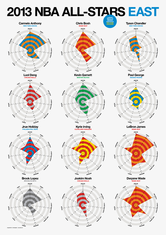
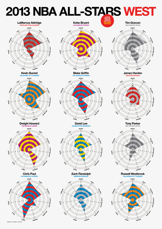
Rami Moghadam has just published two infographic posters detailing the stats for each of the players on the NBA All-Star teams.  2013 NBA All-Stars East and 2013 NBA All-Stars West both use radar charts to highlight each player’s strongest areas.

2013 NBA All-Stars Player Stats infographic

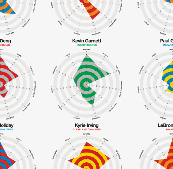
The individual radar charts are color-coded for each player’s regular team.  In the radar charts, you have to look at each stat to determine which direction is a favorable number.  A high number of turnovers isn’t a good thing, so I might suggest reversing the direction of some of the negative stats like fouls and turnovers.

2013 NBA All-Stars Player Stats closeup infographic

Good job Rami, and thanks for sending in the link!

Monday
Oct292012

Halloween Statistics 2012: Creepy Calculations

 Halloween Statistics 2012: Creepy Calculations infographic

It is that time of the year again! Halloween is the perfect time for costumes, scary movies, and Charlie Brown! How do you spend your halloween? Halloweencostumes.com has put together some Creepy Halloween Statistics to show some of this holiday’s most popular happenings. 

What are you most looking forward to this Halloween? Collecting copious amounts of your favorite candy? Dressing up in a trendy  costume? Enjoying a horror movie marathon? Find out what other Americans will be up to this year, with our Ultimate Visual Guide to Halloween Statistics! You’ll discover popular costumes for you and fido, a count-down of the best sweet treats, suggestions for a Halloween playlist and more spooktacular stats!

I really like this design.  The color scheme, the design style, and the easy-to-understand top-to-bottom progression of information.  There are a few statistics that I would like to see visualized, like the Trick-or-Treating By The Numbers section where the values are only shown in big fonts.  I really like the different moon phases to visualize the stats at the top.

The Top 5 lists are a little text-heavy, and it would have been nice to see movie posters or CD artwork to go along with the entries.

In the footnote at the bottom, missing are both a copyright statement (or Creative Commons) and a URL link to the original infographic landing page so readers can find the full-size version.

Thanks to Elise for sending in the link!

Monday
Oct222012

The Sage Hill Difference marketing infographic & interview

The Sage Hill Difference marketing infographic & interview

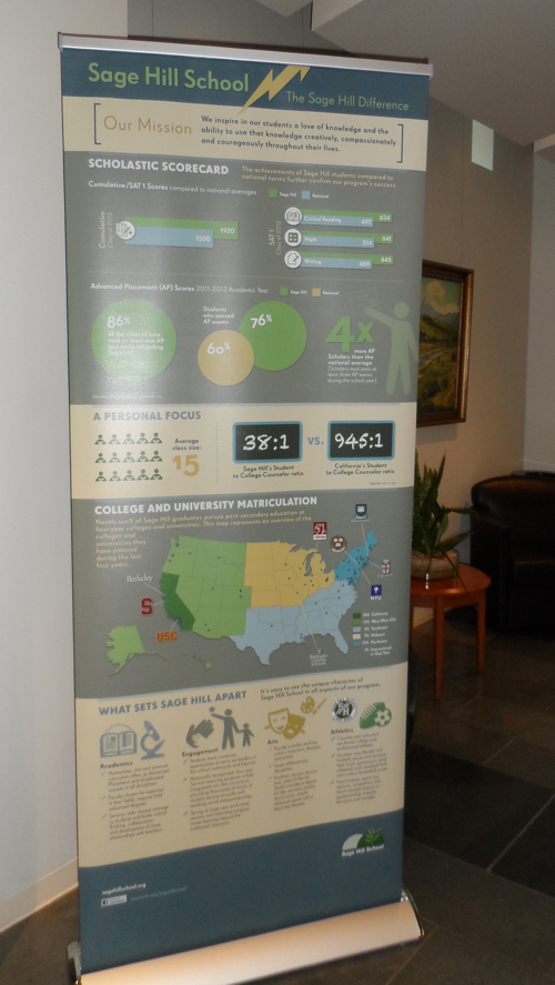
The Sage Hill School has created an infographic as a marketing piece showing many of the different stats about the school’s history and performance.  The Sage Hill Difference has been used as a printed handout, a 7-foot retractable banner, a PDF available for download and the JPG image file online.  The design is used to educate and inform prospective families, parents, students and the general public.


The Sage Difference: 7-foot retractable banner

I asked Torrey Olins, the Director of Communications and Marketing at Sage Hill, some questions about designing and using the infographic as a marketing tool:

Cool Infographics: What software applications were used to help analyze the data and create the design?

Torrey Olins: The piece was created using InDesign. The data was collected and analyzed through a combination of resources from Sage Hill School and our advertising firm, O’leary and Partners (www.adagency.com)  The piece did not require any software for analysis of data.

Cool Infographics: Who designed the infographic?

Torrey Olins: The design of the infographic was a collaboration between myself O’leary and Partners. About six months ago, I came up with the idea of creating an infographic for the school’s marketing efforts in our fall 2012 admission season, and in fact, sent my account manager and her assistant links to coolinfographics.com for inspiration. We were unable to find any other high school that had created an infographic for marketing, so we ended up using elements from a variety of different sources. For example, the school history portion of the infographic was inspired by an infographic created to celebrate the history of a small city.

Because O’leary and Partners has been creating print and digital media for Sage Hill School for several years, they were able to apply our design look and feel (color palate, fonts, etc.) to this piece so that it integrates nicely with our other school communications, while also going in an entirely new direction. I did not want this piece to look like a “one off” and I was pleased that O’leary accomplished my goal of creating an infographic that maintains continuity with our brand.

Cool Infographics: Would you describe the different formats you published the infographic?

Torrey Olins: The infographic was published as an 8.5” x 25” folded print piece that we hand out to prospective students and parents at high school fairs, our Admission Open House and other campus events. We also have a jpg and pdf copy of the infographic on our website (www.sagehillschool.org) and have published it on our Facebook (www.facebook.com/sagehillschool) and Pinterest accounts (www.pinterest.com/sagehillschool). We also reproduced the infographic on two large (7’x3’) retractable banners that we can bring to off campus events or use around campus (we currently have one in our lobby for visitors to see while they are waiting for appointments.)

Cool Infographics: How has the use of the infographic and social media impacted your marketing and recruiting process?

Torrey Olins: Sage Hill School is Orange County, California’s premier independent, coed, nonsectarian high school. The school was founded in 2000 and currently enrolls 466 students in grades 9-12.  Because Sage Hill School is located in a community that does not have as long of a history with independent schools as with the public school system, it is important for us to highlight the differentiators that make Sage Hill School the finest college preparatory option in our area. The infographic is an effective way to communicate the value of a Sage Hill education to the parent who is deciding whether to send a child to public school or pay tuition for Sage Hill School.

The infographic format met my needs for a fresh approach to demonstrate the achievements and differentiators of Sage Hill School to prospective families, as well as reinforcing the value of the school for our currently enrolled families. We are very excited that Sage Hill School is one of (or possibly the first) high schools to utilize the infographic format for marketing in the 2012-2013 admission season!

The recruiting season for independent schools typically begins in October and will last until admission decisions are announced and families sign contracts in the spring. Thus, it is quite early in the process and unfortunately,  it is too soon for us to speak to increases in inquiries/ applications as a result of the infographic or other social media efforts.

Cool Infographics: What has been the reaction and feedback to the infographic?

Torrey Olins: Let’s face it, facts and stats about schools can be extremely dry. For families who are considering a variety of different high school options, numbers and figures tend to run together. Thus far, both current and prospective families have indicated that the information in the infographic is presented in a way that is interesting, fun and memorable.

As a school in our second decade, Sage Hill has established a reputation for innovation in our educational program; this year we are pleased to educate families about Sage Hill School through the use of an innovative communication tool. We are also excited that this piece has put Sage Hill School’s name out in the broader community as an institution that is eager to embrace new media, both inside and beyond the classroom. I have been contacted by a number of other independent schools who are interested in using this format for their marketing as well.


Thanks to Torrey for taking the time to share their process and reaction to using the infographic!


Monday
Aug132012

Cellular Jerks: Where are your Mobile Manners?

Cellular Jerks infographic

So how in tune are you with your technology? Do you take calls on the toilet? Do you sleep with your phone on your bed? See what percent of the U.S. you fall into with the Cellular Jerks infographic from onlinecollege.org.

If you’re considering the pursuit on an online education, chances are you’re pretty plugged into the Internet and technology world.  Modern students everywhere are increasingly engaged with their tech devices, and with the rapid rise of mobile Internet access, many are even able to gain access to the materials and resources they need to study on the go.

 But this easy access might very well be both a blessing and a curse: The rise of mobile access has given rise to savvy, plugged-in individuals, but it may very well also have given rise to another being entirely, namely, the cellphone jerk.  Everyone seems to know someone or interact with a person who just doesn’t seem to have any mobile manners.  From loud conversations at inappropriate times to rude texting at an awkward moment, it seems like more and more people are getting lost in their own cell phone interactions. So attached are people to their cell phones that sometimes, those little devices end up in some interesting places.

 Don’t feel like you’re that addicted?  Check out the following infographic and see for yourself: You might be surprised to realize that you could be a cellular jerk, too.

I like this one because of the fun use of illustration to make the statistics more personal and can relate them to our everyday lives.

Many of the statistics are just shown in text instead of visualized, and most designers don’t understand that by not visualizing those values, it makes them visually “less important” to the readers.  This is especially true the further down the infographic you get, which also implies the project was rushed or the designer got lazy deeper into the design.

The clear Creative Commons license in the infographic is fantastic.  The URL directly to the original infographic landing page should have also been included.

Found on Online College.org 

Wednesday
May302012

How Mobile Technology is Changing World Travel

How Mobile Technology is Changing World Travel

Do you use your smartphone to help make traveling easier? If you do, then your part of a huge growing trend. The How Mobile Technology is Changing World Travel infographic from MyDestination.com shares some interesting statistics when it comes to traveling. 

Back in 1903 when the Wright Brothers first took flight in their first fixed winged aircraft, little could anyone have imagined what travel would become. Fast forward to 2012 and the internet has revolutionised travel – along with communication – with the birth of the smartphone. But just how much as this palm-held device influenced and changed our travelling habits? And just how far has travel–based mobile technology still got to go?

There’s a lot of information gathered from many different sources in this one, which is one reason it’s so long.  The use of mobile devices to plan your travel and the use of them during your travel are definitely growing, and this infographic does a great job of helping the readers get some basic understanding of what’s going on.

A few issues with the data visualization designs though:

  • The doughnut charts at the top are hard to read because the edges are so thin.  A thicker area around the circles would have been easier to see.
  • How can the UK have 129% Mobile Penetration?  By definition that number can’t be higher than 100%.
  • The visualization using the airplane silhouette is challenging.  There should be 10 windows to easily visualize the 74%.  Readers think in tens, and it’s hard to understand a portion of six windows.  I’ll bet the 54% color fill is close, but I have no way to figure out if it’s accurate.
  • Again, readers think in tens, so don’t show the “…traffic for 78% of travel sites” as a visualization of seven computer monitors, use ten.
  • At the bottom should be a copyright, and the URL to the original infographic landing page

My Destination is also asking readers for suggestions for their next infographic design:

Are you an avid smartphone user abroad? Can’t imagine life without Facebook on the move? Don’t have a smartphone and not intending on caving in? We want to hear from you! Whether you are embracing the mobile travel revolution or just love travel, we want to know what is getting you talking. We’re also on the lookout for ideas for our next infographic special. Email hq.socialmedia@mydestination.com with any suggestions or tweet us @MyDestination using #TravAndTech.

Thanks to Oli for sending in the link!

Thursday
Apr122012

IT Infirmity: What's Ailing Your IT Department on 2012?

Is your IT department feeling a little under the weather? Send it to the IT Infirmity! The What’s Ailing Your IT Department infographic from ViaWest is their first infographic!

What do CIOs rank as their biggest IT aches and pains? What are the average salaries of employees within IT departments? What is the impact of ITtention Deficit - the inability to focus on your core business?  Find out in this infographic from ViaWest.

I really like this design, but the data visualizations need help.  It’s obviously a promotional piece for ViaWest, but there’s nothing wrong with using an infographic that way.  They have also made a high-resolution PDF available.

The story reads very easily from top-to-bottom with clearly separated sections. The icons for each sections are also amusing and keep the overall tone light-hearted.

The only issues I have with the design are the data visualizations. 

  • Don’t put 51% on top of a bunch of people icons, and not highlight 51% of the icons to go along with the numerical value. 
  • The two bars showing the data created before and after 2009 are actually two parts of the whole 100%, so this should be shown as a stacked bar.  Why is this shown as two separate bars?
  • Both of the office tower icon visuals in ITrauma would be easier to understand if they were a single row of building icons.  The 93% is hard to understand visually since you can’t visually tell that 13% of the last building is shaded.  In fact, it doesn’t look to me like the last building is shaded properly.
  • At the bottom, there should be a copyright statement
  • The design should also include the URL to find the original, high-resolution image on the ViaWest site so when people see this infographic shared on other sites, they can find the original.

Thanks to Todd for sending in the link!

Wednesday
Mar142012

Romance Reboot: Safe Online Dating Tips from ADT

What did you do for Valentines day? Did you go on a date? Did you meet them online? The Romance Reboot: Safe Online Dating Tips from ADT infographic from homesecuritysource.com provides tips for the 5.5 million singles who use online dating on how to stay safe while finding their true love!

This one is cool because of the new, innovative way to animate the infographic.  You’ll have to view it on the original posting to see it, but the illustrations and visualizations are animated as you slowly scroll down the page.  This design itself is too gaudy for my tastes, but BIG kudos to the designers for trying something new to push the envelope of infographic design!

The bottom is missing the URL for the original posting, which is a big mistake because it makes it hard for readers to find the cool animated version.  It’s also missing a copyright statement and any mention of the designer(s).

Thanks to Andrew for sending in the infographic!

Tuesday
Dec132011

Social Media Stats of the Day


This is a LONG one, but a good one based on statistics recently published in AdAge.  Social Media Stats of the Day from Dream Systems Media visualizes some fo the recent stats about Favebook Twitter and general Social Media usage.

Saw an article on Social Media stats the other day on AdAge by Sarah Evans (awesome list of stats she compiled) and of course, me being who I am, I wanted to visualize the data. So enjoy! I used several of these statistics in my recent SMX Social Media Scottsdale presentation on SoLoMo – Checking into the real world.

- Mat Siltala

I really like the coloring in this design that visually ties the data to the Facebook and Twitter brands instantly for the readers.  Although, big fonts don’t make a data visualization, and a number of percentages included could easily have been visualized as simple pie charts or stacked bar charts.  I do think there is too much text in the design, but I can appreciate how specific you have to be when describing the research data and where it came from.

Nice job Mat!