About
Randy Krum
President of InfoNewt.
Data Visualization and Infographic Design

Infographic Design

Infographics Design | Presentations
Consulting | Data Visualizations

DFW DataViz Meetup

Join the DFW Data Visualization and Infographics Meetup Group if you're in the Dallas/Fort Worth area!

Search the Cool Infographics site

Custom Search

Subscriptions:


Feedburner

The Cool Infographics® Gallery:

How to add the
Cool Infographics button to your:

Cool Infographics iOS icon

- iPhone
- iPad
- iPod Touch


Read on Flipboard for iPad and iPhone

Featured in the Tech & Science category

Flipboard icon

Twitter Feed
From the Bookstore

Caffeine Poster

The Caffeine Poster infographic

Entries in timeline (240)

Thursday
Jun122014

The Evolution of Life Poster

The Evolution & Classification of Life poster

This beautiful “tree of life” poster does two things at once:

First, it shows how over 250 common plants, animals, and microbes are classified by biologists into domains, kingdoms, phyla, orders, families, and genera.

Second, it shows where each group fits into the evolutionary history of life according to the most up-to-date genetic research.

It also includes several extinct groups, featuring artwork by paleo-artists John Gurche and Nobu Tamura.


A “Tree of Life” in a 24” X 36” poster form, The Evolution & Classification of Life poster was designed by Matt Baker from Useful Charts, and and can be purchased on Amazon for $24.95.

There is good use of color to help organize the tree and allow the reader to understand the major section breaks.  Having the pictures of the animals as the main focus of the tree, rather than their names keeps the poster clean and not too cluttered.

Great job Matt!

Thursday
May292014

Born in 2010: How much is left for me?

Born in 2010: How much is left for me? infographic

Resources are running low. The Born in 2010: How much is left for me? infographic puts the amount of each energy resource, metals used in renewable energy solutions, and other industrial metals left in perspective and which country to find them in. The infographic was created by Plan C.

I like the timeline design at the top.  Graphing the remaining resources is much more effective than telling someone in text that there are only 35 years of oil left.  However, I find the map visualization at the bottom confusing.  The color-coding and odd range of filled circles is difficult for readers to comprehend.

Found on Visual.ly

Thursday
Feb272014

The Best Pictures from the Academy Awards

The Best Pictures from the Academy Awards infographic


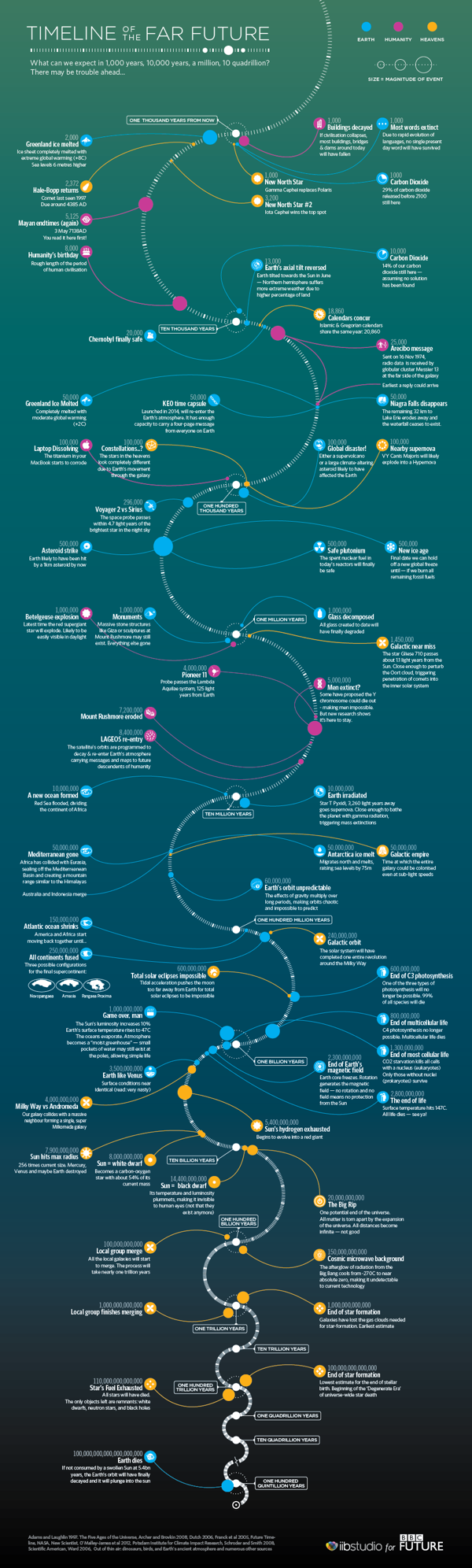
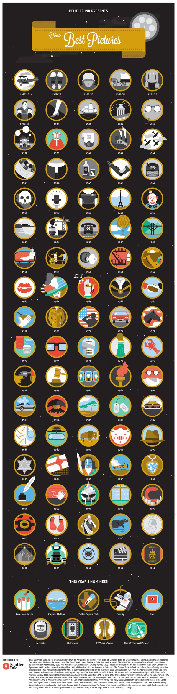
The Best Pictures infographic from Beutler Ink is an iconic timeline through the history of the Academy Awards winners for Best Picture.  Can you identify the movies from the icons?

Beutler Ink celebrates the 2014 Oscars with a poster commemorating each of the past 85 Best Picture winners. See how many movies you can recognize from the icon alone.

This is a fun design that draws the readers in by challenging them to identify the past winners based on the icons or illustrations shown for each film.  I could only identify about half of them, so I appreciated the answers included in the footer.

The big lesson we can learn from this design, is that once an infographic image is published online, it takes on a life of its own.  Infographics are usually shared online by people without any of the accompanying text that the publisher included on the original infographic landing page.  Because of this, all of the relevant information needs to be included in the infographic image file itself, or it gets lost when people share it.

In this case, the audience would have no idea that the award winning pictures in this design are from the 2014 Academy Awards (popularly known as the Oscars).  The landing page includes the introductory description text “Every Best Picture winner since the inception of the Academy Awards…” but there’s no introduction in the infographic design itself.  There are literally hundreds of different types of Film Awards (see http://en.wikipedia.org/wiki/List_of_film_awards), and the audience doesn’t know what this infographic is sharing without that introduction.  It needs to be included in the the infographic itself.

There’s no information that identifies this design is relevant for 2014.  Infographics are generally available online for years, and for a timeline based design, it’s important to clearly state the timeframe represented.  When someone finds this design in 2016, the section for “This Year’s Nominees” won’t be accurate.  Additionally, if they update this design next year, there should be a clear way to identify the version based on the timeframe shown.

Also, when readers find this infographic shared on other sites, they have no way to find the original without a URL.  The URL to the original infographic landing page should be included in the footer.

Thanks to Jarred for sending in the link!  Also found on Visual.ly

Wednesday
Jan152014

Timeline of the Far Future

Timeline of the Far Future infographic

What’s the future of the human race and our beloved planet Earth?  The Timeline of the Far Future from the BBC plots out predicted events for the next 1,000, 1,000,000 and up to 100 Quintillion years into the future!

As it is the beginning of the year we at BBC Future think it’s the perfect time to look ahead.

First, we brought you a prediction of the forthcoming year. Then we brought you a timeline of the near future, revealing what could happen up to around 100 years time. But here’s our most ambitious set of predictions yet – from what could happen in one thousand years time to one hundred quintillion years (that’s 100,000,000,000,000,000,000 years). As the song says, there may be trouble ahead…

They had to use an exponential scale, so each inflection point represents a jump in the timeline scale by a factor of 10.  The icons are small, and some are hard to figure out.  They had enough space they could have made those larger.  The circles are also sized by the magnitude of each event, but these seem to be arbitrary.

It’s worth noting one of the sources in the footer lists Out of Thin Air as a source.  This not a claim that they made up the information.  It’s actually a book titled Out of Thin Air that some of the information was pulled from.  I had to look it up, but it’s a valid reference.

Nice to know that MacBook will still be around for 100,000 years!  Definitely looks like we’re in for a rocky ride though…

Thanks to Digital Information World post on Google+


Tuesday
Jan142014

Information Destruction Through History

Information Destruction Through History infographic

Information Destruction Through History from Global Data Vault explores and quantifies the worst data disasters in history.

Information the most valuable commodity in the world. All human progress depends on the accumulation and preservation of information. When information is lost, human progress suffers. This infographic displays some of the most significant loses of information human civilization has suffered.

The circular timeline shows the data disaster events in chronological order, while also connecting to their geographic locations.  The triangles are proportionally sized so readers can visually compare the modern data equivalents between the events.  This really helps put the disasters into perspective for the audience.

A great infographic design that tells one story really well, but there are a few things I would recommend to improve the design:

  • I wouldn’t have any of the triangles run off the page, because the audience will lose perspective on how disastrous those specific events were.  Show the full impact of those events to the readers.
  • Add the URL directly to the infographic landing page so readers can find the original full-size version when people don’t link back correctly
  • I wouldn’t list Wikipedia as a data source if possible. Track the Wikipedia references back to the original data source to include in the list.

Thanks to Joe for sending in the link!

Monday
Jan062014

The Evolution of Reddit

The Evolution of Reddit Through Time infographic

The Evolution of Reddit Through Time infographic from Randal Olson.com covers the history of Reddit for the past 7 years. With thousands of active subreddits, the visual above displays the 24 most active. Track the popularity of each subreddit through the years!

The graph below shows how 24 of the most active subreddits have changed over time. I ordered the subreddits by the time that they first appeared on Reddit. I recommend zooming in so you can see it better.

(I should note that I purposely excluded /r/reddit.com from this graph because it dominates the entire graph until about 2008, then screws things up again when it got closed down in late 2011.)

The biggest thing that you may notice is that there were very few subreddits from 2006-2008. In fact, there was only one subreddit before 2006 (/r/reddit.com). The majority of the content in 2006-2008 was focused on more techie-friendly subjects: programming, science, politics, entertainment, and gaming. Major subreddits dedicated to solely picture and video content started becoming popular in mid-2008, and even then their posts only comprised less than 1/4 of Reddit’s content. It wasn’t until 2011 did the picture-related subreddits really start taking over, and Reddit never looked back after that.

This graph covers so many changes in the Reddit community that it can’t explain what happened by itself. In the following sections, I will take a closer look at how the Reddit community evolved on a year-by-year basis.

Love these data visualizations of the reddit’s evolution over time from Randy, a 3rd year Computer Science graduate research assistant at Michigan State University.  In his original post, he actually visualizes each year separately, and you can see some major milestones and clear changes in the reddit universe.

The Great /r/reddit.com Spike of 2009

The total growth of reddit over the years is lost in the 100% Stacked Area chart; however, you can clearly see the growth of subreddit content as a portion of the whole.

Found on Flowing Data!

Friday
Jan032014

The Shield of Superman: The Evolution of an Icon

The Shield of Superman: The Evolution of an Icon infographic

If you want to dress up like Superman, it is important to understand which Superman your going to be. The Shield of Superman: The Evolution of an Icon infographic from HalloweenCostumes.com provides visuals and a brief synopsis of each Superman logo in the comics and pop culture.

It’s a bird…It’s a plane…It’s Superman! Well, not Superman himself, but it IS a super awesome Superman infographic.

2013 is THE year for everyone’s favorite Man of Steel. Between it being the hero’s 75th anniversary, and Man of Steel hitting the silver screen on June 14th, we’re bursting with red and blue excitement! Thankfully, we were able to use our energy for good rather than evil, and create a visual guide to the evolution of Superman’s iconic emblem.

We cover the logo’s various incarnations in both comics and popular culture, starting with its first appearance in 1938 and culminating with what the famed “S” will look like when Henry Cavill reveals it on on his Clark Kent-ee chest in theaters in a little over a week!

Love this.  The visual images clearly show the readers how dramatically the logo has changed over the years in both comics and film.  

The footer should include a copyright statement and the URL link back to the infographic landing page.  Readers need to be able to find the original full-size version from the publisher when people share the infographic on other sites without linking back.

Which one was your favorite?

Found on http://www.infographicsarchive.com

Monday
Dec302013

The State of Social Media 2013

The State of Social Media 2013 infographic

The State of Social Media 2013 summarizes some of the major milestones and events in social media that happened during the last 12 months.

What a wild year it’s been. You could say that 2013 was the year of social media and you’d be correct. What was once a novelty for people bored and surfing on the ‘net has risen to be an industry in and of itself that companies large and small have embraced around the world as a powerful cornerstone of their marketing initiatives.

In case you got lost in the details of 2013, we’ve laid out all the notable moments of the year, month by month, in this handy infographic.

There are a handful of statistics listed in the design that should have been visualized instead of just shown in text.  The use of logos and images from the web do a good job of showing the specific events.

Designed by Infographic Promotion UK

Wednesday
Dec182013

The 100 Most Influential Cameras in History

The 100 Most Influential Cameras in History infographic poster

Another great infographic poster from the team at Pop Chart Lab!  A Visual Compendium of Cameras lines up the 100 most influential cameras in history in Chronological order.

A meticulously illustrated catalog of 100 landmark cameras, culled from over a century of photographic history, depicting both professional and consumer models and tracing photography’s history from the first models to today’s digital wonders.

Available unframed for $28 from the Pop Chart Lab Store.

Found on Fast Company Design!


You can see this one and many other infographic posters collected on the Cool Infographic Posters page or my Infographic Posters board on Pinterest!

Monday
Dec162013

The Genealogy of Baseball Teams

The Genealogy of Baseball Teams infographic poster

New infographic poster released by HistoryShots, The Genealogy of Baseball Teams charts the lineage and evolution of the major league teams.  Covering more than 140 years starting in 1871!

The Genealogy of Baseball Teams chronicles the origin and evolution of baseball teams from every major league from the inception of the National League in 1876 to the present day. Trace the fascinating histories of the Boston Red Caps to the Altanta Braves from the Washington Senators to the Minnesota Twins from the Brooklyn Trolley Dodgers to the Los Angeles Dodgers.

The Genealogy of Baseball Teams infographic poster closeup

Printed poster available for purchase from HistoryShots is 42” x 20”, and starts at $36.


You can see this one and many other infographic posters collected on the Cool Infographic Posters page or my Infographic Posters board on Pinterest!