About
Randy Krum
President of InfoNewt.
Data Visualization and Infographic Design

Infographic Design

Infographics Design | Presentations
Consulting | Data Visualizations

DFW DataViz Meetup

Join the DFW Data Visualization and Infographics Meetup Group if you're in the Dallas/Fort Worth area!

Search the Cool Infographics site

Custom Search

Subscriptions:


Feedburner

The Cool Infographics® Gallery:

How to add the
Cool Infographics button to your:

Cool Infographics iOS icon

- iPhone
- iPad
- iPod Touch


Read on Flipboard for iPad and iPhone

Featured in the Tech & Science category

Flipboard icon

Twitter Feed
From the Bookstore

Caffeine Poster

The Caffeine Poster infographic

Entries in USA (24)

Friday
Oct142016

A House Divided: The Rise of Political Partisanship

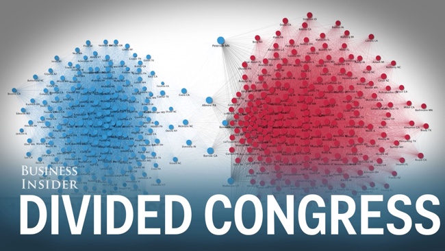
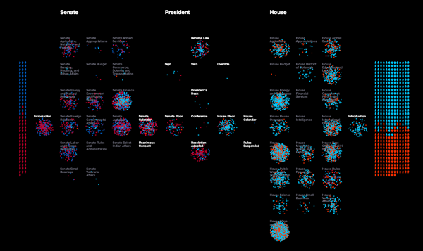
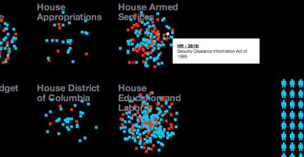
The Rise of Partisanship in the House of Representatives is a video infographic showing network maps and animating their change over time. Business Insider published this great data visualization video earlier this year.


This 60-second animation shows how divided Congress has become over the last 60 years

It's news to no one that Congress has had a hard time passing legislation in recent years. Some have even asserted that partisanship in Washington has reached historic levels. But how do we put the current divide in perspective? A group of researchers recently tried to quantify and visualize House partisanship in a paper published in PLoS ONE.

Produced by Alex Kuzoian. Original visualization by Mauro Martino.

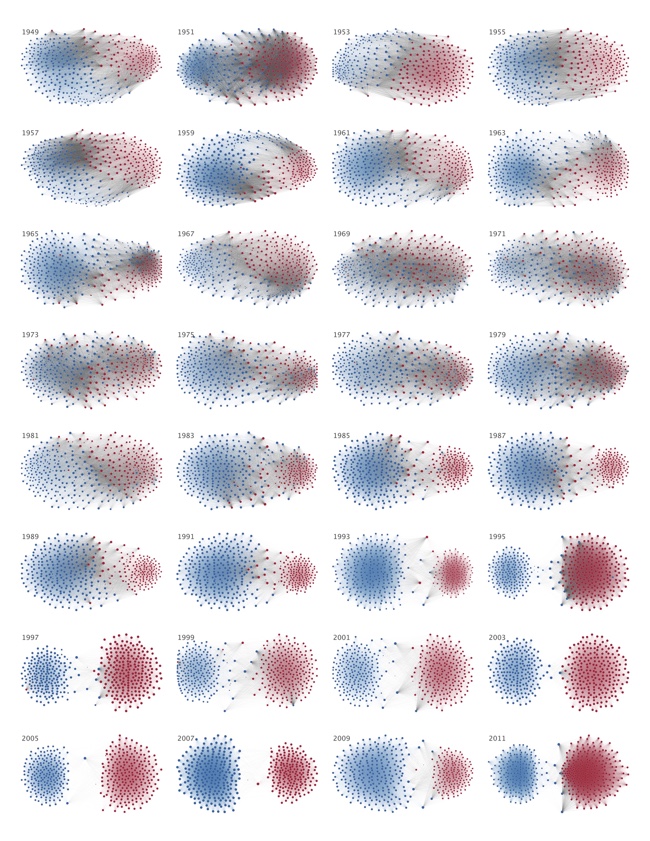
To understand what is being displayed:

  • Each dot represents a member of the U.S. House of Representatives
  • Connection lines represent when two members voted the same way
  • Connection line thickness represents how often they voted together during each 2-year period
  • Dot size based on the total number of connections
  • Color represents political party

A poster version of this design is also available on Mauro Martino's site:

Thanks to Sue Miller for sharing on Facebook!

Wednesday
Jun292016

The U.S. MiseryMap of Flight Delays

The U.S. MiseryMap of Flight Delays Map Infographic

Stuck in an airport? The MiseryMap from FlightAware shows a real-time view of flight delays and cancelations at the top 30 airports in the U.S.

Doughnut charts highlight the totals for each major city (combining airports if there are multiple) and hovering or clicking a specific city will show the flight routes (sankey diagram style) that are experiencing delays and cancelations. The full details are shown in the barr chart sidebar.

Pressing the play button will animate the map for the last 48 hours showing the changes to the weather map overlay, and delays in 4-hour increments. The overall size of each doughnut also seems to represent the total number of flights from that city in each 4-hour increment.

The U.S. MiseryMap of Flight Delays Map Infographic DFW

Thanks to Mary Kaye for sharing the link!

Tuesday
Jul282015

Largest Company by Revenue in Each State 2015

Largest Company by Revenue in Each State 2015 map

The Largest Company by Revenue in Each State 2015 map was created by Broadview Networks by using Hoover’s, a D&B Company's data. Even though there might be "bigger" companies in each state than the ones represented, the map is specifically looking at the greatest amount of revenue from the 2015 financial year.

You may have seen the Largest Companies by Revenue map we put together in June of last year, well we’re back with an updated version using Hoover’s 2015 data.  Last year’s map created so much buzz and insightful conversation that we deemed it essential to find out how it’s changed over the past year.  Using Hoover’s, a D&B Company, we searched through each state’s list of companies to find which had the largest revenue in the last fiscal year.  It was interesting to see how each company’s revenues have changed over the year (for better or worse) and to see if a new largest company had emerged.

At first glance, you may ask, “Where are Apple and Microsoft?”  Yes, these are huge companies but this map is specifically looking at total revenue from the last fiscal year.  If we look at California with Apple vs. Chevron, there is a large discrepancy between market value and total revenues.  Apple’s market value as of March 31, 2015 was $724 billion while Chevron’s was only (and we use “only” lightly) $197 billion.  In terms of revenue, Chevron comes out on top with $203 billion in the last fiscal year while Apple had revenues of $182 billion.

Please note: We used Hoover’s company database as our source, not the most recent Fortune 500 list.  Location and state are based on the corporate headquarters of that company, no branches or foreign offices.  Lastly, we decided not to include any subsidiaries or government entities for the sake of staying consistent.

I liked how they didn't manipulate the US map. Manipulation would have taken the focus away from the company's logos. If you click on the infographic, the original allows you to zoom in close enough to comfortably see small states, like CVS is Rhode Island's largest company of 2015. This infographic could of easily been overworked but instead they kept it simple.

The company post inspired a lot of discussion about the data, and I think that was part of the purpose behind the design. Is this the best data to show? Where are some of the more recognizable companies? There's even at least one error in the map.

Found on Broadview Networks VoIP Blog

Wednesday
May062015

Gardening Hardiness Zones

Gardening Hardiness Zones infographic

When planting a garden, it is best to understand which crops will preform best in different climate zones. Avant Gardening has developed the Gardening Hardiness Zones infographic for the gardener in any part of the United States.

We love the changing seasons, but we definitely miss spending time in our gardens. Every winter, we are starting to wonder when we can begin planting again. 

So, when can we get back out there? The best time for starting your garden depends on where you live. That’s why every gardener knows their USDA Plant Hardiness zone.

A hardiness zone, as defined by Wikipedia, is a “geographically defined area in which a specific category of plant life is capable of growing, as defined by climatic conditions, including its ability to withstand the minimum temperatures of the zone.” 

The USDA sets the zones based on the average annual extreme minimum temperature during a 30-year period in the past. The zones are not determined by the lowest temperature that has ever occurred or what is predicted to occur.

Know Your Hardiness Zone

So, how do you know which zone you’re in? The USDA has created a very detailed map outlining the US and how the zones are broken down. This resource is second-to-none when it comes to hardiness zones.

Once you determine in which hardiness zone you reside – and it is as simple as visiting the USDA map and clicking the mouse on your location - you can use this information to better plan your garden. 

Thanks to Deirdre for sending in the link!

Friday
Jan232015

Equal Population Mapper

Equal Population Mapper Interactive Infographic

Ben Blatt has created the Equal Population Mapper infographic. The interactive version at Slate.com allows you to choose New York City, Los Angeles County, Wyoming, New Jersey, Texas, or the Coastal regions as the target population. Then you select anywhere else on the map and a red circle will appear to show how big of an area you would have to select to have an equal population to your selection.

If you throw in New York City’s other four boroughs, the Big Apple’s total population is just greater than 8 million. That’s about the same number of people who live in Idaho, Montana, Wyoming, North Dakota, South Dakota, Nebraska, and the western half of Minnesota combined.

But don’t let my New York City–centric comparisons hinder your imagination. The interactive at Slate.com lets you visualize how different parts of the country compare in population density.

Click the button at the bottom of the interactive to select Los Angeles County, for instance, and then click anywhere on the map to generate a (roughly) circular region of (roughly) equal population. The population data come from the 2010 census, and the square mileage was calculated by summing each highlighted county’s total area. You can also use New Jersey (the most densely populated state), Wyoming (the least densely populated state outside of Alaska), Texas, the coasts (the group of all counties that come within 35 miles of either the Atlantic or Pacific oceans), and, yes, New York City as the baseline for your population comparison.

Cool interactive map!

Found on Flowingdata!

Thursday
Aug212014

Missing Money

Missing Money Infographic

It is no secret that the U.S. is deep in debt. But something you might not know is how much money the U.S. can’t find. The Missing Money infographic from Masters in Accounting covers multiple instances where huge amounts of money are unaccounted for.

With a national debt approaching $17 trillion, Uncle Sam is tightening his belt and looking under the cushions for extra change. But a closer look at his pocket book reveals just how little he knows about where your money is going. Below are a few examples that will make you think twice about Uncle Sam’s accounting skills.

This infographic shares some bold accusations, all meant to be shocking to the readers.  The sources are clearly cited in the footer, but in this case I would recommend including each source along with the claim in the infographic.  The publisher isn’t making any of these claims themselves, just sharing the claims from others, and that should be made clearer to the audience.  It would also be easier for the audience to follow the source link, and learn more about any particualr claim.

The first chart showing the annual increase in the U.S. Debt caused by the budget deficit should show the deficit amount at the bottom of each column instead of the top.  That would visually show that the deficit is the cause of the growing debt from one year to the next by placing it at the end of the column where the heights are different.

Thanks to Merrill for sending in the link!

Thursday
Jun052014

Legislative Explorer: Watch Government In Action

Legislative Explorer: Watch Government In Action

Legislative Explorer is an interactive, animated data visualization that visualizes the process of bills submitted by houses of Congress; the Senate on the left and the House of Representatives on the right.  Designed by Researchers at the University of Washington’s Center for American Politics and Public Policy, it’s a fascinating visualization that is mesmerizing to watch.

A deluge of data is challenging scientific researchers across disciplines to develop new techniques for detecting patterns in large and complex datasets. This general area of research is known as data-driven discovery, or ‘D3.’ Visualizations are a particularly important area of innovation because they help researchers to investigate complex processes at a more holistic level. The goal of Legislative Explorer is to leverage the same benefits of data-driven visualizations to advance understanding of government.

A more in-depth discussion of Legislative Explorer with multiple animations and videos is available at the Center for American Politics and Public Policy.

Anyone can use Legislative Explorer to observe large scale patterns and trends in congressional lawmaking without advanced methodological training. In addition, anyone can dive deeper into the data to further explore a pattern they’ve detected, to learn about the activities of an individual lawmaker, or to follow the progress of a specific bill. Start Exploring!

I selected the 99th Congress (1985-1986) for the screenshots, and you can see the party breakdown of both houses of Congress by their color.  Each icon represents a specific member of Congress which you can identify by hovering your mouse over the icon.  The animation will show a visual spray of bills introduced by members in both houses of Congress as party-color-coded dots that move into committees and through the steps to becoming a law.

Legislative Explorer: Watch Government In Action Zoom 

There are a number of user-definable filters to help narrow down the visualization to a specific party, only one committee, or even just to watching a single bill move through the proces.

Here’s a quick video tutorial:

Found on FlowingData

Thursday
Oct172013

What is the Debt Ceiling?

What is the Debt Ceiling infographic

What is the Debt Ceiling? from WorldSolo Index does a good job of using the combination of charts and text to make a complex issue more understandable to the readers.

The US Debt Ceiling is explained. The US is expected to reach its borrowing limit by Oct 17, 2013 if the borrowing limit is not raised. This infographic breaks down the debt ceiling in detail.

Good design that focuses on telling one story really well.

Found on Visually

Tuesday
Sep032013

The Racial Dot Map

The Racial Dot Map Chicago

The Racial Dot Map visualizes the 2010 U.S. Census data, where every individual person is represented by a single, color-coded dot.  The color coding shows the racial groupings gathered by the census.

This map is an American snapshot; it provides an accessible visualization of geographic distribution, population density, and racial diversity of the American people in every neighborhood in the entire country. The map displays 308,745,538 dots, one for each person residing in the United States at the location they were counted during the 2010 Census. Each dot is color-coded by the individual’s race and ethnicity. The map is presented in both black and white and full color versions.

The map was created by Dustin Cable, a demographic researcher at the University of Virginia’s Weldon Cooper Center for Public Service. Brandon Martin-Anderson from the MIT Media Lab deserves credit for the original inspiration for the project. This map builds on his work by adding the Census Bureau’s racial data, and by correcting for mapping errors.

Each of the 308 million dots are smaller than a pixel on your computer screen at most zoom levels. Therefore, the “smudges” you see at the national and regional levels are actually aggregations of many individual dots. The dots themselves are only resolvable at the city and neighborhood zoom levels.

Each dot on the map is also color-coded by race and ethnicity. Whites are coded as blue; African-Americans, green; Asians, red; Hispanics, orange; and all other racial categories are coded as brown.

The map is an interactive, zoomable map online of the entire country, and allows you to explore any U.S. locations.  Chicago is show above.

Since the dots are smaller that screen resolutions where the viewer zooms out, the data is aggregated to pixels at each level of zoom.   The Minneapolis-St. Paul metro area is highlighted on the site as an example of the aggregation.  You can see the more detailed dot pattern on the right at the higher zoom level.

The Racial Dot Map Minneapolis

I would love to see this added as a layer in Google Earth!  Wouldn’t that be cool?

Thanks to Renee for sending in the link!  Also, found on Wired.

Atlanta:

The Racial Dot Map Atlanta


Dallas-Fort Worth:

The Racial Dot Map Dallas Fort Worth


The entire U.S.

The Racial Dot Map USA

Friday
Jun142013

How to Fold the U.S. Flag

How to Fold the U.S. Flag infographic

Happy Flag Day in the U.S.  June 14, 2013

Found on the Boy’s Life Facebook page.