About
Randy Krum
President of InfoNewt.
Data Visualization and Infographic Design

Infographic Design

Infographics Design | Presentations
Consulting | Data Visualizations

DFW DataViz Meetup

Join the DFW Data Visualization and Infographics Meetup Group if you're in the Dallas/Fort Worth area!

Search the Cool Infographics site

Custom Search

Subscriptions:


Feedburner

The Cool Infographics® Gallery:

How to add the
Cool Infographics button to your:

Cool Infographics iOS icon

- iPhone
- iPad
- iPod Touch


Read on Flipboard for iPad and iPhone

Featured in the Tech & Science category

Flipboard icon

Twitter Feed
From the Bookstore

Caffeine Poster

The Caffeine Poster infographic

Entries in history (262)

Wednesday
Dec232015

Old vs. New Graphic Design

The Ultimate Battle- Old vs New- Graphic Design infographic

The New Media Company has created the infographic The Ultimate Battle: Old vs New Graphic Design to explore 8 different aspects of graphic design and compare how the methods have changed through the years.

Are you an old school or a newbie designer?  

If you have ever worked in a Design Studio you will have experienced the constant conflict between “Old” and “New” Design... 

You know the ones: "Quark is better than InDesign", "We didn't have the internet in my day." Here we take a look back at some of the tools that older designers used to use and compare them to todays modern technologies. 

Fun variation on the side-by-side comparison infographic style.

Thanks to Danielle for sending in the link!

Monday
Nov302015

A History of Communication

A History of Communication infographic

Communication is just as important to us today as it was in prehistoric times. The need hasn't changed much, but the way we accomplish it sure have! A History of Communication infographic from Thinking Phones divides our technological advances in communication into 4 eras, and then leaves us with the question of, "What's next?"

From the primitive use of smoke signals to today's cutting-edge contextual phone calls, humans have proved there are no boundaries when it comes to advancing the methods with which we communicate. Personally and professionally, we are constantly adopting new interactive technologies for the purpose of getting ahead – to make our lives simpler in a more convenient, intelligent way. Today's innovative communication platforms like text, voice, video, and complete cloud solutions easily enable this goal of efficient and effective contact. As our connectivity needs evolve and technology continues to expand, we humbly take a look back through the history of communication as we know it. 

Simple timeline that highlights the key milestones of communication at a very high level. Minimal detail and text keeps the design clean and easy-to-read.

Thanks to Stephanie for sending in the link!

Friday
Nov202015

Histography

Histography

Histography is a timeline created by Matan Stauber that visualizes every moment in history from Wikipedia as a steel ball. You can navigate the timeline by using a slider to determine what time period you would like to see. Then simply place the courser over a ball to read an event! It is very easy to navigate and tons of fun. Go to Histography to visit the full imteractive site.

Below is an article from Fast Co Design that explains the process in detail.

If every moment in human history was a single steel ball, Histography is like an 4-D Newton's Cradle, visualizing how all of these events bump up and knock up against each other on a 14-billion-year time frame. It's beautifully hypnotic—and impressively, it's all sourced from Wikipedia, which means that it keeps on updating itself.

Created by Matan Stauber, Histography is an interactive timeline spanning the Big Bang to whatever was in the news yesterday. It basically draws all historical events from Wikipedia, visualizing each as a black dot. You can click on each dot to get more information about the event it represents. These dots are then ordered chronologically from left to right, with simultaneous events being stacked vertically on top of each other. The result is that the Histography looks something like a pointillist sound wave, growing and shrinking according to how noisy a year, era, or epoch was.

There's a number of different ways you can browse Histography. The default view shows every historical event from Wikipedia's database at once, which you can then filter down by category: for example, by literature, politics, assassinations, and so on. But I think the 'Editorial Stories' view (accessible by clicking the Histography logo) is more interesting. It represents Wikipedia's database as a nearly endless spiral, which you can descend through scrolling, zooming right down to the Big Bang.

Found on FastCo Design

Wednesday
Jul292015

A History of Cell Phones and Cellphone Technology

A History of Cell Phones and Cellphone Technology infographic

Cellphone Technology has come a long way since the 80's. A History of Cell Phones and Cellphone Technology infographic from Lyca Mobile covers each generation of Cell Phones and adds some fun facts along the way. How many different generations have you owned?

This infographic covers the history of cell phones and cellphone technology from the 1st generation of cell phones in the 80’s to current high-speed 4G networks. 

There has been a lot of different cellphones since the 1980's; however, the infographic chose to separate the cellphones by broadband generations and then use just one easy to recognize cellphone from the time period. I also like how they stacked the uses for the cellphones. It was easy to recognize which features were new.

This design is purely informative. There's no call-to-action or asking the reader to do something with this information. However, they should have included the URL back to the infographic landing page so readers can find the full-size original design we people repost without the backlink to the Lyca website.

Thanks to David for sending in the link!

Monday
Jul132015

A Brief History of Open Source Code

A Brief History of Open Source Code infographic

Learn about the last 20 years of collaborative software development, language relationships, and the current state of the art with A Brief History of Open Source Code infographic. Kinvey, a company that helps its clients create mobile apps, published the infographic designed by Beutler Ink back in 2013. For more in-depth reading, check out this article at Read Write.

We were able to visualize the percentage of total commits in a given quarter for the top 16 programming languages from 1993 until today. We hope you’ll find this image—a provocative pattern of dips and spikes—to be as interesting as we do. It truly shows how dynamic the world of programming is. We’ve also included a few graphs on other interesting data points: total number of languages by year, average lines of code per commit, and tracking which languages influenced the development of others.

There is good use of colors and charts to tell the story of the 16 different source code languages. No numbers were needed to show the popularity of each language, only distances between the colors. The colors are similar, but not to the point where we would have trouble telling them apart. I like the gradual color gradient in the infographic. Too many different colors would make the graphic look too busy.  

Found on http://readwrite.com

Monday
May112015

History of the Batmobile

History of the Batmobile infographic

Batmobile Feature infographic

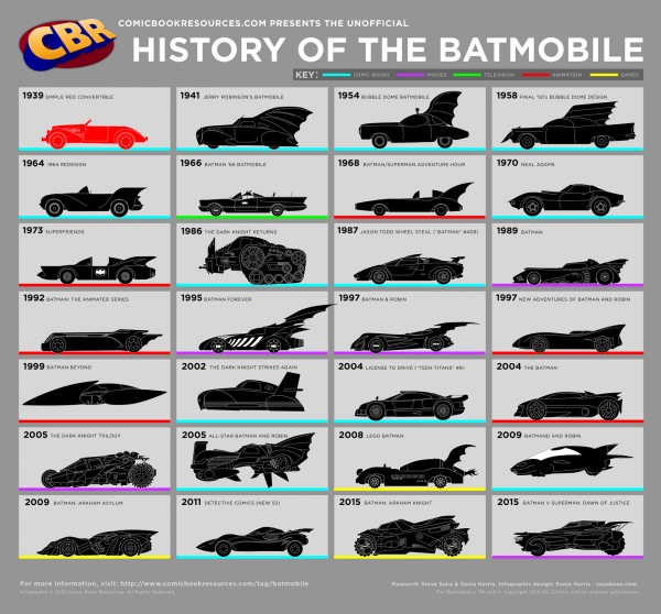
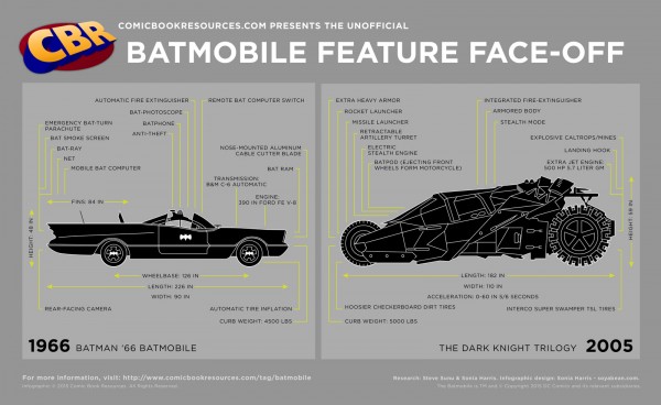
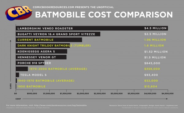
Comic Book Resources has added 3 Batmobile infographics to reveal some interesting trivia. In 75 years, there have been many different Batmobiles over the years. These infographics show past designs, a feature comparison between the 1966 and 2005 model, and final a cost comparison chart ranging from the $13,000s to $4.5 Million.

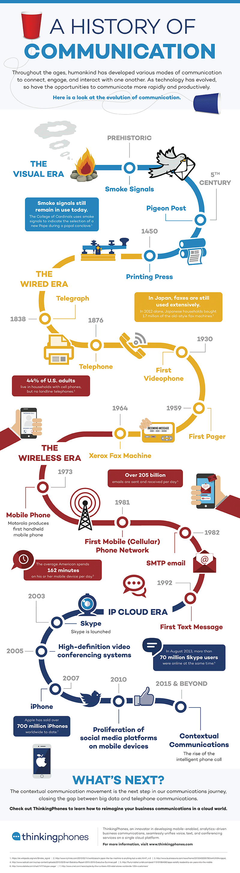
After 75 years of omnipresence, one can make a very strong case that the Batmobile is the most iconic automobile in all of pop culture history. Since Batman’s debut back in 1939’s “Detective Comics” #27, the caped crusader has always relied on a car — usually a stylish, feature-loaded one — to get him from his cave to crime scenes. As a crucial part of the Bat-mythos, the Batmobile — dubbed such in 1941’s “Detective Comics” #48 — has appeared in everything from comics and cartoons to films and video games. Wherever you see Batman, odds are the Batmobile is parked just a few blocks away. 

Zack Snyder Shares Partial Look at New Batmobile

With the Batmobile poised to make it’s eighth big-screen appearance in 2016’s “Batman v Superman: Dawn of Justice,” former CBR editor Steve Sunu set about researching the most intimidating car on DC Comics’ streets. Did you know that the original Batmobile was red? Or that the “Batman ‘66” version had an “emergency bat-turn parachute”? Or that you could buy almost three “Dark Knight” tumblers for the cost one one Lamborghini Veneno Roadster? Graphic artist and COMICS SHOULD BE GOOD contributor Sonia Harris brought all these facts together in the three infographics below, designed to get you up to speed on the fiction’s most notable car.

Peruse CBR’s three Batmobile infographics and broaden your knowledge of comics’ most famous car — and feel free to share and discusses these infographics on social media with #CBRBatmobile!

I would have put all three of these together into one infographic, but the smaller, separate designs might be easier to share in social media. In the Cost Comparison bar chart, I would like to see images or silhouettes of the different cars represented.

Thanks to Mike Wirth for sharing on Facebook.

Thursday
Apr302015

Mobile Phone Size Evolution

Mobile Phone Size Evolution

Great data visualization of the Evolution of Mobile Phone Sizes on the Future Trends page from 3 Danmark!

Simple, easy to understand.

Infographic and data visualization images are often shared without any links or accompanying text, so online images like this need to include some additional text with the source publishing and a URL in the image file itself.

Friday
Apr172015

Your Life in Weeks

Your Life in Weeks infographic is the life of a typical American broken down into the 52 weeks within each year. This infographic was created by Tim Urban from Wait But Why. Each dot represents one week of your life. The infographic highlights some of the major milestones in life, while color coding the weeks into the big categories of schooling, career, and retirement.

Each row of weeks makes up one year. That’s how many weeks it takes to turn a newborn into a 90-year-old.

It kind of feels like our lives are made up of a countless number of weeks. But there they are — fully countable — staring you in the face. 


There are multiple events you can chart on this graph. Famous Deaths is an example of charting which week some famous people died.


Tiger Woods Major Championships (red) and Roger Federer Grand Slam Championships (blue) is another example. This chart makes it easy to track the peak years for athletes.

Tim made a blank version also available for you to fill in your own events or add some world events for perspective like the examples above. What would you add?

Found of Huffington Post.

Tuesday
Apr072015

Greek Mythology Family Tree

Greek Mythology Family Tree chart

Keeping track of Greek mythology’s genealogy can cause a headache. But now, Useful Charts has released a new update to the ultimate cheat sheet called the Greek Mythology Family Tree chart poster! The tree starts with Chaos from the Primordial gods, and finishes through the last of the Olympians.

The poster is available for purchase on Amazon for $24.95

Fans of Rick Riordan’s Percy Jackson books will love this poster! Covering all three generations of Greek gods (Primordial, Titans, and Olympians), it displays both the Greek and Roman names for the gods as well as their titles or functions. It is also color-coded to distinguish between sea gods, sky gods, earth gods, underworld gods, personifications, monsters, demigods, and mortals.

This is a great network map design, and way more complicated than your standard family tree. The images help tremendously.

Created by Matt Baker at UsefulCharts.com

For a detailed look at the poster, check out Matt’s video:

Thursday
Mar122015

Apple Product Flops Timeline #Fail

Apple Fail infographic

Not all ideas are good ones. Apple has had it’s own fair share of ideas gone wrong. The Apple #Fail infographic from 7 Day Shop is a compiled list of Apple’s not so successful inventions.

Behind All Successes Are a Series of Failures

When starting your own business, you should be ready for some failures along the way – but the most successful firms learn from their mistakes. As author C.S Lewis once said: “Failures are finger posts on the road to achievement.”

Take Apple. The Cupertino-based tech giant may be known for the runaway success of the iPhone and Ipad. But as our Infographic shows, Steve Jobs suffered a number of epic fails over the years.

Some misses like the Apple III and the Macintosh Portable, almost put them out of business!

Never Giving Up

But they didn’t give up – even when their machines were tipped for success, but failed to appeal to the tech market. Take the PowerPC processor for example. It could be used as a games console and a word processor, but consumers weren’t bothered.

The same can be said for Apple’s U2 iPod and the U2 album giveaway “Songs of Innocence”. Both failed, but perhaps because of the music churned about by the Irish rock band more than the marketing idea.

And FireWire’s inability to displace the USB, encouraged Apple to develop the Lightning Cable, which is now the standard iPhone charger cable. Even some good ideas did catch on. What about the Power Mac G4 Cube? A shiny monitor in an acrylic glass enclosure with upgradeable video – surely, that had to work! The idea was magic in a box, or as Apple might say, it was genie-us. Consumers didn’t think so. It failed.

Thanks to Kunie for sending in the link!