About
Randy Krum
President of InfoNewt.
Data Visualization and Infographic Design

Infographic Design

Infographics Design | Presentations
Consulting | Data Visualizations

DFW DataViz Meetup

Join the DFW Data Visualization and Infographics Meetup Group if you're in the Dallas/Fort Worth area!

Search the Cool Infographics site

Custom Search

Subscriptions:


Feedburner

The Cool Infographics® Gallery:

How to add the
Cool Infographics button to your:

Cool Infographics iOS icon

- iPhone
- iPad
- iPod Touch


Read on Flipboard for iPad and iPhone

Featured in the Tech & Science category

Flipboard icon

Twitter Feed
From the Bookstore

Caffeine Poster

The Caffeine Poster infographic

Entries in interface (67)

Friday
Dec112009

Send your own Augmented Reality Christmas Cards!


Merry Christmas from Cool Infographics!

What better way to share your Christmas wishes than with augmented reality?!?  You can send your own AR Christmas cards courtesy of arwishes.com.  You can choose from an assortment of animated images that will appear on screen when you friends and family hold up your Christmas card in front of their computer's webcam.


The cards are printed with the marker, disguised as a holiday image.  In this case, the marker is obviously the Christmas Tree.

A number of companies did this last year, sending out cards with an AR marker printed as part of the card, and a number of them are still online.  You can also print out a card from the sites to see the image yourself.  There will probably be a few more this holiday season as well, but here are some videos from last year's AR cards and links to sites if you want to experience them yourself.

Specialmoves.com:


Special Moves Augmented Reality Xmas Card from Iain Tait on Vimeo.

TellArt:


Tellart 2008 Holiday Card from Tellart on Vimeo.

Stella Artois:

Total Immersion:

There's even a video of sending your own AR Christmas Cookies!

Wednesday
Nov252009

Cool Infographics on the Amazon Kindle!


The Cool Infographics RSS feed is now available as a subscription for the Amazon Kindle!

It downloads the new blog posts wirelessly through the Amazon Whispernet network so you can view them anytime, even when you're not connected to the network.  It looks pretty good for being in black & white.  You do get to see the images I post on the blog, but you have to come back and view them on your computer to get the full color images.

Kindle Blogs are auto-delivered wirelessly to the Kindle and updated throughout the day. They are fully downloaded onto your Kindle so you can read them even when you're not wirelessly connected. And unlike RSS readers which often only provide headlines, blogs on Kindle contain full text content and most images.
I  just figured out that this was even possible.  Amazon sets their own price, which they have set at $1.99 per month for some unknown reason.  I do get a very small piece of that, so subscribing does support the Cool Infographics blog.

To give credit, I saw the link on Matthew Hurst's Data Mining blog.

Monday
Nov232009

Probes in the Universe - cool interactive infographic


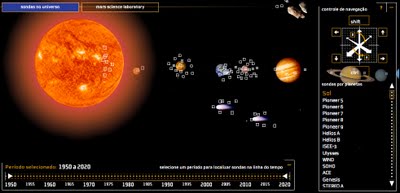
Space Probes is a very well-done interactive graphic about all of the space probes we have launched, visually placing the probes in orbit around the object they are observing.  You can move around the 3-D space with the keyboard controls, change the date range with the sliders on the bottom or go directly to a particular probe from the list on the right that is group by planet or object they are around.  When you mouse-over a particular probe you get more details and an image.


The article and the infographic are in Portuguese from Brazil, so I took the liberty of using the Google Translator for a little help.
The infographic "Space Probes" Super, produced by the team of Internet Editora Abril Jovem, took the silver medal in the category Online Malofiej, top prize in the world of computer graphics.
Thanks to Daniel for the link and a little more information:
It won Malofiej's silver medal (first place, no gold medal) this year. 
It's an infographic about all space probes launched until the date it was published (except Earth probes, which are too many). The info has information about each probe, including the organization(s) that sent it, the target planet(s) (or moons, asteroids, comets and the sun), launch date and mission details, as well as pictures for most of them. User can navigate through our Solar System using the mouse and/or keyboard. It's also possible to know the details of Mars Science Laboratory, the next NASA probe to visit the red planet. The info is in Portuguese, but anyone can understand it's features and learn a little bit about space exploration so far.

Monday
Nov162009

The Ambient Life (an infographic video)


Freeband - The Ambient Life from The QBF on Vimeo.

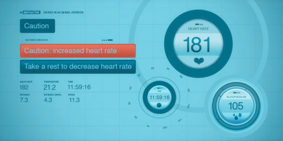
An animated vision of the future commissioned by Freeband Communication, The Ambient Life is a look at how we might interact with infographics all around us in everyday life (although I hope the plane crash isn't an everyday occurrence!)

A world in which information and communication technology render one's surroundings into a thinking and caring environment. 
Design and direction by Martijn Hogenkamp, an Amsterdam based motion director and designer.


Found on DataVisualization.ch

Tuesday
Oct272009

Eye Tracking Infographic Plots


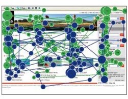
Eye tracking is used is a number of different fields of study; consumer interaction design, advertisements, product packaging, website/software usability, store shelf merchandising design and many more.  The results are plotted visually as an infographic, because it instantly makes the data understandable to the researchers.

In the fixation map image above, a participant's focal points on a website are tracked and the points are numbered in sequential order (like connect-the-dots).  The dots are also each sized based on "Gaze Duration", the amount of time the participant spent looking at that particular point.  In the example above, it took the participant 90 fixations to find the information they were looking for...not a good site design.


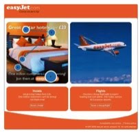
Of course, you can narrow down the fixation points and only see the first few points that attracted the participant's attention.  Answering the question "What does the user see first?"  In this example, the participant looking at the flight website saw the hotel ad first.


It's not just for websites.  When you use this method for product packaging, you can tell what the consumer sees in the store during the first few seconds, and the popular understanding is that you only have 3 seconds of the consumer's attention in the store.  The use of the infographic fixation map instantly conveys to the packaging designers what the consumer sees, and what parts of the design are ignored.


The fixation maps are converted into heat maps to aggregate many participant results together.  You can see here that participants aren't seeing the "Diesel for Successful Living" message.

Thanks to Colin from IDG Consulting for providing the images!  I have used IDG for consumer research projects in the past, and I highly recommend them.

Wednesday
Oct142009

10/GUI - Re-imagining a Desktop Touch Interface


10/GUI from C. Miller on Vimeo.

A little off-topic, but I love this video idea for a new touch interface to replace the mouse from 10/GUI. Designed by R. Clayton Miller.

This video examines the benefits and limitations inherent in current mouse-based and window-oriented interfaces, the problems facing other potential solutions, and visualizes my proposal for a completely new way of interacting with desktop computers. 
Thanks for the link Tyler!  Found on Ignore The Code.

Wednesday
Sep232009

Check Out Your Own Online DNA - Visually


Check out Personas, an interactive, online DNA visualizer.  You enter your own name (or anyone's name for that matter) and watch the system as it categorizes you from online searches.  I've displayed my own DNA above.  The types of attributes it associates with your name are based on the text it finds in the search results.


As you watch Personas analyze the search results you can see that in my case, it doesn't differentiate between me and the other Randy Krums of the world, so our attributes are blended together into one common DNA.


Personas shows you how the Internet sees you.  Upon entering a name, it scours the Internet looking for characterizing statements to use in its analysis.  After suitable information has been found, the viewer watches as the machine tries to make sense of the displayed text.  Once it has reached its final conclusions, the resulting "Personas vector" is displayed and annotated with a minimal legend.
Personas is just one part of the Metropath(ologies) exhibit, now currently on display at the MIT Museum through September 2009 (it needs a new home!).  Metropath(ologies) is a participatory installation about living in a world overflowing with information and non-stop communication, a world in which you are simultaneously the audience and the subject.  It is deliberately ambiguous about the desirability of this communication abundance, riding the line between serene and sinister.
Found on VisualThinkMap.

Thursday
Sep102009

HealthMap: The Global Disease Alert Map


HealthMap.org is an online map tool that locates any reports of disease from a selection of news sources.  Available in multiple languages, HealthMap is a great use of the Google Maps API.  In fact, HealthMap is funded by Google, which explains why they are so dependent on the Google Maps data.
HealthMap brings together disparate data sources to achieve a unified and comprehensive view of the current global state of infectious diseases and their effect on human and animal health. This freely available Web site integrates outbreak data of varying reliability, ranging from news sources (such as Google News) to curated personal accounts (such as ProMED) to validated official alerts (such as World Health Organization). Through an automated text processing system, the data is aggregated by disease and displayed by location for user-friendly access to the original alert. HealthMap provides a jumping-off point for real-time information on emerging infectious diseases and has particular interest for public health officials and international travelers.
They also recently launched an iPhone app called Outbreaks Near Me, available for free in the iTunes app store.  The app allows you to view the maps from your iPhone and get alerts for outbreaks in your area.

Wednesday
Sep092009

Balance Your Media Diet (The Media Pyramid Infographic)

From Wired Magazine's "New Rules for Highly Evolved Humans" section of the August 2009 issue.
Practicing good nutrition keeps your mind sharp, your body fit, and your life long. The same could be said for consuming media. (Seriously, knowledge is power.) When you add it all up, the average American spends roughly nine hours a day glued to some kind of screen, and like your diet, quality is as important as quantity. Here areWired's suggested servings for optimal media health.
Found on Nathan's Flowingdata.com

Friday
Sep042009

New Hans Rosling video, using GapMinder (Must see!)

New TED Talk video of Hans Rosling talking to the U.S. State Department, "Let my dataset change your mindset".  Using the GapMinder software that was purchased by Google, Hans shows the third world isn't as far behind the U.S. as most people believe.