About
Randy Krum
President of InfoNewt.
Data Visualization and Infographic Design

Infographic Design

Infographics Design | Presentations
Consulting | Data Visualizations

DFW DataViz Meetup

Join the DFW Data Visualization and Infographics Meetup Group if you're in the Dallas/Fort Worth area!

Search the Cool Infographics site

Custom Search

Subscriptions:


Feedburner

The Cool Infographics® Gallery:

How to add the
Cool Infographics button to your:

Cool Infographics iOS icon

- iPhone
- iPad
- iPod Touch


Read on Flipboard for iPad and iPhone

Featured in the Tech & Science category

Flipboard icon

Twitter Feed
From the Bookstore

Caffeine Poster

The Caffeine Poster infographic

Entries in map (184)

Thursday
Jun132013

Visualizing International Criminal Tribunals


Visualizing International Criminal Tribunals

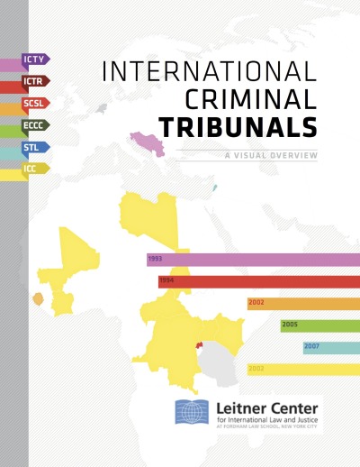
Very cool report that uses data visualization and infographics design to communicate complex information about International Criminal Tribunals from the Leitner Center for International Law and Justice at Fordham Law School, New York City.

The Leitner Center launches a new report, “International Criminal Tribunals: A Visual Overview,” providing an introduction to the work of the international tribunals and the conflicts which led to their establishment. Despite widespread interest in these tribunals and the view that they represent a definitive advance of international law and justice, there is also much confusion and misconception about their work. This new 90-page report, providing analysis and information through written summaries and detailed visualizations, aims to make the work of the courts more accessible to the general public and legal professionals alike.

Media attention dedicated to the work of the tribunals is too often superficial, and tends to confuse key distinctions between them; more informed scholarship, on the other hand, is largely confined to specialty publications, remaining inaccessible to most. “International Criminal Tribunals: A Visual Overview,” aims to provide well-researched and accessible information for anyone wishing to more fully understand these issues. This will help democratize engagement with these courts, which are tasked with delivering justice for victims of some of the world’s worst atrocities. Examples of the visual graphics in the report are included below.


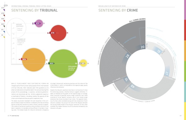
Awesome use of different styles of data visualization to summarize the often-complex information behind these tribunals.  Timelines, maps, area charts, polar grids, rose diagrams and treemaps.  The Case-by-Case timeline are fascinating.

The complete report is publicly available as a PDF for download.

I asked Daniel McLaughlin a few questions about the development and design of the report:

Cool Infographics: What software, websites or tools did you use to create the visualizations?

Daniel: We used Adobe Illustrator and InDesign to create the visuals for the report.

Cool Infographics: Did you create the report yourself, or use a design team?

Daniel: As a lawyer working with law students on this project, I was dependent on graphic and information design volunteers to create the visuals. The students and I carried out all the substantive research and then worked with these volunteers to figure out how best to translate it visually. Paula Airth of www.bepeculiar.com, in particular, was instrumental in bringing the project to life.

Cool Infographics: How long did the report take to design and put together?

Daniel: The report started out as a short (8-9 page) publication on the work of the international criminal tribunals. It grew into the present 90 page version as we continued to accumulate new data and the graphic/information design volunteers continued to create new graphics. All told, the research took around 4 months and the creation of the visuals/layout took another 5 months or so.

Cool Infographics: How has the use of data visualization design and social media impacted your marketing?

Daniel: The goal of this publication was to make the work of the international criminal tribunals more accessible to lawyers and non-lawyers alike. As indicated in the publication,

“There is wide awareness, though little true understanding, of the work of the international criminal tribunals.  International prosecutions of high-ranking civilian and military leaders, including former heads of state, on charges of crimes against humanity, war crimes and genocide, represent for many the ultimate condemnation of these individuals’ past actions and a measure of their fall from power. Yet, despite the tribunals’ grasp on the popular imagination, they are the subject of significant misconceptions and confusion. Much of the media coverage dedicated to their work remains superficial, at best, and largely muddles over key distinctions between various tribunals, past and present. Conversely, the more informed scholarship is largely confined to specialty publications that remain inaccessible to most. In truth, many lawyers and non-lawyers alike lack a clear understanding of the role and functioning of these increasingly-pivotal international institutions.  This publication seeks to redress this knowledge gap by providing well-researched and accessible information for those wishing to more fully understand the international criminal tribunals and the conflicts over which they have jurisdiction. An informed public is an engaged public - and the issues that animate these tribunals, including delivering justice for victims of some of the world’s worst atrocities, are too significant to be discussed solely by a small cadre of international criminal law specialists.

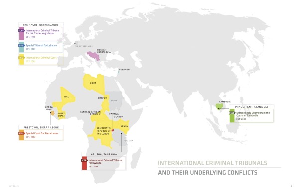
Notably, this publication was created in partnership with graphic and information designers so as to reach a broader public. The designers’ visualizations present information regarding the tribunals and their underlying conflicts in a direct and accessible manner to a wide range of viewers, including those without a legal background. Beyond this democratizing function, information visualization also serves to reveal important data and trends that might otherwise go unnoticed in a more conventional format. Ideally, the following information, which is current as of January 2013, would be integrated into a continually updated interactive webportal dedicated to engaging a global public on issues of international justice.

In sum, this publication aims to facilitate a broader discussion of the international criminal tribunals’ notable accomplishments, as well as ongoing shortcomings.”


Thanks to Daniel McLaughlin for sending in the link!

Monday
Jun032013

The History of NFL Logo Designs

The History of NFL Logo Designs infographic

Football is extremely popular in the United States. People pick sides and cheer on their teams loyaly.  The History of NFL Logo Designs infographic posted on Visual.ly tells the story of each football team’s logo through the years.

In Infographics below we are going to show you some of the interesting logo design changes across the (NFL) community with their territory maps.

Cool design that shows visual evolution of various NFL logos.

Thanks to Rachael for sending in the link!

Friday
May032013

Subways of North America

Subways of North America infographic

Now this is truly meta.  A subway map visualization of all the Subways of North America from Randall Monroe of xkcd.com.

For the pedantic rail enthusiasts, the definition of a subway used here is, with some caveats, “a network containing high capacity grade-separated passenger rail transit lines which run frequently, serve an urban core, and are underground or elevated for at least part of their downtown route.” For the rest of you, the definition is “an underground train in a city.”

About one in three subways stops in North America are in NYC

Another great design from Randall!

Thursday
May022013

The United States of Energy

The United States of Energy infographic poster

The United States of Energy from Saxum, is a huge project to map domestic energy sources.  

Finally… After almost 50 years of dependence on foreign sources to meet our growing energy needs, our country is finally in a position to begin reversing the trend. Through advances in drilling technology, discoveries of new oil and natural gas reserves and swift progress in the renewables sector, the United States is setting a course for energy self-sufficiency.

What began as a simple graphic showcasing America’s energy riches quickly grew into a two-sided, folded map concept displaying thousands of individual data points.

The #USofEnergy map visualizes our country’s energy potential by charting current sources of energy production and identifying future resources and known deposits. Energy resources surveyed include: natural gas, oil, coal, nuclear, hydroelectric, wind, geothermal, solar and biomass.

This is actually designed as two landscape posters as the front and back, but when put together, they make one very detailed portrait orientation poster.  I love the main U.S. map that is the primary focus, and the designers took on the challenge to visualize the many different energy sources as represented with the overlapping colors.  You’ll notice that the smaller area coverage shapes are always on top, so the small circles aren’t completely hidden by the larger area shapes.  I would have attempted making the colored areas slightly transparent to let the underlying shapes show through, and removing the text names of all the states might have helped to reduce the visual noise.

My power contract for InfoNewt here in Texas is 100% Wind Power, but I had no idea that Texas is the national leader in wind power production!

I’m not sure what to call them, but I like the paired 180° doughnut charts showing how the sectors and sources of energy have changed from 1949-2011.  However, I don’t like the chart legends that makes them hard for the reader to figure out what each color represents.  Legends are evil!  It would have been nice for the nine types of energy to be shown with icons (along with the color-coding), and the icons or text could have been shown along with the larger 2011 doughnut segments.

The statistics shown at the bottom are shown as just text numbers.  In contrast to all of the data visualizations throughout the rest of the design, this makes these numbers seem unimportant to the reader.

Found on Visual.ly

Friday
Mar222013

460 Million Connected Internet Devices

Beautiful data visualizations of some very scary data!  

An anonymous hacker under the pseudonym of “Carna Botnet” has posted a comprehensive Internet Census 2012 report of over 460 million internet connected devices that responded to PING requests or were found to have open ports.  He was able to create a botnet using over 30,000 Internet devices that had remote administration available using the Telenet and still had the factory installed standard passwords.  He found several hundred thousand open devices, but didn’t need that many.

Abstract: While playing around with the Nmap Scripting Engine (NSE) we discovered an amazing number of open embedded devices on the Internet. Many of them are based on Linux and allow login to standard BusyBox with empty or default credentials. We used these devices to build a distributed port scanner to scan all IPv4 addresses. These scans include service probes for the most common ports, ICMP ping, reverse DNS and SYN scans. We analyzed some of the data to get an estimation of the IP address usage. 

All data gathered during our research is released into the public domain for further study. 

The visualizations he was able to create using the gathered data are fantastic.  Check out the IMAGES page of the report for beautiful, high-resolution images.

The map visualization above shows the geolocation data of all 460 million devices that responded to the queries from the botnet, clustered around population centers as you might expect.  The animated GIF below shows the geolocated devices that responded during the course of a day, showing that many devices are turned off overnight but many more are just left on constantly.

My favorite visualization from the data is the Hilbert Map, which uses the a 2-dimensional Hilbert Curve to map out the continuous sequence of IP4 addresses into a square area, and then color-codes the address blocks that responded to a PING request.  There’s even a cool zoomable viewer of the Hilbert Map that lets you drill into the details.


This form of mapping was inspired by the xkcd Map of the Internet, which shows the Internet addresses that were distributed to major corporations in the 1990s before the Regional Internet Registries took over the allocation.


Found on the Security Now podcast #396 and FlowingData

Wednesday
Mar132013

Beautiful Animated Wind Maps

The static image above doesn’t do these maps justice.  Go see the Wind Map on the Hint.fm site to truly appreciate the design work from artists Fernanda Viégas and Martin Wattenberg.

An invisible, ancient source of energy surrounds us—energy that powered the first explorations of the world, and that may be a key to the future. This map shows you the delicate tracery of wind flowing over the US. 

The animation is mezmerizing, and the interactive piece allows you to click-to-zoom in closer to any part of the map to see much more detail in a specific region.  The main page shows the map based on the most current weather information, but the Gallery page has some snapshots linked to specific points in time (like Hurricane Sandy).  I love that even the speed legend on the side is animated!

You can also buy a poster version as an art print.

Thanks to Jeff Jarvis for sharing this on Google+!

Tuesday
Feb262013

Manhattan Building Heights as Land Value

Manhattan Building Heights infographic

Manhattan Building Hieghts by radicalcartography.net is an indirect measure of land value based on building height. The infographic is shaped like Manhattan itself, and the actual building’s color darkness shows their heights in their correct locations.

You can also see an alternate design using assessed tax value as the data set, and how that maps out land value differently.  

Found on http://visual.ly


Thursday
Feb142013

I Love You in 130 Languages

I Love You in 130 Languages infographic pink

Fun design for Valentine’s Day from GlobalNova.  The I Love You Map, shows the phrase “I Love You” translated into 130 different languages and positioned on the map based on the primary language spoken in that country or region of the world.

When setting out on any language-related project, one can count on unexpected discoveries and changing perspectives.  Our World Valentine project seemed simple to me at the outset – just map ‘I love you” in 100 or so languages onto a world map.  I thought of it pretty simply as a Valentine card for my wife.

But the real blow landed in choice of languages.  Setting out with no goal beyond rendering a selection of languages geographically, I quickly wandered into a thicket.  Where did Mongolian go? And many others?  Were we bounded by chance and limited space, or less forgivably prey to political naiveté? 

Here is the design also in Black:

I Love You in 130 Languages infographic black

Thanks to Matt for sending it the link!

Monday
Feb112013

The Submarine Cable Map 2013

The Submarine Cable Map 2013 infographic poster

A beautiful map of the World’s undersea Internet cables, The Submarine Cable Map 2013.  Brought to us be TeleGeography, sponsored by Telecom Egypt and design credit is listed as Nick Browning, Markus Krisetya, Larry Lairson, Alan Mauldin.

Cables depicted include all active international and U.S. domestic cables.  In-service cables have an announced Ready for Service (RFS) date by December 31, 2012.  Planned cables include those actively under construction and those that have announced they were fully funded as of year-end 2012.  Map does not depict proposed cables that have not announced landings or configuration.  Cable routes are stylized and do not reflect physical cable location.

I love the hand-drawn design style, meant to pay homage to old maps, but overlaid with very current information.  This is also available for purchase as a poster 36” x 50” for $250.

An interactive website with more information about all of the cables is also run by TeleGeography and can be found at submarinecablemap.com

Found on FastCoDesign.


Thursday
Feb072013

Syria: The Basics, an infographic presentation

Syria: The Basics is an infographic slide show using the Prezi presentation tool.  It plays like a movie, and does a great job utilizing the new features of Prezi like Fade-In animation and Audio Overlay.

Designed by Lara Setrakian (@Lara), co-founder and managing editor of Syria Deeply, a single issue news website.  Fantastic design work!  The presentation utilizes data visualization design concepts including relative sizing to put the size of the country into perspective, a timeline layout of events, related news photos and world map information.

Syria: The Basics, an infographic presentation