About
Randy Krum
President of InfoNewt.
Data Visualization and Infographic Design

Infographic Design

Infographics Design | Presentations
Consulting | Data Visualizations

DFW DataViz Meetup

Join the DFW Data Visualization and Infographics Meetup Group if you're in the Dallas/Fort Worth area!

Search the Cool Infographics site

Custom Search

Subscriptions:


Feedburner

The Cool Infographics® Gallery:

How to add the
Cool Infographics button to your:

Cool Infographics iOS icon

- iPhone
- iPad
- iPod Touch


Read on Flipboard for iPad and iPhone

Featured in the Tech & Science category

Flipboard icon

Twitter Feed
From the Bookstore

Caffeine Poster

The Caffeine Poster infographic

Entries in map (184)

Friday
Jan092015

World Map for Power Plug Types

World Map for Power Plug Types infographic

When traveling abroad, it is best to be prepared. However, does your check list include power plugs? The World Map for Power Plug Type infographic from Easy Smart, maps out the location and types of each plug throughout the world. Never go on vacation unprepared again!

Helpful, information visualizations are fantastic topics for infographics. Not a fan of the color scheme. Just a thought, but this would be even better if it was printed on small cards for travelers to carry!

Found on Life Hacker

Wednesday
Aug202014

Why are Superior's Cotton Threads 'Superior'?

Why are Superior's Cotton Threads 'Superior'? infographic

An infographic with information about Superior’s cotton from Egypt, Why are Superior’s Cotton Threads ‘Superior’? created by Superior Threads. This infographic focuses on comparing Egypt’s cotton to other cotton growing countries.

We created an infographic which explains why Egyptian-grown Cotton is so fantastic. Our Cotton threads are truly made from Cotton plants which are grown and harvested in Egypt.

Egyptian-grown extra-long staple Cotton

We put a lot of emphasis on ‘Egyptian-grown extra-long staple’ as a description for our Cotton threads. This is because the highest quality cotton available is Egyptian-grown extra-long staple Cotton when it comes to the textile/thread industry. ‘Extra-long staple’ means less lint and stronger thread. Egypt has the perfect growing conditions for Cotton and the result is a naturally strong and beautiful fiber.

The infographic gets straight to the point with answering its question about what makes Superior’s cotton so great. You can see in the text blurb above that Superior’s cotton comes from Egypt; however, it is not stated anywhere in the infographic.  So that information is lost when people share the infographic by itself.  Infographics take on a life of their own online, and all of your information needs to be included in that image file.

This is a great example for product companies.  Every product has a story about what consumer need it fills, or how it compares to the competition.  Companies should be using more infographic to help tell those stories to their potential customers. 

Thanks to Betsy for sending in the link!

Wednesday
Apr022014

The Enterprise Mobility Ecosystem Map

The Enterprise Mobility Ecosystem Map infographic

The Enterprise Mobility Ecosystem Map published by Kinvey attempts to make sense of the ownership and acquisitions rapidly taking place within the mobile backend providers.  Platforms for authorization, payments, location services and software development kits (SDKs).

Enterprise mobility is a classic IT disruptor. It’s the kind of disruptor that companies like IBM, Oracle and VMware, SAP, Salesforce, etc. were built on. It may look like a peripheral part of IT infrastructure now, but since mobile will be the primary access point to apps and data for many enterprises, many — if not most — new apps are going to be “mobile first.” Thus, the entire IT infrastructure is going to have to become very mobile friendly, very quickly, or else risk becoming a legacy platform.

As a consequence, major IT vendors are partnering with or acquiring companies throughout the mobile stack. Market consolidation and investments have taken place in MDM, API Management, cloud and handset markets. To visualize this activity, we’ve produced the Enterprise Mobile Ecosystem map below.

A network map visualization like this can help companies figure out where their business plays, and how other company acquisitions around them may impact their business.  I like that the design is purely informational, and doesn’t add a lot of extra data or information to the design.  The message is all about the connections, and doesn’t include things like the size of the companies or the value of the acquisitions.  This keeps the infographic focused on telling one story really well.

I would recommend using the company logos in the subway map style design to make it faster and easier for the audience to recognize the companies involved.  It’s much harder for the readers to read all of the company names in text to find the companies they recognize.

The Pac-man icons are a nice touch to indicate the direction of ownership or acquisition.

Monday
Mar312014

Map of the Internet 2.0 Poster

Map of the Internet 2.0 Poster

Designer Martin Vargic has released an updated version of his Map of the Internet 2.0 that creates what looks like a vintage-style map.  However, this version plots out the major websites and technology companies, with related sites grouped together on the same continent.  The sizes of the websites on the map are scaled relative to their number of visitors, so bigger sites show as bigger geographic regions.

Second version of our flagship project, the Map of the Internet.

This conceptual work of cartography treats major internet sites and enterprises such as Google, Yahoo, Microsoft, HP, and Apple like sovereign states, on a classic map of the world. To explain the dominance and relationships of these entities, they were all given a visual hierarchy that gives prominent treatment to companies with the most users (or sites with the most visitors), surrounding them with smaller countries representing related websites and services.

This poster includes one full map of the internet, 4 minimaps showcasing NSA surveillance, most used social networks, most used internet browser, and worldwide internet penetration, list of Alexa Top 500 websites, quick timeline of the Internet History, top software companies and much more!

The map includes more than 250 separate websites/enterprises as sovereign states, and more than 2000 separate labels.

A high-resolution version is available online, and you can also order 24” x 36” printed posters on Zazzle.

This what I call a 2nd level design, which means it’s a highly detailed design that is meant to present a ton of information to the audience.  This type of design isn’t trying to communicate a key message in a few seconds, but is intended for readers to zoom-in and explore.

Map of the Internet 2.0 Poster Zoom


Found on Business Insider

Monday
Feb102014

The Internet Map

The Internet Map is an interactive, zoomable design that uses a combination of algorithms and the Google Earth API to display 350,000 websites as sized circles representing their overall traffic.

Designed by Ruslan Enikeev, the color-coding shows the country affiliations.

Like any other map, The Internet map is a scheme displaying objects’ relative position; but unlike real maps (e.g. the map of the Earth) or virtual maps (e.g. the map of Mordor), the objects shown on it are not aligned on a surface. Mathematically speaking, The Internet map is a bi-dimensional presentation of links between websites on the Internet. Every site is a circle on the map, and its size is determined by website traffic, the larger the amount of traffic, the bigger the circle. Users’ switching between websites forms links, and the stronger the link, the closer the websites tend to arrange themselves to each other.

Semantic web

The map of the Internet is a photo shot of the global network as of end of 2011 (however, baloons show actual statistics from Alexa). It encompasses over 350 thousand websites from 196 countries and all domain zones. Information about more than 2 million links between the websites has joined some of them together into topical clusters. As one might have expected, the largest clusters are formed by national websites, i.e. sites belonging to one country. For the sake of convenience, all websites relative to a certain country carry the same color. For instance, the red zone at the top corresponds to Russian segment of the net, the yellow one on the left stands for the Chinese segment, the purple one on the right is Japanese, the large light-blue central one is the American segment, etc.

I even found Cool Infographics on the map!

Found on Fast Company

Tuesday
Jan142014

Information Destruction Through History

Information Destruction Through History infographic

Information Destruction Through History from Global Data Vault explores and quantifies the worst data disasters in history.

Information the most valuable commodity in the world. All human progress depends on the accumulation and preservation of information. When information is lost, human progress suffers. This infographic displays some of the most significant loses of information human civilization has suffered.

The circular timeline shows the data disaster events in chronological order, while also connecting to their geographic locations.  The triangles are proportionally sized so readers can visually compare the modern data equivalents between the events.  This really helps put the disasters into perspective for the audience.

A great infographic design that tells one story really well, but there are a few things I would recommend to improve the design:

  • I wouldn’t have any of the triangles run off the page, because the audience will lose perspective on how disastrous those specific events were.  Show the full impact of those events to the readers.
  • Add the URL directly to the infographic landing page so readers can find the original full-size version when people don’t link back correctly
  • I wouldn’t list Wikipedia as a data source if possible. Track the Wikipedia references back to the original data source to include in the list.

Thanks to Joe for sending in the link!

Thursday
Nov072013

Most Popular Pizza Chains Map Visualization

Most Popular Pizza Chains infographic

FlowingData has released a fantastic map visualization of the Most Popular Pizza Chains in the United States.

Most of the major pizza chains are within a 5-mile radius of where I live, so I have my pick, but I usually order from whatever place is closest to where I am. So it doesn’t matter if there are more Domino’s locations than Pizza Huts where I live. I just want my feeding time to come sooner rather than later, and if that place happens to be Pizza Hut so be it. (Although, if I’m not in a rush, I’ll go to the local sit-down place.)

This is the point of the map above, which shows the nearest pizza place within a 10-mile radius across the United States. Nice and clean data courtesy of AggData.

You can also see the major chains individually:

Most Popular Pizza Chains Separate Maps

Found on LaughingSquid.

Now I’m hungry.

Tuesday
Sep032013

The Racial Dot Map

The Racial Dot Map Chicago

The Racial Dot Map visualizes the 2010 U.S. Census data, where every individual person is represented by a single, color-coded dot.  The color coding shows the racial groupings gathered by the census.

This map is an American snapshot; it provides an accessible visualization of geographic distribution, population density, and racial diversity of the American people in every neighborhood in the entire country. The map displays 308,745,538 dots, one for each person residing in the United States at the location they were counted during the 2010 Census. Each dot is color-coded by the individual’s race and ethnicity. The map is presented in both black and white and full color versions.

The map was created by Dustin Cable, a demographic researcher at the University of Virginia’s Weldon Cooper Center for Public Service. Brandon Martin-Anderson from the MIT Media Lab deserves credit for the original inspiration for the project. This map builds on his work by adding the Census Bureau’s racial data, and by correcting for mapping errors.

Each of the 308 million dots are smaller than a pixel on your computer screen at most zoom levels. Therefore, the “smudges” you see at the national and regional levels are actually aggregations of many individual dots. The dots themselves are only resolvable at the city and neighborhood zoom levels.

Each dot on the map is also color-coded by race and ethnicity. Whites are coded as blue; African-Americans, green; Asians, red; Hispanics, orange; and all other racial categories are coded as brown.

The map is an interactive, zoomable map online of the entire country, and allows you to explore any U.S. locations.  Chicago is show above.

Since the dots are smaller that screen resolutions where the viewer zooms out, the data is aggregated to pixels at each level of zoom.   The Minneapolis-St. Paul metro area is highlighted on the site as an example of the aggregation.  You can see the more detailed dot pattern on the right at the higher zoom level.

The Racial Dot Map Minneapolis

I would love to see this added as a layer in Google Earth!  Wouldn’t that be cool?

Thanks to Renee for sending in the link!  Also, found on Wired.

Atlanta:

The Racial Dot Map Atlanta


Dallas-Fort Worth:

The Racial Dot Map Dallas Fort Worth


The entire U.S.

The Racial Dot Map USA

Thursday
Jun272013

The Nearest Stars

The Nearest Stars infographic

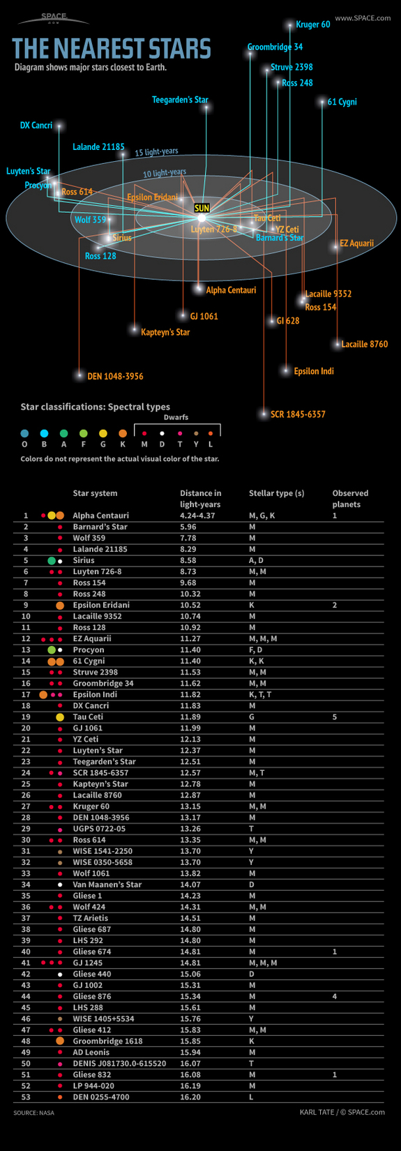
The Nearest Stars infographic from Space tracks the 53 closest stars to the earth. Their classification and distance is also included.

The nearest stars to Earth are in the Alpha Centauri triple-star system, about 4.37 light-years away. One of these stars, Proxima Centauri, is slightly closer, at 4.24 light-years.

Of all the stars closer than 15 light-years, only two are spectral type G, similar to our sun: Alpha Centauri A and Tau Ceti. The majority are M-type red dwarf stars.

Only nine of the stars in this area are bright enough to be seen by the naked human eye from Earth. These brightest stars include Alpha Centauri A and B, Sirius A, Epsilon Eridani, Procyon, 61 Cygni A and B, Epsilon Indi A and Tau Ceti.

Barnard’s Star, a red dwarf 5.96 light-years away, has the largest proper motion of any known star. This means that Barnard’s Star moves rapidly against the background of more distant stars, at a rate of 10.3 seconds of arc per Earth year.

Sirius A is the brightest star in Earth’s night sky, due to its intrinsic brightness and its proximity to us. Sirius B, a white dwarf star, is smaller than Earth but has a mass 98 percent that of our sun. 

In late 2012, astronomers discovered that Tau Ceti may host five planets including one within the star’s habitable zone. Tau Ceti is the nearest single G-type star like our sun (although the Alpha Centauri triple-star system also hosts a G-type star and is much closer).

The masses of Tau Ceti’s planets range from between two and six times the mass of Earth.

Great data from Space.com.  The infographic focuses on visualizing the distance of the stars from Earth. In that process, it caused some of the visual to be cluttered.  It’s always hard to convey 3D information on a 2D image.

From a data visualization standpoint, the lower table is unnecessary.  All of that information could have been conveyed in the star map illustration.  The color coding of the names in the map doesn’t match the color coding of the star classifications, and that’s confusing to readers.  It would have also helped to provide an explanation of why star systems can have multiple classifications.

If they wanted to keep the detailed table below, it should include more visual elements. The stellar types with the classification are redundant and can be combined.  The distances could have included bars to show the light years from Earth.  The number of observed planets could have used icons.

Found on Visual.ly

Thursday
Jun202013

The Cost of a Road Trip to the Top 10 U.S. Vacation Cities

The Cost of a Road Trip to the Top 10 U.S. Vacation Cities infographic

I Drive Safely and Gas Buddy partner up to create the Cost of a Road Trip to the Top 10 U.S. Vacation Cities infographic. The infographic calculates the total cost of food, lodgings, and gas and then gives some money saving tips. This infographic can be found on idrivesafely.com.

Did you know that a road trip to the top 10 US vacation cities is more than 7,600 miles (12,231km) of driving? That’s the same distance as a flight from Alaska to Australia! Wondering if you could afford to pack up and leave on this awesome road trip? We partnered with our friends at GasBuddy.com to bring you the infographic below which breaks down the cost of a 25-day road trip including the cost of gas, food and lodging. We’ve also included some tips for saving money on your trip.

The top 10 U.S. vacation cities are based on a 2012 poll from U.S. News Travel and excludes cities not in the continental United States. Fun fact: 3 of the top 10 US vacations spots are in California: San Diego, Yosemite and San Francisco!

Fun topic idea, and certainly relevant to both Gas Buddy and I Drive Safely.  Relevance is super-important as the search engines would like to down-grade the value of links to irrelevant content.

I would have liked to see more of the actual data visualized in the design.  Why does the calendar icon have 8 days shown when the data is 5.2 days?  Because it’s just an icon, not a data visualization, and can be confusing to readers.  The costs would have been very easy to visualize as stacked bars to make them easier to understand.

Thanks to John for sending in the link!