About
Randy Krum
President of InfoNewt.
Data Visualization and Infographic Design

Infographic Design

Infographics Design | Presentations
Consulting | Data Visualizations

DFW DataViz Meetup

Join the DFW Data Visualization and Infographics Meetup Group if you're in the Dallas/Fort Worth area!

Search the Cool Infographics site

Custom Search

Subscriptions:


Feedburner

The Cool Infographics® Gallery:

How to add the
Cool Infographics button to your:

Cool Infographics iOS icon

- iPhone
- iPad
- iPod Touch


Read on Flipboard for iPad and iPhone

Featured in the Tech & Science category

Flipboard icon

Twitter Feed
From the Bookstore

Caffeine Poster

The Caffeine Poster infographic

Entries in news (62)

Thursday
Jan062011

The 2010 Year in Review #infographic


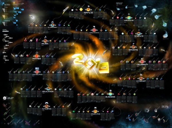
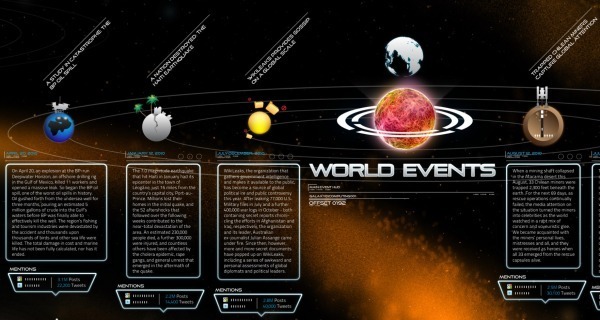
OnlineSchools.org has released the 2010 Year in Review zoomable infographic summarizing the major events of 2010.  The zoomable version is below, and it’s best viewed in full-screen million.

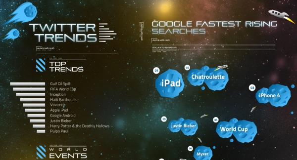
I have mixed feelings about this one.  Using the outer space metaphor, there are 15 major news categories with text descriptions of a handful of events in each.  Each event has a small celestial body illustration related to it, and a measure of blog posts and tweets on Twitter related to the event.


It really does need the zoomable feature, because the font sizes are dramatically different between the titles and the text.  That does make it difficult to read sometimes.  I noticed the Star Trek font used as well as part of the sections.

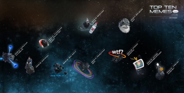
In the corners are some visualizations of things like Top Memes, Top Songs, Twitter Trends, Yahoo Searches and Google’s Fastest Rising Searches.


I think this one is missing good sources for where their information came from, a designer listing, some of the text s too small and in some cases is more illustration then infographic.  Overall it’s fun to zoom around and appreciate the details they’ve included.

Thanks Brittany!


Thursday
Dec162010

DataStore - Launched at The Guardian


Today, the Guardian, home of the DataBlog, has launched a new site as the home for their data journalism, DataStore.


From Simon Rogers, Editor of the DataBlog and the DataStore:

Today we launch a new gateway to our data journalism and visualisations - find out what’s new at guardian.co.uk/data.

Data journalism has become an increasingly big part of our work here at the Guardian - from Wikileaks to government spending, it’s our job to make the key data accessible and easy to understand.

As Tim Berners-Lee said recently:

[Journalism is] going to be about poring over data and equipping yourself with the tools to analyse it and picking out what’s interesting. And keeping it in perspective, helping people out by really seeing where it all fits together, and what’s going on in the country

So, we’ve pulled all our data journalism into one new place: guardian.co.uk/data.

Besides our award-winning datablog, the site includes:
• The key data of the day - broken down for you
• Our pick of the data blogosphere - which sites have the key posts?
• Search the world’s government data - and global development data
• What have you done with our data? Featured apps

We’ll be adding new features and changes over the next months. What would you like to see?


Wednesday
Dec302009

The Last 10 Years...Visually


Great chart by Phillip Niemeyer over on NYTimes.com, Picturing the Past 10 Years.  Using icons and unique pictures, Phillip captures the key event of each year in 12 different categories.

Found on FlowingData, WeLoveDataVis, and it was tweeted but a few people on my Twitter list, Cool Infographics People.

Friday
Dec182009

Word Spectrums! The Online Infographic Battleground


On Chris Harrison's site, there are a number of graphics that he calls Word Spectrums.  More like a battleground, Chris is using the enormous amount of data from websites that has been made public by Google.  This is an advanced form of a word cloud that visualizes related words and their relative connections to the two topics.  (FYI, since this is based on raw Google data, foul language does appear in some of them).


Using Google's enormous bigram dataset, I produced a series of visualizations that explore word associations. Each visualization pits two primary terms against each other. Then, the use frequency of words that follow these two terms are analyzed. For example, "war memorial" occurs 531,205 times, while "peace memorial" occurs only 25,699. A position for each word is generated by looking at the ratio of the two frequencies. If they are equal, the word is placed in the middle of the scale. However, if there is a imbalance in the uses, the word is drawn towards the more frequently related term. This process is repeated for thousands of other word combinations, creating a spectrum of word associations. Font size is based on a inverse power function (uniquely set for each visualization, so you can't compare across pieces). Vertical positioning is random.


Chris has created and shared a number of different versions on the Word Spectrum page of his website, and you can see high-resolutions PDFs of each there.

Want to try your own?  Building on Chris' idea, Jeff Clark from Neoformix has created interactive Word Spectrums using either Twitter or News as the source that lets you enter your own terms to compete.  I especially like the idea of pitting two competing brands against one another.


Wednesday
Oct282009

A Graphic History of Newspaper Circulation


From The Awl, this certainly isn't the prettiest infographic I've ever seen (it's basically just a line chart), but it tells it's story to the viewer very well.  Maybe there are times when a simple chart from Excel can do the job...NAH.   From a title that proclaims "A Graphic History of Newspaper Circulation" we certainly expect much more visual information.

I'm sure many of the graphic designers reading this blog could turn this data into a significantly better infographic (hint, hint...).

Every six months, the Audit Bureau of Circulations releases data about newspapers and how many people subscribe to them. And then everyone writes a story about how some newspapers declined some amount over the year previous. Well, that's no way to look at data! It's confusing—and it obscures larger trends. So we've taken chunks of data for the major newspapers, going back to 1990, and graphed it, so you can see what's actually happened to newspaper circulation. (We excluded USA Today, because we don't care about it. If you're in a hotel? You're reading it now. That's nice.)
Some surprising trends: the New York Post has the same circulation it had two decades ago! Also, the once-captivating battle of the New York City tabloids has become completely moot.
Some unsurprising trends: the Los Angeles Times is an absolute horrorshow. Not shown: the Boston Globe disappearing off the bottom of this chart, in a two decade decline from 521,000 in 1990 to 264,105 this year.
Found on Daring Fireball.

Thursday
Sep102009

HealthMap: The Global Disease Alert Map


HealthMap.org is an online map tool that locates any reports of disease from a selection of news sources.  Available in multiple languages, HealthMap is a great use of the Google Maps API.  In fact, HealthMap is funded by Google, which explains why they are so dependent on the Google Maps data.
HealthMap brings together disparate data sources to achieve a unified and comprehensive view of the current global state of infectious diseases and their effect on human and animal health. This freely available Web site integrates outbreak data of varying reliability, ranging from news sources (such as Google News) to curated personal accounts (such as ProMED) to validated official alerts (such as World Health Organization). Through an automated text processing system, the data is aggregated by disease and displayed by location for user-friendly access to the original alert. HealthMap provides a jumping-off point for real-time information on emerging infectious diseases and has particular interest for public health officials and international travelers.
They also recently launched an iPhone app called Outbreaks Near Me, available for free in the iTunes app store.  The app allows you to view the maps from your iPhone and get alerts for outbreaks in your area.

Tuesday
Apr072009

Can design save the newspaper? (Jacek Utko)

Short TED Talk by Jacek Utko that explores how design can not only improve newspapers, but also your product or brand.

Jacek Utko is an extraordinary Polish newspaper designer whose redesigns for papers in Eastern Europe not only win awards, but increase circulation by up to 100%. Can good design save the newspaper? It just might.

Tuesday
Mar172009

Bad News for Newspapers


Infographic from the NY Times (I know, ironic isn't it?) that shows the drop in circulation of major newspapers across the U.S.
Heavy debt has dragged several newspaper companies into bankruptcy. The industry’s dwindling revenues have forced some money-losing papers to close, and papers that are for sale are having trouble finding buyers. Experts say that before long, a major American city could be left without a daily paper. (Related Article)
Found on Twitter from @edial

Tuesday
Mar032009

TimeSpace - World


From The Washington Post, TimeSpace-World is an experiment in a visual way to see news stories from around the world.  You can specify the time period during a day that you want to see with the slider, and then click the stories to zoom into the map.  You can also enter search terms to view a smaller set of relevant stories.

TimeSpace is an interactive map that allows you to navigate articles, photos, video and commentary from around the globe. Discover news hot-spots where coverage is clustered. Use the timeline to illustrate peaks in coverage, and customize your news searches to a particular day or specific hour. (Many Washington Post stories appear at midnight; others are published throughout the day as news happens). Click the ? In the upper right for help.

 Link found from Mitul69 on Twitter

Friday
Feb202009

Google Data Visualization Concepts


Check out GridPlane.com.  JD Hooge has posted images of some data visualization concepts he worked on with Google to look at aggregating social media topics.


I collaborated with Instrument to develop a series of data visualization concepts for Google. These interface sketches are are all based around a concept of aggregating and visualizing online media buzz across various social media outlets.


Thanks Edial for sending in the link!