About
Randy Krum
President of InfoNewt.
Data Visualization and Infographic Design

Infographic Design

Infographics Design | Presentations
Consulting | Data Visualizations

DFW DataViz Meetup

Join the DFW Data Visualization and Infographics Meetup Group if you're in the Dallas/Fort Worth area!

Search the Cool Infographics site

Custom Search

Subscriptions:


Feedburner

The Cool Infographics® Gallery:

How to add the
Cool Infographics button to your:

Cool Infographics iOS icon

- iPhone
- iPad
- iPod Touch


Read on Flipboard for iPad and iPhone

Featured in the Tech & Science category

Flipboard icon

Twitter Feed
From the Bookstore

Caffeine Poster

The Caffeine Poster infographic

Entries in population (46)

Friday
Feb012013

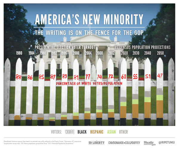
America's New Minority

America's New Minority infographic

The demographics of America are changing, and America’s New Minority from 59 Liberty shows us how far we have come and predicts the next 40 years.  

With the country’s changing demographics, whites will drop under 50% of the population in the 2040s. Every Republican Presidential candidate since 1968 has won the white vote, but with the population shift can the GOP compete?

This graphic simply presents the data of a changing electorate. We went through numerous iterations attempting to find something appealing that presented the data accurately.

We worked with Projects by Chi/Donahoe on concepts, Ripetungi on design, and Hustle Labs for PR support.

For direct access to the data used, please view the spreadsheet here.

I really like how simple and strong the message is with this design.  The data will be surprising to many people, so it should be popular with social sharing.

I LOVE that they include a link to the raw data in a Google Docs spreadsheet for anyone to get their hands on the raw numbers from the data sources.  The link is in the additional text on the infographic landing page.  It would be more effective if the URL of the infographic landing page and the Google Docs spreadsheet were both included in the infographic so they would be readily available to readers who see the infographic posted on other sites.

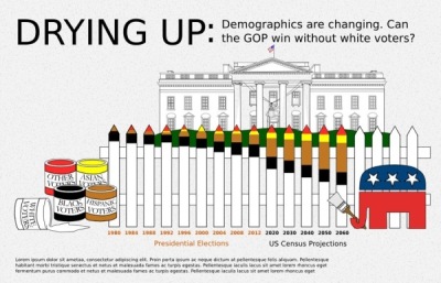
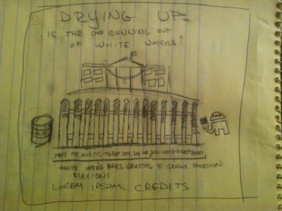
They also share some of the early drafts and other versions of the design they considered on the infographic landing page.  You can see a couple here, but there are more on the page at 59 liberty.

America's New Minority infographic

America's New Minority infographic

Tuesday
May292012

Hans Rosling TEDTalk: Religions and Babies

Another great TEDTalk from Hans Rosling called Religions and Babies about the growth of the world population.

Hans Rosling had a question: Do some religions have a higher birth rate than others — and how does this affect global population growth? Speaking at the TEDxSummit in Doha, Qatar, he graphs data over time and across religions. With his trademark humor and sharp insight, Hans reaches a surprising conclusion on world fertility rates.

In Hans Rosling’s hands, data sings. Global trends in health and economics come to vivid life. And the big picture of global development—with some surprisingly good news—snaps into sharp focus.

Wielding the datavis tool Gapminder, Professor Rosling is a master at using data visualization to tell his story.

The video is also avilable on YouTube for portable devices:

Tuesday
Nov082011

How Did We Get to 7 Billion People So Fast?

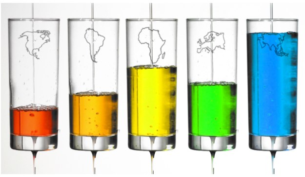
I love the cool infographic video from NPR.  7 Billion: How Did We Get So Big So Fast? is a video that uses colored liquids to visualize the population rates of the differen continents.  High birth rates mean fast liquid pouring in, slower death rates slow down the liquid dripping out of the bottom.

The U.N. estimates that the world’s population will pass the 7 billion mark on Monday. [Oct 31st]

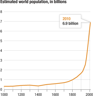
As NPR’s Adam Cole reports, it was just over two centuries ago that the global population was 1 billion — in 1804. But better medicine and improved agriculture resulted in higher life expectancy for children, dramatically increasing the world population.

Found on FlowingData

Tuesday
May242011

U.S. Education vs. The World

U.S. Education vs. The World is a very cool infographic from MAT@USC.  You can imagine this data as a boring series of bar charts in an academic report, but the colorful, visual design here is fantastic.  The winding connecting lines can make it a little difficult for the reader to understand the data, but I think it also draws the reader in like a simple puzzle.

We’ve put together this infographic that compares the United States’ education spend and performance versus eleven countries.  The U.S. is the clear leader in total annual spending, but ranks 9th in Science performance and 10th in Math.

Thanks to Sarah for sending in the link!

Friday
Jul022010

The 2010 Internet Censorship Report infographic


From Antonio Lupetti at WoorkUp.com, The 2010 Internet Censorship Report looks at how many people in the world population are effected by government censorship.

It is one of the tools used by governments to filter out unwanted information and to prevent the spread through the World Wide Web. It is a phenomenon of staggering proportions that affects over 25% of the global population.

My suggestion for improvement is that I think the the white circles representing the countries should be sized in accordance the population numbers.

Thanks to Antonio for sending in the link.

Tuesday
Jun292010

How Wild is North America? (infographic)

How Wild is North America? is an infographic from TheBigWild.org.

Infographics really come in handy when you want to highlight fun facts and empirical  evidence as it relates to scale and impact.

The Big Wild infographic features biodiversity in North America and compares Canada to the United States and Mexico.

Thanks to Alain for sending in the link!

Monday
Jun212010

Where Americans are Moving (interactive infographic)

From Jon Bruner at Forbes.com, Where Americans are Moving is an interactive map infographic that shows the migration both into and out of that county.  You’re not limited to the predefined cities that have buttons, but can choose any county in the country.  Even after zooming in, it can be hard to see the details because there are so many lines displayed.

More than 10 million Americans moved from one county to another during 2008. The map below visualizes those moves. Click on any county to see comings and goings: black lines indicate net inward movement, red lines net outward movement.

Based on IRS data, I wish the statistics were easier to see.  You can get access to the underlying data at data.gov; search for ‘migration’.

Who knew so many people were moving out of Hawaii?!?

Found on ChartPorn.com, FlowingData.com, and @JonBruner

Friday
Mar262010

The Best Small Cities to Buy A House (Infographic)

Fixr.com posted this infographic on their blog yesterday showing the statistics behinds the top 10 Best Small Cities to Buy A House in America.  I like the format of a larger infographic that combines a few different styles into one comprehensive image.  Combing map data, stylized bar charts and informative lists into one, easy-to-read infographic.

Imagine living in a small town where people are relaxed and friendly, no traffic jams, clean air, great education, fun leisure and culture, high salaries, and much more. We want to illustrate the top 10 small cities to live in the U.S taking into consideration such factors.

Thanks Andres for the link, and the chance to provide some input.  Nice job!

Tuesday
Feb092010

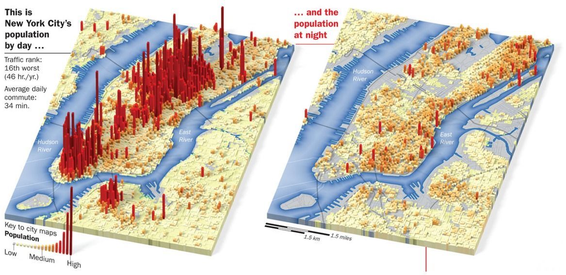
City Population Shift Maps

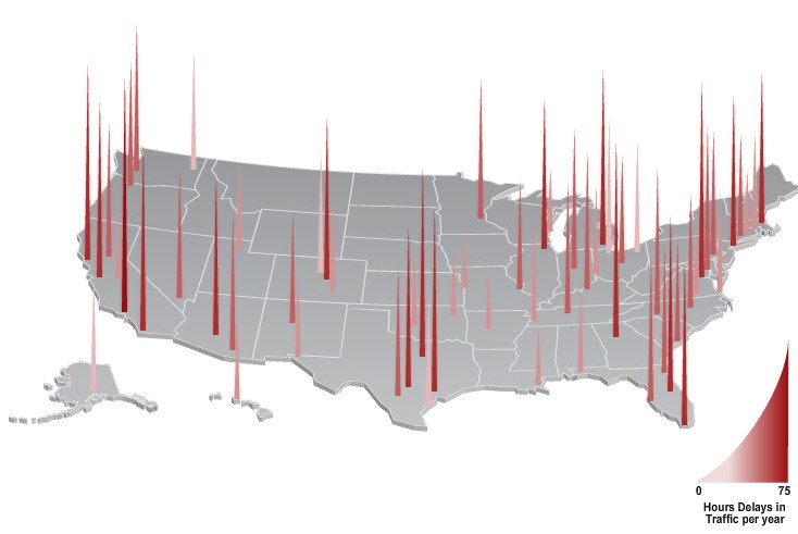
These Day-Night maps are from a Time Magazine November 2007 interactive map feature called One Day in America.  Other cities highlighted are Dallas, San Francisco, Seattle, Boston, Chicago and more.  The feature also included histogram map of traffic delays.  

The maps were created by Joe Lertola, who has some other great stuff posted on his website.

Thanks to justinpobrien for sending me the link in the comments.

Friday
Jan152010

World Progress Report poster - Available for one week ONLY


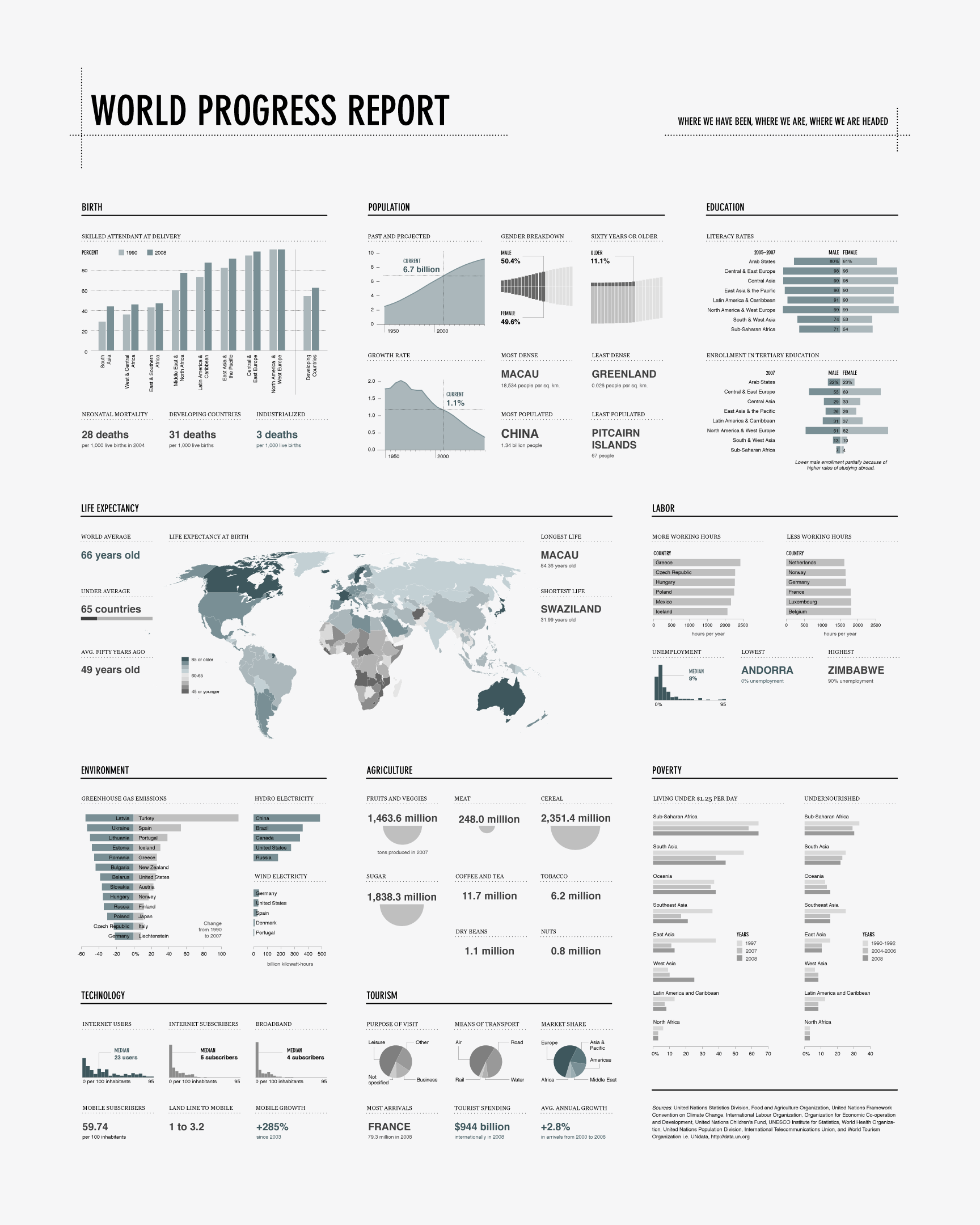
Nathan Yau at FlowingPrints has released a new poster, the World Progress Report.  It’s available for one week ONLY, and then he’s going to release the printer to start printing them up.  Orders will only be taken until January 21st.  Each 24”x30” poster is signed and numbered, and one can be yours for $26 + shipping & handling.

Nathan is doing another great thing.  All proceeds go to UNICEF’s relief effort in Haiti!

One more thing…for the first 50 people who pre-order: a free copy of Atley’s “How America Learns” poster!


UNdata provides a catalog of 27 United Nations statistical databases and 60 million records about the past, present, and future state of the world. Topics include demographics, life expectancy, labor levels, poverty, and a lot more. What does all that data mean though? World Progress Report, the latest from FlowingPrints, offers a look into the expansive UN collection.

In whole, the report tells a story of how we live and die, and the stuff in between.


Check out some of the great details in the poster: