About
Randy Krum
President of InfoNewt.
Data Visualization and Infographic Design

Infographic Design

Infographics Design | Presentations
Consulting | Data Visualizations

DFW DataViz Meetup

Join the DFW Data Visualization and Infographics Meetup Group if you're in the Dallas/Fort Worth area!

Search the Cool Infographics site

Custom Search

Subscriptions:


Feedburner

The Cool Infographics® Gallery:

How to add the
Cool Infographics button to your:

Cool Infographics iOS icon

- iPhone
- iPad
- iPod Touch


Read on Flipboard for iPad and iPhone

Featured in the Tech & Science category

Flipboard icon

Twitter Feed
From the Bookstore

Caffeine Poster

The Caffeine Poster infographic

Entries in poster (133)

Friday
Jul052013

The Conversation Prism 4.0 for 2013

The Conversation Prism 4.0 for 2013 infographic

Brian Solis has released the new Conversation Prism 4.0, with updated companies and categories for 2013.  This project series has been a favorite on Cool Infographics since version 1.0 was released in 2008, and we haven’t seen an update since version 3.0 was released in 2010.

What is The Conversation Prism?

Developed in 2008 by Brian Solis, The Conversation Prism is a visual map of the social media landscape. It’s an ongoing study in digital ethnography that tracks dominant and promising social networks and organizes them by how they’re used in everyday life.

Version 4.0 brings about some of the most significant changes since the beginning. In this round, we moved away from the flower-like motif to simplify and focus the landscape. With all of the changes in social media, it would have been easier to expand the lens. Instead, we narrowed the view to focus on those that are on a path to mainstream understanding or acceptance. The result was the removal of 122 services while only adding 111. This introduces an opportunity for a series of industry or vertical-specific Prisms to be introduced so stay tuned.

The Conversation Prism 4.0 for 2013 closeup

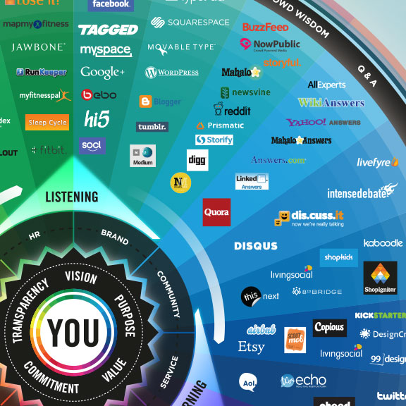
The design highlights the major companies in 26 different categories of social networking services.  This update loses the flower-like design style of the last three versions, and changes to a more straightforward circle with equal sized pie slices.

The inner circles have always been a little confusing for readers and marketers because the intent is that the inner labels can be adjusted depending on the user.  They don’t necessarily relate specifically to the services they are located near in the outer slices.

As a snapshot of the current social media landscape, this is a fantastic tool for marketers to consider the tools and services they want to engage for any particular campaign.  Three years was too long to wait for an update, since this landscape is changing and evolving very quickly.  That’s why 122 individual services were removed and 111 services were added. 

The Conversation Prism 4.0 for 2013 poster

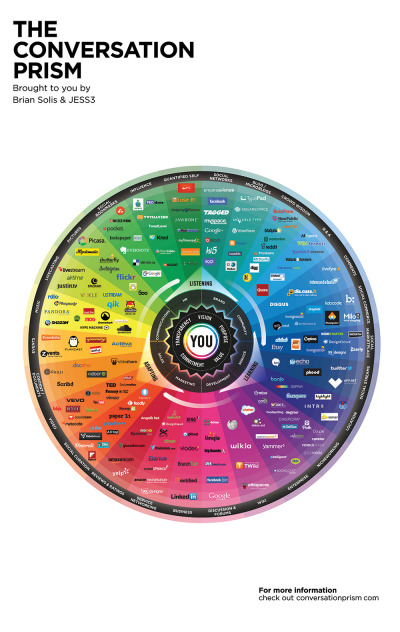
The Conversation Prism 4.0 is available as a free high resolution JPG image download (great for computer wallpaper/desktop) of for purchase as a 22”x28” wall poster for $19.

Thanks to Jarred for sending in the link!  Also found on Mashable and The Next Web.


Thursday
May162013

The Stephen King Universe

The Stephen King Universe infographic poster

Are you a Stephen King fan? Have you yourself made these connections? From TessieGirlThe Stephen King Universe has been updated to include the many connections to the Dark Tower series.

When I was in Grade 5 (guess I was ten), my friend Tarnya Smyth brought her mum’s battered copy of Stephen King’s ‘Carrie’ to school. We broke it into about 4 pieces and passed them around, all taking turns reading each battered section. I told mum about it and she FLIPPED HER WIG and told me to ‘Stop reading that book immediately!!’ So I finished it.

Now, I TOTALLY do not recommend  ten year olds reading Stephen King books (messed me up good), but this was when my life long relationship with Mr King began. My love for his books is based around his characters. They are so full. I love Stephen King dialogue. I love his sense of humour. And I love the links and connections between the books. I am the kind of annoying person who likes to know the ‘In Joke’. So, of course, I MADE A FLOW CHART!!!

This chart is like my fourth child. Be kind to it. It means a lot to me.

I wish they had published a higher-resolution version online.  Some of the text is too small to read, but I think I can follow all of the connections.  A must have for any Stephen King fan!

Also, it’s available for purchase as a poster from the TessieGirl site for $25 plus shipping from Australia.  You can also see the original version.

Thanks to Becky for sending in the link!

Tuesday
May072013

Visualizing the School of Design

Visualizing the School of Design infographic

Visualizing the School of Design is a very data dense infographic poster that analyzes the School of Design at the Politecnico di Milano.

Politecnico di Milano, in order to present the School of Design in its own stand at Salone del Mobile 2013, asked DensityDesign to realize a 4 mt x 2 mt poster showing the structure and the efficiency of the School of Design system at Politecnico. The visualization is a picture of the 2010 / 2011 academic year.

Definitely take a look at the full-size version to appreciate the thought and effort put into the design.  This project was amazingly developed in one week by the team at DensityDesign.

Visualizing the School of Design close up

Found on Datavisualization.ch


Thursday
May022013

The United States of Energy

The United States of Energy infographic poster

The United States of Energy from Saxum, is a huge project to map domestic energy sources.  

Finally… After almost 50 years of dependence on foreign sources to meet our growing energy needs, our country is finally in a position to begin reversing the trend. Through advances in drilling technology, discoveries of new oil and natural gas reserves and swift progress in the renewables sector, the United States is setting a course for energy self-sufficiency.

What began as a simple graphic showcasing America’s energy riches quickly grew into a two-sided, folded map concept displaying thousands of individual data points.

The #USofEnergy map visualizes our country’s energy potential by charting current sources of energy production and identifying future resources and known deposits. Energy resources surveyed include: natural gas, oil, coal, nuclear, hydroelectric, wind, geothermal, solar and biomass.

This is actually designed as two landscape posters as the front and back, but when put together, they make one very detailed portrait orientation poster.  I love the main U.S. map that is the primary focus, and the designers took on the challenge to visualize the many different energy sources as represented with the overlapping colors.  You’ll notice that the smaller area coverage shapes are always on top, so the small circles aren’t completely hidden by the larger area shapes.  I would have attempted making the colored areas slightly transparent to let the underlying shapes show through, and removing the text names of all the states might have helped to reduce the visual noise.

My power contract for InfoNewt here in Texas is 100% Wind Power, but I had no idea that Texas is the national leader in wind power production!

I’m not sure what to call them, but I like the paired 180° doughnut charts showing how the sectors and sources of energy have changed from 1949-2011.  However, I don’t like the chart legends that makes them hard for the reader to figure out what each color represents.  Legends are evil!  It would have been nice for the nine types of energy to be shown with icons (along with the color-coding), and the icons or text could have been shown along with the larger 2011 doughnut segments.

The statistics shown at the bottom are shown as just text numbers.  In contrast to all of the data visualizations throughout the rest of the design, this makes these numbers seem unimportant to the reader.

Found on Visual.ly

Wednesday
Mar132013

Beautiful Animated Wind Maps

The static image above doesn’t do these maps justice.  Go see the Wind Map on the Hint.fm site to truly appreciate the design work from artists Fernanda Viégas and Martin Wattenberg.

An invisible, ancient source of energy surrounds us—energy that powered the first explorations of the world, and that may be a key to the future. This map shows you the delicate tracery of wind flowing over the US. 

The animation is mezmerizing, and the interactive piece allows you to click-to-zoom in closer to any part of the map to see much more detail in a specific region.  The main page shows the map based on the most current weather information, but the Gallery page has some snapshots linked to specific points in time (like Hurricane Sandy).  I love that even the speed legend on the side is animated!

You can also buy a poster version as an art print.

Thanks to Jeff Jarvis for sharing this on Google+!

Tuesday
Mar052013

The History of Prime Time Television

The History of Prime Time Television infographic poster


The History of Prime Time Television is a new infographic poster from HistoryShots co-founder and designer Larry Gormley.  Covering 70+ years of television history, the timeline plots out the most important/popular/trendsetting shows grouped by genre.

This graphic charts the history of prime time television from the origins of the industry in 1940s to the present day. More than 550 of the most important, popular, and trendsetting television shows are mapped into more than 20 genres. Shows selected have won critical acclaim according to recognized television critics or have wide audience appeal based on Nielsen ratings and awards won. The number of years each show has been aired is mapped allowing you to quickly see how long each show lasted.

This graphic was created by Larry Gormley. Reebee Garofalo’s Genealogy of Pop/Rock Music was a key inspiration for the design.

Compared to prior designs, it looks like this new project presented the additional challenge of visualizing multi-year television series, which were addressed with extended dotted lines showing the date range for each television show.

The History of Prime Time Television infographic poster

The design is available for purchase as a 41”x20” poster for $39.00 from the HistoryShots site.


Tuesday
Mar052013

Pairing Wine & Food

Pairing Wine & Food infographic poster

Pairing Wine & Food from Wine Folly is a simple, but incredibly useful infographic design.

Ever sink your teeth into a maple bar donut and follow it with a sip of straight black coffee? If you haven’t, you need to. The sweet and fat of a donut is the perfect compliment to bitter hot coffee. You’ll never want to add milk and sugar again.
 
Sommeliers use opposing taste profiles such as sweet and sour all the time to create perfect food and wine pairings. Follow the simple set of guidelines below to make the best wine and food pairings at home.

This is the kind of infographic design you just want to hang up in your kitchen, because you’ll be looking at it so often.  This design is deceptively simple.  The color-coded connection lines are easy to follow, and it’s clear to the reader that they have good choices to drink with different foods.  There isn’t one “right” answer.

Also available as a poster: http://shop.winefolly.com/collections/posters/products/basic-food-wine-pairing

Found on Infographics Showcase and  Best Infographics

Monday
Mar042013

2012 SEO Tactics

2012 SEO Tactics infographic

The 2012 SEO Tactics infographic from Response Mine Interactive breaks down the tactics they use to get the highest rankings for their clients in 2012, and expect them to stay the same for the majority of 2013. The four main tactics are on-site influences, off-site influences, reporting & analytics, and keywords.  

These are the components of a dominating SEO campaign. It’s a simple infographic listing and weighting every tactic we employ to gain top rankings for our clients and make them millions of dollars. Expect this chart to stay current through most of 2013.

A Little History

Since 2001, RMI has managed direct response digital marketing campaigns for world class companies like Rooms to Go, The Home Depot, Staples, Travelzoo and Hallmark. 

But does it come in a poster?!

Yes! If you would like a FREE 36x24 color poster simply email your name and address to deborah.fisher@responsemine.com and we will send it to you. 

Free Downloads

The poster and large format graphic was such a huge hit last year we’ve decided to take it a step further, Desktop Wallpaper. Simply choose the size that fits your monitor resolution. It should open in another tab/window then just right-click and save the file locally. Enjoy: 1024x7681280x8001280x10241366x7681440x9001680x10501920x10801920x12002560x1440.

Found on http://visualoop.tumblr.com

Friday
Feb152013

2013 NBA All-Stars Player Stats

2013 NBA All-Stars Player Stats infographic

Rami Moghadam has just published two infographic posters detailing the stats for each of the players on the NBA All-Star teams.  2013 NBA All-Stars East and 2013 NBA All-Stars West both use radar charts to highlight each player’s strongest areas.

2013 NBA All-Stars Player Stats infographic

The individual radar charts are color-coded for each player’s regular team.  In the radar charts, you have to look at each stat to determine which direction is a favorable number.  A high number of turnovers isn’t a good thing, so I might suggest reversing the direction of some of the negative stats like fouls and turnovers.

2013 NBA All-Stars Player Stats closeup infographic

Good job Rami, and thanks for sending in the link!

Friday
Oct262012

A Visual History of the US House poster and interview

The Visual History of the United States House of Representatives infographic poster


Timeplots has launched a new infographic poster, The Visual History of the United States House of Representatives.  Available for purchase from the Timeplots site for $34.95.

This large-scale (48″x32”) print is like nothing else available on the history of the U.S. House of Representatives. It depicts the progression in political ideology of every House seat from 1789 to 2010.

Other highlights include a timeline of over 100 major legislative enactments and significant developments in U.S. legislative history, and visual summaries of party control and ideological distribution of the House and Senate in each Congress. A Visual History of the U.S. House of Representatives is packed with information and is not intended to be absorbed at a glance, but rather visited and revisited over time. 

The infographic design visualizes the entire history from 1789-2013.  The main, central visualization is the unique highlight of this design.  Each representative is shown by a colored circle that matches their party affiliation, and placed along a vertical scale based on their ideology.  The circles are filled partially transparent, so you get the cumulative color effect when the circles overlap.  This creates a darker color when many representatives within any particular two-year Congress share a similar ideology, and you can see clear areas of concentration.  Fantastic new visualization method, and creates a beautiful image.

The Visual History of the United States House of Representatives infographic poster ideology

The poster also visualizes the balance of power for each two-year Congress by party, and compares it to the Senate and the President from the same time period.  Major milestones, amendments, governance issues, economy, foreign affairs, civil rights and social policy achievements are also plotted within the time periods they took place.

Nathaniel Pearlman, Founder and President of Timeplots, agreed to answer a few behind-the-scenes questions about designing the poster.

Cool Infographics: What software applications were used to help analyze the data and create the design?

Nathaniel Pearlman: So far we have programmed our information graphic prints in the R language and done the final design pass in Illustrator. I’m interested in hearing about other platforms to use for complex data and layout — especially other software applications that would allow us to create interactive and print versions from the same code base.

Cool Infographics: What’s the most interesting thing you learned from the data?

Nathaniel Pearlman: As with some of our other posters, I like the big picture: for me, the visual history of the U.S. house print shows the sweep of U.S. history — a marked contrast with the more journalistic, and immediate, take on the political and economic state of the nation that we are used to seeing in the news. You can clearly see the ebb and flow over time of ideological overlap between the parties – and how they are at such loggerheads now.

Cool Infographics: What was the hardest part behind designing the House poster?

Nathaniel Pearlman: For the House poster, it took us a while to come up with a compelling central graphic. We were looking for something visually arresting from a distance, but that captured the key patterns in the data.  I think we found that.  

Cool Infographics: What should we expect in the future from Timeplots?

Nathaniel Pearlman:  We have recently launched Graphicacy, a design group that helps other tell their own stories with print or interactive information graphics, especially involving large or complex data sets. For Timeplots, we are currently working on a history of U.S. State boundaries and a visual history of baseball. I am excited about both of them. I would also love to hear from your audience what they would like to see, and we are always looking for collaborators, if someone would like to work with us on a project that they care about. We’re open to new ideas!

Cool Infographics: Who is your primary audience for the posters?  Schools, businesses, political offices, individuals, etc.?

Nathaniel Pearlman: Our primary audience is those with true interest in the subject matter.  Our work is explanatory or educational art for smart people – and just about everyone has areas of intense interest, whether it is sports, entertainment, food, politics or finance.  Timeplots has done a lot with American politics so far, but we intend to move now into other areas as well.