About
Randy Krum
President of InfoNewt.
Data Visualization and Infographic Design

Infographic Design

Infographics Design | Presentations
Consulting | Data Visualizations

DFW DataViz Meetup

Join the DFW Data Visualization and Infographics Meetup Group if you're in the Dallas/Fort Worth area!

Search the Cool Infographics site

Custom Search

Subscriptions:


Feedburner

The Cool Infographics® Gallery:

How to add the
Cool Infographics button to your:

Cool Infographics iOS icon

- iPhone
- iPad
- iPod Touch


Read on Flipboard for iPad and iPhone

Featured in the Tech & Science category

Flipboard icon

Twitter Feed
From the Bookstore

Caffeine Poster

The Caffeine Poster infographic

Entries in poster (133)

Friday
Jan242014

Famous Movie Quotes as Charts - the Poster

Famous Movie Quotes as Charts infographic poster

Dr. Nathan Yau, PhD from FlowingData.com has charted the 100 most memorable quotes from American movies, as selected by the American Film Institute, into a data visualization series called Famous Movie Quotes as Charts.  He had designed the first handful of them a few years ago, but only recently got back into the project and completed all 100.  

These have now been compiled into a beautiful 24”x36” poster available for a limited time before the one-and-ONLY print run for $19.00.  Pre-order your copy this week here!

This 24” by 36” poster is printed on 80lb cover with a matte finish, each signed and hand-numbered.

There’s only going to be one printing, so take advantage of the special pre-order price while it lasts.

Shipping February 2014.

Each chart is a clear visualization of the movie quote, and easy for the audience to understand.  They are beautiful in their simplicity and can be very funny in their interpretation.

Famous Movie Quotes as Charts Jaws Chart

Here’s a link to the big version for all of the detail.

Wednesday
Jan082014

The Charted Cheese Wheel

The Charted Cheese Wheel infographic

The Charted Cheese Wheel infographic poster is your cheese cheat sheet to success. The infographic can be found at popchartlab.com in poster form for purchase at $28.

A charting of 65 delightful cheeses from around the world, assembled into one wondrous wheel. The cheeses are broken down by the animal that produced the luscious milk, and then by the texture of the resultant cheese, forming a cornucopia of cheese that range from the mild to the stinky and from the rock hard to the silky smooth. The chart includes all-time greats like Cheddar, Brie, and Mozzarella as well as foodie faves like Stinking Bishop and Humboldt Fog.

18” x 24”

Each print is signed and numbered by the artists, and comes packaged in a Pop Chart Lab Test Tube. See below for finishing options, and note that framed prints require an additional 3-4 business days of processing time.

Using 100 lb. archival recycled stock certified by The Forest Stewardship Council, this poster is pressed on an offset lithographic press with vegetable-based inks in Flatlands, Brooklyn.

The infographic is organized well. There is a lot of cheese out there and Pop Chart Lab was able to organize 66 different varieties of cheese into easily-understood categories.

Found on visual.ly and www.fastcodesign.com

Friday
Dec202013

Icons of the Web 2013

Icons of the Web 2013 infographic poster

Icons of the Web from the open source Nmap Security Scanner Project (http://nmap.orgis an update to the hugely popular project from 2010.  This update brings all new data, a n updated interactive viewer and printed posters available for sale through Kickstarter for a limited time (until January 17th!)

The Nmap Project is pleased to release our new and improved Icons of the Web project! Since our free and open source Nmap Security Scanner software is all about exploring networks at massive scale, we started by scanning the top million web sites for 2013 (as ranked by the analytics company Alexa). We then downloaded each site’s favicon—the small icon displayed next to a site title in browser bookmarks and tabs.

We scaled the icons in proportion to each site’s monthly reach (popularity) and placed them in a giant collage. The smallest icons—for sites visited by only 0.00004% of the Internet population each month—are 256 pixels square (16x16). The largest icon (Google) is 394 million pixels. The whole collage is 5 gigapixels.

This is an update to a similar project we performed in 2010. That edition proved very popular. It was written up in the New York Times and other sites, exhibited at the Newseum in Washington D.C., and even found its way into the Guinness Book of World Records (see the press section for more). It is interesting to compare the new data with the old to see how the Internet has evolved in recent years.

Since your web browser would likely choke on a 5 gigapixel image, we’ve created the interactive viewer below. It’s divided into 813,200 small files which are only loaded as needed based on your location and zoom level. Click and drag to pan and use the mouse wheel (or toolbar) to zoom. For mouse wheel zoom, you may need to interact with the viewer first (e.g. drag something). A new feature this year allows you to hover your mouse over an icon to see the site name. You can also click on icons to visit the actual sites, but be careful with that! Even even sites with cute icons (like the cartoon Hamster) can be pornographic or worse. We have also added a fullscreen viewing option.

To find your favorite site (or your own site), type in the domain name (example: reddit.com) and hit search.

Our most common request in 2010 was for a physical poster version. We only printed them for Nmap developers last time, but now we’re making them available to anyone who orders by January 17.

An update to a very cool design.  I ordered a poster!

Check out the comparison to the 2010 poster!

Icons of the Web 2013 poster comparison

Cool Infographics is in there too!  See if you can find it.

Thanks to Fyodor for sending in the link!

Monday
Dec162013

The Genealogy of Baseball Teams

The Genealogy of Baseball Teams infographic poster

New infographic poster released by HistoryShots, The Genealogy of Baseball Teams charts the lineage and evolution of the major league teams.  Covering more than 140 years starting in 1871!

The Genealogy of Baseball Teams chronicles the origin and evolution of baseball teams from every major league from the inception of the National League in 1876 to the present day. Trace the fascinating histories of the Boston Red Caps to the Altanta Braves from the Washington Senators to the Minnesota Twins from the Brooklyn Trolley Dodgers to the Los Angeles Dodgers.

The Genealogy of Baseball Teams infographic poster closeup

Printed poster available for purchase from HistoryShots is 42” x 20”, and starts at $36.


You can see this one and many other infographic posters collected on the Cool Infographic Posters page or my Infographic Posters board on Pinterest!

Tuesday
Nov122013

Star Wars Episodes IV-VI Character Poster

Star Wars Episodes IV-VI Character Poster

The Star Wars Episodes IV-VI Character Poster from designer Wes Anderson is a fantastic visual tribute to the Star Wars series.  The limited run of 500 printed posters sold out in a few days on Spoke Art, but everyone can still admire the design online.

In 1978 my father took me as an excuse to go see that movie about silly robots and spaceships that everybody was talking about. I didn’t get much at that time, since I was very young, but what I do remember well is how much I enjoyed beginning my first geeky action figures collection that came right after the movie. My first figure ever was Luke Skywalker, a figure that got lost over the years. I’m still looking for it on my parent’s attic. Where are you Luke Skywalker?

With the time I became a fan, of course. As homage to that great moment of my life, here’s a new poster featuring (almost) every character of the first Star Wars trilogy in order of appearance. It is of course limited and numbered. If you want a copy, this link will take you to Spoke Art Gallery’s online shop where you can easily order one and receive it at your front door. We gave the mailmen specific orders to be dressed as Storm troopers during delivery, but they didn’t take it so well, so they probably won’t.

Star Wars Episodes IV-VI Character Poster detail


Found on Nerd Approved, Technabob, and the Fire Wire blog

Monday
Oct142013

The Magnificent Multitude of Beer

The Magnificent Multitude of Beer infographic poster

The Magnificent Multitude of Beer is a cool new poster design from Pop Chart Lab.

This wall map is the most complete charting of beer ever, breaking down ales and lagers into over 100 delicious styles from hoppy IPAs to fruity lambics, and including over 500 individual beers as notable examples of each style as well as glassware recommendations. The Magnificent Multitude of Beer captures the proud work of hundreds of breweries around the world, clocks in at a staggering 60 inches by 40 inches, and is the perfect finishing touch for your man cave or lady lair.

SALE today only!  The team at Pop Chart Lab has a 15% OFF Everything sale for Columbus Day (October 14).  Use the code COLOMBO at checkout to get the discount.  The code is valid until 12:30pm EST tomorrow.

Monday
Aug122013

Design Client Engagement Poster

Design Client Engagement Poster

The Design Client Engagement Poster argues that a positive client experience can lead to a sustainable business. The poster separates the experience into 3 phases. The Pre-Service Phase is about client’s expectations, the Service Phase is about the client’s experiences, and the Post-Service Phase is about client satisfaction/dissatisfaction. This poster can be found on Design Client Engagement.com and is available for purchase for $25 + shipping here.

A positive client experience with your service can lead to more clients and ultimately, a sustainable business. A service does not exist in isolation; it is a string of experiences made up of touchpoints over time. Like a chain that will break at the weakest link, the client experience will break at the weakest touchpoint.

Cool visual explanation design created by Matt Pasternack from Nack Creative can be found on www.designclientengagement.com!

Monday
Jul292013

Apple's Infographic Timeline Poster

Apple Celebrates 5 years of the App Store infographic timeline poster

Apple just released the infographic timeline poster, Apple Celebrates 5 Years of the App Store.  Copies of this poster were sent to various members of the press.  The above photo is from Lauren Goode from All Things D.

If anyone has a copy they don’t want, I would love to get a copy!

Sadly, no high-resolution versions of the poster are available online, but the data is available to view from within the iTunes Store.  You can see the images, icons and events, but they aren’t laid out like the poster timeline.  You can view the events in iTunes by following this link.

Found on All Things D 

Friday
Jul262013

Death & Taxes 2014 Poster and Interview

Death & Taxes 2014 poster infographic

The new 2014 Death & Taxes poster has been released, and it is fantastic!  Visualizing the President’s proposed budget for next year, each department and major expense item is represented with proportionally sized circles so the viewer can understand how big they are in comparison to the rest of the budget.

You can purchase the 24” x 36” printed poster for $24.95.

Since 2004, Death and Taxes has been depicting the federal budget and has grown into a powerhouse of information.

For the FY2014 budget, this poster contains over 500 departments, agencies, programs and just about everything else the government can spend money on. It is still the single most open and accessible record of government spending ever created. All in six square feet. 

Previously, the Death & Taxes series has been a project of Jess Bachman (ByJess.net), but this year the series has been taken over by the great team at Timeplots.  Owner Nathaniel Pearlman graciously spent some time answering some of my questions:

Cool Infographics: What’s new in the 2014 design of Death & Taxes?

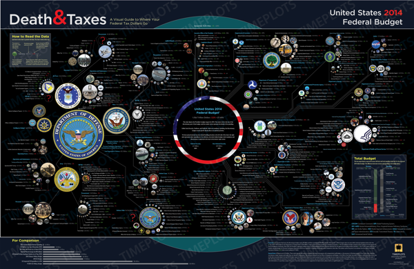
Nathaniel Pearlman: Timeplots is continuing the Death & Taxes poster franchise, taking it over from its creator, Jess Bachman. We agreed to do this before the scheduled release of the FY2014 budget. To produce the poster efficiently and meet the expectations of an audience already familiar with its look and feel, we minimized big changes and largely stayed with Jess’s design aesthetic. We kept the location of departments, labeled and colored expenditure numbers in the same format; and, the Office of Governmental Ethics is still the smallest circle plotted on the poster. We did, however, make some subtle design changes.

In the bottom-right corner we converted pie charts to a bar chart. We also changed the “For Comparison” section bubble charts to horizontal bar charts. Bars also serve as a visual clue that the information here is different and you see immediately that they differ from the bubbles depicting the discretionary budget in the main area of the poster. We also unified the presentation style throughout the poster. We also omitted the “How much does it cost you” section. 

Cool Infographics: The Death & Taxes poster design is now being made by the team at Timeplots, what are the major differences from the prior posters that were designed by Jess Bachman?   

Nathaniel Pearlman: Timeplots has a four year history of visualizing complex data with compelling design. We have diverse skills and resources and may introduce changes in future posters like dark type against a lighter background for ease of reading; advancing visual unity either by replacing the photos with icons, or by making all color photographs more duotone, or monochromatic; and finally, crafting the type in the header section so that it has more personality. We are also thinking about how to improve the substance of the poster. We would love to hear feedback or suggestions for improvement from your readers.

Cool Infographics: When did the 2014 data become available, and how long did it take you design the poster?

Nathaniel Pearlman: The data was released on April 11, 2013. To prepare, we wrote some data queries and scripts based on the 2013 data about one week before the release. Once we got the 2014 data, we just ran the 2013 scripts. It took about two days to get all of the circles in place on the poster. The design and crafting took longer. The poster went out for review to experts about a month after the we got the data. Of course we were working on many other projects in between as well.

Cool Infographics: What software applications were used for the Death & Taxes poster design?

Nathaniel Pearlman: Scripting and plotting were done in R—an open source statistical application that we have used for other Timeplots posters. The design completed in Adobe Illustrator. Jess created the previous Death and Taxes with Excel and Photoshop, so there was no code or design template we could borrow or reuse. Our programming and design process was new to Death & Taxes, but we decided to go this route because this process would present data more accurately and make future updating much easier.

Cool Infographics: What’s the most interesting thing you learned from the 2014 data?

Nathaniel Pearlman: We guess it shouldn’t be a surprise, but data shows how trivial in the context of the whole budget are some of the biggest political tangles. Things like the National Endowment for the Humanities or the Corporation for Public Broadcasting are very small by comparison to big ticket items.  The nice thing about the poster is that each viewer will be able to reach their own conclusions, based on the area of they wish to investigate or focus upon. Each department, each item, has its own story. 

Cool Infographics: Where do you have them printed, what are the printing specs and why?

Nathaniel Pearlman: The 2014 poster is on a 36” by 24” sized, 80 lb. cover paper. We use a local printer for offset printing and through a process of several proofs we have more control over the colors and the final look and feel of the print. The 2014 poster is slightly lighter than the 2012 one. The lighter paper can roll more easily into tubes without getting creases.

Cool Infographics: Social media has always been a big part of marketing the Death & Taxes poster.  What are your plans to promote the 2014 poster?

Nathaniel Pearlman: Social media is important to us. We have been receiving supportive comments and thoughtful suggestions through a number of channels. Death & Taxes has its own Facebook channel: (https://www.facebook.com/pages/Death-and-Taxes/373639641532). You can also follow Timeplots on Twitter (@timeplots) and Facebook (https://www.facebook.com/timeplots) to receive notice of latest news. Keep your eyes open to these places.

Graphicacy, (the consulting arm of Timeplots) is also working on an interactive version using the same budget data to pair with the poster. That interactive, presenting the same information, will enable interested viewers to explore the federal budget online.

The poster now sells at Timeplots and Amazon.  

Cool Infographics: Prior versions have been available online in a zooming viewer.  Is the 2014 version also available in this format?  What zooming tool is being used?

Nathaniel Pearlman: Yes, you are able to zoom on a watermarked version of the 2014 poster on our Timeplots site. The zoom tool is the default for our shopping content management system, and it allows for crystal-clear views of the information, watermarks aside. While you will have a good sense for the design and presentation of the poster by viewing it online and zooming-in on its details, we believe the print poster will surprise you with its vibrant colors on smooth paper, sharp type, and scale.

 You can also check out Jess Bachman’s thoughts about the new version in his blog post on Visual.ly

Friday
Jul192013

Units of Measure Calendar

An intriguing calendar that shows the date by using units of measurements commonly used. Designed by the team at ACRE in Singapore, you can buy your own Unit of Measure Calendar poster. There are two editions, a blue and black version as well as a black and copper.  

The idea of creating a calendar was always at the top of our heads. However, we needed an idea that was sound, that made sense. We went back to our roots for that big idea, and we stumbled upon the fact our agency is named after a unit of measure.

Things began to click into gear and the team worked to create a calendar that would highlight 12 units of measure . This brought a lot of symmetry to our design philosophy which melds sense and practicality together. This craft-centric calendar is designed to be practically functional as well as aesthetically pleasing. 

I do wish the high-resolution version was available to view online, but we can only see the gallery images.


Dimensions: 990 × 680 mm (39 × 26.75 in)

Found on Fast Co Design