About
Randy Krum
President of InfoNewt.
Data Visualization and Infographic Design

Infographic Design

Infographics Design | Presentations
Consulting | Data Visualizations

DFW DataViz Meetup

Join the DFW Data Visualization and Infographics Meetup Group if you're in the Dallas/Fort Worth area!

Search the Cool Infographics site

Custom Search

Subscriptions:


Feedburner

The Cool Infographics® Gallery:

How to add the
Cool Infographics button to your:

Cool Infographics iOS icon

- iPhone
- iPad
- iPod Touch


Read on Flipboard for iPad and iPhone

Featured in the Tech & Science category

Flipboard icon

Twitter Feed
From the Bookstore

Caffeine Poster

The Caffeine Poster infographic

Entries in twitter (42)

Wednesday
Jul272011

The VIZoSPHERE - Visualizing DataViz People on Twitter

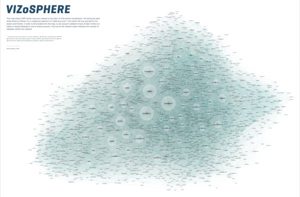
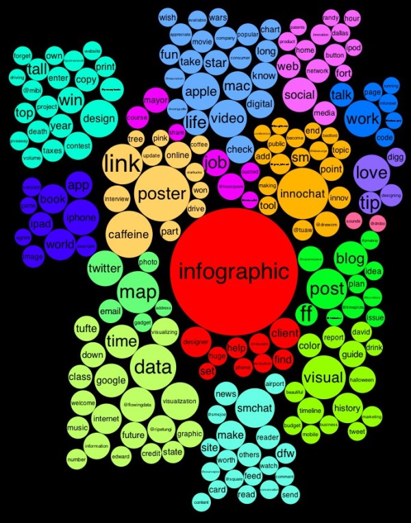
From Moritz Stefaner on Visualizing.org, comes the VIZoSPHERE project (Click the image to see the high-resolution image viewer).  Using GePhi, Moritz started with 18 seed accounts on Twitter, and then mapped 1,645 of the connected, networked accounts that relate to data visualization.  Bubble size in this visualization shows how many followers each account has from within this DataViz pool of users.

This map shows 1645 twitter accounts related to the topic of information visualization. The accounts were determined as follows: For a subjective selection of “seed accounts”[1], the twitter API was queried for followers and friends. In order to be included into the map, a user account needed to have at least 5 links (i.e. follow or being followed) to one of these accounts. The size of the network nodes indicates the number of followers within this network.


[1] The seed accounts were; @moritz_stefaner, @datavis, @infosthetics, @wiederkehr, @FILWD, @janwillemtulp, @visualisingdata, @jcukier, @mccandelish, @flowingdata, @mslima, @blprnt, @pitchinteractiv, @bestiario140, @eagereyes, @feltron, @stamen, @thewhyaxis

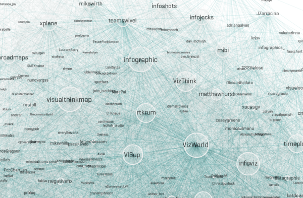
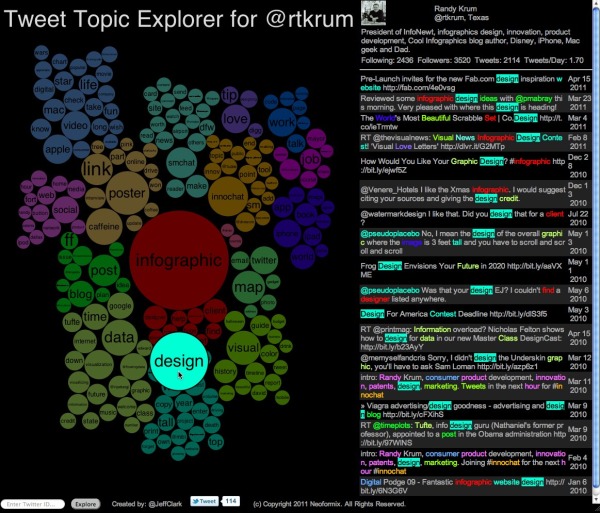
The zooming interface is crucial to view such a highly-detailed visualization and be able to read any of the nodes.  I was about to find my own Twitter account (@rtkrum), but it would be nice if Moritz would also provide a listing of the Twitter accounts or some way to search the map.

Great job Moritz!

Found on FlowingData and Robin Richards (@ripetungi) on Twitter.

Wednesday
May042011

Real Estate: Social Media Killed the Blog Star


Another good infographic from Fixr.com about the how the real estate industry is changing.  Social Medai Killed the Blog Star: Real Estate looks at how buyers are finding their information online and who are the most influential blogs and real estate people on Twitter.

I like the use of company logos and Twitter profile images.  I also like that all of the data is built-in to the pie charts and bar charts to make it easier for the readers to comprehend.

The side-by-side Top 10 lists are interesting, but because they’re based on different measurements (followers vs. Alexa page rank), the graphic should give the reader some context of how to compare the different values.  Why do these lists support the overall message that social media is more important than blogging?

Some major technical errors as well.  Pie chart percentages should ALWAYS add up to 100%.  The pie charts here add up to 71%, 99%, 91% and 100%, which means that the visual of the slice sizes doesn’t match the data.  You never want your data visualizations to tell a story that isn’t supported by the data.

Thanks to Raul for sending in the link!

Tuesday
Apr262011

Real Estate Professionals & Social Media Infographic


From Mashable and Postling, the Real Estate Industry + Social Media Use infographic looks at how social media is reshaping how realestate agents communicate with potential buyers.

The real estate industry has seen a number of social media innovations over the past few years. Real estate pros are using social media to provide online property tours, schedule showings and showcase local expertise.

Alexis Lamster, VP of customers at Postling and creator of the infographic below, told us that the company analyzed more than 500 Postling accounts specific to real estate and more than 7,000 small business accounts to extract information on how the real estate industry is using social media.

Although the infographic is made up of mostly pie charts and bar charts, it clearly communicates the information in a clean, easy-to-read format.

Friday
Apr222011

The Tweet Topic Explorer


Jeff Clark at Neoformix has created a cool, interactive tool that visualizes word frequency in a specific Twitter stream called Tweet Topic Explorer.  You can enter anyone’s Twitter ID and it will generate an interactive visual on the fly.  Above is the visualization of my Twitter ID: @rtkrum.  According to Jeff (see note below), this works in most browsers but has trouble with Microsoft Internet Explorer.

Similar to a word cloud, the area of the circles is sized based on the frequency of that word in the Twitter stream.  Words are clustered together and color-coded if they are often found together in the same Tweets.  The actual text of the Tweets is displayed next to the visual, so you can click on any word and it’s highlighted in the text as well.  Clicking on any Twitter names in the text will generate a new visualization for that Twitter user.


One issue I have is that the font size of each word is adjusted to fit within it’s circle, so longer words are naturally smaller to fit on one line withing the circle.  So even if a long word has a higher frquency (and a larger circle area) it appears smaller to the reader’s eye because the font is so small. 

I have created a new tool to help see which topics a person tweets about most often. It also shows the other twitter users that are mentioned most frequently in their tweets. I call it the Tweet Topic Explorer. I’m using the recently described Word Cluster Diagrams to show the most frequently used words in their tweets and how they are grouped together. This example below is for my own account, @JeffClark, and shows one word cluster containing twitter,data,visualization,list,venn, and streamgraph. Another group has word,cloud,shaped,post etc. It’s a bit hard to see in this small image but there is a cluster about Toronto where I live and mentions of run, marathon, soccer. Also, there are bubbles for some of the people on Twitter I mention the most often: @flowingdata, @eagereyes, @blprnt, @moritz_stefaner, @dougpete.

This application was created with the wonderful tool Processing.js which is the javascript-based extension of the Processing tool I have used in the past. Performance is very good with the Chrome browser, and decent in Firefox and Safari. It will not work in Internet Explorer (except perhaps the new IE 9) and currently crashes on iOS devices.

Anyone out there still reading?  Generate a visualization using your Twitter ID and post a link in the comments!

Outstanding job Jeff!  

Found on FlowingData

Wednesday
Apr202011

Social Media and College Admissions


Are colleges using social media as part of the student admissions process?  Schools.com explored this topic with the Reading Students like an Open Facebook infographic.  It’s hard enough to get teenagers to understand that online photos and status updates will be a permanent record of their behavior for the rest of their life, but even more immediately it could impact their entrance into college!

As Facebook has become more and more popular—if it were a country, it would be the third largest in the world—its use in the field of education has expanded, too. In fact, more than 80% of college admissions officers report using Facebook as part of their recruiting process. 

Are admissions officers really looking at the Facebook profiles of prospective students? And if so, are they making admissions decisions based on these profiles? Below is an infographic that highlights the answers to these questions and more—which might surprise you.

Thanks to Kristen for sending in the link!

Tuesday
Apr122011

The Current State of Social Networks #infographic

From ignite, a social media agency, comes The Current State of Social Networks.

It goes without saying that Facebook is the network du jour, but even though the reigning champion’s user stats keep soaring, social networking as a whole might be leveling off. Nevertheless, there are still scores of other highly competitive social sites that are waxing and waning; and different networks and apps are more popular in specific geographic areas, with certain genders or age groups, and even among various social classes.

For example, Plaxo is the network with the most users over the age of 65. Facebook is more popular with women, but Digg and Reddit tend to be more popular with men. LinkedIn is the “richest” social network, but Plurk outranks it when it comes to well-educated users who have graduate degrees.

They have a ton of traffic data to work with, and this infographic does a good job of summarizing some of the key findings at the top level. 

Found on Mashable and Social Media Graphics

Thursday
Feb102011

2010 Facebook vs. Twitter Social Demographics

Facebook vs. Twitter is a good one from DigitalSurgeons.com.  They’ve done a great job of compiling the data from at least 10 different sources, to create an overall profile of the standard Facebook and Twitter users.

One has over 500 million users, the other just over 100 million. But who are they and what’s their behavior? What’s their value to a brand? How old are they? What’s their education? How much do they make? Just exactly what does the Facebook vs. Twitter landscape look like? Good questions. Here’s how we see it.

The use of the Polar Area Chart (also called a Nightingale Rose Diagram) does a good job of breaking down the demographic information into 11 different categories.  Unlike a standard pie chart, each slice is the same angle, and only the radius of each slice conveys value.

The difficulty in using this visualization style, is that it’s hard for the reader to compare between the two diagrams.  Does Twitter or Facebook have more logins by mobile device?  The reader can’t tell from the visuals, and they have to move back and forth reading the values to tell the difference.

One possible alternative would have been to put everything into one Polar Area Chart, so for every section the Facebook slice is next to the Twitter slice.  That way you could visually compare the two without reading the numbers or comparing between two charts.

Thanks Matt for sending in the link!

Thursday
Jan062011

The 2010 Year in Review #infographic


OnlineSchools.org has released the 2010 Year in Review zoomable infographic summarizing the major events of 2010.  The zoomable version is below, and it’s best viewed in full-screen million.

I have mixed feelings about this one.  Using the outer space metaphor, there are 15 major news categories with text descriptions of a handful of events in each.  Each event has a small celestial body illustration related to it, and a measure of blog posts and tweets on Twitter related to the event.


It really does need the zoomable feature, because the font sizes are dramatically different between the titles and the text.  That does make it difficult to read sometimes.  I noticed the Star Trek font used as well as part of the sections.

In the corners are some visualizations of things like Top Memes, Top Songs, Twitter Trends, Yahoo Searches and Google’s Fastest Rising Searches.


I think this one is missing good sources for where their information came from, a designer listing, some of the text s too small and in some cases is more illustration then infographic.  Overall it’s fun to zoom around and appreciate the details they’ve included.

Thanks Brittany!


Wednesday
Oct202010

Brazilian Presidential Elections infographic

From TwitRadar.com is a cool tracking map of Twitter posts during August 2010 related to the Brazilian Presidential Election and the candidates.  Data is captured from www.twiteleitoral.com.br

It describes the daily variations on the number of quotations for the top 2 more mentioned candidates, Dilma and Serra. It also points out “of the curve” campaign or media events that took affect on the twitter chattering.

Norton Amato Jr. and his team were gracious enough to translate it into English for readers of Cool Infographics, and here is the original:

Big thanks to Norton and his team!  Great job!

Tuesday
Jun152010

InfoChimps Data API BETA program launched!

InfoChimps.com has launched the BETA program for the use of their data through InfoChimps APIs.  The two initial data sets are Twitter and U.S. Census data.

Initial pricing has been announced for this introductory period, and there is a level for FREE access for anyone who want to experiment with the data.

Found on ReadWriteWeb