About
Randy Krum
President of InfoNewt.
Data Visualization and Infographic Design

Infographic Design

Infographics Design | Presentations
Consulting | Data Visualizations

DFW DataViz Meetup

Join the DFW Data Visualization and Infographics Meetup Group if you're in the Dallas/Fort Worth area!

Search the Cool Infographics site

Custom Search

Subscriptions:


Feedburner

The Cool Infographics® Gallery:

How to add the
Cool Infographics button to your:

Cool Infographics iOS icon

- iPhone
- iPad
- iPod Touch


Read on Flipboard for iPad and iPhone

Featured in the Tech & Science category

Flipboard icon

Twitter Feed
From the Bookstore

Caffeine Poster

The Caffeine Poster infographic

Entries in twitter (42)

Wednesday
Apr282010

Jess Bachman Interview (Death & Taxes 2011 Poster Giveaway!!)  #deathandtaxes

Last week, Jess Bachman (@mibi) from WallStats.com released the new 2011 Death & Taxes poster.  I caught up with Jess (by email) to ask some questions about his huge infographic undertaking.  The high-resolution image of the poster is available now online, and the printed version will start shipping on May 7th.  You can pre-order for $24, and the shipping cost is only $0.75 TODAY (April 28th)

WIN a copy of the poster!  Jess has been kind enough to offer a free poster to a reader of Cool Infographics.  To be eligible, you must tweet (or retweet) a link to this post on Twitter before May 7th, and include the #deathandtaxes hashtag.  I included the hashtag in the post title, so any retweets will be automatically eligible.  NOTE: you must also be following me on Twitter (@rtkrum) so that I can send you a DM if you have won!

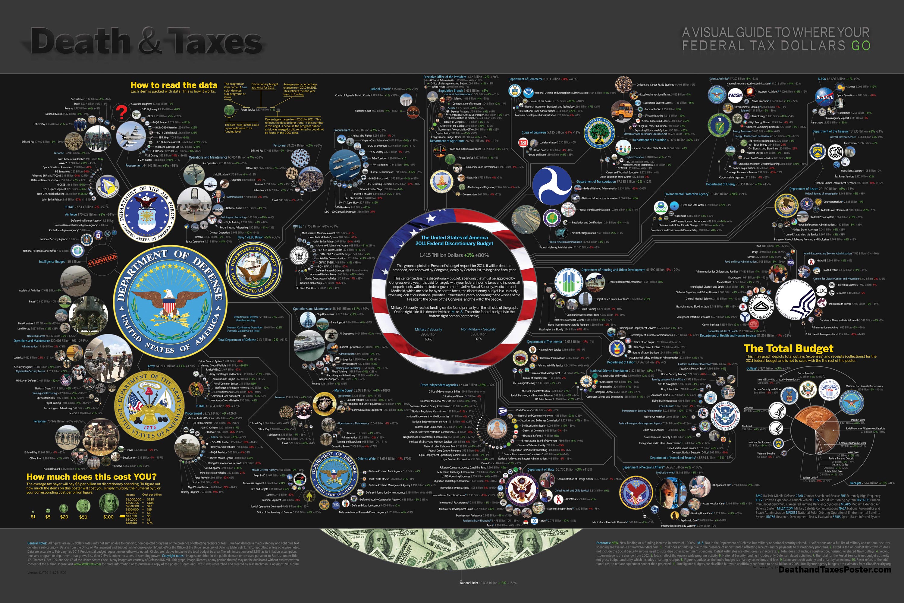
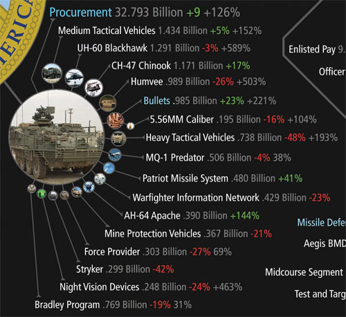
Death and Taxes” is a large representational graph and poster of the federal budget. It contains over 500 programs and departments and almost every program that receives over 200 million dollars annually. The data is straight from the president’s 2011 budget request and will be debated, amended, and approved by Congress to begin the fiscal year. All of the item circles are proportional in size to their funding levels for visual comparison and the percentage change from both 2010 and 2001 is included so you can spot trends.

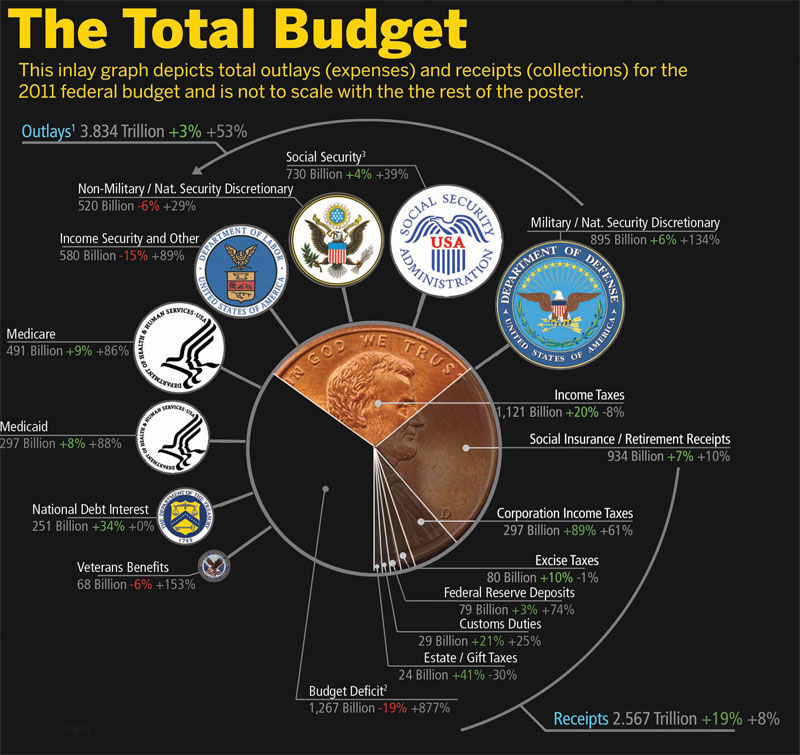
The detail in this poster is stunning, and in this small shot you can see how the total budget request breaks out. Only the “Military/Nat. Security Discretionary” and “Non-Military/Nat. Security Discretionary” portions of the budget request details are displayed in the poster.


Jess was also nice enough to answer a few interview questions I sent him:

Cool Infographics: What software applications do you use for the Death & Taxes posters?

Jess Bachman: The only applications I use are Photoshop and Excel.  Excel is where I in put all the data and it crunches the numbers, adjusts for inflation and calculates diameters.  Photoshop is where I put it all together and the PSD file occasionally exceeds 1 gig so it can be a beast to work with.  Saving takes about 5 minutes.

Cool Infographics: What’s your design process?

Jess Bachman: Normally I start from scratch and layout the images and make them fit; however, this year the budget didn’t change all that much, likely being from the same President, so I was able to keep the 2010 format and change the size of circles.  Of course some things had to be added and removed.  So this year I saved myself about 3 weeks of work just getting right into it, but the design process is grueling.  it’s small tasks, repeated 500 times.

Cool Infographics: What’s the most interesting thing you learned from the data?

Jess Bachman: I can definitely see the differences in Presidents from Bush to Obama.  Lots of reductions on the military side this year and the whole security climate as a whole isn’t as fiscally robust as it was a few years ago.  Much more progressive funding with Obama too.  Every year Bush would cut climate change research, now its back, along with other green tech.  For some reason, public proadcasting gets the hack saw every year no matter who’s in office.

Cool Infographics: Where are some of your favorite places that have the Death & Taxes poster on display?

Jess Bachman: Well it’s always good to see it on display in schools and classrooms.  But I really enjoy hearing from military members who have in their offices or even in station.  I have sent several to Afghanistan.  Critics often say the poster is anti-military, but the military is quite receptive to it, even the former Dept. of Defense Comptroller, Tina Jonas, loved the poster.  Some people from the Dept of Energy’s Oak Ridge Lab displayed the poster on their 30’ Everest computer screen… that was cool too.

Cool Infographics: What’s the hardest part when developing the poster?

Jess Bachman: The hardest part is just getting through all the rote data processing and mindless photoshopping.  The research side is quite fun, and going through the military budgets is a trip with all their classified and hi-tech programs. However, copying and pasting 5,000 times really takes a toll on my creativity and motivation.

Cool Infographics: You said you do a lot of copy & paste work, in what format do you get the data?

Jess Bachman: Some of the government data is in Excel already, but there is no context so I am dubious about working solely with their data sets.  Mostly I pull the numbers from the actual printed budget, which is in PDF form.  So I end up copying and pasting the program name and its funding level for 3 years into Excel, then I copy and paste the program name, funding level, and percentages back into photoshop as a text layer.  Rinse and repeat 500 times.  Many people ask if there was an automated way to create the poster each year and I wish there was, but the confines of the paper make size and fit a manual process.

Cool Infographics: Where do you have them printed, what are the printing specs and why?

Jess Bachman: I get my posters printed from a company called PrintPelican in Florida.  There really are no cheaper prices out there but I opt for a thicker cut of paper than usual.  I get 100# gloss cover which is a few shades from a business card in thickness.  To be honest, they have screwed up my order a few times over the years but we have always managed to work it out.  I usually print runs of 1000-2500 and always 24” x 36”.

Cool Infographics: How do you handle all of the printing and shipping of the posters?  Do you tube them yourself?

Jess Bachman: I used to do it all myself.  I had a 400lb brick of posters next to my bed, and 12 giant boxes of tubes all over the house, and I would roll pack and ship them all.  Now I use two shippers who do fulfillment of the orders for me.  For a while I would send them the orders and addresses weekly but I have offloaded that duty as well.  I think the self shipping method is a good lesson in customer service and its good to know your product inside and out, but after while my time became more valuable than stuffing tubes could afford.

Cool Infographics: You’ve used a few different online zoomable image services in the last few years, what have you learned?

Jess Bachman: There are lots of zooming options out there and new ones seem to pop up all the time.   I used Zoomify until it felt too clunky and slow, then Zoomorama which I really loved for its performance and options.  This year I experimented with an self hosted open source app called Open Zoom and it certainly was a slick and great user experience, unfortunately the demands it placed on my server from huge inflows of traffic proved too much, taking down the whole site.  So I had to switch to my backup, which was Closr.it, and let them deal with server demands.  Closr.it has been very attentive to my needs and I have found that most developers will work with me to tailor a custom solution if I ask.  The zooming apps keep getting better so I expect to keep changing apps as long as the space keeps innovating.

Cool Infographics: You mentioned the 30’ display, have you printed it out in larger sizes?

Jess Bachman: No, I have not printed it out any larger.  The file being Photoshop, and the images being mostly rastered do not allow quality printing beyond the poster size.  The file is 300 dpi so I could get away with a slightly larger size, but oversize printing is expensive and who wants a poster that big anyways. 

Cool Infographics: Where do the images come from?

Jess Bachman: Most of the military images come from defenseLINK, which is a great repository for hi-res military photos.  Other images come from stock photography sites for the most part.  It does help that most government logos are round.  I suppose it’s just an old school way of doing things, government seals and all.  The design aesthetic amongst government logos is really all over the map though, and its quite interesting.  Some look like that are from the 1700’s, and some from the 2700’s.

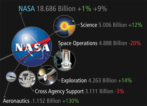
 There was one correction to the online version that Jess has posted:

So I totally had the wrong data for NASA on the visual. Here is the corrected image, which reflects what you have been reading in the news. Science up, space down. I fixed it before it was printed, don’t worry.

You can view the image, buy the poster and more at the new site DeathandTaxesPoster.com.

SPECIAL: If you pre-order the poster TODAY (April 28th) shipping is only $0.75!

Tuesday
Apr272010

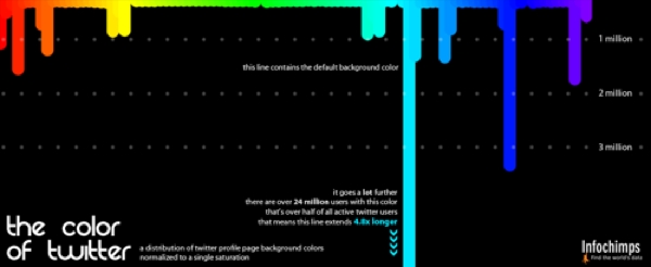
The Color of Twitter

I really like The Color of Twitter from InfoChimps.org that plots the background colors used by all 40 million of the Twitter.com users.  I do think the infographic would be better if they had actually extended out the default light blue color instead of just noting that it extends 4.8x longer.  They also don’t account for background images that cover the background color, which would account for a large number of people not changing their colors.

As part of the release of a number of new, free Twitter data sets, Infochimps created the following beautiful infographic showing just what color Twitter really is.

The data for the infographic comes from the just-launched Histograms dataset that aggregates anonymous data about Twitter users such as how many users have x number of friends or followers, or how many users are in x location. The company also released new data sets (paid) about stock tickers, hashtags and URLs on Twitter.

Found on Mashable.com

Tuesday
Jan192010

6 Twitter Topic Visualizations for "Caffeine Poster"

The Caffeine Poster got a huge amount of traffic, specifically on Twitter, so I thought this would be a good chance to share a collection of the available, interactive twitter visualizations.  Although there are many visuals that show a Twitter user’s network of connections, these are visualizations that show conversations based on the search topic “caffeine poster” on Twitter.

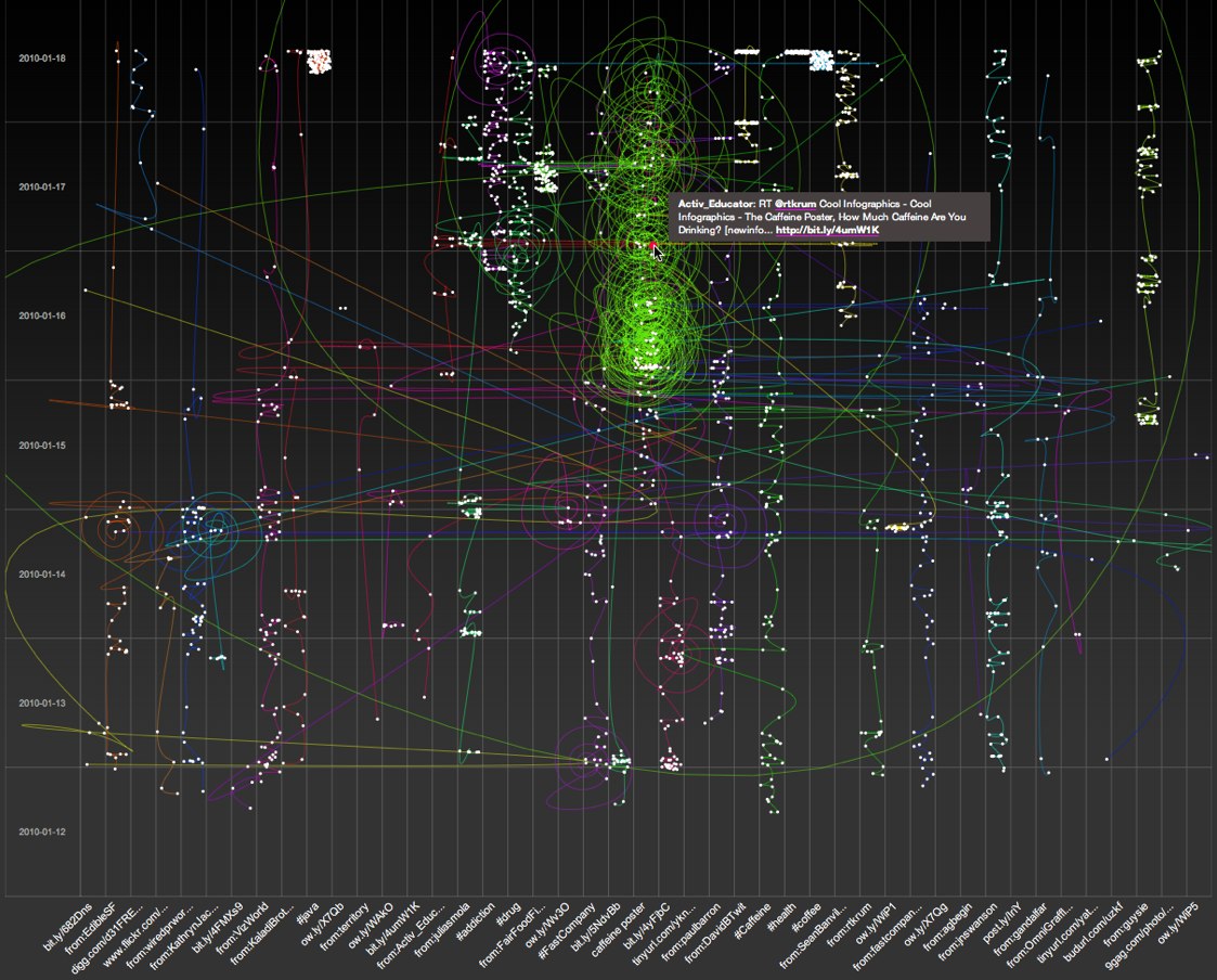
SocialCollider.net, by Karsten Schmidt and Sascha Pohflepp, maps the connections within a conversation starting with a Twitter stream or search topic.

This experiment explores these possibilities by starting with messages on the microblogging-platform Twitter. One can search for usernames or topics, which are tracked through time and visualized much like the way a particle collider draws pictures of subatomic matter. Posts that didn’t resonate with anyone just connect to the next item in the stream. The ones that did, however, spin off and horizontally link to users or topics who relate to them, either directly or in terms of their content.


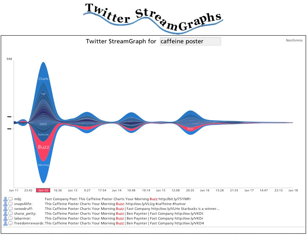
The Twitter Streamgraph from Jeff Clark at Neoformix.

The StreamGraph shows the usage over time for the words most highly associated with the search word. One of these series together with a time period are in a selected state and coloured red. The tweets that contain this word in the given time period are shown below the graph. You can click on another word series or time period to see different matches. In the match list you click on any word to create a different graph with tweets containing that word. You can also click on the user or comment icons and any URL to see the appropriate content in another window. If you see a large spike in one time period that hides the detail in all the other periods it will be useful to click in the area to the left of the y-axis in order to change the vertical scale.


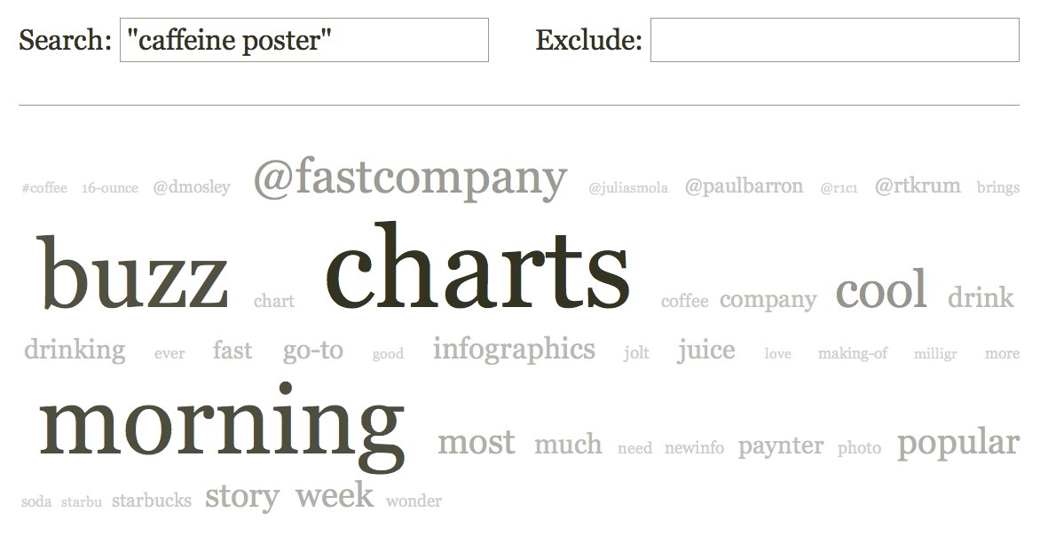
Cloud.li, by Elbert F, creates a word cloud based on your search terms.


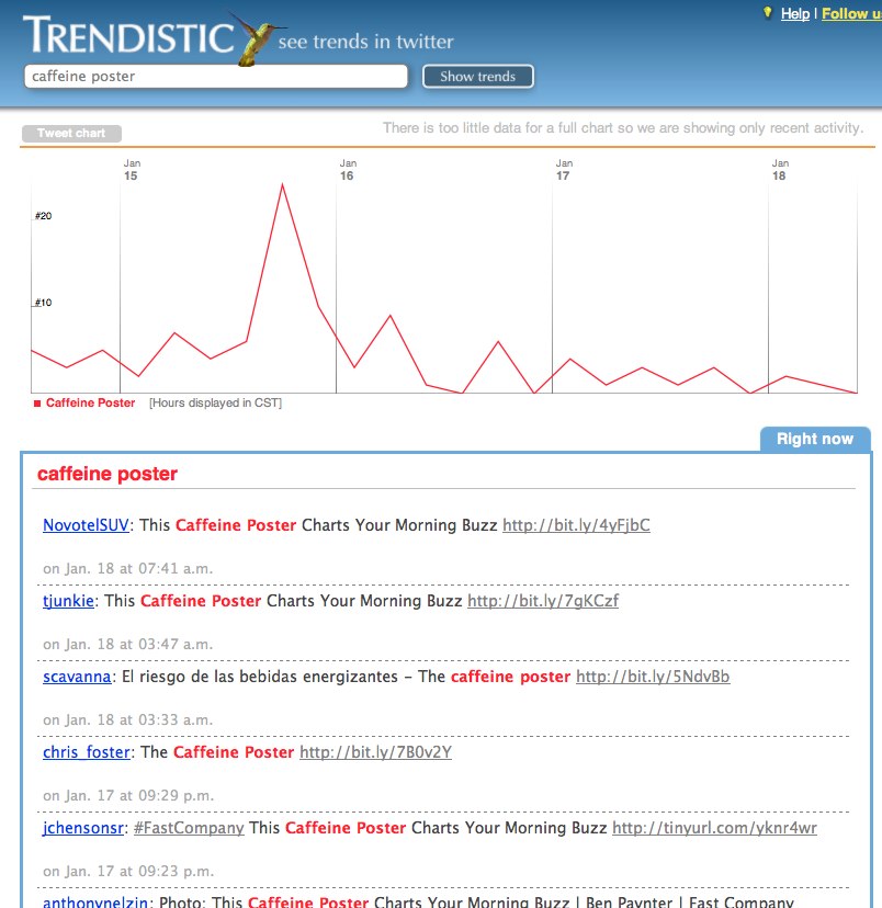
Trendistic will plot the tweet volume on a timeline based on your search terms.  You can click anywhere on the timeline to see the specific tweets for that time too.

Trendistic is a tool that allows you to track trends on Twitter, similarly to what Google Trends does for Google searches. It gathers tweets as they are posted, filters redundant ones and compiles the rest into one-hour intervals.

This way, it shows how the frequency of one, two, three and four-word phrases fluctuate over time. The result is a visualization of what is popular and what is not among Twitter users, and how certain events are reflected or even predicted by themicroblogosphere.

You can enter a phrase (topic) in the 
Trendistic search box to see how its frequency varies over time, or several different topics separated by commas to see how they relate (each topic will show in the chart with a specific color): try comparing ‘dinner’ and ‘breakfast’ or ‘morning’ and ‘night’ for instance, to see how powerful it can be. 


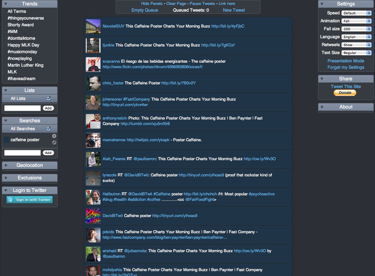
TwitterFall shows you the tweets based on your search term, and presents them as an animated waterfall.

Twitterfall is a way of viewing the latest ‘tweets’ of upcoming trends and custom searches on the micro-blogging site Twitter. Updates fall from the top of the page in near-realtime.

For popular trends, Twitter is queried from the Twitterfall server, and results arepushed to your browser, rather than your browser doing the queries, or your computerpolling our server repeatedly. This means using Twitterfall for popular trends is nicer on Twitter than other services.


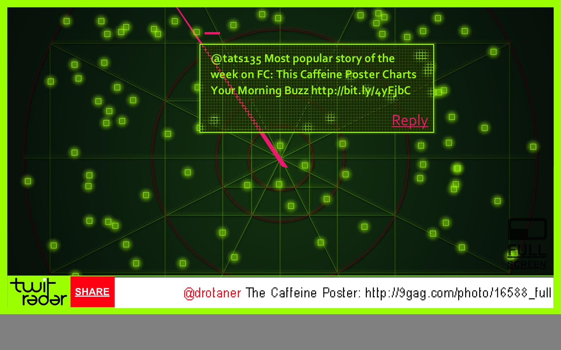
 TwitRadar.com will map out a search term, a user or a hastag into a handful of different visuals.

Google Translated from Portuguese: The TwitRadar is a tool for monitoring Twitter. With TwitRadar you can track, monitor and share real-time, the subject you want. Just type the tag you want to track, the TwitRadar show, very simple and intuitive, all that is written about it on Twitter. And not to be confused with the volume of information tracked, the TwitRadar organizes the results according to the criteria that you want.

Tuesday
Jan122010

Bronson Wins Infographic Poster!


Congrats to Bronson Harrington (@Gnuboss on Twitter)!  Bronson won a free poster of his choice from Infojocks.com by retweeting about the infographic contest we announced in December.  By including the #BCSvisual hashtag, Bronson was then randomly selected to receive the free poster.

The contest wraps up next week, so look here for all of the entries and the winner.

Thanks to everyone for helping to spread the word!

Tuesday
Jan052010

Twitter Territory: A Different Twitter Map

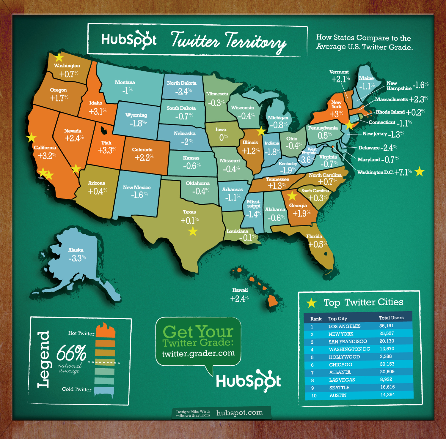
Twitter Territory is a different kind of Twitter map made in collaboration between designer Mike Wirth and Shannon Sweetser from HubSpot.com.  Made using HubSpot’s data from Twitter Grader, the map shows how people in all 50 states compare to the national average grade of 66 (which is an D, isn’t it?).

I think this is a great use of HubSpot’s data, and the map is a great way to introduce people to the Twitter Grader for the first time.  As a social media marketing tool, now all Shannon has to do is sit back and hope people blog and Tweet about it.  Oh wait…I just did.

I also noticed that @MikeWirth (91) and @Shannon (98.1) both get A’s!  Great job!

Friday
Dec182009

Word Spectrums! The Online Infographic Battleground


On Chris Harrison's site, there are a number of graphics that he calls Word Spectrums.  More like a battleground, Chris is using the enormous amount of data from websites that has been made public by Google.  This is an advanced form of a word cloud that visualizes related words and their relative connections to the two topics.  (FYI, since this is based on raw Google data, foul language does appear in some of them).


Using Google's enormous bigram dataset, I produced a series of visualizations that explore word associations. Each visualization pits two primary terms against each other. Then, the use frequency of words that follow these two terms are analyzed. For example, "war memorial" occurs 531,205 times, while "peace memorial" occurs only 25,699. A position for each word is generated by looking at the ratio of the two frequencies. If they are equal, the word is placed in the middle of the scale. However, if there is a imbalance in the uses, the word is drawn towards the more frequently related term. This process is repeated for thousands of other word combinations, creating a spectrum of word associations. Font size is based on a inverse power function (uniquely set for each visualization, so you can't compare across pieces). Vertical positioning is random.


Chris has created and shared a number of different versions on the Word Spectrum page of his website, and you can see high-resolutions PDFs of each there.

Want to try your own?  Building on Chris' idea, Jeff Clark from Neoformix has created interactive Word Spectrums using either Twitter or News as the source that lets you enter your own terms to compete.  I especially like the idea of pitting two competing brands against one another.


Sunday
Nov012009

Twitter List: Cool Infographics People


Introducing, the Cool Infographics People Twitter list! 

Last week, I got a nice surprise from Twitter.  My home page featured a new, sizable banner that announced the “beta” release of lists.  I'm lucky I went to the Twitter home page, because I usually use TweetDeck for Twitter and I wouldn't have seen it.

I started with everyone from my recent post "37 People You Should Follow for Infographics on Twitter" including all of the people that had been suggested after that post came out.  I added a bunch from the datavisualization.ch post "30 More People You Should Follow for Info Graphics on Twitter" by Ben.  Finally I found a handful of more infographics people just by using the new lists function to see who else is on other lists.

I knew lists were coming out in waves, slowly letting more and more people get access to the new feature, so I was on the lookout.  I think it's been rolled out to most Twitter users, but your account needs to be enabled with lists before you can see the lists from other people.  Once your account has been enabled, you will see a new statistic "Listed" on your Home page.


This shows you how many lists that other people have created that you've been included in.  Once you start following or creating lists, a new Lists section is added to your sidebar.  Here you can see the lists that you follow or manage yourself.


Please follow the Cool Infographics People list if you use Twitter, and obvously I will continue to add more infographic people to the list as I find them.  Also, please make any suggestions you think I am missing.

Friday
Sep182009

37 People You Should Follow for Infographics on Twitter


[The Visual Guide to Twitter is from Applicant.com]

If you don't already follow me on Twitter, I'm rtkrum.  I post links to all of the Cool Infographics posts, and hold a few side conversations with people there.  I don't know how some people keep track of following thousands of people, but TweetDeck has become an indispensable tool for me.  The main reason is that I can create groups among the people I follow and of course I keep an infographic group.

Instead of featuring an infographic today, I thought I would embrace the Twitter tradition of Follow Friday and share the list of people and companies I follow related to infographics.  So here is my list of who to follow for infographics on Twitter (in alphabetical order):

Ben_Fry
Choreographics
Datamarket
DataVis
DaveGray
EagerEyes
Ethel_Baraona
Five15Design
FlowingData
GOOD
iA
infobeautiful
Infographic
InfoJocks
InfoShots
Infosthetics
Infoviz
Jess3
LifeAnalytics
Matthewhurst
Mibi
MikeWirth
Mslima
Neal_Levene
OmniGraffle
OpenRoadMaps
RaayaDesign
SND09
TeamSwivel
TimePlots
VisualThinkMap
VISup
Vizeds
VizThink
VizWorld
Xplane

I know I have to be missing some, so that's the selfish part of this request.  Who else do you follow?

Tuesday
Jun232009

The Story (so far) of Twitter


Graphic designed for Manolith.com, by infoshot.  It’s a reverse timeline of Twitter.

Twitter, Twitter, Twitter. Seems every where you turn these days that little blue bird is staring you right in the face. But how did it all start? Where is it all going? Who’s to say really, except you I suppose, in 140 character bursts. In the meantime let’s take a look back on some milestones of microblogging.  Please do enjoy, The Story (so far) of Twitter. Start at the bottom and work your way up on this one.


Of course, I found this on Twitter!

Friday
Mar202009

SXSW Twitter Visualizer from Pepsi


The 2009 SXSW PepsiCo Zeitgeist Twitter Visualizer (long name isn't it?) was a great experiment during the 5-day South By Southwest symposium/conference/party in Austin, TX.  Developed by Slash7, the site contains a number of dufferent visualizations using the Twitter APIs.


These real-time visualizations were able to capture only Tweets about the event using the hash-tag #SXSW and highlight the popular topics and show where people were Twittering on a map.  PepsiCo has a bigger site with some additional content at http://pepsico.com/sxsw

Found on Information Aesthetics and of course, Twitter.