About
Randy Krum
President of InfoNewt.
Data Visualization and Infographic Design

Infographic Design

Infographics Design | Presentations
Consulting | Data Visualizations

DFW DataViz Meetup

Join the DFW Data Visualization and Infographics Meetup Group if you're in the Dallas/Fort Worth area!

Search the Cool Infographics site

Custom Search

Subscriptions:


Feedburner

The Cool Infographics® Gallery:

How to add the
Cool Infographics button to your:

Cool Infographics iOS icon

- iPhone
- iPad
- iPod Touch


Read on Flipboard for iPad and iPhone

Featured in the Tech & Science category

Flipboard icon

Twitter Feed
From the Bookstore

Caffeine Poster

The Caffeine Poster infographic

Entries in video (137)

Friday
Oct042013

Advertisers, You Need YouTube

Advertisers, You Need YouTube is a motion graphic from MDG Advertising that shows many of the stats from successful YouTube video advertising campaigns.

While YouTube began as a source of online video entertainment, its massive popularity and mainstream prevalence has turned it into a major video advertising platform. To show why YouTube is now a very powerful and vastly important video marketing tool for advertisers, MDG Advertising created the following video. It shows the reasons, results, and revenue that are making YouTube a video marketing must for brands trying to catch the eye of audiences worldwide.

The video style is visually appealing, and has some fantastic statistics.

However, the design makes a common mistake we see in many motion graphic videos.  Big fonts are not data visualizations!  I noticed at least 20 different numbers shown to the audience in a really big font.  None of them were visualized to give them context for the audience.  Making the number value in big text and moving across the screen doesn’t make it any easier for the audience to grasp the meaning behind the data.

In data visualization and infographics design we know that visualizing the data always puts it into comparison to another number to provide the audience a frame of reference.  That helps the audience understand the scale of the numbers and how large or small they actually are.  Without that comparison in the design, the audience is left to try to compare the values to something they already know.

Thanks to Jarred for sending in the link!

Tuesday
Oct012013

The Rise in Mobile Video

The Rise in Mobile Video infographic

The Rise in Mobile Video from Digital Surgeons takes a look at the confluence of data behind the growth of mobile devices and the growth of video content made for those mobile devices.

Mobile video offers brands a new and interesting way to interact with it’s customers. It’s not about the platform, it’s about telling engaging stories and connecting with audiences.

We took all of that pesky research around the current state of mobile video and condensed it into a beautiful infographic. It’s our pleasure to present the Rise of Mobile Video Infographic.

They have gathered some fantastic data together in this infographic, and the data tells a great story.  The simple color scheme is easy on the eyes, and the use of icons and logos for the different device brands helps to reduce the text.

However, the design is visually noisy, and hard for the readers to follow.  Here are a few tips that could make this infographic great:

  • Big fonts are not data visualizations.  If you want your audience to understand the data, the design needs to visualize it to put the value into context for the reader.
  • Values not visualized are perceived as being less important.  Readers are skimming the infographic because they expect an infographic to make the data fast and easy to understand.  Usually they will skip the text and look at the visuals first.  This means that any values not visualized are skipped when the readers are skimming.
  • Streamline the path of information.  An infographic should walk the audience sequentially through the data, building up the conclusions.  In this design, the major sections move top-to-bottom, but within each section is a random placement of statistics.  Some are side-by-side and some are top-to-bottom.  It’s hard for the reader to understand where to move next after each statistic.  A clean, linear flow would be easier to read.

Thanks to Alex and Peter for sending in the link!

Friday
May312013

UK Income Tax and National Insurance

Income Tax and National Insurance - What are you really paying? is a new infographic video explanation from the team at See What You Mean that helps unravel the complexity of the UK tax system.

The UK’s taxes on people’s wages are needlessly complex and obscure. Produced with the team from See what you mean, the video highlights how National Insurance is a second income tax in all but name.

Previous YouGov polling for the TPA has shown that many people are not aware of how much tax they actually pay. The video makes clear the real rates of tax people pay when Employee’s National Insurance and Employer’s National Insurance are factored in.

Thanks to Richard for sending in the link!

Thursday
May302013

Water in the Anthropocene

Water in the Anthropocene is a very cool infographic video looking at the different ways we humans are changing the global water cycle.

Water in the Anthropocene is a 3-minute film charting the global impact of humans on the water cycle.

Evidence is growing that our global footprint is now so significant we have driven Earth into a new geological epoch — the Anthropocene.

Human activities such as damming and agriculture are changing the global water cycle in significant ways.

The data visualisation was commissioned by the Global Water Systems Project for a major international conference (Water in the Anthropocene, Bonn, Germany, 21-24 May, 2013). 
conference2013.gwsp.org

The film is part of the first website on the concept of humans as a geological force, anthropocene.info

Thanks to Owen for sending in the link!

Tuesday
May212013

DNA Explained

BBC Knowledge Explainer DNA from Territory on Vimeo.


An animated visual explanation of DNA found on creativeblog.com.

BBC Knowledge and Learning is exploring a wide variety of topics from social history to science in a series of three-minute online Explainer documentaries, and commissioned Territory Studio (territorystudio.com) to produce an animated film on the subject of DNA.

Three minutes is a short time to explore a subject where most doctorates only scratch the surface, so writer Andrew S. Walsh teamed up with molecular biologist Dr Matthew Adams to distil the script down to the most fundamental elements required to understand not only DNA’s form and function but how our understanding of these discoveries has affected the wider world. While this length may feel restrictive, the team found that this limitation acted as a lens, focusing the piece on the essentials.

The Explainer series is designed to intrigue and inform, encouraging those who discover the documentaries to further explore through links to additional information found on the BBC website.

Thanks to Jordan from sayitvisually.com for sending in the link!

Tuesday
Apr302013

Drowning in Big Data [infographic video]

Infographic video from 2011 by The Economist that uses animated data visualizations to tell the story about growing Big Data.

Digital data will flood the planet—and help us understand it better

Found on Visual Loop

Thursday
Apr252013

The 2012 Adobe U.S. Digital Video Benchmark

Cool infographic video from the team at Adobe that shares the results of their own 2012 Digital Video Benchmark research.

As you relax at home, walk through stores, and sit in airports, you see people watching video on more screens than ever before. But don’t rely on the eyeball test. The Adobe Digital Index team looked at 19.6 billion video starts on media websites to confirm the growth of broadcast video consumption across connected devices. See the latest video trends they uncovered for device use, ad placement, social media, and more. 

Learn more about what they found here: http://adobe.ly/ZeXLoI.

Adobe Digital Index publishes research on digital marketing based on the analysis of anonymous, aggregated data from over 5,000 companies worldwide that use Adobe Marketing Cloud.

The information is about all videos and ad placements in online videos, but the data also applies to infographic videos.  Online videos are still on the rise, and have become a very effective content and advertising platform for companies.

Clean data visualizations that I would assume were created in Adobe After Effects.  The bar charts that change size and shape in multiple directions are disconcerting though.  I can’t tell if they were appropriately adjusting the area of each bar, but I doubt it.  It looks more like a designer thought it would look unique and different without realizing that it corrupts the visualization of the data.

Thanks to Jordan from Say It Visually for sending in the linK!

Monday
Mar112013

Wealth Inequality in America

The Wealth Inequality in America infographic video was posted on YouTube back in November 2012.  The video is a good example of what the best infographic designs accomplish: Make the complex understandable.  

Infographics on the distribution of wealth in America, highlighting both the inequality and the difference between our perception of inequality and the actual numbers. The reality is often not what we think it is.

The data visualization in the video is very powerful and effective.  It takes the huge numbers that our brains have trouble processing, and visualizes them in a way that we can understand.  Comparing numbers puts them into context for the viewer, and comparing the different fifths of the population works very well in this instance.

The data sources are clearly listed at the end of the video, and they are even made available as clickable links in the video description on YouTube (which is very helpful).  This helps the credibility of the video tremendously.  Not many viewers (4,336,254 views as of the day I post this) will click to the links to view the source data, but they’re there.  Transparency creates credibility.

However, it’s not clear who created and is publishing the video, and this hurts the credibility a little bit, at least to a skeptic like me.  The video was uploaded by the user politizane, whose account was created just to upload this video.  No history of other videos, and no links to a company or website.  The author/designer obviously has an agenda, and spent a lot of time or money creating the video.  It would enhance the credibility even more if the viewer knew who was publishing and promoting the video.

Thanks to Doug for sending the link!

Monday
Dec312012

Water Changes Everything

I have heard it argued that clean water has been the single greatest medical advancement in mankind’s history.  With effects including longer lifespan, reducing diseases, reducing birth defects and generally improving health, it’s easy to undertand how important clean water is.  Water Changes Everything is an infographic promotional for the Charity Water organization.

I’ve started the “Start 2013 Clean” campaign to raise $1,000 for Charity Water from Cool Infographics readers.  Start off 2013 right, and help me support making the world a better place.

Almost a billion people live without clean drinking water. We call this the water crisis. It’s a crisis because it only starts with water — but water affects everything in life.

Health. Education. Food security. And the lives of women and children, especially.

We can end the water crisis in our lifetime. But first we have to let everyone know it’s happening. Learn how water changes everything — and share this with everyone you know. 

It was an infographic map design by John Snow in 1854 that led to the discovery that a cholera outbreak in Soho, London was geographically tied to the location of a water well.  At the time, the popular belief was that cholera was airborne, and people would become sick by breathing “bad air.”  But John Snow’s early data visualization of reported cases was used to convince local officals to shut down the potentially contaminated well (by removing the handle).  This action is commonly credited with ending the epidemic.

Original map made by John Snow in 1854. Cholera cases are highlighted in black.

Video was designed by Jonathan Jarvis, who also designed the Crisis of Credit infographic video, and the voiceover is Kristen Bell.

Found on Daily Infographic and FastCoDesign

Monday
Dec242012

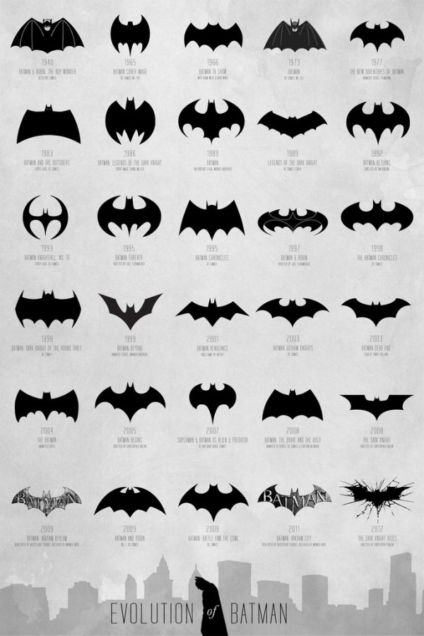
Evolution of the Batman Logo

Evolution of the Batman Logo infographic

The Evolution of Batman poster designed by Cathryn Lavery from Calm the Ham is a visual history of the Batman symbol over the years.  I can’t think of any consumer logo that has changed this much, but the Batman logo remains a very powerful and recognizable brand.

A comprehensive and extensive chart of the Batman logo evolution, spanning over 72 years from 1940 - 2012 to map the transformation of a timeless hero.  Thanks to DC Comics for creating this cultural icon that we can all obsess over, all logos belong to them.

The infographic timeline covers 72 years (1940-2012) and shows different version of Mr. Wayne’s logo so the reader can easily distinguish the different iterations.  Additional information like the year and media publication format are listed in text.  I would have liked to see them spaced out along an actual timeline, but this design format fits better on a standard poster.  Three different size posters are available from the Calm the Ham site.

I found this design on the FastCoDesign site, but a few other designers have also tackled this specific history.  Cathryn Lavery mentions this 2008 video from Rodrigo Alejandro Rojas Sandoval as being the first one she knows of that had attempted this:

I saw this design on Nathan Yau’s FlowingData site in 2010, but he wasn’t able to cite the original source.  This one shows fewer versions, and doesn’t include any additional information.