About
Randy Krum
President of InfoNewt.
Data Visualization and Infographic Design

Infographic Design

Infographics Design | Presentations
Consulting | Data Visualizations

DFW DataViz Meetup

Join the DFW Data Visualization and Infographics Meetup Group if you're in the Dallas/Fort Worth area!

Search the Cool Infographics site

Custom Search

Subscriptions:


Feedburner

The Cool Infographics® Gallery:

How to add the
Cool Infographics button to your:

Cool Infographics iOS icon

- iPhone
- iPad
- iPod Touch


Read on Flipboard for iPad and iPhone

Featured in the Tech & Science category

Flipboard icon

Twitter Feed
From the Bookstore

Caffeine Poster

The Caffeine Poster infographic

Entries in web (190)

Friday
Jul052013

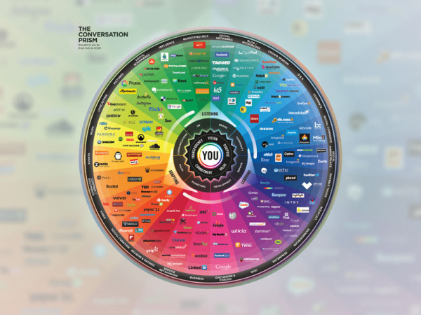
The Conversation Prism 4.0 for 2013

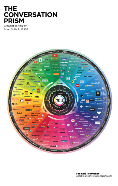
The Conversation Prism 4.0 for 2013 infographic

Brian Solis has released the new Conversation Prism 4.0, with updated companies and categories for 2013.  This project series has been a favorite on Cool Infographics since version 1.0 was released in 2008, and we haven’t seen an update since version 3.0 was released in 2010.

What is The Conversation Prism?

Developed in 2008 by Brian Solis, The Conversation Prism is a visual map of the social media landscape. It’s an ongoing study in digital ethnography that tracks dominant and promising social networks and organizes them by how they’re used in everyday life.

Version 4.0 brings about some of the most significant changes since the beginning. In this round, we moved away from the flower-like motif to simplify and focus the landscape. With all of the changes in social media, it would have been easier to expand the lens. Instead, we narrowed the view to focus on those that are on a path to mainstream understanding or acceptance. The result was the removal of 122 services while only adding 111. This introduces an opportunity for a series of industry or vertical-specific Prisms to be introduced so stay tuned.

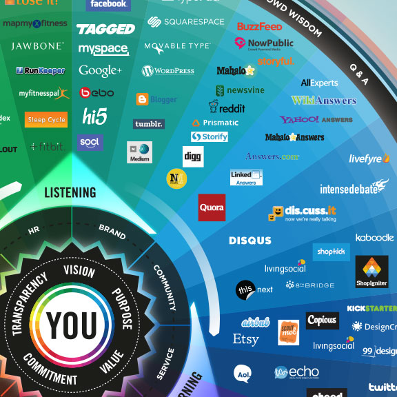
The Conversation Prism 4.0 for 2013 closeup

The design highlights the major companies in 26 different categories of social networking services.  This update loses the flower-like design style of the last three versions, and changes to a more straightforward circle with equal sized pie slices.

The inner circles have always been a little confusing for readers and marketers because the intent is that the inner labels can be adjusted depending on the user.  They don’t necessarily relate specifically to the services they are located near in the outer slices.

As a snapshot of the current social media landscape, this is a fantastic tool for marketers to consider the tools and services they want to engage for any particular campaign.  Three years was too long to wait for an update, since this landscape is changing and evolving very quickly.  That’s why 122 individual services were removed and 111 services were added. 

The Conversation Prism 4.0 for 2013 poster

The Conversation Prism 4.0 is available as a free high resolution JPG image download (great for computer wallpaper/desktop) of for purchase as a 22”x28” wall poster for $19.

Thanks to Jarred for sending in the link!  Also found on Mashable and The Next Web.


Tuesday
Jun182013

Design With Impact: A Guide to Webpage Anatomy

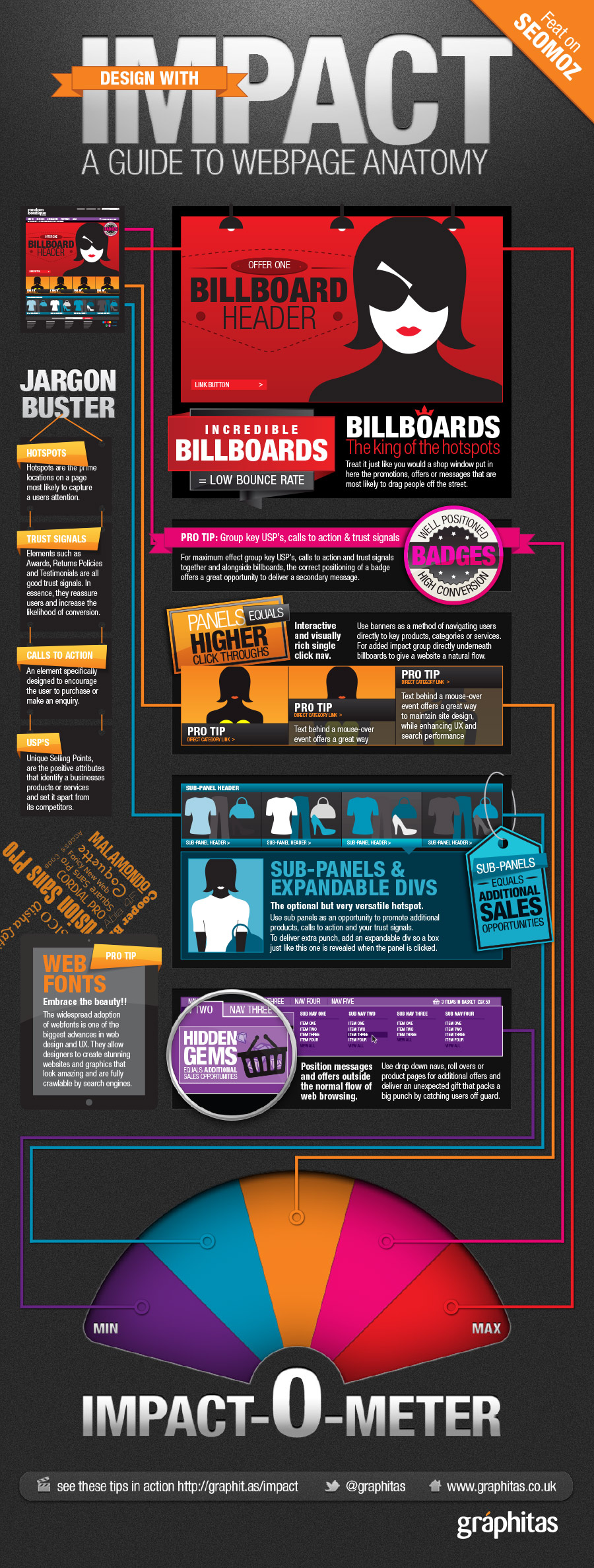
Design With Impact: A Guide to Webpage Anatomy infographic

Find out all the tips on how to design an impactful webpage with the Graphitas’ infogaphic, Design With Impact: A Guide to Webpage Anatomy.  See what you can and can’t live without on your webpage with the Impact-O-Meter.

As part of a my recent blog for SEOmoz on “Designing for SEO”, the team at Graphitas created an infographic to illustrate the impact of page positioning.

A lot of text in this design, but the information is strong and the design is visually impactful.  It’s missing a link to the original infographic page in the footer to help readers find the full size high-resolution verison.

Thanks to Justin for sending in the link!

Tuesday
May282013

Wireframe, Prototype and Simulator Tools

Wireframe, Prototype and Simulator Tools infographic

So what is the difference between Wireframe, Prototype, and Simulator Tools? This infographic compares how the products preform in terms of design capabilities, mobile integration, collaboration features, and interactivity. From User Testing, this infographic  helps guide you through the design making process of what program is right for you.

If you’re into building websites, mobile sites, or apps, you probably use some type of mockup tool—prior to coding—to help you envision how a site will work and look. But do you get customer feedback on them? In this ultimate guide, we’ll explore leading mockup tools — wireframing, prototyping, and simulating –and show you how to run user tests with them.

Good design that puts the icons and information directly into the visuals.

Also available as a PDF download.

Thanks to Liz for sending in the link

Thursday
Apr252013

The 2012 Adobe U.S. Digital Video Benchmark

Cool infographic video from the team at Adobe that shares the results of their own 2012 Digital Video Benchmark research.

As you relax at home, walk through stores, and sit in airports, you see people watching video on more screens than ever before. But don’t rely on the eyeball test. The Adobe Digital Index team looked at 19.6 billion video starts on media websites to confirm the growth of broadcast video consumption across connected devices. See the latest video trends they uncovered for device use, ad placement, social media, and more. 

Learn more about what they found here: http://adobe.ly/ZeXLoI.

Adobe Digital Index publishes research on digital marketing based on the analysis of anonymous, aggregated data from over 5,000 companies worldwide that use Adobe Marketing Cloud.

The information is about all videos and ad placements in online videos, but the data also applies to infographic videos.  Online videos are still on the rise, and have become a very effective content and advertising platform for companies.

Clean data visualizations that I would assume were created in Adobe After Effects.  The bar charts that change size and shape in multiple directions are disconcerting though.  I can’t tell if they were appropriately adjusting the area of each bar, but I doubt it.  It looks more like a designer thought it would look unique and different without realizing that it corrupts the visualization of the data.

Thanks to Jordan from Say It Visually for sending in the linK!

Tuesday
Apr022013

Social Network Overload

Social Network Overload infographic

How often have you checked your social media accounts today? Feeling unplugged is a problem for many people.  Social Network Overload from mylife.com talks about how people are addicted to social media, and what they rather do than give up their Internet lifeline. 

Afraid you’re missing something important on your email, Facebook, Twitter, or other accounts? You are not alone. Two out of three people feel the same way. In the same survey, three out of five people wished there was a solution to monitor their various communication options.

Here’s an interesting infographic based on a survey by Harris which illustrates a growing trend—social media overload

The isometric illustrations of people and the data visualizations are fun, and the light-hearted data makes this one appealing to share.  The design is missing the URL to the infographic landing page, so that readers can find the original when they see thie infographic posted on other sites.

Found on The Undercover Recruiter and Visual Loop.

Tuesday
Mar192013

Serif vs. Sans: The Final Battle

Serif vs. Sans: The Final Battle

Ever have a problem deciding whether to use Serif or Sans? The Serif vs. Sans: The Final Battle infographic from webdesignerdepot.com has broken down when and why you should use each one. The final verdict? Serif is better for print and Sans is better for web.

First it was the Capulets versus the Montagues; then it was Coke versus Pepsi; and the latest epic battle? Serif versus sans-serif, of course.

Lucky for us, the crew at UrbanFonts has produced a nifty infographic to help clarify the age-old rivalry between serif and sans. Brief, yet information-packed, it covers everything from DPI to classification, and expertly explains why serif is better for print and sans serif is best suited for web.

This clever infographic — that smartly draws upon humor to drive home its points — offers a simple, insightful conclusion that designers should bear in mind: “The best font choices are ones where readers do not notice the font … but the message.”

Thanks to Jordan from Say It Visually for sending in the link!

Friday
Feb222013

Cloud Computing: Fact or Fiction?

Cloud Computing: Fact or Fiction? infographic

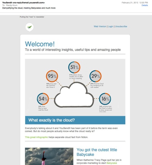
Cloud Computing: Fact or Fiction? is a new infographic from Devry University helping to explain the basics about cloud computing, and the clear up the common misunderstandings people have about the Cloud.

Cloud computing allows you to store, access and share data from Internet-connected devices in one central location.  As technology careers continue to grow across the U.S. and cloud computing creates nearly 14 million jobs by 2015, the Cloud is more important than ever.  Here are the fact you need to know about the Cloud - and the fiction than many believe.

This is a really clean and easy-to-read design, with a great color scheme.  The statistics to support each section are good, and clearly sourced in the long list of data sources in the footer.

The data visualizations are a mixed bag.  The doughnuts are easy to read and the percentage bars are clearly visualized as portions of 100%.  The 24% doughnut in the top visualization is wrong.  That will catch many people’s eye, and cast doubt on the rest of the visualizations.  Once you get one data visualization wrong, you lose credibility and people will more closely scrutinize the rest.

Why are other numbers not visualized?  The “cyber attacks” and “people using the cloud” statistics would have been easy to visualize, but now seem unimportant to the reader because they are just shown in text.


The most interesting thing is that I got this promotional, marketing email (image above) from YouSendIt.com highlighting this infographic and showing the top portion with the incorrect visualization.  As far as I know, Devry and YouSendIt are not related in any way, so this is just using someone else’s work for their own purposes.  

Of course, infographics are meant to be shared, but you shouldn’t claim credit for someone else’s work, especially in an email promoting your own commercial services.  By omitting any design credit to Devry in the email, the message implies that the infographic is coming from YouSendIt, so it looks like the YouSendIt designers messed up the data visualization.  The negative impression created by the false visualization will now also create a negative impression of the folks at YouSendIt.  Oops.

Friday
Feb222013

Top 250 Internet Retailers Q3 2012 Update

Top 250 Internet Retailers Q3 2012 Update infographic

Top 250 Internet Retailers Q3 2012 Update infographic from the Campalyst blog

Back in May we published an infographic about Top 250 Internet Retailers’ presence on social media. The infographic was perceived really well by our readers, customers and the media; thanks a lot to all the people sharing it on Facebook, Twitter, Pinterest and their blogs!

Now we are happy to present you with the Q3 update! Spoiler: those were two incredible quarters for Pinterest! Amazing growth in terms of the number of brands building their presence on Pinterest and the size of their communities!

I like the color scheme and the variety of data visualizations used in this infographic.  Bars, icons, arcs and proportional circles.  The use of the Internet retailer logos in the circles is especially effective.

I wish the Social Media site logos had been used, especially in the first three sections.  I shouldn’t have to read the text and match the color to figure out what the visualization represents.  That’s too much work for the reader.  How many people does each of the people icons represent in the “How Many Followers Do They Have?” section?  The lines look “relatively right”, but the number of icons seems to have no relationship to the actual numbers shown.

The footer needs both a copyright statement (or Creative Commons license) and the infographic landing page URL so readers can find the original when they see this posted on other sites (like this one!).  Many bloggers are not good about linking back to your original site correctly, and you want your audience to be able to find it easily.

Found on Fresh Peel and Visual Loop


Tuesday
Nov132012

Which Social Networks Take Home the Gold?

Which Social Networks Take Home the Gold? infographic

How popular is your favorite social network?  It is important to know if it is on the rise or decline because well, what is the use of a SOCIAL network with no one on it?  See which are on the rise and some interesting facts about who is on which social network with mashable.com’s Which Social Networks Take Home the Gold?

We love the Olympics, but an international social media showdown is a little more our speed.

Ignite Social Media is back with the 2012 Social Network Analysis Report, breaking down demographic, geographic and search data that shows which networks are the underdogs and which are mounting the winners’ podium.

Here at Mashable, we can’t get enough GIFs and hashtags. We’re excited to see that this type of digital currency is gaining value — Twitter and Tumblr are among the top five networks with the strongest rate of growth.PinterestReddit and LinkedIn round out the pack.

Launched just over a year ago, Google+ was included in the report for the first time this year but is notably absent from the list of fastest growing platforms. And while Facebook is actively continuing its quest for world domination, it’s hard to improve your growth rate when practically everyone’s already joined the club.

Check out the graphic below, with data based on a report from Ignite Social Media. It also features statistics about men versus women, the youngest skewing networks and which sites are luring in the whiz kids. The researchers at Ignite point out that social network search interest continues to remain stagnant, as it has since 2009.

The timeline trend charts are especially effective showing the rise (and fall) of many of the most popular and well-known networks.  Even though these are “simple bar charts”, they are incredibly effective in making the data easy to understand to the readers.  Although its explained in the footer, it would have been better to explain the  y-axis unit of measure along with the charts.

Found on mashable.com

Wednesday
Sep262012

How Much Does SEO Cost?

How Much Does SEO Cost? infographic

How Much Does SEO Cost? is generally a mystery in the online marketing world.  The range is certainly big, from under $50/month up to the unbelievable price of over $250,000/month!  This informative infographic shares the results of custom research from SEOmoz, and was designed by AYTM.

How much does SEO cost? How much time do you have to discuss the various models and prices out there! However, a new survey sheds some light on the subject.

Over 500 people and companies who offer search engine optimization services were asked about how their models. Turns out, it’s most common to charge $100 to $150 per hour, in the US. But by-the-hour consulting is only one of four nearly co-equal ways of charging.

Also popular is project-based pricing, where the average price is between $2,500 to $5,000, in the US. That’s also the same average price for those who buy on a monthly retainer basis. Fixed prices on a contract basis is also a popular way that SEO is sold, but no averages were provided.

The survey was conducted by SEOmoz and compiled into the infographic below by AYTM:

From a design standpoint, there are a lot of things I like about this infographic.  

The consistent columns for regions of the world make the layout very easy to follow.  The data is also organized nicely by starting with basic demographic data to provide a foundation to the reader before getting into “The Main Event” - the main research results.

The data visualizations are fairly simple, and very easy for the reader to understand.  I also like the variety of data visualization methods; no one wants to see all bar charts.  The color scheme is also simple, which visually implies a certain level of authority.  By taking complex data and designing simple visualizations, the design shows the readers that SEOmoz has a clear understanding of the content.

The actual values are not included in the design, which is disappointing.  Since this was custom primary research, I have no way to validate the data visualizations without seeing the data, and that reduces the credibility of the entire design.  From a sharing perspective, it’s hard to quote interesting statistics in a text Tweet or Facebook post without having the numbers to work with.

Legends are Evil!  My biggest complaint is their use of legends in a few sections.  In those charts, the colors are visually hard to differentiate, and the reader has to work very hard to understand which pie slice or bar goes with each color.  This is only a problem in the Agency Type and Common Client Types sections.  The rest do a good job of connecting the data labels directly to the visualization.

The footer should include some type of copyright statement, and the URL for readers to find the original infographic landing page.

Found on Visual Loop