About
Randy Krum
President of InfoNewt.
Data Visualization and Infographic Design

Infographic Design

Infographics Design | Presentations
Consulting | Data Visualizations

DFW DataViz Meetup

Join the DFW Data Visualization and Infographics Meetup Group if you're in the Dallas/Fort Worth area!

Search the Cool Infographics site

Custom Search

Subscriptions:


Feedburner

The Cool Infographics® Gallery:

How to add the
Cool Infographics button to your:

Cool Infographics iOS icon

- iPhone
- iPad
- iPod Touch


Read on Flipboard for iPad and iPhone

Featured in the Tech & Science category

Flipboard icon

Twitter Feed
From the Bookstore

Caffeine Poster

The Caffeine Poster infographic

Entries in companies (42)

Wednesday
Dec262012

Top 20 Field Service Management Software Solutions

Top 20 Field Service Management Software infographic

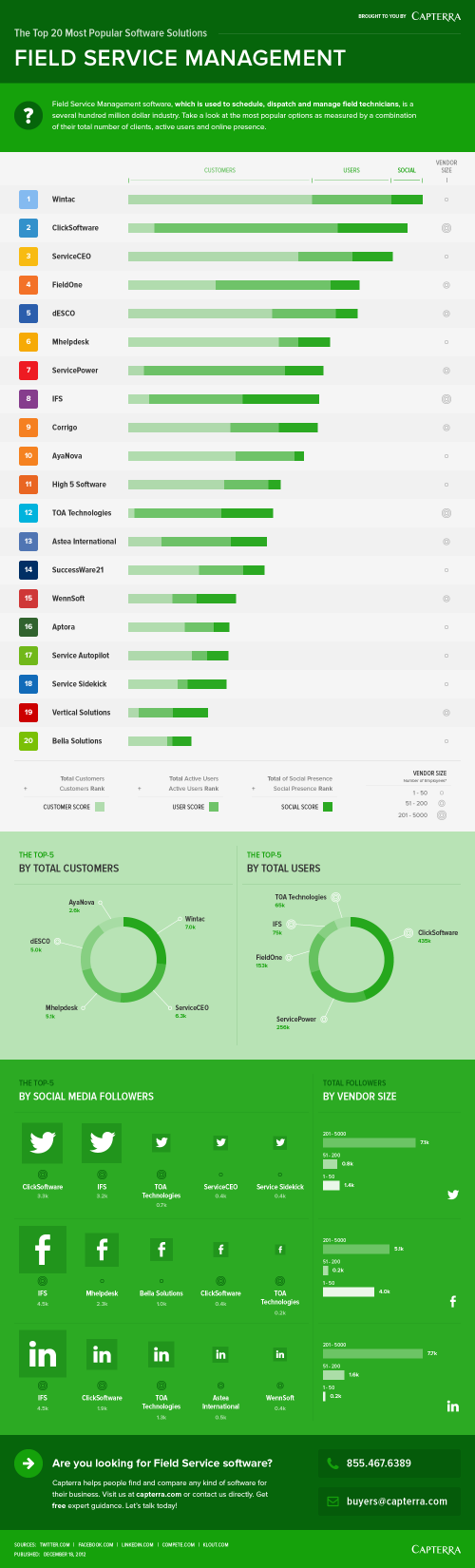
The new Top 20 Field Service Management Software infographic from Capterra continues their series of “Top 20 Most Popular” infographics for different software categories.  I’ve previously posted about the Top 20 Marketing Automation Software Solutions and the Top 20 Medical Records Software Solutions.

This design shows a little more detail behind how they score and rank the different software options.

Field Service Management software serves companies that send technicians or other employees into the field by helping them automate scheduling and dispatching. Below is a look at the most popular options as measured by a combination of their total number of clients, active users and online presence. In order to see a comprehensive list, please visit our Field Service Management Software Directory.

Capterra developed a popularity index consisting of three components to rank the field service management providers: number of customers (40%), number of end users (40%), and online presence (20%). The online presence metrics included traffic estimates from Compete.com, as well as the company’s number of LinkedIn followers, Facebook page likes, Twitter followers, and Klout scores – each weighted equally to comprise 20% of the vendor’s overall score.

The stacked bars to showing the three separate score metrics works nicely, and is a clear visual of the descending total scores.  The Rank numbers are in colored boxes that match the primary brand colors of each software company, but the readers don’t know that.  Without seeing the actual company logos, the colors just look random and create some unnecessary visual noise.

By not showing the company logos throughout the design, it’s harder for the reader to see where a particular company appears in the different sections.  A visual logo would be easy to recognize at a glance, but in just text, the reader has to read every entry to try to find a match.

Nice, clear Call-To-Action at the end of the design, so the target audience readers know what they should with this information.  The footer should also include a copyright statement and the URL link to the infographic landing page on Capterra’s site so readers can find the original, full-size version.


Monday
Dec172012

Facebookโ€™s Network of Worldwide Affiliates

Facebook's Network of Worldwide Affiliates infographic

From BusinessProfiles.com, this Facebook infographic takes a look at the complex virtual network of affiliates behind Facebook.

Earlier this week, Facebook’s proposed revisions to its legal agreements with users went into effect following a vote by the social network’s users. One of the changes means that Facebook can now share your data with its affiliates. But who exactly are Facebook’s affiliates? Most of the media coverage has focused on Instagram. But Business Profiles research can now reveal that Facebook has at least 67 Facebook affiliate companies worldwide. The results are summarized in today’s infographic.

I like this design, and it has some great information about what Facebook’s legal agreements really mean to members.  It’s a focused story that isn’t trying to tell the reader too much information.  The color scheme is so close to the official Facebook brand colors and design that it could easily be misunderstood as an official publication, which it isn’t.

The lack of clear title makes this infographic design hard to share.  Anyone that posts a link has to make up a related title, which will be very inconsistent.  The lack of clear title, also makes it more challenging for a reader to know why they should take the time to read the infographic.  The risk is being considered “just another infographic about Facebook” and ignored by readers.

The map data is clear and easy to read.  The affiliate connects are the most interesting part of this design.  When the privacy policy says they can share you personal information with Facebook Affiliates, this is who they actually mean.

We sourced this information from our own extensive corporate registration directory as well as from other public and subscription sources. Please note that not every jurisdiction makes comprehensive business registration readily available. As a result, there are likely even more Facebook affiliates than those listed above. However, we hope that this gives some sense of the extensive and rapidly expanding physical footprint of the social network.

Information sources were obviously a challenge, and the statement above is included under the design on the infographic landing page.  However, there is no Sources statement in the footer of the design itself, so when the infographic is shared on other sites there is no mention of where the data came from.  Infographic designs really need to have the data sources listing in the image file so they go with the infographic when shared online.

Found on Infographic Journal

Thursday
Dec062012

MHPM's Infographic CSR (Corporate Sustainability Report)

MHPM's Infographic CSR (Corporate Sustainability Report)

MHPM Project Managers has taken a different approach with the release their first CSR (Corporate Sustainability Report).  Instead of the normal text report that other companies release, MHPM created an infographic poster with all of their sustainability information.  It serves as a great example to their clients of how even CSR data can be designed in an engaging way.

MHPM Project Leaders passed a milestone towards integrating sustainable practices into its business operations today, with the release of its first annual corporate sustainability report.

MHPM’s corporate sustainability report evaluates MHPM’s impact on the environment and the community, its transportation practices and workplace policies. The findings reveal areas for improvement and provide a benchmark against which to measure future performance.

Designed by InfoNewt, this poster was printed at 24” x 36” by MHPM and is also available online on the Corporate Sustainability Report section of their website.  The front side of the post visualizes all of the data, and puts most of it into context by comparing to prior year results.  The back side of the design includes all of the required text, which keeps the front side less cluttered and easy to read.  The entire design is inspired by the Global Reporting Initiative’s guidelines.

This is a fantastic use of infographic design principles!  The full size, high-resolution poster is available as a PDF download from the CSR page.

Tuesday
Dec042012

Tracking Customers for Retail Profiling

Tracking Customers for Retail Profiling infographic

Is tracking customers purchases creepy? Decide for yourself! The You are Not Special, but Your Purchases are infographic from Camcode.com talks about profiling customers based on their purchases and then giving them a coupon that is relevant to them. Other companies like Dominos tracks when people buy pizza the most and discovered it was when it rains. So they base their campaigns on local weather patterns.

Did you know that major brands profile you based on what you buy? Retailers like Target and Domino’s Pizza gather and store this data via barcode technology, and they use it to determine everything from how best to market to you, which coupons you’re most likely to use based on your life stage, and what you might buy based on previous purchasing habits. Yes, they get all this from scanning a barcode! It’s what’s known as predictive technology, and major retailers use it to create database-driven consumer profiles to not only boost sales, but also to create more personalized buying experiences.

We decided to take a closer look at predictive technology and its role in consumer profiling. We did some digging and put together this infographic called, “You are Not Special, but Your Purchases are.”

I like how this design walks the reader through a easy to understand story about retail profiling.


  1. What is Retail Profiling?
  2. How does it benefit both consumers and retailers?
  3. What do customers find disturbing about tracking?
  4. Real-life case studies


Some of the dark red on red colored visualizations are hard to read, and the footer should include a copyright statement.  The brand URL back to Camcode.com is included, but there should also be a URL to the infographic landing page so readers can find the original high-resolution version. 

Thanks to Ashley for sending in the link!

Monday
Oct012012

Honda Accord: 30 Years of U.S. Production

Honda Accord 30 Years of American Craftmanship infographic

Honda Accord: 30 Years of American Craftmanship is a large infographic from Honda America that was released as part of the release of the new 2013 model design of the Honda Accord in August.  Designed by Jeremy Yingling with InfoNewt (my company) this is a very brand specific, marketing-style infographic.

IN 2012, HONDA WILL MARK 30 YEARS OF ACCORD PRODUCTION IN THE UNITED STATES.

The first Japanese nameplate manufactured in the U.S., the second-generation Accord first rolled off the Marysville, Ohio assembly line in November of 1982. In the 30 years since, more than nine million U.S.-built1 Accords have helped define American manufacturing craftsmanship. The all-new 2013 Honda Accord will once again redefine space efficiency and driving joy in the midsize class, signaling the start of Honda’s next three-decade chapter of building the Accord in America. 

The 2013 model becomes the ninth major design generation of the Accord.  This gave us the opportunity to highlight differences each major model design has brought to the Accord over the last 30 years.  The design visualizes the major technical specifications, the major advancements included in the Accord and shows the multi-year periods that each design generation was available.  The eye-catching color-waterfall shows the available exterior colors available for every model year, and the milestones along the left-side of the design show the progression to reach a cumulative total over 9 million Accords produced in 2012 coming out of the manufacturing plant in Marysville, OH.

Honda has done a great job of utilizing this one infographic design in a handful of different ways.  The infographic was initially used as 9’ banners at the Honda press events, and included in the press kits provided to everyone invited to attend.  Honda has now released the infographic online on the Honda News page on Flickr, making the design available to everyone.

Monday
Sep102012

BYOD: The Good, the Bad and the Ugly

 BYOD: The Good the Bad the Ugly infographic

“BYOD” Bring Your own Device. A great idea that can easily turn messy. Biztech has introduced the BYOD: The Good, the Bad and the Ugly infographic asking you to answer 6 easy but important questions before you launch into a BYOD situation. 

If your company is considering allowing employees to bring their own devices to work, make sure you have a game plan in place.

BYOD has freed up many enterprises from the responsibility of exclusively purchasing and maintaining computing devices, such as notebooks, tablets and smartphones, but companies still need to have policies set in place to make things work.

BizTech magazine has put together an infographic that highlights six core questions every company should consider before moving forward with BYOD:

  1. Who buys the devices?
  2. What’s the right policy?
  3. What’s the employee’s role?
  4. What’s the impact on IT?
  5. How do we tackle security?
  6. How about apps?

For each of these questions, we’ve outlined a good answer, which we’d advise you to follow; a bad answer, which probably isn’t the best way to handle things; and an ugly answer, which should be avoided at all costs. Hopefully, this will help your company remain on the pleasant side of this growing workplace trend.

The organization in this design is really well done.  After explaining the concept of BYOD, the infographic walks the reader through six questions and provides some stats and information about each aspect.  The text is short, the illustrations are relevant and entertaining and the information is valuable to companies.

One of the data visualizations is hard for the readers to understand.  Highlighting 72% of employers as six people icons is very odd (Use 10 icons for percentages), but then they correctly used 10 icons when visualization 70% of Cisco employees.  At the bottom of the infographic image, it’s missing a URL to the original infographic landing lage, and a copyright statement.

Thanks to Ricky for sending in the link!

Monday
Jul232012

True Colors: What Your Brand Colors Say About Your Business


True Colors: What Your Brand Colors Say About Your Business infographic

Does your companies brand reflect their business correctly? Check out True Colors: What Your Brand Colors Say About Your Business infographic from Marketo.

The most prominent brands in the world are defined by their colors. Think of McDonald’s golden arches, the name Jet Blue, and UPS’ slogan, “What can Brown do for you?” These companies, and many others, strategically use colors in their logo, website, and product to appeal to customers. As a B2B marketer, it’s important to think about how you utilize colors and what the colors you choose say about your business.

Research has found that different colors provoke very different reactions in people. Marketo choose to use the color Purple for branding because at the time Marketo was founded, purple was relatively un-used. Additionally, purple represents wealth, royalty, and richness which also has associations to leadership and revenue. Integrating your brand colors in your logo, landing pages, product, and more will help you achieve the highest impact. We put the rainbow under a microscope to find out how each color can help you connect with your consumers.

Designed by Column Five Media, this is a really good infographic.  The use of the specific colors in question make the design attractive and very easy to follow.  I also like the use of icons to show industries that use the different main colors.  The icons and bullet lists also help cut down on the amount of text the audience has to read.

A couple things I would change: 

  • There are a number of statistics at the top that should have been visualized instead of just making the fonts really big.
  • There are a number of what appear to be quotes from different sources about the power of colors, but the sources aren’t citied.  I assume they’re a part of the sources listed in the footer, but quotes should be immediately attributed.
  • Which Colors are Companies Using Most? adds up to 103%.  It’s not clear if these should be mutually exclusive or if the study counts multiple colors from the same company in the results.
  • The bottom should have a copyright and the URL link to the original infographic landing page. 

Thanks to Carra for sending in the link!

Tuesday
Jun262012

Client: Avoid the Dip from IPO Lockups

Wealthfront Lockup Avoid the Dip infographic

Avoid the Dip: The Effect of Lockup on Stock Price is a new infographic InfoNewt designed for Wealthfront.

A flood tide of shares is hitting the market in May and June, as a number of the high-profile tech IPOs from the fall emerge from lockup periods, including Jive Software (JIVE), Zynga (ZNGA) and Angie’s List (ANGI).

If you’re one of the employees of the 28 companies whose lockups are expiring in May or June, you’re wondering how to diversify your portfolio and when to sell.

Here’s our research on the question of what to do in the days immediately following the lockup expiration, presented visually to help you see the dip that typically follows the end of the lockup.*

As valuable financial information to many employees of the tech companies going IPO this year, Wealthfront looked back at 254 prior technology company IPOs to chart “The Dip” that consistently have a price dip the first day after the Lockup ends.

Don’t understand what a Lockup is?  That’s explained in the infographic as well.

Thanks to the team at Wealthfront!

Friday
May112012

Backpacking Basics

How to choose and use a backpack infographic 

Everyone loves the great outdoors! Well… until something doesn’t go as planned… With the informative How to Choose & Use a Backpack infographic from REI, enjoying roughing it without having to, you know, rough it.

Need a break from the daily multitasking merry-go-round? Trade in your digital devices for boots and backpacks—they’re your ticket to off-the-grid adventures and the wonders of the backcountry! With the right pack and a little preparation, you can head out for a day hike or a through-hike and say “CUL8R” to the daily grind. 

Many consumer products have an educational piece to them, and the challenge for a retailer is to educate their customers without feeling like a hard-sell ad.  This infographic does a great job of educating and informing their audience without listing available products, brands or any pricing.  It’s just purely informative, and adds to REI’s brand credibility.

The design is a little text-heavy for my taste, but it’s packed with information.  Some of the data in the text of the design could also have been visualized to make it easier for the reader to comprehend.  Weight ranges, lengths and the number of items that fit in the backpack would have been great visuals.

I don’t mind the URL link to the REI Backpack products page, but there should also be the URL to the original infographic landing page.  When people share this online with their firends as an informative piece, they will want to share the infographic URL.  There should also be a copyright statement at the bottom.

Thanks to Ron for sending in the link!

Monday
Apr302012

Just How BIG Is Apple?

Watch out New York! There’s a new Big Apple in town! The Just How BIG Is Apple? infographic from bestcomputersciencedegrees.com illustrates how important Apple really is to us.  Pardon me while I check a text on my iphone and post this with my Mac…

It is the first company to successfully pivot from computer maker to device maker. And its devices are now ubiquitous, its annual new product releases are among the most anticipated in the world and it recently announced it would begin issuing a dividend to its stock owners expected to generate $10 billion in the first year alone. There is also speculation that Apple will enter into the payments market in the near future (allowing its handheld products to serve in the same fashion as a credit card). This alone would turn them into a trillion dollar company.

Love this clean, easy-to-read design.  I understand the sized red bars surrounding the world map, but the GDP values are so close to each other that this visualization makes it very hard to compare between countries.  A rose diagram behind the world map might have worked much better.

I love the use of the company logos to make the bar chart more visual.  The work “billion” could have been removed from each of the values, and made into the chart scale.  There’s one bar between Google and P&G that is missing it’s company logo.  The bar chart makes this very easy for the reader to compare values between the companies, and it should identify the date these market capitalizations were gathered since these values change every day.  It also needs a copyright statement, and the URL of the origianl infographic post so readers can get back to the original high-resolution infographic. 

Found on Infographic Journal