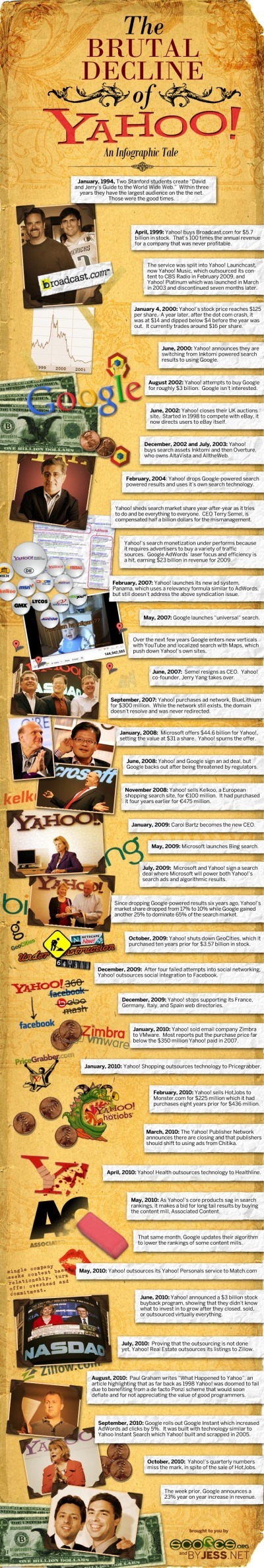
Designed by our friend, Jess Bachman, this one relies heavily on visuals related to the events on the timeline over the last 16 years. A little text heavy for my tastes, but I had forgotten at least half of this stuff that Yahoo! messed up. It’s a little amazing that they’re still as big as they are.
Google has a dominate market share of a very important gateway; internet search. Can they stay impartial when they have their own products to pitch? Whether or not they are a monopoly is up to the government and the best way to predict the future is to look to the past. Examining these four historical monopolies, and their outcomes, should give us a better sense of Google’s fate.
Brian Solis and JESS3 have released v3.0 of The Conversation Prism for 2010. The Conversation Prism is a great infographic showing the major players in each of 28 different online conversation categories. The original 1.0 version from August 2008 (image available on Flickr) only had 22 categories, and some of those only had one player.
You can buy the poster (I’ve got v2.0 hanging in my office) for $20, or there are also some great multi-pack deals for 3 posters for $40 or 4 posters for $50.
One of the best projects I’ve worked on is to use this idea to help companies map out their own corporate online strategy. Which if these categories and tools are you trying to use to drive your business? My advice, don’t try them all, be targeted about which ones are best to reach your target customers. Use this as a guide, but make your own company-specific conversation prism.
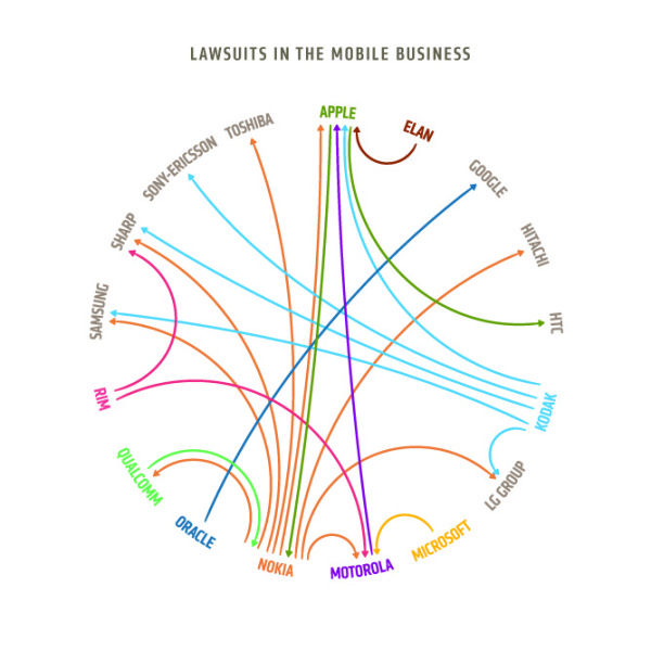
An attempt at redesigning this chart from The Guardian to make the plaintiffs and defendants a bit more clear.
Although this doesn’t add the additional data dimensions of company revenues like “Who’s Suing Whom?”, this diagram is much easier to read and understand than the originals.
Who’s Suing Whom is a great infographic design improvement by David McCandless from InformationIsBeautiful.net. David took existing diagrams (which were pretty poor) from The Guardian and the NY Times, and created a much more compelling and information-rich infographic. My feeling from the news is that there are many more lawsuits that these, but I don’t know the data.
I thought those charts generated more questions than they answered. So, as ever, I tried to answer the obvious questions and convey various contexts simultaneously.
I wondered, too, if I could design the connections so the lines didn’t cross. Almost managed it!
And see if there was a relationship between dropping revenues and litigiousness. What do you think? Is there?
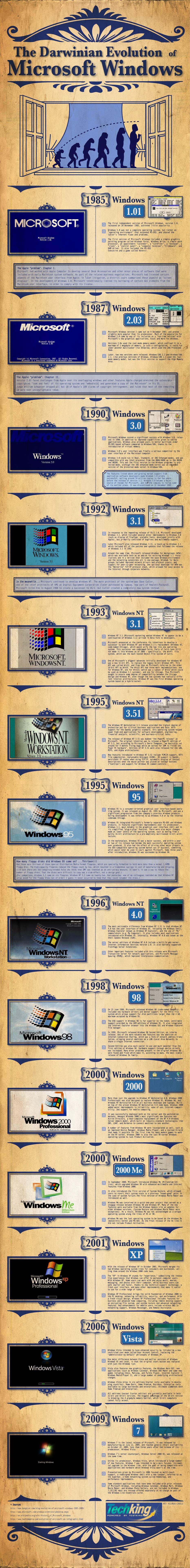
This is a cool infographic timeline, showing the Darwinian Evolution of Microsoft Windows from version 1.0 in 1985 up through the current Windows 7 in 2009. Although it makes for a really tall infographic, I love seeing the visuals of the startup screens and the desktops.
Art is credited to Richard Cavolo, and the project is from TestKing.com (even though I can find no mention of it on their site). It was posted on BitsandPieces.us
Update on Tuesday, October 5, 2010 at 11:00AM by
Randy
I found the release post from the future on Testking.com. I say “from the future” because the post is dated October 10th, 2010.
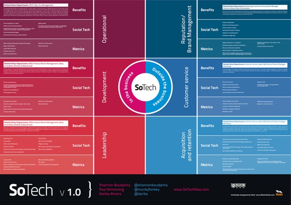
The SoTech Infographic v1.0 was released during the Social Collective 2010 Conference in London last week as a visual way to show how social networks interact with the different functions of business. The infographic was created by Hold, a Brighton based graphic design studio.
Introduced at Social Collective, Darika Ahrens, Shannon Boudjema + Paul Armstrong presented an infographic (created by http://www.wearehold.com) that demonstrates how social technologies work within a business + outside a business -
The infographic is available in a number of formats, like PDF and JPG, Scribd and Slideshare. An online copy of the presentation from the conference is below (using Prezi, a great visual presentation tool!). I agree with their thoughts on using infographics as a conference tool as well.
Both on the SoTech Now website, and the email I got from Paul Armstrong, is the invitation to heavily critique this v1.0 of the infographic. They would like to develop and release v2.0, but are looking to incorporate all of the feedback they can get. Leave comments below or on the SoTechNow site with your own reactions.
Here are some of my initial thoughts (mainly on the design):
Very text heavy.
Readability is low. I’m a fan of big infographics that allow you to zoom in and dig deeper into the details, but in this version, by the time you zoom in close enough the read the text, you’re too close to understand the context.
Use icons, at least for the different business functions
Show examples of sites in each of the “Social Tech” sections. Otherwise it seems like wishful thinking that there is a product that successfully does each of these functions.
Show examples of the metrics. Are these actually quantifiable?
I think the infographic does provide a great framework to either develop a social plan, or to evaluate an existing plan. It would be fascinating to review a company’s efforts using this framework as an example of social media being used successfully (or not) by a corporation.
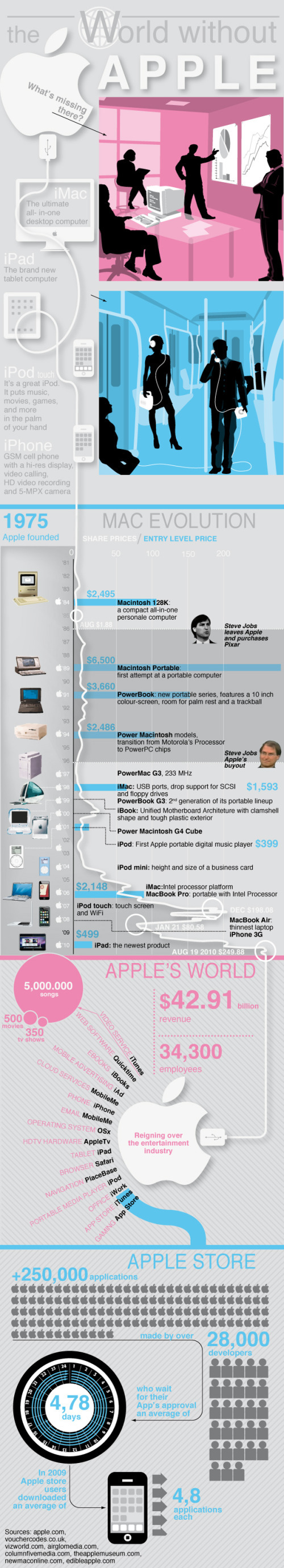
The World Without Apple, from Infographic Labs is a great design. The main feature combines the history of Apple’s products in a timeline with its stock prices and new product introduction prices. Also included are some statistics about the app store and all of the different aspects to Apple’s business.
The AppleGazette team asked us to analyse the complete product timeline and stock value of the Cupertino based company. The result is another stunning graphic, first published at AppleGazette.
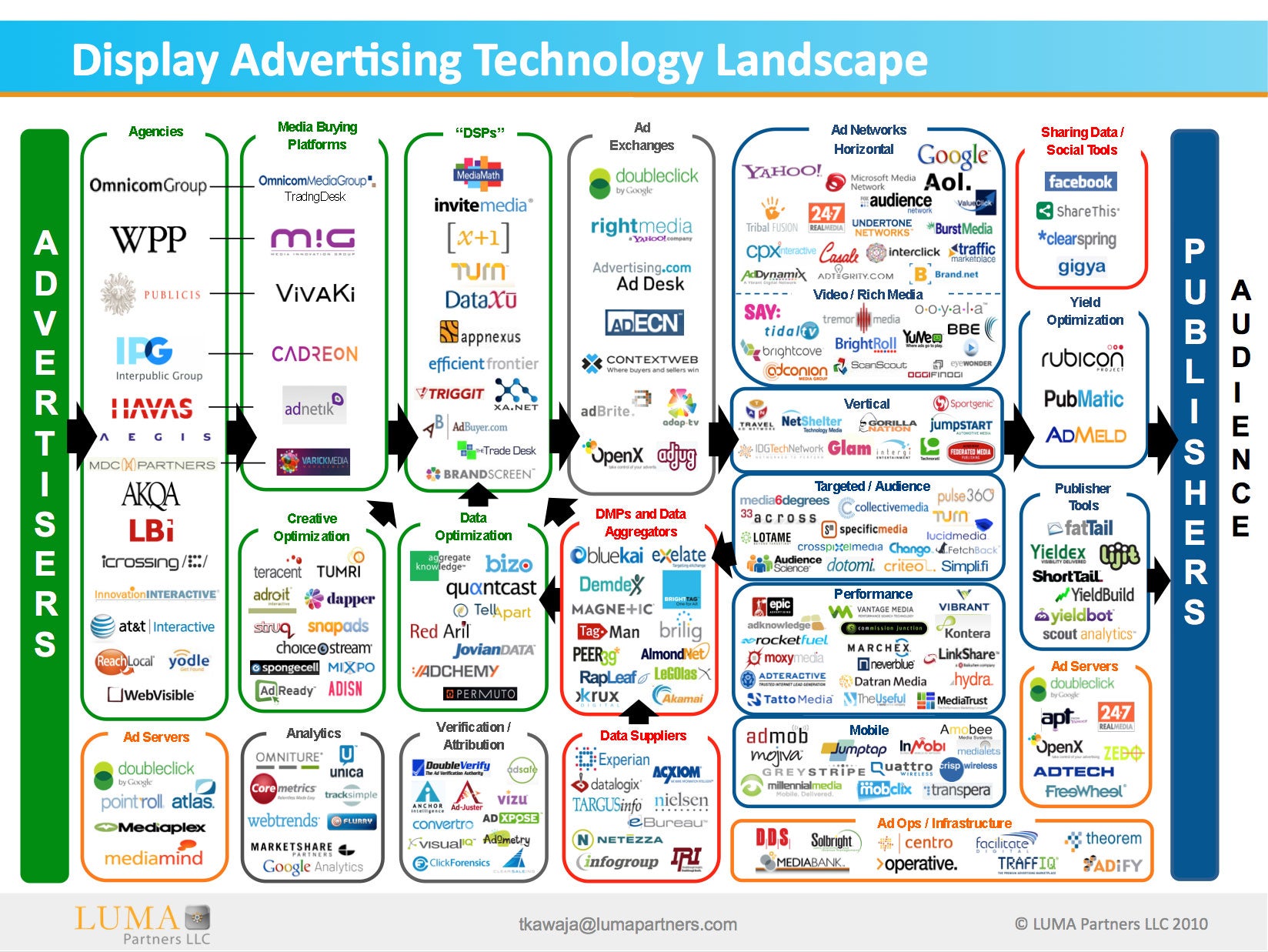
Developed by Terence Kawaja of LUMA Partners, the Display Advertising Technology Landscape makes an attempt to map out the companies involved in this ever-changing business. This is his latest version, but even he admits that his chart is far from perfect.
By definition the chart will never be final since the space is so dynamic. I am still discovering companies.
A few things to bear in mind. This chart is far from perfect. Organization of such a fragmented and dynamic industry is flawed by its very nature. Many companies operate across several categories and there are distinctions within categories. This chart does not include many of the search players which are increasingly overlapping with display nor does it reflect whole categories such as lead generation and ecommerce which likewise utilize display advertising in their funnel, not to mention international companies which are barely reflected. At some point in the future I may construct an uber landscape which captures these and other players.
I believe we are in for some interesting times as the space rationalizes and consolidates along with the advent of new strategic entrants.
I applaud Terence in his attempt to visualize this complicated business environment that he works with. Even if it’s not perfect, it certainly helps readers understand this business better by making it visual. You certainly don’t have to be a graphic artist to make useful infographic, and I think Terrance has made a step in the right direction. I look forward to seeing future versions.
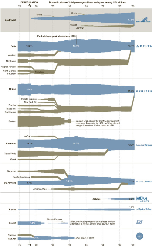
I really like this one from the NYTimes.com. Converging Flight Paths visualizes the airline mergers over time from 1975 to today, but also shows the “Domestic share of total passengers flown each year.”
The deregulation of the airline industry in 1978 led to a wave of mergers that continues to this day. But even as the legacy carriers have been consolidating and growing, they have been losing market share to low-cost carriers. Two of them, SouthWest and AirTran, have just agreed to merge and carried the most domestic passengers in 2009 combined. But if international passengers were included, this ranking would be greatly rearranged.
By KARL RUSSELL/The New York Times. Sources: American Transport Association (passenger data 1975-89); Bureau of Transportation Statistics (passenger data 1990-2009)


 brand,