About
Randy Krum
President of InfoNewt.
Data Visualization and Infographic Design

Infographic Design

Infographics Design | Presentations
Consulting | Data Visualizations

DFW DataViz Meetup

Join the DFW Data Visualization and Infographics Meetup Group if you're in the Dallas/Fort Worth area!

Search the Cool Infographics site

Custom Search

Subscriptions:


Feedburner

The Cool Infographics® Gallery:

How to add the
Cool Infographics button to your:

Cool Infographics iOS icon

- iPhone
- iPad
- iPod Touch


Read on Flipboard for iPad and iPhone

Featured in the Tech & Science category

Flipboard icon

Twitter Feed
From the Bookstore

Caffeine Poster

The Caffeine Poster infographic

Entries in corporations (104)

Tuesday
Jan292013

How Social Sites Make Money

How Social Sites Make Money infographic

The number of social media followers are growing. But how do the sites make a profit? How Social Sites Make Money infographic from usbundles.com tells you which social media websites make money with ads, or paying customers, or mobile apps, or affiliates.

We turn to social media services to stay connected more and more each day. But even with hordes of devoted followers, how do these social sites manage to turn a profit?

Here’s a quick look at which revenue streams help major social networking companies go from social service to successful business.

Nice use of a Venn Diagram.

The doughnut charts aren’t accurate.  Like the designer eye-balled them instead of doing the calculation.  For example, the 71% doughnut is actually visualizing a value of 66.6% (2/3).

Found on http://socialtimes.com/how-social-sites-make-money_b91551

Monday
Dec172012

Facebookโ€™s Network of Worldwide Affiliates

Facebook's Network of Worldwide Affiliates infographic

From BusinessProfiles.com, this Facebook infographic takes a look at the complex virtual network of affiliates behind Facebook.

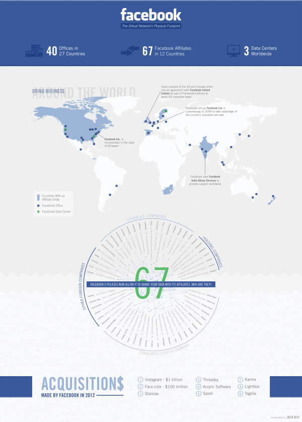
Earlier this week, Facebook’s proposed revisions to its legal agreements with users went into effect following a vote by the social network’s users. One of the changes means that Facebook can now share your data with its affiliates. But who exactly are Facebook’s affiliates? Most of the media coverage has focused on Instagram. But Business Profiles research can now reveal that Facebook has at least 67 Facebook affiliate companies worldwide. The results are summarized in today’s infographic.

I like this design, and it has some great information about what Facebook’s legal agreements really mean to members.  It’s a focused story that isn’t trying to tell the reader too much information.  The color scheme is so close to the official Facebook brand colors and design that it could easily be misunderstood as an official publication, which it isn’t.

The lack of clear title makes this infographic design hard to share.  Anyone that posts a link has to make up a related title, which will be very inconsistent.  The lack of clear title, also makes it more challenging for a reader to know why they should take the time to read the infographic.  The risk is being considered “just another infographic about Facebook” and ignored by readers.

The map data is clear and easy to read.  The affiliate connects are the most interesting part of this design.  When the privacy policy says they can share you personal information with Facebook Affiliates, this is who they actually mean.

We sourced this information from our own extensive corporate registration directory as well as from other public and subscription sources. Please note that not every jurisdiction makes comprehensive business registration readily available. As a result, there are likely even more Facebook affiliates than those listed above. However, we hope that this gives some sense of the extensive and rapidly expanding physical footprint of the social network.

Information sources were obviously a challenge, and the statement above is included under the design on the infographic landing page.  However, there is no Sources statement in the footer of the design itself, so when the infographic is shared on other sites there is no mention of where the data came from.  Infographic designs really need to have the data sources listing in the image file so they go with the infographic when shared online.

Found on Infographic Journal

Thursday
Dec062012

MHPM's Infographic CSR (Corporate Sustainability Report)

MHPM's Infographic CSR (Corporate Sustainability Report)

MHPM Project Managers has taken a different approach with the release their first CSR (Corporate Sustainability Report).  Instead of the normal text report that other companies release, MHPM created an infographic poster with all of their sustainability information.  It serves as a great example to their clients of how even CSR data can be designed in an engaging way.

MHPM Project Leaders passed a milestone towards integrating sustainable practices into its business operations today, with the release of its first annual corporate sustainability report.

MHPM’s corporate sustainability report evaluates MHPM’s impact on the environment and the community, its transportation practices and workplace policies. The findings reveal areas for improvement and provide a benchmark against which to measure future performance.

Designed by InfoNewt, this poster was printed at 24” x 36” by MHPM and is also available online on the Corporate Sustainability Report section of their website.  The front side of the post visualizes all of the data, and puts most of it into context by comparing to prior year results.  The back side of the design includes all of the required text, which keeps the front side less cluttered and easy to read.  The entire design is inspired by the Global Reporting Initiative’s guidelines.

This is a fantastic use of infographic design principles!  The full size, high-resolution poster is available as a PDF download from the CSR page.

Monday
Apr302012

Just How BIG Is Apple?

Watch out New York! There’s a new Big Apple in town! The Just How BIG Is Apple? infographic from bestcomputersciencedegrees.com illustrates how important Apple really is to us.  Pardon me while I check a text on my iphone and post this with my Mac…

It is the first company to successfully pivot from computer maker to device maker. And its devices are now ubiquitous, its annual new product releases are among the most anticipated in the world and it recently announced it would begin issuing a dividend to its stock owners expected to generate $10 billion in the first year alone. There is also speculation that Apple will enter into the payments market in the near future (allowing its handheld products to serve in the same fashion as a credit card). This alone would turn them into a trillion dollar company.

Love this clean, easy-to-read design.  I understand the sized red bars surrounding the world map, but the GDP values are so close to each other that this visualization makes it very hard to compare between countries.  A rose diagram behind the world map might have worked much better.

I love the use of the company logos to make the bar chart more visual.  The work “billion” could have been removed from each of the values, and made into the chart scale.  There’s one bar between Google and P&G that is missing it’s company logo.  The bar chart makes this very easy for the reader to compare values between the companies, and it should identify the date these market capitalizations were gathered since these values change every day.  It also needs a copyright statement, and the URL of the origianl infographic post so readers can get back to the original high-resolution infographic. 

Found on Infographic Journal

Thursday
Mar082012

Airbnb's Global Growth

Airbnb has released a fantastic infographic, Airbnb’s Global Growth, sharing their own stats about their phenominal growth from August 2008 to February 2012.

Airbnb started in Brian and Joe’s San Francisco apartment. Today, more than five million nights have been booked on Airbnb. And although Airbnb’s roots are in the USA, more than 75% of all reservations last year were international - where either the traveler or host (or both!) was outside the United States. Check out our infographic celebrating the international growth that you’ve powered.

I think an infographic is a great way for a company to share it’s story with it’s executives, it’s shareholders, the press and the public in general.  Infographics are visual storytelling, and every company has a story to tell.

The design is beautiful!  They’ve included a wide variety of data visualization types: area chart, doughnut chart, maps, bars and illustrations.  The one complaint I have is that too many of the stats are just shown in large text.  Large fonts don’t make good data visualizations.

They made an interesting choice and included the URL for a separate page on their website about the Airbnb service, instead of linking back to the original infographic.  I know they want to promote their service, but I think this is a mistake, because a reader has to search through their blog posts to find the infographic.  A couple things missing from the bottom: a copyright statement and credit to the designer.

Thanks to Slavik for sending in the link!

Friday
Mar022012

The Genealogy of Automobile Companies 

A brand new infographic poster designed by Larry Gormley at HistoryShots.comThe Genealogy of U.S. Automobile Companies visualizes over 100 years or corporate history of car company mergers, acquisitions and closures.

A flowing history of more than 100 automobile companies across the complete time span of the automobile industry. From 1900 to 1925 over 3,300 organizations were formed to produce automobiles in the United States. In 1910 alone 400 new startups entered the industry. Most attempts lasted less than two years. While car sales exploded (from 1910 to 2010 US sales rose from 200,000 to 11.5 million cars) the strongest entrepreneurs bought out rivals and combined forces. Today, ten companies account for about 90% of all US automobile sales.

This graphic uncovers and explains how the industry was created and how it arrived at its present form. At the core is a full genealogy of over 100 companies from the Big Five to the small defunct companies. Folded into the genealogy is the relative market share of US sales for each company.

The Big Five car companies have unique colors, and all of the other companies are color-coded into categories of he trest of the Top 20, defunct companies and other interesting or famous companies.  The thickness of the lines change over time to represent market share.

You can buy a copy of the 38” x 23” poster for $29.95 over at HistoryShots.com

Thanks to Larry for sending in the link!  Great design!

Wednesday
Feb292012

The Startup Ecosystem: Predator vs. Prey

The Startup Ecosystem: Predator vs. Prey is a fun but informative infographic from udemy.  It looks at the different roles related to tech startup companies in an amusing way by personifying them as fish in the sea.

The startup waters are murky and full of hidden dangers. Below the surface, the ecosystem rests in a delicate balance between predators and prey.

To help you navigate these stormy seas, we’ve created the infographic below. Read on to find out where you stand in the startup food chain.

This one is light on data, but does convey valuable information to the reader.  The visual scale of Ubiquitous to Endangered is easy to understand, and the color coding is consistent throughout the design.

Found on Best Infographics

Thursday
Feb162012

The Changing Role of the CIO

The Changing Role of the CIO infographic from Wikibon explores the varying roles of the CIO. The prominence of the CIO position has risen greatly as information technology has become an increasingly important aspect of the modern organization.  The amount of information that companies ahve to deal with and make sense of is only going to continue to increase.

CIOs today have a top operational and strategic priority (not technology priority) to support the mission of the business through the application of technology. While they are under pressure to reduce costs, CIOs must deliver agility and efficiency to the organization. The CIO is also VERY concerned about risk. CIOs don’t want to disrupt what’s working while chasing new opportunities.

Think of the CIO as managing a portfolio of applications, technologies, people and processes. The technology portfolio is allocated to initiatives that are designed to 1) Run the business 2) Grow the business and 3) Transform the business. Like a good portfolio manager, the CIO must balance risk and reward by allocating resources in a balanced manner. The degree of risk is a function of the objectives of the board of directors and the strategic plan and operating plans of the companies.

I really like the topic, and the information covered in this design.  However, there isn’t a clear path for the reader to follow the information story down the design.  It’s crowded, and has different data scattered throughout the design.

Four things are missing from the bottom of the design: a copyright statement, the URL where readers can find the original infographic landing page, credit to the designer(s) and SOURCES.  Where did the data come from?  Why should we believe it?

Thanks to Jay for sending in the link!

Friday
Nov182011

Project Prediction: Demystifying Parametric Cost Estimation

Project Prediction: Demystifying Parametric Cost Estimation is a new infographic from Galorath.com, and is really an advertisement for their Seer service.

Infographics have a huge potential for use in advertisements, brochures, product packaging, etc.  This one started off nicely with minimal text, using icons and illustrations of the different product abilities, but fell apart into a whole lot of text at the end.

I’m pretty sure I still don’t understand what “Parametric Cost Estimation” does.

Tuesday
Oct252011

What is a Stock?

What is a Stock? from Mint.com explains what stock ownership is.  It’s informative to the readers (a little text heavy), and doesn’t come across like an ad.

To make investment choices that ultimately pay off, you need to start by knowing the fundamentals. It’s a step many investor wannabes skip, since… well, studying the basic terms and trends is not exactly entertaining. We thought one way of helping you get a jumpstart on your basic investing terminology is a series of infographics that explain, visually, basic concepts. First up: what is a stock?

This is a good example of what I call the Online Lifespan of an infographic.  Instead of an infographic about a recent news topic, this one covers an informational topic that doesn’t change or drop out of the news cycle.  It’s more than a year old, but the information is still relevant, and continues to drive traffic for Mint.  This design probably has an Online Lifespan for 4-5 years before the Dow Jones chart at the bottom makes the whole infographic feel dated.

What’s the line chart in the middle?  It’s a timeline, but the height of the line chart has no meaning whatsoever.  This should have shown some type of information, but instead is just confusing to the reader.

Thanks to Dawn for sending in the link!