About
Randy Krum
President of InfoNewt.
Data Visualization and Infographic Design

Infographic Design

Infographics Design | Presentations
Consulting | Data Visualizations

DFW DataViz Meetup

Join the DFW Data Visualization and Infographics Meetup Group if you're in the Dallas/Fort Worth area!

Search the Cool Infographics site

Custom Search

Subscriptions:


Feedburner

The Cool Infographics® Gallery:

How to add the
Cool Infographics button to your:

Cool Infographics iOS icon

- iPhone
- iPad
- iPod Touch


Read on Flipboard for iPad and iPhone

Featured in the Tech & Science category

Flipboard icon

Twitter Feed
From the Bookstore

Caffeine Poster

The Caffeine Poster infographic

Entries in education (65)

Thursday
Dec202012

Fire Code Regulations for Live Christmas Trees in Schools

Fire Code Regulations for Live Christmas Trees in Schools infographic

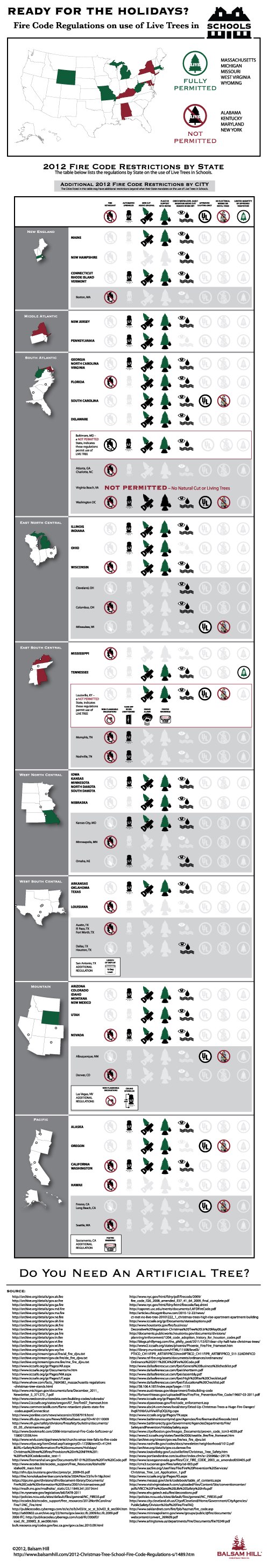
Fire Code Regulations for Live Christmas Trees in Schools is an informational infographic from the team at Balsam Hill, an online retailer for artificial Christmas trees.  This design is meant to help school officials and purchasing agents all over the country, and not really intended for the general public online.

Setting up a real Christmas tree in a school requires detailed knowledge of a state’s Christmas tree fire code. School fire code regulations for real Christmas trees vary by city and state, and can be overwhelming to puzzle out due to a confusing and sometimes conflicting set of rules. The Balsam Hill Christmas Tree Company has compiled each state’s school fire code regulations for live trees into an infographic for schools and school districts to reference. Look through the infographic to help you decide whether or not an artificial Christmas tree may be a more practical alternative for your school this holiday season.

From a marketing perspective, this design succeeds tremendously.  The overall message is clear: “Regulations around live Christmas trees in schools are complicated.  An artificial tree would be much easier.”  Balsam Hill put together a ton of research (look at the number of sources!), and even though they were able to gather the state level regulations, many cities, counties and individual school districts have their own regulations that may be contradictory.  A number of major cities with different regulations than their state are highlighted, but that list is incomplete.  It only shows a few cities that have different regulations to let the reader know that state level fire codes aren’t the only regulations that schools have to follow.

The design does a good job of clarifying very complicated information, but that can only go so far.  The regulations are actually very complex, so this is still a very long design to thoroughly visualize the data.  Great job using visual design to help readers understand a very complex issue!

You can see additional designs that also cover the regulations for Hotels and Churches.

Friday
Dec072012

Nobel Prizes and Laureates Timeline Visualization

Nobel Prizes and Laureates Timeline Visualization 

Nobel Prizes and Laureates is great visualization from the Milanese design firm Accurat.  From 1901-2012 this information design breaks down the winners by category, age, principal university affiliates and even hometowns.

The high-resolution version is available on Visualizing.org

The visualization explores Nobel Prizes and Laureates from 1901 to 2012 analyzing the age of recipients at the time prices were awarded, average age evolution through time and distribution among categories, grade level, main affiliation universities and principal hometowns of the laureates.

Designed as a part of an ongoing series for the Milanese newspaper Corrierre della Sera, La Lettura is a culture supplement.  You can see this design and the rest of the series in the collection on Visualizing.org.

The timeline takes a lot of information, and makes it easy to understand for the readers.  I especially appreciate the transition from line chart of ages to the bar chart of education grade levels to the sankey diagram of universities at the right end of the timeline.  Beautifully done.

Each dot represents a Nobel laureate, each recipient is positioned according to the year the prize was awarded (x axis) and age of the person at the time of the award (y axis).

Found on FastCoDesign

Thursday
Aug232012

The Rising Cost of Higher Education

The Rising Cost of Higher Education infographic

The Rising Cost of Higher Education from SchoolTutoring Academy does a good job visually showing the reader how quickly the price of college educations have risen.

Attending a college or university represents a significant investment for families. Tuition fees have continued to rise which has made it increasingly difficult for families to accurately budget and save. This problem is exacerbated for low and middle-income families where tuition fees as a percentage of median family income has increased significantly. Learn how affordable tutoring can help your child.

The design gets to the point immediately.  If the reader only looks at the top portion of the infographic (without scrolling down) they still walk away understanding the key message of how dramatically college costs have risen as a percentage of the median family income.  However, I don’t see any indication that the values have been adjusted for inflation or not.

I also like the concentric doughnut graphs that are used with consistent colors to show the same 8-year comparison for different income level families.  The line chart comparison of annual costs is also clear and easy to understand.

The lower portion of the design becomes too text heavy, and begins to show data values in text without visualizing them.  This is where the design will start to lose readers by trying to convey too much text information.  What is the icon in the description of Private Loans?

The bottom of the design is missing a copyright (or Creative Commons) license and should also include the URL to the infographic landing page where readers can find the original, high-resolution version.

Friday
May252012

NASCAR 101: The Beginner’s Guide to NASCAR

NASCAR 101 The Beginner’s Guide to NASCAR infographic

Have you ever watched NASCAR? Apparently, its the 2nd most popular professional spectator sport in the U.S.! However, if you haven’t, the NASCAR 101: The Beginner’s Guide to NASCAR infographic from Quicken Loans Racing gives an illustrated breakdown of the 2012 Sprint Cup Series.

By now you’ve heard that Quicken Loans is dipping our toes in the whole NASCAR sponsorship world. We’re new to the whole thing, so we decided to put our creative heads together and make a super cool, fun-for-your-eyeballs NASCAR 101 infographic to explain the basics of NASCAR!

Maybe you’re new to racing and could use an introduction?  

Maybe you’re a superfan and you want to help your uninformed friends/family members/random people on the street realize the awesomeness of stock car racing?  

Maybe you like beautifully-designed artwork that is not only pleasing to the eyes but chock full of neat info?


Check it out.

This is a cool infographic design that does a fantastic job of communicating the basics.  Bold color scheme that uses the black background and textures to embody racing.  Simple, clear visualizations that are easy for the reader to understand.  Not too many stats or information crowded into the design to keep the overall design clean.

At the bottom, there should be a copyright statement and the URL to final the original landing page.  I linked back to the original landing page here, but not everyone will.

Found on TopSpeed.com


Friday
May112012

Backpacking Basics

How to choose and use a backpack infographic 

Everyone loves the great outdoors! Well… until something doesn’t go as planned… With the informative How to Choose & Use a Backpack infographic from REI, enjoying roughing it without having to, you know, rough it.

Need a break from the daily multitasking merry-go-round? Trade in your digital devices for boots and backpacks—they’re your ticket to off-the-grid adventures and the wonders of the backcountry! With the right pack and a little preparation, you can head out for a day hike or a through-hike and say “CUL8R” to the daily grind. 

Many consumer products have an educational piece to them, and the challenge for a retailer is to educate their customers without feeling like a hard-sell ad.  This infographic does a great job of educating and informing their audience without listing available products, brands or any pricing.  It’s just purely informative, and adds to REI’s brand credibility.

The design is a little text-heavy for my taste, but it’s packed with information.  Some of the data in the text of the design could also have been visualized to make it easier for the reader to comprehend.  Weight ranges, lengths and the number of items that fit in the backpack would have been great visuals.

I don’t mind the URL link to the REI Backpack products page, but there should also be the URL to the original infographic landing page.  When people share this online with their firends as an informative piece, they will want to share the infographic URL.  There should also be a copyright statement at the bottom.

Thanks to Ron for sending in the link!

Monday
May072012

How Has Internet Changed Education?

How Has Internet Changed Education? infographic

How has internet changed education infographic from SEO.com explores what kind of impact the Internet has on education. Ever had a question and found yourself on wikipedia? Apparently your not the only one!

If you want evidence of the way the internet is pervading every aspect of our lives, you need look no further than its effect on education. The internet and social media have dramatically changed both teaching and learning.

In fact, most students’ (an incredible 93 percent) first instinct when confronted with a research problem is to turn to Google or Bing to get information rather than going to the library, and despite the best efforts of faculty to discourage its use, Wikipedia is the research resource that is used most often. It’s not only students that are turning to the web, however. A whopping 90 percent of faculty uses social media in the courses they’re teaching, and 8 in 10 have used online video in class. In addition, colleges and universities are reaching out to students in a way they never could before—85 percent of admissions offices use some sort of social media, from video blogging to social networking.

Great clean design.  Easy to read and the visualizations are easy to understand.  The only visual I had an issue with was the grid of icon people.  It’s hard for readers to grasp quantity when the rows aren’t 10 people across, but 33 people across is a very odd number.  33x17=561, 561x10,000=5,610,000, which is less than the “Over 6 million” number on the text.

I’m not sure why the 8 out of 10 faculty data point is shown as 6 out of 8 people in the visualization???

The sources are all listed on the original landing page, but because they are in the infographic design, they are lost whenever someone shares the infographic on another site (like this one), and that hurts the credibility of the design.  That’s one more reason the original landing page URL should be included in the design as well.

Found on WiredAcademic

Monday
Mar122012

The Learning Power of LEGO


The Learning Power of LEGO infographic from onlinecollege.org brings to light the uses of LEGOs in education as well as a brief history of Lego Bricks.


Lego is a range of construction toys first created by Ole Kirk Christiansen in the 1940s in Denmark. Beginning as a set of stackable, interlocking blocks, Lego has evolved into the company’s global flagship product of colorful plastic pieces that can be assembled and re-assembled in infinite ways. The blocks are so popular with children that LEGO has designed educational products and curricula, and teachers are using them in their classrooms.

This is a bright and colorful design, just like LEGOs themselves. Easy to follow the information down the page, but uses too much text in my opinion.

The second section, Statistics, should have used some data visualizations to show the numbers visually. I think they missed an opportunity here to use Legos themselves to visualize the numbers. Hidden in here is the idea that LEGO should be considered the World’s Largest Producer of Tires (which I find astonishing), and a quick visual looking at the world's tire companies would have been great!

The bottom does a good job listing the data sources and the producing company logo, but is missing a URL to the original infographic posting and some type of copyright statement.

Thanks to Stella for sending in the link!

Tuesday
Sep132011

The Flipped Classroom infographic


From Knewton comes and infographic about The Flipped Classrom.  It’s a good explanation of one theory behind changing the classroom environment.  I don’t know how widespread it is, but the results from Detroit look impressive.

Many educators are experimenting with the idea of a flipped classroom model.  So what is it and why is everyone talking about it?  The flipped classroom inverts traditional teaching methods, delivering instruction online outside of class and moving “homework” into the classroom.

Thanks to Krista for sending in the link!


Tuesday
May242011

U.S. Education vs. The World

U.S. Education vs. The World is a very cool infographic from MAT@USC.  You can imagine this data as a boring series of bar charts in an academic report, but the colorful, visual design here is fantastic.  The winding connecting lines can make it a little difficult for the reader to understand the data, but I think it also draws the reader in like a simple puzzle.

We’ve put together this infographic that compares the United States’ education spend and performance versus eleven countries.  The U.S. is the clear leader in total annual spending, but ranks 9th in Science performance and 10th in Math.

Thanks to Sarah for sending in the link!

Friday
May202011

Expert Driving Techniques #infographic

Here’s a good one to start the weekend.  From imingle.com comes Expert Driving Techniques That Could Save Your Life.

This has got to be one of the longest infographics I’ve seen, so I shrunk it down a little bit to post here.  I know my readers like to see the whole infographics when I post them, but you can see the full-size version here.

Not many statistics or data visualizations, but really good driving advice and some good illustrations to make them easier to understand.  Some of the illustrations (like braking methods) look like data visualizations, but there’s no data behind them

Thanks to Brittany for sending in the link!