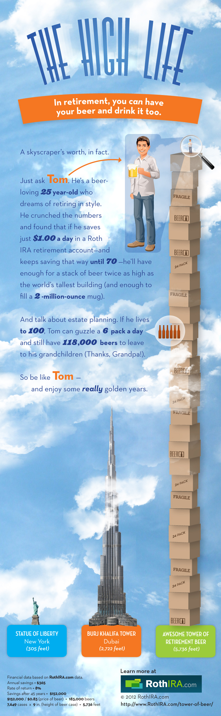
The High Life in a new infographic from RothIRA.com that visualizes the awesome tower of beer you could buy if you were to save just $1 per day starting at age 25.
Getting older has its benefits—how about all the beer you can drink? All it takes is a dollar a day (and a really, really large fridge).
Designed by InfoNewt (my company), this design follows the strategy of telling one story really well. There are hundreds of charts online showing the power of compound interest and why people should invest early for retirement. We took a different approach to put the power of those savings into terms that young adults are more likely to relate to…BEER!
Thanks to the team at RothIRA.com for being great to work with!
Update on Tuesday, August 28, 2012 at 7:44PM by
Randy
Awesome! The Tower of Beer infographic went viral and was picked up on…
Traveling is a pleasure that we don’t want to give up, but costs keep rising! Find the Best Airline For You infographic from Nerd Wallet lets you know which airline to travel on depending on your traveling habits to keep the costs down!
U.S. airlines continue to increase fees - more fees and higher fees. However, there are no standards or regulations when it comes to airline fees so travelers don’t know what to expect. Fee prices range widely by airline, and there is little transparency on the terms of each fee. For example, some fees are charged based on how stops are made, while others are billed as flat fees. Some fees have a base rate but increase from the time of booking to boarding the plane.
As a result, cost comparison is extremely difficult, especially when travelers are evaluating multiple airlines. To make matters worse, fees are not properly disclosed – they are hidden within multiple layers on airlines’ websites and shrouded by vague wording. NerdWallet gathered the data and analyzed each fee across all major U.S. airlines. To help travelers save money, we defined several traveler profiles and calculated fees on a comparable basis to determine which airline is best (and worst) for each type of traveler.
There are a handful of things I like about this one.
The main thing is that throughout all of the Lowest/Highest comparisons, the scale of the bar charts is kept consistent. This allows the reader to easier understand how much money is related to each travel fee.
The green-red (good-bad) color scheme is instantly understandable to the reader.
The icons (all in blue) are easy to understand. By keeping them all a consistent solid blue color, they are kept simple and don’t create a bunch of “visual noise” that would distract the reader.
Sources are listed at the bottom
The direct URL to the original infographic is included at the bottom so readers can find the high-resolution original no matter where they find it posted on the Internet.
I would suggest using the airline logos, even in a solid color, to make it easier for the readers to pick out the airlines they recognize.
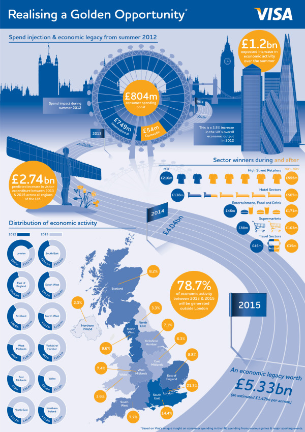
The London 2012 Olympic and Paralympic Games will deliver an £804m consumer spending injection for the UK this summer and an economic legacy worth £5.33bn by 2015, according to Visa’s report, “Realising a Golden Opportunity: Visa Europe’s London 2012 Olympic and Paralympic Games Expenditure and Economic Impact Report”.
The report looks at the consumer expenditure and economic output related to the Games and its distribution across the country. It is based on Visa’s unique insight into consumer spending in the UK and spending data from previous Games and major sporting events.
We have also produced a unique infographic providing an easily-digested visual summary of the report’s findings.
This is a great use of an infographic as an executive summary of a much larger report. This builds awareness, interest and traffic to a report that VISA Europe obviously spent a lot of money to sponsor.
A few thoughts about the infographic design:
The call-out circles surrounding the map of the UK should be sized to match their values.
The doughnut charts don’t work for the Distribution of Economic Activity. The percentages are too close together, so all of the doughnuts look almost the same. I think a pair of bars for each location, but keeping the scale consistent across all locations would have worked much better.
I love the icons for the business sectors
The color scheme is fantastic! Simple, directly tied to VISA and makes the overall design bold without being gaudy.
The monument silhouettes from London are easily recognizable, and work nicely in the background without drawing too much attention.
The bottom should have a clear copyright, and the direct URL link to the original infographic landing page.
They also created a short infographic video based on the static infographic:
Fractional Reserve Banking refers to a banking system which requires the commercial banks to keep only a portion of the money deposited with them as reserves. The bank pays interest on all deposits made by its customers and uses the deposited money to make new loans.
This design does a good job of showing the audience the scale of the amount of money involved. Each $100 stack of bills is carefully used to visualize the amount of money being used in the explanation, and it makes a bigger impact by making it visual.
The sources are carefully documented and all of the visualizations appear to match the numerical values. At the bottom should be some type of copyright or Creative Commons statement, and the text URL back to the original infographic to help readers find the high-resolution version when they see posts of this on other sites.
The designer here did a really good job of telling a simple, focused story in the the infographic that is quick and easy for readers to understand.
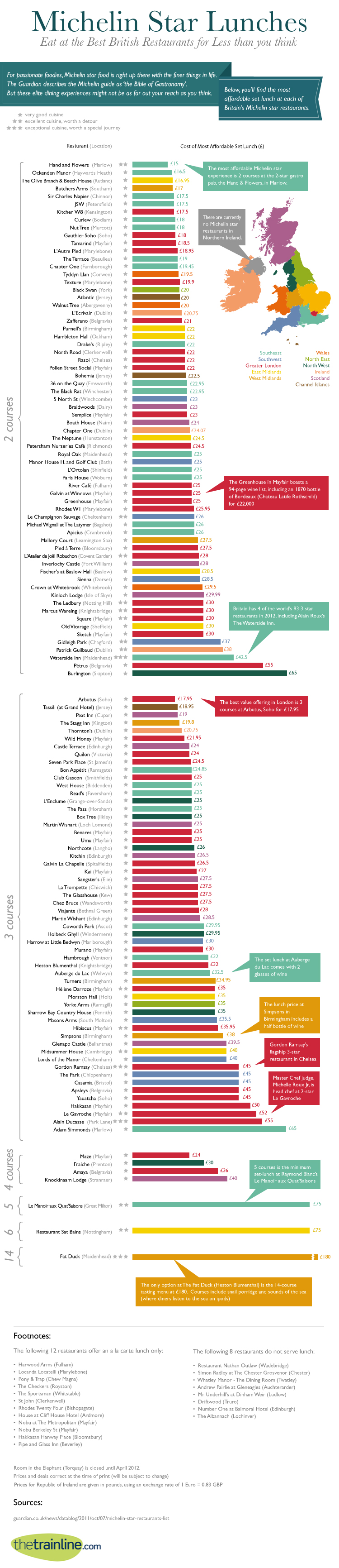
If you ever find yourself in the UK, this will be a very helpful infographic! The Michelin Star Lunches infographic from thetrainline.com keeps your belly, taste buds, and wallet happy!
For passionate foodies, Michelin star food is one of the finer things in life. However, for many of us, such top quality dining may feel out of reach price-wise. In fact, a day out to enjoy the finest dining (maybe taking the train and enjoying a guilt-free glass of wine or 2) could be as affordable as £15 for two courses at the two star gastro pub, the Hand & Flowers in Marlow. Even fine dining in London is affordable with 3 courses at Arbutus, Soho for just £17.95.
Look at our handy guide to all the Michelin starred restaurants in the UK above - shown in order of their most affordable set lunches.
This is a fantastic, informational, reference infographic to help you find outstanding food at reasonable prices…as long as you go for lunch instead of dinner. Color-coded by region of the country, and organized in ascending price range, this design tells one story really well.
Seriously, if you travel or live in the UK, I would keep a copy of this infographic on your phone just so you could easily lookup these highly rated restaurants near you.
Timely for the Final Four on Saturday, the SeatGeek to the Final Four infographic takes a fun look at the expenses related to anyone headed to New Orleans to watch the Final Four games in person.
The infographic stands on its own nicely without any description, and I really like the design. Of course they used a basketball court wood flooring as the background, and carefully didn’t use any official Final Four logos from the NCAA. Even the jerseys are helpful illustrations and avoid using any official school logos.
I like most of the data visualizations. The line charts are simple, and the map is easy to read with clear driving paths. The Flying vs. Driving comparisons are also very easy to understand, but should have been visualized.
The design makes one big mistake! Only a couple data sources are mentioned at all (Kayak.com and Hipmunk.com), so we are left to wonder if the rest of the data is accurate. Did the rest of the data come from the SeatGeek servers? Where did the historical ticket prices come from?
The ticket price chart title indicates that they only charted the actual face value of the tickets, but they probably should have been adjusted for inflation. The doughnut charts for ticket sales by state and by city are hard for the viewer to compare, and I think it was a poor choice of visualization method. Aren’t these supposed to add up to 100%?
The visuals are very heavily weighted at the top of the design layout, and it’s disappointing that the information becomes mostly text at the bottom. My guess is that the designer was running out of time. The Total Spent values and the spending comparisons also should have been visualized. As an infographic designer, you should never make fake visualizations either (like showing 40 Hurricanes from Pat O’Brien’s next to the actual value of 125).
It’s interesting that they didn’t include the URL to the find the original infographic at the bottom, it’s really an ad URL to their Final Four page of ticket sales. I would have recommended including both URLs. There’s nothing wrong with the link to the sales page, but you should also include the infographic URL. There should also be a copyright statement at the bottom as well.
The Payroll and Tax Deductions infographic from Paycor takes an unbelievably dry topic and makes it interesting by visually walking someone through their paycheck. The design allows them to understand all of the different things that may come out prior to the final amount that makes it to their bank account.
Most American workers aren’t aware of the factors that determine how much is deducted from their paychecks, yet it’s important to have that understanding so you can speak up about any errors. Read more about the details of payroll and tax deductions in this infographic.
So what exactly is that payroll software deducting from your paycheck? Typical deductions include federal income tax, OASDI, Medicare tax, disability and state income tax. Your tax bracket will range from 10% to 35% depending on your amount of taxable income. Medicare tax rates will be different depending on whether you work for a company or are self-employed.
At the state level, individual states handle taxes differently, with seven states charging all residents a flat tax rate and nine other states not collecting any income taxes at all.
I think this is a fantastic use of an infographic to explain a really confusing and boring topic. The visual design makes it much easier to understand and the character illustration help lighten up the topic to make it more approachable by readers.
I do think the visualizations using the stacks of cash are weak. They show a size comparison between deduction amounts, but don’t visualize their specific value well. There is also still more text than I would like in the design, but with this topic you do have to be clear and precise because the tax laws are so complicated.
At the bottom, the design is missing the URL for the original landing page, a copyright statement and any credit to the designer.
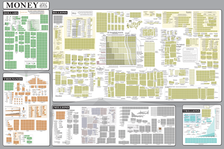
The Money Chart from Randall Munroe’s webcomic xkcd.com is a huge poster showing the scope and scale of money flowing all over the world. In a great move for transparency, the entire list of over 200 sources is also online.
This is the poster version of comic #980, which is a guide to money. It started as a project to understand taxes and government spending, and turned into a rather extensive research project. With upwards of 200 sources and 150,000 tiny boxes, it’s best appreciated in poster form. The 36”x24” high-quality poster print allows you to stand back and, all at once, take in the entire world economy.
Each square represents one unit of the specific section it’s in. One dollar, One million dollars, One trillion dollars, etc. To provide some scale, each section is then visualized to scale in the next higher section. Here’s the transition from dollars to thousands.
The new 2012 Death & Taxes poster has been released, and this year it’s better than ever. Designed by Jess Bachman (ByJess.net) this poster visualizes the 2012 proposed U.S. Federal Budget. The Death & Taxes poster is one of the best infographics I’ve ever seen, and it gets better every year.
“Death and Taxes” is a large representational graph and poster of the federal budget. It contains over 500 programs and departments and almost every program that receives over 200 million dollars annually. The data is straight from the president’s 2012 budget request and will be debated, amended, and approved by Congress to begin the fiscal year. All of the item circles are proportional in size to their funding levels for visual comparison and the percentage change from both 2012 and 2002 is included so you can spot trends.
PURCHASE: This year, Jess also had the opportunity to partner with Seth Godin and his Domino Project to make the full-size 24” x 36” poster available for purchase through Amazon. Currently, you can purchase a copy of the poster for $19.99. Also, check out Jess’s video introduction on the Amazon page.
POSTER GIVEAWAY: Cool Infographics is giving away one FREE copy of the poster. The free poster will go to one randomly chosen person that tweets a link to this blog post on Twitter and includes the hashtag: #deathandtaxes. I included the hashtag in the post title, so any retweets will be automatically eligible. NOTE: you must also be following me on Twitter (@rtkrum) so that I can send you a direct message if you have won!
I will choose the winner at 12 noon (Central Time) on Friday, November 11, 2011 (11/11/11). I will contact the winner, and order the poster from Amazon to be delivered to the winner.
INTERVIEW: Similar to last year, Jess was willing to answer some behind-the-scenes questions about this year’s poster:
Cool Infographics: What’s the most interesting thing you learned from the 2012 data?
Jess Bachman: Lots of reductions in the military side. It’s mostly from the OCO war funding, but its interesting to see what actually is getting cut the most. Mostly Army funding and RDT&E across the board. I would think the OCO was mostly Operations and Procurement.
Cool Infographics: Has you design process changed at all this year? What software did you use to help dig through the data and create the design?
Jess Bachman: Well this year I tried to work exclusively within the official spreadsheets, rather than pick out the numbers from the paper (PDF) budget. I think it’s more accurate and easier to get totals. Mainly just used excel and photoshop as always.
Cool Infographics: When did the 2012 data become available, and how long did it take you create this year’s poster?
Jess Bachman: It was supposed to be released in February but it was a month late. I started moving on it at a full clip then got involved with Amazon/Godin and the timelines shifted quite a bit, so while I usually get the post out in April, it was released in September this year.
Cool Infographics: How did working with Seth Godin and the Domino project come about?
Jess Bachman: Seth just emailed me out of the blue. We talked and it seemed like a no-brainer.
Cool Infographics: How does working with Amazon and the Domino project change how you print and distribute the poster?
Jess Bachman: Well previously my Mom did most of the shipper and I also had a 3rd party do fulfillment and shipping. It’s a rather time consuming and frustrating process. Sending out orders, doing customer support, paying vendors, etc. Now it’s all in Amazon’s hands. They got it printed and of course are warehousing and shipping it too. I’m quite glad as they do a much better job of shipping than I do. Of course they also take their cut of the profits. As for Domino, they have their own distribution channels and lists and also work closely with Amazon to make sure the product page is well presented too. This year it reached #18 on the best sellers list. I guess that makes me a best selling author. I don’t think I could have accomplished that without Domino/Amazon.
Cool Infographics: I see you made a video to include on the Amazon page, how was that experience?
Jess Bachman: Seth told me they needed a video ASAP so I just made one that afternoon. I suppose I would put more effort into it next year but videos help sell products and i think it does a good job of that.
Cool Infographics: Any new design features added to the poster this year?
Jess Bachman: I wanted to include some non-governmental items in the poster this year for reference. They are in the bottom left and include things like the size of the video game industry, bill gate’s net worth and other such things. When talking about billions of dollars all the time, sometimes you need to get out of government-mode to put those figures into further context.
Cool Infographics: The past posters have been shared very heavily in social media, which social sharing sites have you found most successful?
Jess Bachman: Well, Digg has traditionally been a big asset, but then Digg fell apart so I no longer pay attention to it. In general, I have abandoned the traditional accelerants like Digg, reddit, etc. and instead focus on my network of bloggers and influencers. Combine that with Facebook liking and you can really spread something.
Cool Infographics: Last year we talked about some favorite places that have the poster on display. Any new ones this year?
Jess Bachman: Well, with a larger audience and hopefully more sales, the poster will be everywhere. Unfortunately, I get lots of requests for discounts for schools with tight budgets, but I have no control over price anymore. I can say that an iOS app is in development so that will be interesting. My ultimate goal is to get on the Daily Show to talk about the poster in April. People constantly tell me I need to be on there, and I’m a huge fan, so I figure I have a good shot, just need to nag the right people.
We all love to be a little scared sometimes, and Halloween is the perfect day for that. We get to enjoy all of the frightening festivities: creepy carnivals, haunted houses, trick or treating and of course, horror film marathons. The Halloween Horror Films infographic takes us back to some of our most feared nightmares. Look at 35 of the most popular cult classics, their rotten tomatoes ratings, the original movie budget and their gross domestic box office revenue. See which movies made the cut to become the Top 15 Highest Ranked Horror Films of All Time.


 Randy
Randy


