About
Randy Krum
President of InfoNewt.
Data Visualization and Infographic Design

Infographic Design

Infographics Design | Presentations
Consulting | Data Visualizations

DFW DataViz Meetup

Join the DFW Data Visualization and Infographics Meetup Group if you're in the Dallas/Fort Worth area!

Search the Cool Infographics site

Custom Search

Subscriptions:


Feedburner

The Cool Infographics® Gallery:

How to add the
Cool Infographics button to your:

Cool Infographics iOS icon

- iPhone
- iPad
- iPod Touch


Read on Flipboard for iPad and iPhone

Featured in the Tech & Science category

Flipboard icon

Twitter Feed
From the Bookstore

Caffeine Poster

The Caffeine Poster infographic

Entries in social media (74)

Wednesday
Aug272014

Visual Customer Service in the Social Age

Visual Customer Service in the Social Age infographic

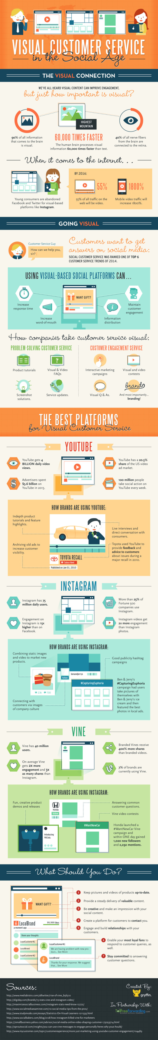
The Visual Customer Service in the Social Age infographic created by Gryffin for TollFreeForwarding.com, describes the different social media platforms and how they could be to supplement customer service information to customers.

I’m sure you know that visual content on social media can massively improve engagement. But just how important is it?

On the web, it’s estimated that 55 percent of all traffic will be video by 2016, and mobile video traffic will increase by 1800 percent. YouTube, Instagram and Vine are currently the best platforms to maximise video engagement, so are you utilising them to their full potential in your marketing campaigns?

I like that this design takes some of the great things we know about visual information and applies it to a specific company function.  This is one way the companies can leverage the power of visual information with their customers.

It’s interesting that I couldn’t find the original infographic on either Gryffin or TollFreeForwarding.com sites.  There’s no blog post or infographic landing page on either one.

Again, we see the folk research statistic that “the brain processes visual information 60,000 times faster than text.”  This data point is quoted so often that people believe it’s true, but no one can find the research to back it up.  As far as anyone can tel, it was quoted in some marketing information from 3M in the 1980’s to support sales of transparency sheets used on overhead projects.  If you’re interest, I suggest reading these posts from Alan Levine and Darren Kuropatwa.

Found on www.mediabistro.com and Visual.ly

Tuesday
Jul152014

House of Cards: Power Connections

House of Cards: Power of Connections infographic

We’ve all have heard the saying, “It’s not what you know, it’s who you know.”  The House of Cards: Power Connections infographic from Linkedin brilliantly uses the House of Cards show to show a good example of being connected. How powerful is your connection network?

Relationships Matter

From college internships to becoming President of the United States, who you are connected to and how you leverage those connections matters.

We wrote the post 4 sales strategy lessons from Frank Underwood to take some learnings from the show and how they can apply to your professional growth. It was an amazing use of social media that we got a response from the House of Cards Twitter profile and felt we should lean-in on some of the content.

The best way for us to illustrate the valuable connections of a character like Frank Underwood is to create a LinkedIn InMap infographic with Frank at the center.

I love the idea of using a famous fictional person to show the “Power of Connections” instead of a real person that people might not be familiar with. Color-coding is always a helpful tool to minimize words on an infographic, and it’s used well here. Also, the use of faces for the key people on the graphic break up the names to keep it interesting. However, the reasoning behind the use of different sizes of circles around the names is unclear. Always make sure to include the URL of the infographic landing page at the bottom so that viewers can find the original.

This is based on the same network map visualization tool that you can use to automatically visualize your own connections on Linkedin.  Login with your Linkedin account on the Linkedin Labs page: http://inmaps.linkedinlabs.com/

Found posted on Google+ by Jason Lankow

Wednesday
May072014

The Dead Zones: When Not to Post on Social Media

The Dead Zones: When Not to Post on Social Media infographic


The Dead Zones: When Not to Post on Social Media infographic from SumAll takes a look at the the worst times to post content on social media.

Now that everyone knows the best times to post on social media – and if you don’t, take a look at our infographic for a refresher–we started thinking about the flip side to the golden hours: the dead zones.

We researched what hours of the day your post will be seen by the fewest number of people and collected them all into this infographic. Beware.

Tell one story really well is one of the keys to a successful infographic, and this design does just that!

Here’s their prior infographic about the BEST times to post for comparison:

BEST times to post on social media infographic


Monday
Apr212014

Choosing a Social Media Platform

Choosing a Social Media Platform infographic

Released about a year ago, the Choosing The Most Effective Social Media Platforms infographic was published by Edge Media and designed by Infographics.SG.  Photos, video, articles or text?  Depending on the type of content you are generating, your choices for effective social platforms are different.

Facebook, Twitter, Pinterest, Google+, LinkedIn. Etc. So many social media platforms. And so little time. (And manpower. And ideas.) 

There are costs involved to maintaining a social presence. It is vital for brands / companies / organisations to market on the right platform(s) in order to optimize their resource allocation. 

Use this infographic to help you choose the most efficient social media platform(s) according to factors like your goals, target audience and capabilities.

 The design includes a good mix of data visualization methods and the bold colors are eye catching to the audience.  However, some of the charts are difficult to understand.  The polar grid used for the “What Do You Aim To Achieve?” section does not clearly communicate the information to the readers.  I also the the colors should have been color-coded to be relevant to the specific social media brand colors. 

They also leveraged the infographic content into a SlideShare presetnation.  This allows them to utilize the content they already created on another social platform to reach a different audience.


Thanks to Brian for posting on Google+

Monday
Jan062014

The Evolution of Reddit

The Evolution of Reddit Through Time infographic

The Evolution of Reddit Through Time infographic from Randal Olson.com covers the history of Reddit for the past 7 years. With thousands of active subreddits, the visual above displays the 24 most active. Track the popularity of each subreddit through the years!

The graph below shows how 24 of the most active subreddits have changed over time. I ordered the subreddits by the time that they first appeared on Reddit. I recommend zooming in so you can see it better.

(I should note that I purposely excluded /r/reddit.com from this graph because it dominates the entire graph until about 2008, then screws things up again when it got closed down in late 2011.)

The biggest thing that you may notice is that there were very few subreddits from 2006-2008. In fact, there was only one subreddit before 2006 (/r/reddit.com). The majority of the content in 2006-2008 was focused on more techie-friendly subjects: programming, science, politics, entertainment, and gaming. Major subreddits dedicated to solely picture and video content started becoming popular in mid-2008, and even then their posts only comprised less than 1/4 of Reddit’s content. It wasn’t until 2011 did the picture-related subreddits really start taking over, and Reddit never looked back after that.

This graph covers so many changes in the Reddit community that it can’t explain what happened by itself. In the following sections, I will take a closer look at how the Reddit community evolved on a year-by-year basis.

Love these data visualizations of the reddit’s evolution over time from Randy, a 3rd year Computer Science graduate research assistant at Michigan State University.  In his original post, he actually visualizes each year separately, and you can see some major milestones and clear changes in the reddit universe.

The Great /r/reddit.com Spike of 2009

The total growth of reddit over the years is lost in the 100% Stacked Area chart; however, you can clearly see the growth of subreddit content as a portion of the whole.

Found on Flowing Data!

Monday
Dec302013

The State of Social Media 2013

The State of Social Media 2013 infographic

The State of Social Media 2013 summarizes some of the major milestones and events in social media that happened during the last 12 months.

What a wild year it’s been. You could say that 2013 was the year of social media and you’d be correct. What was once a novelty for people bored and surfing on the ‘net has risen to be an industry in and of itself that companies large and small have embraced around the world as a powerful cornerstone of their marketing initiatives.

In case you got lost in the details of 2013, we’ve laid out all the notable moments of the year, month by month, in this handy infographic.

There are a handful of statistics listed in the design that should have been visualized instead of just shown in text.  The use of logos and images from the web do a good job of showing the specific events.

Designed by Infographic Promotion UK

Friday
Dec062013

29 Powerful Tools for a Social Media Marketer

29 Powerful Tools for a Social Media Marketer infographic

A Productive Day in the Life of a Social Media Marketer from Razor Social is a great use of an infographic design within a larger content strategy online.  The larger piece is an article that lists out all 29 tools, with links and descriptions, but the infographic shows a character using all of the tools throughout the day.  So the infographic grabs the attention of the audience and gets shared frequently, with links back to the full article.

The demands on us to market our products and services using social media is constantly increasing and the technology/tools required to support this is also increasing.

We start early morning and we finish late at night.  How many of you check your Twitter or Facebook account last thing in the evening and first thing in the morning?

So we thought it would be a good idea to take a look at a very busy day in the life of a Social Media Marketer.  During the  day there are so many tools and tasks.  If you work alone then we certainly wouldn’t expect you to do everything listed here or use all the tools we suggest, but if you are part of a team then you could share out the tasks and tools to make it easier.

A special thanks goes to Donna from Socially Sorted who is my go to person when I want anything visual done.  Thanks Donna.

The infographic design does a good job of removing most of the text descriptions and just using icons and logos to represent the various tool.  Interested readers can dig into the full article for more information.

The footer is missing the URL link back to landing page with the article.  When people post infographics on blogs and social media sites, they aren’t always good about linking back to the original.  By including the text URL in the infographic itself, you can make sure all of the readers can find the landing page.

Monday
Nov182013

17 LinkedIn Profile Must-Haves

17 LinkedIn Profile Must-Haves is a how-to infographic that walks the reader through optimizing their LinkedIn profile page.  Published by MarketMeSuite working with Maximize Social Business.com’s Neal Schaffer.

This year has been a big one for LinkedIn. With new features like the Creative Portfolio Display, you now have the ability to visually showcase your professional portfolio. But before diving any deeper with the latest add-ons, does your LinkedIn profile have all the elements that will help you rise to the top? This new infographic has all the tips you need to elevate your LinkedIn profile: 17 LinkedIn Profile Must-Haves!  Everyone can use great tips, so please share the LinkedIn love!

Great design using a mock LinkedIn profile as the background.  The callouts are clearly connected to the appropriate areas on the profile.  There’s a lot of text, but in this case I think most of it is necessary to clearly explain each point.  The reader can work off of this infographic without any additional research on other sites.

The statistics at the bottom should have been better visualized.  Mixing the 50.5% stat with the profile complete percentage visual from LinkedIn is confusing.  Also, it was difficult for me to find the original infographic landing page.  The footer should have the URL for readers to find the full-size original version of the infographic.  The source list text is too small to read too.

Thanks to Martin Mosler for post on Google+!

Wednesday
Nov132013

How to Setup Google Authorship in 6 Minutes

How to Setup Google Authorship in 6 Minutes infographic

How to Setup Google Authorship in 6 Minutes is simple, clear, focused design from Brafton.

Google Authorship helps brand publishers personalize the custom content they post to their websites. Studies show that including an author’s byline and headshot in search engine results pages (SERPs) increases clicks and may eventually improve PageRank. 

Brafton’s “Content marketing, meet Authorship” resource outlines everything a savvy marketer must know to benefit from Google technology, and our accompanying infographic makes it even easier to setup Authorship on a given site. (Our downloadable resource includes a print-friendly version of this graphic!) Follow these six steps (in about six minutes) to be on your way to publishing online content using Google Authorship. Don’t forget to read our related blog: Why It’s Time to Embrace Authorship, and download our free resource.

This infographic design keeps it simple for readers by telling one short story really well.

Knowing that the PNG image file of the infographic will be shared on other sites, the design should have included the Brafton logo, a copyright statement, and the URL for readers to follow to find the original, full-size version of the infographic.  Not all bloggers are good about linking back to the original landing page.

Friday
Oct042013

Advertisers, You Need YouTube

Advertisers, You Need YouTube is a motion graphic from MDG Advertising that shows many of the stats from successful YouTube video advertising campaigns.

While YouTube began as a source of online video entertainment, its massive popularity and mainstream prevalence has turned it into a major video advertising platform. To show why YouTube is now a very powerful and vastly important video marketing tool for advertisers, MDG Advertising created the following video. It shows the reasons, results, and revenue that are making YouTube a video marketing must for brands trying to catch the eye of audiences worldwide.

The video style is visually appealing, and has some fantastic statistics.

However, the design makes a common mistake we see in many motion graphic videos.  Big fonts are not data visualizations!  I noticed at least 20 different numbers shown to the audience in a really big font.  None of them were visualized to give them context for the audience.  Making the number value in big text and moving across the screen doesn’t make it any easier for the audience to grasp the meaning behind the data.

In data visualization and infographics design we know that visualizing the data always puts it into comparison to another number to provide the audience a frame of reference.  That helps the audience understand the scale of the numbers and how large or small they actually are.  Without that comparison in the design, the audience is left to try to compare the values to something they already know.

Thanks to Jarred for sending in the link!