About
Randy Krum
President of InfoNewt.
Data Visualization and Infographic Design

Infographic Design

Infographics Design | Presentations
Consulting | Data Visualizations

DFW DataViz Meetup

Join the DFW Data Visualization and Infographics Meetup Group if you're in the Dallas/Fort Worth area!

Search the Cool Infographics site

Custom Search

Subscriptions:


Feedburner

The Cool Infographics® Gallery:

How to add the
Cool Infographics button to your:

Cool Infographics iOS icon

- iPhone
- iPad
- iPod Touch


Read on Flipboard for iPad and iPhone

Featured in the Tech & Science category

Flipboard icon

Twitter Feed
From the Bookstore

Caffeine Poster

The Caffeine Poster infographic

Entries in world (200)

Tuesday
Dec292015

Where The USA Gets Its Oil

Where The USA Gets Its Oil infographic

Two data visualization maps from Aschere Energy Education that show Where The USA Gets Its Oil.

The area cartogram created with a Gastner-Newman diffusion based algorithm is used to resize the countries above. It's a fun and unusual visualization method that stands out and gets attention because it breaks our usual understanding of the world map.

The second map uses the 3D heights of the countries and color-coding to represent the oil & petroleum exports to the U.S.

Thanks to Joe for sending in the link!

Tuesday
Dec082015

The Global Carbon Budget 2015

The Global Carbon Budget 2015 infographic

The Global Carbon Budget 2015 full report and infographic have just been released this week.

You can also download the infographic as a HiRes JPG or PDF

Emissions from fossil fuels and industry grew 0.6% in 2014 and are projected to decline by -0.6% in 2015. This marks a break in the rapid emissions growth of 2.4% the previous decade.

The great infographic was designed by Nigel Hawtin working with Owen Gaffney at the Future Earth Media Lab for the Global Carbon Project. 

Designers can learn from Nigel's careful use of color to clearly highlight the stories in the data, and use of black and gray for all of the reference data. Clear Creative Commons license, and each section can be broken apart to easily post on Twitter and in social media.

Because the infographic will be shared as a stand-alone piece on the Internet (without the full report or surrounding text) it's missing the URL to the full report. The URL text should be included in the actual infographic JPG image so readers can find their way back to the original full-size version on the publisher's site.

Monday
Jul202015

Beautiful Map Posters of Anywhere

Mapiful custom map posters

Mapiful is a great site that lets us choose the location and customize a beautiful black & white poster of any location in the world based on OpenStreetMap data. You can change the location, the zoom level, the label text, the orientation, and choose from a handful of clean layout styles.

The printed posters are a flat cost of $60 with free shipping worldwide.

Regardless of where you live and what city, country or spot you wish to eternalize - Mapiful takes you there. We bring people's favorite places to their homes. The city you were born, where you fell in love or just a place that makes your heart skip a beat. Search, zoom and tweak. Within days your unique Mapiful print will arrive in the mail.

Found on FlowingData and Visual News

Thursday
Jun252015

Business Etiquette Around the World

Business Etiquette Around the World infographic

When you are on a business trip, making a good impression is always key, but meeting internationally for business can make things a little tricky. The Business Etiquette Around the World infographic from CT Business Travel has compiled a list of expectations for those meeting in foreign countries around the world. As the infographic states, "Follow these tips and never put a hand, fork, or word out of place again."

Customs and etiquette vary wildly from country to country, and business professionals are often unaware of the differences.

This made us think, wouldn’t it be really useful to research and produce an illustrative guide that provides an easy to digest overview of the essential cultural differences for when professionals meet international clients, suppliers and colleagues overseas – so we did and here it is.

For instance the French prefer to shake hands lightly, as do the Japanese and South Koreans, and pre-business chit-chat may be customary in Brazil, but this is not the case in Russia, Switzerland and a number of other countries.

The following Infographic outlines the rules that can be unwittingly broken across the world and will be of interest to anyone who wants to seal the deal rather than tarnish their reputation.

Table data like this is always a challenge to visualize. Using icons in the table format is a good way to make the data easier to understand and compare between rows.

Thanks to Danny for posting the link on Linkedin!

Monday
Jun012015

A World of Languages

A World of Languages infographic

A World of Languages - and How Many Speak Them is a new infographic by Alberto Lucas López for the South China Morning Post that compares the number of people that speak the top 23 languages in the world as their primary language. High resolution image version available HERE.

There are at least 7,102 known languages alive in the world today. Twenty-three of these languages are a mother  tongue for more than 50 million people. The 23 languages make up the native tongue of 4.1 billion people. We represent each language within black borders and then provide the numbers of native speakers (in millions)  by country. The colour of these countries shows how languages have taken root in many different regions

The dominant visual centerpiece appears to be a combination of a voronoi diagram & circular treemap, where the area of each section is representative of the number of people that speak each language as their first language. I don’t know any any software that will create this specific visualization style, so I’m assuming the area of each section had to be calculated separately. With the different, organic shapes how were those areas calculated? Iteration?

The data is a little bit controversial. It’s an estimate of the number of people that speak each language as their first language. There’s no accounting for multi-lingual people or language families. I love the data visualization design, but the underlying data may cause some concern.

Friday
Apr032015

Best Film Awards From Around the World

 'Best Film' Awards From Around the World infographic

In America, winning an Oscar is a dream come true for people in the film industry; however, the award is not one of a kind! There are many ‘Best Film’ Awards From Around the World and Robert Shaw has created this infographic to illustrate the coveted trophies.

The awards illustrated here represent only a small fraction of the festivals that celebrate achievements in cinema throughout the world. It is by no means a definitive list.

The criteria for this infographic was to include awards that hold a dedicated trophy or statuette for an overall ‘Best Film’ category, presented in ceremony for at least four years. However, some exceptions do appear in order to show as many nations as possible.

I think the size of this infographic is the primary message. I know many people don’t like tall infographics, but in this case that is the primary design element. It’s also eye-opening information because I would guess that most readers would have no idea that there are this many different film award organizations in other countries.

Thanks to Robert for sending in the link!

Friday
Mar202015

The Top Color Trends of 2014

The Top Color Trends of 2014 infographic

Shutterstock has analyzed it’s collection of 40 million images to track color trends through the years. The newest infographic release, The Top Color Trends of 2014  explores the trend change from 2013 to 2014, as well as identifies the most popular colors in the countries that are Shutterstock’s top markets.

Earlier this year, we brought you Shutterstock’s annual Design Trends infographic, and now we’re following up with some facts and figures that are all about color. Using data from our collection of 40 million images and our 400 million all-time downloads, we analyzed which popular colors are set to dominate design in the coming months.

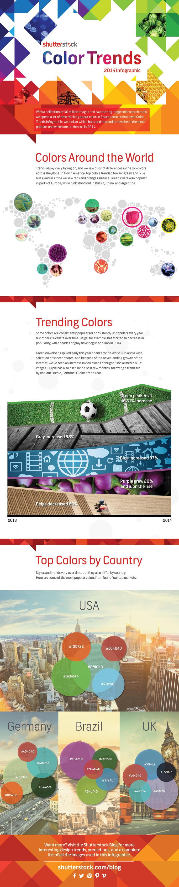
We know how important color is to design — that’s why we created two innovative color search tools, Palette and Spectrum. Color impacts everything: web and graphic design, fashion fads, even home decor. Some of the trends we saw this year, like a change from natural palettes to gray tones, reflected similar trends seen on Fashion Week runways and in home design. Others were influenced by global events like the World Cup, the continued rise of social media, and Pantone’s Color of the Year, Radiant Orchid. 

Check out the infographic below to discover which colors are en vogue around the world, then scroll on to see which images we used to create it, and to explore six colorful image collections inspired by the 2014 Color Trends infographic.

In the Trending Colors section, the infographic chooses to use a photograph dominated by a specific color, then trimmed the edges of the photograph to represent a timeline of the downloads of that color throughout the year. The lines may also predict where the color trends may be heading for next year.

The use of hex color numbers in the Top Color by County section provides a precise color definition. By doing this, the viewer can accurately pinpoint which shade of “purple” that is popular and use it. The colors use values are diverse enough that the circle sizes are different enough for the reader to see the differences.

Found on Shutterstock

Monday
Mar092015

Life Hacks for the Modern Traveller

Life Hacks for the Modern Traveller infographic

The Life Hacks for the Modern Traveller infographic from Direct Holiday Cottages provides you with some new travel tips for the connected traveller.

Here is an infographic that we have created providing a number of hacks to help you out on your holiday as well as some must have travel apps.

Busy design style, but that’s how people lay out their belongings before packing them all up in luggage. The font size is too small for the size of the infographic. 

Friday
Jan092015

World Map for Power Plug Types

World Map for Power Plug Types infographic

When traveling abroad, it is best to be prepared. However, does your check list include power plugs? The World Map for Power Plug Type infographic from Easy Smart, maps out the location and types of each plug throughout the world. Never go on vacation unprepared again!

Helpful, information visualizations are fantastic topics for infographics. Not a fan of the color scheme. Just a thought, but this would be even better if it was printed on small cards for travelers to carry!

Found on Life Hacker

Tuesday
Nov182014

Old World Language Families

Old World Language Families infographic

The Old World Language Families infographic from Stand Still Stay Silent Comic shows the “roots” of our modern languages. Follow each language’s path from bush to roots and discover how closely languages are related to each other.

Language trees for the language lovers! I’ve gathered pretty much all the data for this from ethnologue.com, which is an awesome well of information about language families. And if anyone finds some important language missing let me know! (Naturally most tiny languages didn’t make it on the graph, aww. There’s literally hundreds of them in the Indo-European family alone and I could only fit so many on this page, so most sub-1 mil. speaker languages that don’t have official status somewhere got the cut.)

Fantastic illustration that visualizes the evolution of all the modern languages! It’s a complex design that is intended for readers to dive deep and explore.

Knowing that the image itself will be shared as a stand-alone content piece, the image should include credits and links to the original site.

Found on http://mentalfloss.com