About
Randy Krum
President of InfoNewt.
Data Visualization and Infographic Design

Infographic Design

Infographics Design | Presentations
Consulting | Data Visualizations

DFW DataViz Meetup

Join the DFW Data Visualization and Infographics Meetup Group if you're in the Dallas/Fort Worth area!

Search the Cool Infographics site

Custom Search

Subscriptions:


Feedburner

The Cool Infographics® Gallery:

How to add the
Cool Infographics button to your:

Cool Infographics iOS icon

- iPhone
- iPad
- iPod Touch


Read on Flipboard for iPad and iPhone

Featured in the Tech & Science category

Flipboard icon

Twitter Feed
From the Bookstore

Caffeine Poster

The Caffeine Poster infographic

Entries in Data (85)

Thursday
Jan072016

Three Simple Resolutions to Design Better DataViz

Welcome back to the office! You’re back to work in the new year with energy and ambitions of doing better work than you’ve ever done before. Very quickly though, you fall back into the old routine and find yourself making the same charts and the same presentation slides as always. There are tight deadlines, pressure from your boss, and it’s just easier to use the templates.

Let me offer a few simple resolutions that can make your content and business communication significantly better this year.

Visualize Your Data

Visuals are so much more powerful than text and numbers. I can’t tell you how many presentations and infographics I see from lazy designers that just make the numbers really big.

“Big fonts are NOT data visualizations!”

Picture Superiority Effect infographic

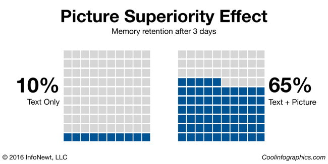
Our brains process visual information faster and more easily than text, and visual information is 650% more likely to be remembered by your audience than text alone (Brain Rules, John Medina, 2009). If you want to communicate a clear message, and you want your audience to remember that message, make it visual.

Visualize Your Data infographic

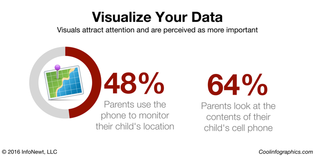
Look at these two statistics. They could be on a presentation slide, in a report, or included in an infographic. Your eye is drawn to the visualized number on the left, with both a doughnut chart and an illustration of the concept of GPS location. You as the reader are more likely to remember that statistic on the left than the number on the right, which just shows the stat in a big font size.

Remove Chart Legends

It’s frustrating that the most popular charting software in the world, Microsoft Office, always includes a chart legend by default. The “tyranny of the default” is that most designers will just accept it, and not improve their charts. It’s your responsibility as the dataviz designer to make your charts as easy as possible to understand.

Legends that are separate from the visualization of the data make your readers work much harder, looking back and forth between the data and the legend, to understand your visualization. Make understanding your data visualization much faster and easier by moving the data descriptions into the chart itself, and connected to the actual data.

Remove Chart Legends infographic

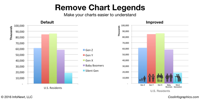
Here you can see the default column chart created by PowerPoint on the left, and an improved version on the right. In this example, I removed the chart legend and added the data descriptions below each column. To add a visual element, I also added stock icons to visually represent the age groups as images on top of the chart. These chart improvements only took 10 minutes to create, and the chart is much easier to read.

Try New Ways to Visualize Your Data

You do want your audience to remember your data, right? You’re trying to help them make better decisions based on your information, and for that to be successful they have to be able to remember your data. Purchase decisions, voting decisions, health decisions, financial decisions, business decisions, and many more are all impacted by the information people have, and can remember.

Breaking out of the Big 3 charts is tough. Bar charts, line charts and pie charts (the Big 3) make up most of the dataviz in the world. However, they can also make your data look like everyone else’s. In order for visuals to be memorable to your audience the visuals need to be unique and different.

Visualizing Percentages infographic

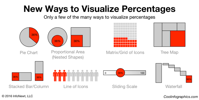
Consider a single percentage statistic: 36%. A percentage is actually two numbers in comparison. Your data value as it compares to 100%. Pie charts are the most common way to visualize a percentage, but there are easily more than 25 different ways to visualize this statistic.

Visit sites these sites to discover new ways to visualize your data:

Design Better DataViz This Year

I ask you to make your own resolution to improve your charts and dataviz designs this year. Start with the three resolutions above, and start communicating data more effectively.

Monday
Dec212015

The Data Science Industry: Who Does What?

The Data Science Industry: Who Does What? infographic

Where's the "Data Visualizer"?!? The data science occupation is a very popular new career field that many companies are hiring; however, many of these titles are mistakenly used interchangeably. The Data Science Industry: Who Does What? infographic from The Data Camp Blog introduces some of the positions in this upcoming field.

In this infographic we compare the roles of data scientists, data analysts, data architects, data engineers, statisticians and many more. We have a look at their roles within companies and the data science process, what technologies they have mastered, and what the typical skill set and mindset is for each role. Furthermore, we look at the top employers that are currently hiring these different data science roles and how the average national salaries of these roles map out against each other.

Good, thorough source reference links. Needs a copyright statement and the URL to the infographic landing page on the DataCamp site so readers can find the original full-size version.

Found on MarketingProf

Thursday
Nov122015

Does Scouting Work?

The Does Scouting Work? infographic was created by the Boy Scouts of America based on the results of a study done by Tufts University comparing scouts to non-scouts. The infographic focuses on the four key points from the study and their statistical findings.

The Boy Scouts also created a downloadable PDFpresentation slides and a press release based on the same results and design. This is a great way to leverage the design assets that were created in multiple formats.

Current and former Scouts have always felt that Scouting has made a difference in their lives, and now a study out of Tufts University has found that Scouting does in fact have a measurable, positive impact in the character development of young people.

The study, funded by the John Templeton Foundation, involved nearly 1,800 Cub Scouts and 400 non-Scouts under the age of 12, and was conducted over three years. It sought to measure the difference Scouting makes in young people’s lives as those positive changes were happening.

“After three years, Scouts reported significant increases in cheerfulness, helpfulness, kindness, obedience, trustworthiness, and hopeful future expectation,” said Dr. Richard M. Lerner, who led the study at Tufts University. “In our control group of non-Scouts, there were no significant increases, and in some cases (e.g., religious reverence) there was an observed decrease, which was quite striking.”

In addition, the study found a direct correlation between the amount of time boys spent in Scouting and the positive impact realized—those who spent more years in the program reported higher character attributes. Scouts who were more engaged also reported higher character attributes. And those who attended regular meetings reported higher character attributes compared to those with lower attendance.

It's always great to hear about a program's success when it comes to helping develop kids. By highlighting the research's four best results, they don't end up bombarding a reader with too much information. This could be enough to encourage a parent to enroll their kid in Scouts, or entice a curious reader into learning more about the study and scouts in general.

The infographic appears to have been designed by the national office of the Boy Scouts of America and published here. Many other scouting sites have reposted the infographic, and it would really be helpful to readers to have the URL to the original infographic page in the infographic image. That way readers can find their way back to the original design.


Monday
Oct122015

Giveaway: Data Visualization Training Video Package

I have ONE Data Visualization - 5-Course Video Training package from O'Reilly to give away in October! This is a great giveaway! Regular price $309.99, Over 14 Hours of online training

Register HERE by 11:59pm on October 30, 2015 to be entered.

A winner will be randomly selected on Oct 31st.

Successful data visualizations allow you to impart meaning and emphasis to your data points. This Learning Path will teach you how to display trends, patterns, and outliers while you discover the power of letting your data to speak. Once you’ve finished, you’ll be able to efficiently communicate volumes of data with ease. The Data Visualization training package includes all five course videos:

  1. An Introduction to d3.js: From Scattered to Scatterplot, Presented by Scott Murray | 2 hours 52 minutes
  2. Learning to Visualize Data with D3.js, Presented by Rafael Hernandez | 3 hours 52 minutes
  3. Using Storytelling to Effectively Communicate Data, Presented by Michael Freeman | 1 hour 30 minutes
  4. Effective Data Visualization, Presented by Jeff Heer | 2 hours 52 minutes
  5. Intermediate D3.js, Presented by Scott Murray | 3 hours 38 minutes
Tuesday
Sep082015

DataViz & Infographics Fall Course at SMU CAPE

Cool Infographics Course at SMU

Infographics & Data Visualization Design

September 24-November 12, 2015 | 6pm-9pm Thursday Evenings | SMU CAPE Plano Campus | $595

$75 off discount code for Cool Infographics readers: RK215

This Fall, I will again be teaching a course as part of the CAPE program (Continuing and Professional Education). This time the course will be at a new location at the SMU Plano Campus. This is a very hands-on course where participants will start to develop better charts, infographics and your own infographic resume. Topics include:

  • The art and science of data visualization and infographics
  • The data visualization and infographics design process
  • Data analytics and basic statistics for the designer
  • Different chart types, dashboards and graphing options
  • How to use the various software and online tools readily available and when to use them
  • Strategies for publishing and promoting infographics online
  • Understanding IP, trademark and copyright issues and how they relate to infographics
  • And more...

Please share with anyone in the Dallas area, or join the class yourself. Enrollment is very limited, so register quickly!

Click Here to learn more: bit.ly/SMU-DataViz-Plano


Also check out the DFW Data Visualization & Infographics Meetup group with monthly speakers and events in the Dallas-Fort Worth area!

Sunday
Feb222015

Cool Infographics Course at SMU

Cool Infographics Course at SMU

Infographics & Data Visualization Design

April 7-May 19, 2015 | 6am-9pm Tuesday Evenings | SMU CAPE Dallas Campus | $495

$50 off discount code for Cool Infographics readers: VIP50

I will be teaching a new course at the SMU Dallas Campus this spring as part of the CAPE program (Continuing and Professional Education). In this course, working professionals will become familiar with the exciting and expanding field of data visualization and infographics. By attending this course you will start to develop your own portfolio and learn:

  • The art and science of data visualization and infographics
  • The data visualization and infographics design process
  • Data analytics and basic statistics for the designer
  • Different chart types, dashboards and graphing options
  • How to use the various software and online tools readily available and when to use them
  • Strategies for publishing and promoting infographics online
  • Understanding IP, trademark and copyright issues and how they relate to infographics
  • And more…

Please share with anyone in the Dallas area, or join the class yourself. Enrollment is very limited, so register quickly!

Click Here to learn more: bit.ly/SMU-DataViz


Also check out the DFW Data Visualization & Infographics Meetup group with monthly speakers and events in the Dallas-Fort Worth area!

Friday
Jan232015

Equal Population Mapper

Equal Population Mapper Interactive Infographic

Ben Blatt has created the Equal Population Mapper infographic. The interactive version at Slate.com allows you to choose New York City, Los Angeles County, Wyoming, New Jersey, Texas, or the Coastal regions as the target population. Then you select anywhere else on the map and a red circle will appear to show how big of an area you would have to select to have an equal population to your selection.

If you throw in New York City’s other four boroughs, the Big Apple’s total population is just greater than 8 million. That’s about the same number of people who live in Idaho, Montana, Wyoming, North Dakota, South Dakota, Nebraska, and the western half of Minnesota combined.

But don’t let my New York City–centric comparisons hinder your imagination. The interactive at Slate.com lets you visualize how different parts of the country compare in population density.

Click the button at the bottom of the interactive to select Los Angeles County, for instance, and then click anywhere on the map to generate a (roughly) circular region of (roughly) equal population. The population data come from the 2010 census, and the square mileage was calculated by summing each highlighted county’s total area. You can also use New Jersey (the most densely populated state), Wyoming (the least densely populated state outside of Alaska), Texas, the coasts (the group of all counties that come within 35 miles of either the Atlantic or Pacific oceans), and, yes, New York City as the baseline for your population comparison.

Cool interactive map!

Found on Flowingdata!

Wednesday
Dec242014

The Graphic Continuum - Desktop Version

The Graphic Continuum - Desktop Version

Jon Schwabish and Severino Ribecca have released a full-color, double-sided, laminated 8.5”x11” desktop version of The Graphic Continuum, available for only $10 until the end of the year when the price will go up to $13. This is a smaller version of The Graphic Continuum poster they released earlier this year.

Nearly 90 graphic types grouped into 6 categories on a laminated 8.5”x11” sheet. It does not include every type of graphic, nor does it display every type of link between visualization, but it serves as a thought-starter. Use it to develop ideas, consider different options, or simply as a piece of art.

A fantastic reference of data visualization methods to give you some ideas for ways you can visualize your data differently.

The Graphic Continuum - Desktop Version Page 1

The Graphic Continuum - Desktop Version Page 2

Friday
Nov072014

The Most Detailed Maps from the Midterm Elections

The Most Detailed Maps from the Midterm Elections North Carolina infographic

The team at the NYTimes has published these fantastic Most Detailed Maps from the Midterm Elections.

Why are we so confident these are the most detailed maps you’ll ever see from the 2014 Senate elections? Precincts are the smallest level of geography for publicly-reported election results. There were more than 175,000 precincts in the United States in 2012, fifty times the number of counties. The maps here show precinct-level results, where available, from some of the closest Senate races.

Maps exclude early votes in counties that do not report them by precinct. Some precinct boundaries are approximate.

I would call these Pop-Up Infographics, where the map is static, but additional details are shown in a pop-up frame when you hover over each voting precinct.

The Most Detailed Maps from the Midterm Elections Louisiana Infographic

Found on Flowing Data, and thanks to Mike Wirth for posting on Facebook!

Thursday
Nov062014

Top 100 DJ's of 2013


Top 100 DJS of 2013, by Data infographic

Top 100 DJ’s of 2013, by Data, created by by Topple Track, takes a different approach to coming up with a top 100 DJ list. Instead of the traditional voting method, they took a more data driven approach.

We partnered with our friends over at JustGo.com to compile a list of ’100 DJ’s’ that is driven by data. (Data that is available to anyone who obtains an API key to the applicable social platform).

Our goal with list was to create an alternative view to the existing lists. This doesn’t mean there isn’t value in a traditional voting poll or we’re questioning it’s validity, this is our attempt at taking data, consumption weighted, algorithmic approach.

The biggest names in EDM command big money, for promoters it’s a numbers game. For many, social data is a huge barometer for who to book and who not to book.

Our methodology is made up of the following weighting (as mentioned in the infographic):

  • 60% Total Fans
  • 30% 2013 Fan Growth
  • 10% Buzz & Piracy

The data started on January 1, 2013 and ran through nearly all of 2013. It’s clear we have room from improvements, such as spotting the ‘next big thing’ through trends (a la Martin Garrix’s absence from the current poll) and tweaking weighting of certain platforms as usage permits.

*Editors Note – We did exclude 3 DJ’s that we deemed at least 75% or more of their social following was purchased.

Clean, colorful design that does a good job of changing the visualization method each time you move down from one section to the next. Pie-Doughnut to Doughnut to Line to bar chart to list.

Thanks to Brandon for sending in the link!