If you have any thoughts of attending the 2013 Strata Conference in London, England, the discount code “AFF20” will cut 20% off the registration price for readers of Cool Infographics! Big data, visualization, privacy, science and business! What’s not to love?!?
This is an expensive conference, so the 20% discount is a BIG deal; saving hundreds of dollars! The 2013 conference will run from November 11-13, 2013 in London, England.
The future will be data-driven. But who’s driving the data?
If it’s you—or it should be you—join us at Strata Conference to explore the opportunities made possible by the latest state-of-the-art data tools and analytic approaches.
Get the skills, tools, and technologies to make your data work successfully today—and the insights to plan for a data-driven future.
The infographic is based on an exclusive survey of over 1,350 consumers in to their attitudes to SMS marketing.
The results highlight that 84% of customers want to receive appointment reminders, 61% want order confirmations and 89% would like delivery notifications via text; showing there are a lot of ways to market through this channel that customers love.
48% of consumers are also likely to respond to a text from a company they have previously purchased from. Consumers love special offers by text and like to be able to ask questions to companies via text messages.
Since the data is from their own survey research, there are no additional data sources cited. The purpose of the first section is to establish the credibility of the data, but the total number of respondents alone isn’t enough. Surveys like this target specific consumers, and use screener questions to target a specific portion of the population. What type of consumers were surveyed for this report?
The visualizations of the data are clear, and the iPhone illustrations for the results of each question break apart the data nicely. It’s a little hard for readers to understand that the lineup of iPhones is meant to add up to the total of 100% of respondents for each question.
The footer should include a copyright notice, and the URL back to the original infographic landing page so readers can find the full-size version if a link is not available. A link to the source data would increase the credibility of the data too. Instead, the landing page has a link to the home page of Text Marketer as the data source link, which means public access to the numeric data is not available.
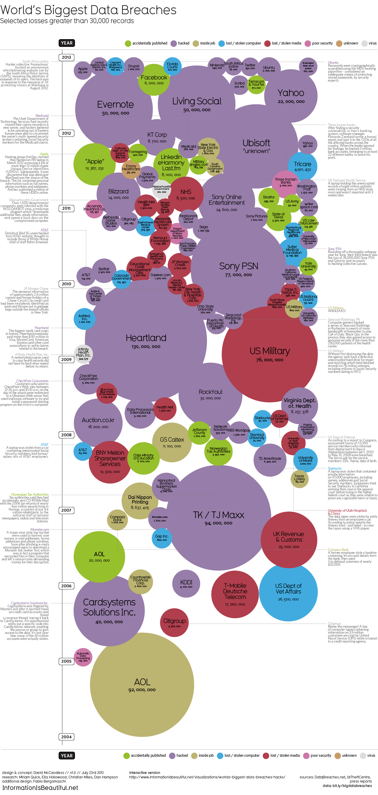
This weekend, Apple’s developer site was hacked. 275,000 logins, passwords and other records potentially compromised. Two days before that, popular open-source operating system Ubuntu had its forums hacked. 1.82 million records stolen.
Are those big data breaches? Or just pin-points in the big data universe?
We’ve pulled out the interesting and funny stories out of the data. Click on the bubbles to read.
A fantastic design, the interactive version allows you to adjust the sorting, circle size and color-coding parameters. It’s very easy for the reader to understand how one data breach fits into the overall history of stolen data.
In a move for transparency, the entire data set gathered and used in the design is available publicly to anyone through a Google Docs Spreadsheet. Anyone can access the source data to verify the visualization or to create their own.
The verdict is out; Support mother’s decisions on how they raise their children. Based on the StrongMoms Empower, The National Motherhood Decisions Survey from Strong Moms Empower, many mothers make decisions on how to raise their kids to avoid criticism!
In conjunction with the StrongMoms Empower program, the National Motherhood Decisions Survey was conducted to gauge how moms feel supported or judged. This infographic illustrates the survey findings, which include: 95 percent of moms have felt judged or criticized; one in three moms makes parenting decisions to avoid criticism; nine out of ten moms notice a positive impact on kids when they feel supported. For more information please visit StrongMomsEmpower.com
Good design. The key message is very clear. You don’t have to read the whole infographic to understand that the infographic wants you to support moms in a positive way. Also, a very clear call-to-action at the end with the link to signing an online petition.
The 2012 Feltron Annual Report is a report by information designer Nicholas Felton whose numbers were gathered with a custom-built iPhone app called Reporter. At random intervals each day the app sent reminders to complete a survey. The results of these questions were saved alongside background measurements to form the basis of this document. You can see the examples of the report at Feltron.com and buy it at the shop.
Today, you probably know Nicholas Felton best for his most widely seen work, Facebook’s Timeline. But since 2005, he’s been working on a cult-favorite project all his own, the annual Feltron Report. The 2012 version is out now for $28.
As always, the report is a meticulously documented year in review of everything he’s done, presented in a series of rich infographics that push the boundaries on personal data quantification. With a glance, you’ll learn some of Felton’s most intimate details. Each day, he consumes coffee around 10:40am and booze around 8:38pm. He spends about 4x as much time with his girlfriend as his mother. And on June 20, he shot a Glock 22.
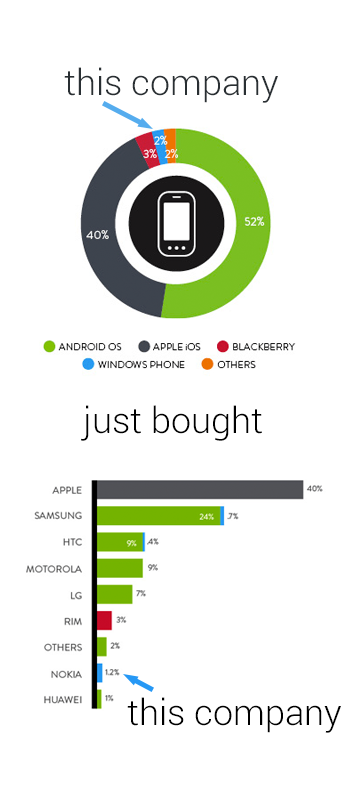
You’ve no doubt heard the old, oft-quoted adage, “men are from Mars, women are from Venus,” used to denote the fact that men and women may not always see completely eye to eye. While this light-hearted statement isn’t taken literally, when it comes to the virtual world of Internet interactions, similar sentiments may be formed surrounding the different ways men and women use social networking. While the majority of adults in the US are plugged into some sort of social media outlet, not all of them are used in equal measure, and not all of them are used by both genders equally. For instance, the average Google+ user spend just three minutes per month on the network, while the average Facebook user will spend 405 minutes per month updating statuses, posting pictures, and checking out others’ profiles. So what can be learned about men and women in the world of the web? As is turns out, men and women tend to dominate very different social media networks. The following infographic takes a look at some of the differences between male and female-dominated social media sites: How many users each one has, as well as how they interact.
There’s so really good data they have compiled in here, and most of the data visualizations are easy to understand. I would not have expected to see that Twitter has 40 million more female users each month.
There are a handful of minor tweaks that would help improve the design:
The salmon/orange/peach color for women is unexpected compared to the traditional pink.
Go ahead and use the official Twitter and Facebook icons. No need to design their own.
The pie slices for time spent would work much better with colors that are more distinct. The different shades of gray are very hard to differentiate.
For the pie charts, the text label should be placed next to the pie slice its describing, instead of the opposite side as shown in this design. Flipping the pie charts horizontally would fix that easily.
I appreciate the clear Creative Commons license in the footer, but the URL to the original infographic lansing page is missing. Since the infographic image file is shared by itself, the URL always helps readers to find the original.
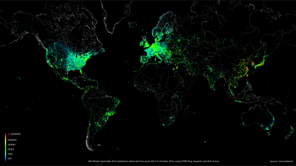
Beautiful data visualizations of some very scary data!
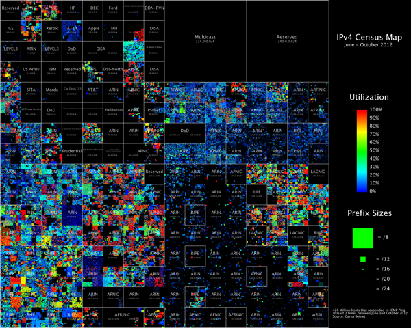
An anonymous hacker under the pseudonym of “Carna Botnet” has posted a comprehensive Internet Census 2012 report of over 460 million internet connected devices that responded to PING requests or were found to have open ports. He was able to create a botnet using over 30,000 Internet devices that had remote administration available using the Telenet and still had the factory installed standard passwords. He found several hundred thousand open devices, but didn’t need that many.
Abstract: While playing around with the Nmap Scripting Engine (NSE) we discovered an amazing number of open embedded devices on the Internet. Many of them are based on Linux and allow login to standard BusyBox with empty or default credentials. We used these devices to build a distributed port scanner to scan all IPv4 addresses. These scans include service probes for the most common ports, ICMP ping, reverse DNS and SYN scans. We analyzed some of the data to get an estimation of the IP address usage.
All data gathered during our research is released into the public domain for further study.
The visualizations he was able to create using the gathered data are fantastic. Check out the IMAGES page of the report for beautiful, high-resolution images.
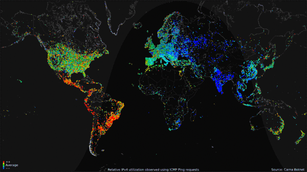
The map visualization above shows the geolocation data of all 460 million devices that responded to the queries from the botnet, clustered around population centers as you might expect. The animated GIF below shows the geolocated devices that responded during the course of a day, showing that many devices are turned off overnight but many more are just left on constantly.
My favorite visualization from the data is the Hilbert Map, which uses the a 2-dimensional Hilbert Curve to map out the continuous sequence of IP4 addresses into a square area, and then color-codes the address blocks that responded to a PING request. There’s even a cool zoomable viewer of the Hilbert Map that lets you drill into the details.
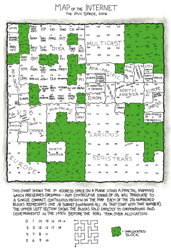
This form of mapping was inspired by the xkcd Map of the Internet, which shows the Internet addresses that were distributed to major corporations in the 1990s before the Regional Internet Registries took over the allocation.
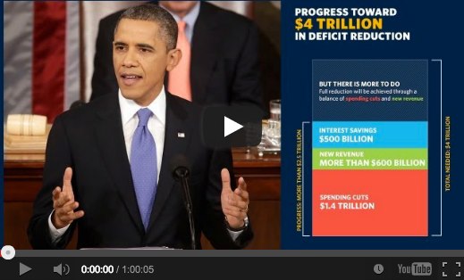
On February 12, 2013, President Obama gave his annual State of the Union speech, but this year it was “enhanced” with charts, data visualizations and additional information in a sidebar of the display (full video above). The team at NPR (@nprapps) published a great review a few days later called Chart Check: Did Obama’s Graphics ‘Enhance’ His Big Speech? They also included opinions from a couple of the best data visualization experts Stephen Few (PerceptualEdge.com) and Nathan Yau (FlowingData.com)
I will say that I think the use of the charts was very successful and does make the President’s speech more effective. By their very nature, the charts imply that the President has data behind his message, and that can be a very persuasive, compelling tactic. You’ll also notice the wide array of chart styles so they are each memorable for different topics in the speech. We didn’t get 27 bar charts, because the audience wouldn’t have been able to tell them apart after the speech. We got different data visualizations for different types of data. Stacked bars, line charts, area charts and grids colored icons.
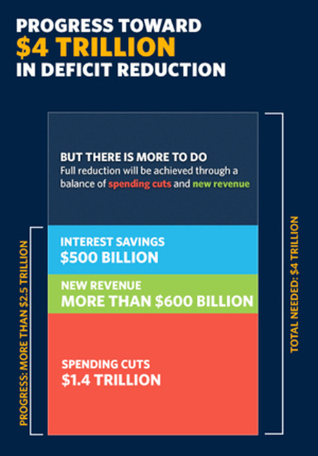
The key frame from the video (above) is what first caught my eye. This is the still image shown before you start playing the video. I was instantly concerned about all of the charts after seeing this one about Deficit Reduction. It may be because I work with data visualizations every day, but I could see instantly that the chart was wrong. How can the $500 Billion part of the stacked bar be larger than the $600 Billion part? That can’t be right! Seriously, I look at this stuff all the time, and this jumps out at me in a big way. Welcome to my life.
Here’s the full chart:
One of the biggest risks with data visualizations and infographics is what I call the Risk of Negative Impression. The idea is that while good visuals can quickly leave a good impression with your audience, if your visualizations are incorrect or flawed, you can leave a bad impression just as quickly and effectively. The audience thinks, “if they messed up this chart, why should I trust anything else they have to say?” Then they feel like they have to carefully scrutinize every chart, and you have lost all credibility with your audience.
The NPR piece does a great job of breaking down 14 of the 27 charts from the speech, and even created some corrected charts to show a more realistic real visualization of the data. I highly recommend you read the whole article on the NPR site.
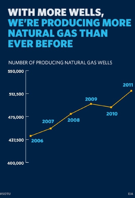
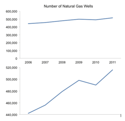
I’ll mention one more example. By visualizing data, the designer adds context and bias to the information. The best designers try to minimize the bias, but even the choices about what data to include in the visualization help frame the audience’s understanding. One common way to skew perception of the data is to change the scale of one or both of the axes. A number of slides from the speech don’t start at zero, so the chart exaggerates the changes. This is a common practice when charting stock values so the audience can see the small changes, but they often make the changes feel much bigger than they actually are. That was the intent with this chart that only shows the range of values from 400,000 to 550,000.
Stephen Few redesigned this corrected chart for the NPR piece, and I think he nailed it. By expanding the y-axis to start at 0, he puts the changes over time into a different perspective for the audience.
The White House has published all of the 107 slides as a scribd.com presentation:


 Randy
Randy