About
Randy Krum
President of InfoNewt.
Data Visualization and Infographic Design

Infographic Design

Infographics Design | Presentations
Consulting | Data Visualizations

DFW DataViz Meetup

Join the DFW Data Visualization and Infographics Meetup Group if you're in the Dallas/Fort Worth area!

Search the Cool Infographics site

Custom Search

Subscriptions:


Feedburner

The Cool Infographics® Gallery:

How to add the
Cool Infographics button to your:

Cool Infographics iOS icon

- iPhone
- iPad
- iPod Touch


Read on Flipboard for iPad and iPhone

Featured in the Tech & Science category

Flipboard icon

Twitter Feed
From the Bookstore

Caffeine Poster

The Caffeine Poster infographic

Entries in Marketing (53)

Wednesday
Feb252015

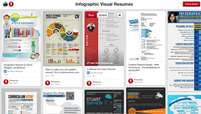
Five Innovative Ways Companies Are Using Infographics to Share Data

The popularity of turning data into visuals has skyrocketed in recent years. Especially the keyword “infographic,” as evidenced through Google Trends. This has sent capable marketers scrambling for a competent team of: designers, copywriters, and producers to create new and exciting content. While charts and graphs are nothing new, the way they are displayed visually (and the stories they can tell), is expanding into uncharted waters.

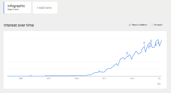
via: Google Trends - “Infographic”

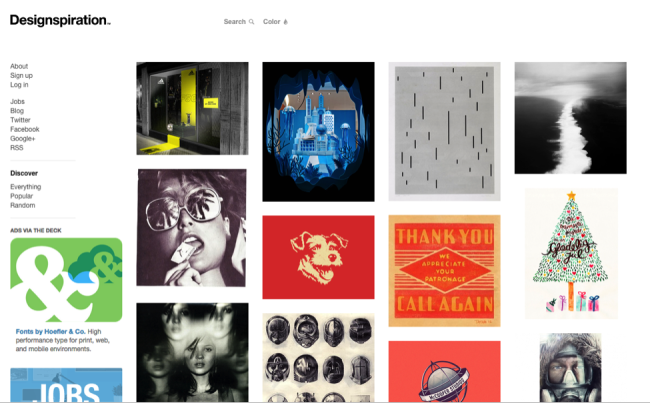
Infographics and data visualizations were once the playthings of academics. Beautiful displays of information were created and tucked away in their ivory towers of academia. Those days are now long over, and the power of data combined with visual information has been passed on to the masses.

For a while, it seemed nearly everyone under the sun was creating infographics. This resulted in an over-saturation of infographics online, with marketers cranking them out as fast as possible. Complete with often poor designs, and misleading data.

While this over-saturation did hurt the online marketing reputation of infographics slightly, their growth in online popularity did not. This online exposure and awareness of infographics has driven a significant increase in the use of infographics inside companies as well.

To help clear the air, check out these six examples below for how companies are coming up with innovative ways to use infographics.  


1. Hotels.com: PR Infographics

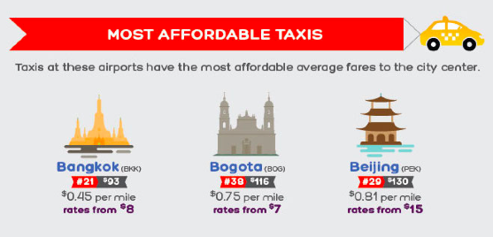
Traveling and flying to new cities can be equal parts exciting and terrifying. This infographic from Hotels.com, provides travelers with valuable insights they should know before arriving in major cities around the world. This infographic is great because it gives their customers valuable information (and saves a bit of decision-making time) to make their transition from the sky to the city that much smoother.

Another great thing about these infographics is that they are specifically targeting the press with their proprietary internal data. This builds their credibility by sharing their expertise and valuable insight into the hotel industry. They’re not just telling the press, they’re showing them the data visually as well.


2. Wine Folly: Food and Wine Pairing

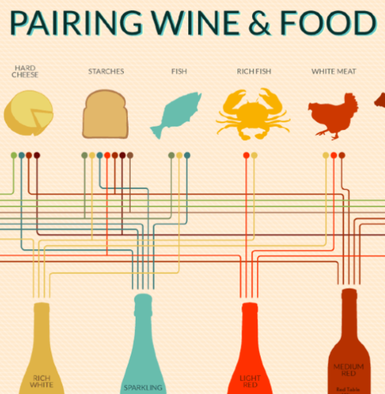
This infographic from Wine Folly looks at all the different taste profiles, such as sweet and sour, to create the perfect food and wine pairings. The great thing about this infographic is its online life span - which can easily last for many years. Twenty years from now, the information will still be the same, and the design will still be relevant to readers.

Online lifespan can make a huge difference to the ongoing SEO value of any infographic, and should be an integral part of the topic selection process.


3. SumAll: The Internet is a Zoo - The Ideal Length of Everything Online

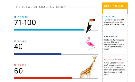
This infographic from SumAll looks at something we all struggle with: our attention spans. How many characters long should a Facebook post be? What is the ideal subject line length? How many words should a blog post be so that it actually gets read? All the answers to your burning questions are here in one place. 

What makes this graphic so good is that these observations apply to all social media audiences, no matter what industry they come from. It’s a valuable topic for marketers in any industry.


4. Warby Parker Annual Report

The annual report is getting a strong makeover thanks to innovative companies like Warby Parker. The annual report used to be a non-event. Everyone made an annual report, and they all basically looked and felt the same; i.e. lots of words, mixed in with some charts and graphs. Warby Parker really hit the mark with their 2013 Annual Report

In an article on Business Insider, they explain how Warby Parker’s previous two annual reports fit into it’s quirky brand, but the 2013 annual report is it’s most ambitious. It may seem like it has plenty of meaningless information, but it’s a smart business move. Because amidst all of the meaningless information, you begin to realize that it’s not actually an annual report at all, but a giant advertisement intended to become viral. This resulted in some of their biggest sales days.

Seeing as how every business loves talking about itself on social media, it’s surprising it has taken this long for the annual report to become relevant again.


5. MHPM Corporate Sustainability Report

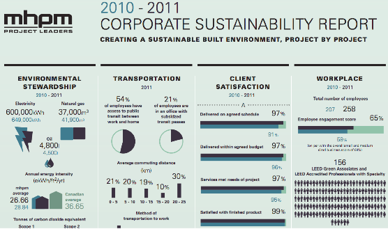
This infographic from MHPM examines the creation of a sustainably built environment, project by project. More and more, sustainability matters to clients, employees and the communities they all live and work in. With the right practices in place, a sustainable building is worth more (and costs less to operate) than traditional buildings, helping to make them an attractive choice versus competitors.

This new application of infographics lets MHPH tell their own story in a visually appealing way. By providing the numbers behind their commitment to keeping their projects green, MHPM has not only helped prove their own claim that Sustainability is Free™, but they also share how they can help their customers.

As we have seen over recent years, infographics have continued to grow in popularity. Giving rise to a new Internet, continually heading in the direction of displaying more advanced, and beautiful ways to visualize information. What are some other creative uses of infographics you have seen lately?

Thursday
Feb192015

Busting Myths About Hand Sanitizers

Busting Myths About Hand Sanitizers infographic

The Debunking the Myths About Alcohol-Based Hand Sanitizer infographic from PURELL clears up some of the most common misconceptions about their products. 

All germs are bad germs, right? Not necessarily. Using hand sanitizer dries out hands? Some don’t, but PURELL® Advanced Hand Sanitizer won’t strip your hands of their natural moisturizers. There is much confusion today around antibiotics, antibacterial soaps and hand sanitizers, as well as their effectiveness and whether they contain harmful chemicals like Triclosan (which Purell does not). Learn the truth about alcohol-based hand sanitizers as 7 of their most common myths are debunked for good.

Infographics are a fantastic way for companies to help consumers better understand complicated products and issues. Health and safety are some of the top concerns from consumers, and the team at PURELL has done a great job here of addressing the top concerns and misunderstandings they hear about their products.

The use of the infographic as part of a larger marketing campaign is also a great use of the data and design assets that have been created. The larger campaign includes videos, a SlideShare presentation, the infographic and a downloadable PDF.

Monday
Feb022015

The Anatomy of the Perfect Sales Presentation

The Anatomy of the Perfect Sales Presentation infographic

Good infographics tell stories to the audience, and you sales presentations should too. The Anatomy of the Perfect Sales Presentation from Clemence Lepers (@PPTPOP) uses an infographic story to help people learn to tell better stories with PowerPoint. Very meta isn’t it?

You’re not gonna like it, but if you’re willing to start making some solid sales presentations that’ll help you generate more business, you’ll have to print the next sentence in your brain. Nobody cares about you. I repeat, nobody cares about you.  People care about how YOU can solve their problems and deliver the outcomes they are interested in. To grab prospects attention and close more sales, you need to bring consistent, clear solutions to their problems.

Easier said than done, right?

To help you with that, I’ve created an infographic that breaks down the key elements of a highly effective sales presentation. Follow them, and you’ll be set to get your value proposition across, communicate a compelling message and convert more prospects.

There’s a structure to a story, no matter what medium is being used to tell it. Don’t just throw your data and talking points into an infographic (or a presentation). Tell a story that makes your data meaningful to the audience.

Tuesday
Jan202015

The Key to Infographic Marketing: The Psychology of the Picture Superiority Effect

In Ancient times, Cicero considered memory training to not just be a method, but a form of art. He felt strongly that training your memory was one of the most valuable things you could do to improve your capabilities as a speaker, and a citizen.  Even in ancient times, Cicero knew that remembering images was superior to remembering text alone.

People remember pictures better than words, especially over longer periods of time. This phenomenon as we know it today, is called the Picture Superiority Effect*. It refers to the notion that concepts that are learned by viewing pictures are more easily and frequently recalled than are concepts that are learned by reading their written word form counterparts.

What had been known to the Ancients throughout the centuries, has been quantified scientifically in our modern times. In my book, I included this quote from John Medina’s Brain Rules, to help explain the value of the Picture Superiority Effect. However, to make it visual I created this simple data visualization to help readers remember the power of visual information.

“Based on research into the Picture Superiority Effect, when we read text alone, we are likely to remember only 10 percent of the information 3 days later. If that information is presented to us as text combined with a relevant image, we are likely to remember 65 percent of the information 3 days later.” - John Medina, Brain Rules, 2008

Cool Infographics Picture Superiority Effect

via: coolinfographics.com/book

Advertisers have known this for years. Whether it’s been a simple application like the Yellow Pages (ads with pictures got more business) or giant billboards in New York’s Times Square. To see a real world example of how the Picture Superiority Effect works, check out this excellent coverage area map ad campaign from Verizon:

Verizon Coverage Map Infographic Ad

These maps show Verizon’s 4G LTE network coverage area, compared to the coverage area of their competitors. If you were only to get the text version, imagine how much of this paragraph explaining their coverage area you would remember 3 days after reading it:

“Among the four major wireless carriers, only Verizon’s 4G network is 100% 4G LTE the gold standard of wireless technology. Available in over 500 cities, Verizon 4G LTE covers almost 97% of the U.S. population. Experience the speed and power in more places.”

Now, take a look at the maps again. How much easier it is to see how the four major wireless carriers stack up against each other? It’s obvious Verizon covers the most area. Verizon takes it a step further, and has a link to a PDF highlighting their coverage in Alaska and an interactive map to view different parts of the country. All complete with map visualizations, of course.

However, there is another very important aspect of the Picture Superiority Effect that must be understood: It’s not just any image. It needs to be an image relevant to the content, which reinforces the message from your data. This works across all mediums of advertising, and of course, infographics.

In infographic design, the Picture Superiority Effect is extended to include charts, graphs, and data visualizations. Infographic designers use data visualizations and illustrations as the visual component of a design to trigger the Picture Superiority Effect, which can have incredible success getting the audience to remember the information presented.

Here is an great example from Dan Roam, author of the book, The Back of the Napkin, Solving Problems and Selling Ideas With Pictures, of how using images and text can help a designer understand which type of visualization is appropriate to use when communicating different types of information. Easy to understand, easy to remember.

Dan Roam Back of the Napkin <6><6> Rule

via: DanRoam.com

Infographics work so well because using text and images together helps people to retain the information. Remember, if it’s just words, people will only remember 10% of the information they read. But, if you combine the text with a relevant image, they are likely remember 65% of the information! While others may choose to work harder by crafting a perfectly written article or advertisement, it would be a smarter choice to use text and relevant images together.

Remember to “Make It Visual” if you want your audience to remember the information about your company’s products or services. You don’t have to be a professional designer either. You can make your content visual using a wide range of tools like the Adobe Creative Cloud suite, Microsoft PowerPoint, OmniGraffle, or online design tools like Visme.co or Tableau Public.


Sources:
*Nelson, D.L., Reed, U.S., & Walling, J.R. (1976). Pictorial superiority effect. Journal of Experimental Psychology: Human Learning & Memory, 2, 523-528.
Thursday
Jan152015

Starbucks Espresso Infographic Advertising

 
Can you name all 6 Espresso Classics?
Starbucks Guatemala


NOW AT STARBUCKS! The newest addition to the Starbucks menu is the Flat White. But what is the difference between The Flat white and the rest of Starbuck’s menu?

Starbucks sent this cool infographic as a content marketing piece in an email to all of their customers introducing The Flat White to their menu. The infographic visualizes the recipes for the 6 Espresso Classics. Currently available for view in most Starbucks stores around the country is an infographic that explains the differences between the styles of drinks on the menu.

The graphics in the email are actually the 3 separate images you see above, and I assume they could be changed for different people receiving the email. For example, someone else might receive an email about the Cappuccino or a different coffee flavor ad at the bottom. Good for flexibility in the emails, but bad for sharing in social media.

A product of simplicity, crafted into artistry, our baristas know that balance is key to the perfect Flat White. An extra ristretto shot ensures that it’s bolder than a latte, yet steamed milk keeps it smoother than a cappuccino. But perfection doesn’t end there—the technique for steaming and pouring the milk requires close attention as well. Steamed milk is folded into itself creating a velvety microfoam that gives the Flat White its silky texture and signature white dot.

Starbucks The Flat White

Love the cafe-style chalkboard look, and the layered drink r recipe visualization design!

Using this infographic in an email campaign is brilliant, but I wish it had been designed to also stand on its own so it could be shared online in social media easier.

Starbucks Espresso Spectrum

They use this design style throughout their entire espresso menu of drinks.

Thanks to Starbucks for sending the infographic to it’s customers! I put the separate pieces together below to make sharing easier!

Starbucks The Flat White Espresso Email Infographic

Friday
Jan022015

SEO Rank Correlations and Ranking Factors 2014

SEO Rank Correlations And Ranking Factors 2014 infographic

The SEO world is constantly changing. The SEO Rank Correlations and Ranking Factors 2014 infographic is your guide to good rankings! The infographic was created by Search Metrics, and they determined that the most important factors to optimal SEO is high quality!

We made it and just in time for this fall’s season. So download Ranking Factors 2014 on your tablet or smartphone because this study will be your best SEO read yet. Last year’s Ranking Factor study placed positive emphasis on good content, onpage technology and social signals that correlate with better positioned websites.

Get the latest and greatest SEO Ranking Factors and Rank Correlations 2014 – Google U.S. and get an in depth definition and evaluation of the factors that have a high rank correlation with organic search results.

A great way to summarize the top level findings from a longer report. This is a detailed infographic, but the information is incredible valuable.

I wish more of the numbers and statistics were visualized. Big fonts are not data visualizations!

Found on Business2community.com

Monday
Dec222014

5 Ways to Market Yourself Visually

Visuals communicate complex ideas into something more digestible. Large amounts of text make it harder for our brains to find pertinent information in a timely manner. This problem can be remedied quite easily, by adding images and visuals into marketing yourself.

Visuals can help turn a complex idea into something more easily digestible, with less effort and time spent by the person viewing it. By putting extra work in on your end, you position yourself to leave a more lasting impression, and stand out from a pile of resumes. Especially when marketing yourself to a recruiter or HR department - making it easier for them to understand your most important work. In Cool Infographics, I cover how visuals are 6.5 times more likely to be remembered than text alone, and there’s no better time to be remembered than when you’re applying for a new job.

Below are five ways to start marketing yourself visually right away:

1. The Infographic Resume

Infographic Resumes Pinterest BoardPinterest Board Gallery of over 900 Infographic Resumes

Infographics are an excellent visual tool to have in your arsenal. They are the pinnacle of displaying complex information in an easily digestible way. Either pay a talented infographic designer, or do one yourself. If you’re not comfortable using graphics design software, check out an excellent free option online like Visme.co - that will have you designing infographics in no time.

Take a look at this Infographic Resume Pinterest Board with over 900 examples for inspiration, and check out the great book The Infographic Resume by Hannah Morgan when you’re ready to get serious about developing your own.


2. Visualize Your LinkedIn Profile

via Richard Branson’s LinkedIn profile

It should be no big surprise that a prospective employer will look at your LinkedIn profile prior to checking you out in person. LinkedIn allows you to add photos and visually rich imagery, so take advantage of these opportunities. If you add companies that Linkedin recognizes to your work history, your profile will automatically display their logos.

Examples could be photos of you working at a trade show, product prototypes you designed, or a photo of you giving a presentation (LinkedIn has Sl SlideShare integration, so embed the presentation in your profile as well). Other images or PDF files work as well, like an advertisement you designed.


3. Create A Visual Portfolio of Your Work


Talking about your creative work only goes so far, you need to provide visuals. Visuals help the employer see what you’re capable of, and gives you the opportunity to control the work they see. Websites like Behance and Dribble are excellent options for creatives of all types. Not only do you get to upload all of your projects, but you get to interact with their creative communities as well - having the chance to inspire others, and be inspired yourself.


4. Create a Blog Post to Provide More Information and Visuals of Your Work


A resume should be a brief overview of skills, previous employment, education, and best works. One page is best. If you would like to expound further upon your projects, then create a blog post - loaded with visuals - that delves deeper into your work.  Tumblr is a great free option for keeping a personal blog.

Include links to any additional content you publish in your Linkedin profile and even on your text resume. Make it as easy as possible for hiring managers and recruiters to find your work.


5. Content Curation

Similar to the idea of creating a blog post to highlight your best work, create a content curation site to highlight the best infographics, articles, quotes, YouTube videos, podcasts, brands, inspirational work, thought leaders, TED talks, and books you’re reading. Show your future employer that you have a passion for gaining knowledge, and are an expert in your field. Pinterest is a great option, and if you’re looking for a design-centric curation site, Designspiration has got you covered.


What other ideas would you recommend?

Wednesday
Dec032014

40 Brand Logos with Hidden Messages

40 Brand Logos with Hidden Messages infographic

Some of the best known logos hide the best kept secrets. 40 Brand Logos with Hidden Messages infographic designed by Oomph! reveals some of those secrets. How many did you already know?

You probably already know the story behind the famous FedEx logo and its clever use of negative space. (If you don’t, read this.) But of course, it’s hardly the only logo with a “hidden message.”

British plastic card maker Oomph has collected 40 such logos—check them out below. Amazon, Unilever and the Tour de France are particularly cool. How many of these sneaky messages would you have spotted without the help?

You can’t cover this topic without the visuals, and that’s why this infographic is so effective. It shows you the logos with clear explanations of the stories behind them.

The footer should include the uRL to the infographic landing page, so readers can find the original, full-size version when they find this design on other sites across the Internet.

Found on: http://www.adweek.com and http://www.thedrum.com

Friday
Sep192014

Marketing Artists vs. Marketing Scientists

Marketing Artists VS Marketing Scientists infographic

The Marketing Artists vs. Marketing Scientists infographic from Pardot highlights the assets of both kinds of marketers in the modern age. But the alliance between the two groups will create the best end product.

In a great article published last week, Stan Woods of Velocity Partners offered his thoughts on how fast marketing has developed over the past few months, and the new marketing roles this change has created.

In his closing paragraph, Woods distinguishes between the creative-driven and data-driven marketers by referring to them as “marketing artists” and “marketing scientists,” respectively. Although a slight oversimplification, these distinctions hold a lot of truth about the current divide that exists within many marketing departments.

Technology has given marketers the ability to track, quantify, and optimize marketing processes at a level that was unheard of only a year ago. The marketing scientist has come to dominate this new arena of objective measurement and data-driven thinking, while the marketing artist continues to thrive on creative ideas and a more abstract way of thinking.

But while these two differently-minded marketers may sometimes disagree over where the focus should lie,  the marketing departments that will truly excel in this new age of marketing are those that recognize the value in both approaches. We have put together the infographic below to help highlight the tremendous assets marketing artists and marketing scientists can bring to the table, and the advantage of finding a balance between the two.

This is a purely informational design with no numerical data, but tells a good story. There are two aspects to marketing represented by the illustrated personas. I would prefer less text and more icons or illustrations, but the infographic does a great job of telling one story really well.  That keeps the design short, easy to share and easy to read.  The dominant central visual is also appealing and attracts attention.

The footer should include the URL to the infographic landing page, not just Pardot.com.  When readers come looking for the full-size version, don’t make them search your site for it.

Found on http://www.business2community.com/

Wednesday
Aug272014

Visual Customer Service in the Social Age

Visual Customer Service in the Social Age infographic

The Visual Customer Service in the Social Age infographic created by Gryffin for TollFreeForwarding.com, describes the different social media platforms and how they could be to supplement customer service information to customers.

I’m sure you know that visual content on social media can massively improve engagement. But just how important is it?

On the web, it’s estimated that 55 percent of all traffic will be video by 2016, and mobile video traffic will increase by 1800 percent. YouTube, Instagram and Vine are currently the best platforms to maximise video engagement, so are you utilising them to their full potential in your marketing campaigns?

I like that this design takes some of the great things we know about visual information and applies it to a specific company function.  This is one way the companies can leverage the power of visual information with their customers.

It’s interesting that I couldn’t find the original infographic on either Gryffin or TollFreeForwarding.com sites.  There’s no blog post or infographic landing page on either one.

Again, we see the folk research statistic that “the brain processes visual information 60,000 times faster than text.”  This data point is quoted so often that people believe it’s true, but no one can find the research to back it up.  As far as anyone can tel, it was quoted in some marketing information from 3M in the 1980’s to support sales of transparency sheets used on overhead projects.  If you’re interest, I suggest reading these posts from Alan Levine and Darren Kuropatwa.

Found on www.mediabistro.com and Visual.ly