About
Randy Krum
President of InfoNewt.
Data Visualization and Infographic Design

Infographic Design

Infographics Design | Presentations
Consulting | Data Visualizations

DFW DataViz Meetup

Join the DFW Data Visualization and Infographics Meetup Group if you're in the Dallas/Fort Worth area!

Search the Cool Infographics site

Custom Search

Subscriptions:


Feedburner

The Cool Infographics® Gallery:

How to add the
Cool Infographics button to your:

Cool Infographics iOS icon

- iPhone
- iPad
- iPod Touch


Read on Flipboard for iPad and iPhone

Featured in the Tech & Science category

Flipboard icon

Twitter Feed
From the Bookstore

Caffeine Poster

The Caffeine Poster infographic

Entries in Visualization (49)

Friday
Feb222013

Cloud Computing: Fact or Fiction?

Cloud Computing: Fact or Fiction? infographic

Cloud Computing: Fact or Fiction? is a new infographic from Devry University helping to explain the basics about cloud computing, and the clear up the common misunderstandings people have about the Cloud.

Cloud computing allows you to store, access and share data from Internet-connected devices in one central location.  As technology careers continue to grow across the U.S. and cloud computing creates nearly 14 million jobs by 2015, the Cloud is more important than ever.  Here are the fact you need to know about the Cloud - and the fiction than many believe.

This is a really clean and easy-to-read design, with a great color scheme.  The statistics to support each section are good, and clearly sourced in the long list of data sources in the footer.

The data visualizations are a mixed bag.  The doughnuts are easy to read and the percentage bars are clearly visualized as portions of 100%.  The 24% doughnut in the top visualization is wrong.  That will catch many people’s eye, and cast doubt on the rest of the visualizations.  Once you get one data visualization wrong, you lose credibility and people will more closely scrutinize the rest.

Why are other numbers not visualized?  The “cyber attacks” and “people using the cloud” statistics would have been easy to visualize, but now seem unimportant to the reader because they are just shown in text.


The most interesting thing is that I got this promotional, marketing email (image above) from YouSendIt.com highlighting this infographic and showing the top portion with the incorrect visualization.  As far as I know, Devry and YouSendIt are not related in any way, so this is just using someone else’s work for their own purposes.  

Of course, infographics are meant to be shared, but you shouldn’t claim credit for someone else’s work, especially in an email promoting your own commercial services.  By omitting any design credit to Devry in the email, the message implies that the infographic is coming from YouSendIt, so it looks like the YouSendIt designers messed up the data visualization.  The negative impression created by the false visualization will now also create a negative impression of the folks at YouSendIt.  Oops.

Wednesday
Feb202013

NPR Chart Check from the Enhanced State of the Union (SOTU)

On February 12, 2013, President Obama gave his annual State of the Union speech, but this year it was “enhanced” with charts, data visualizations and additional information in a sidebar of the display (full video above).  The team at NPR (@nprapps) published a great review a few days later called Chart Check: Did Obama’s Graphics ‘Enhance’ His Big Speech?  They also included opinions from a couple of the best data visualization experts Stephen Few (PerceptualEdge.com) and Nathan Yau (FlowingData.com)

Chart Check from the Enhanced State of the Union (SOTU)

I will say that I think the use of the charts was very successful and does make the President’s speech more effective.  By their very nature, the charts imply that the President has data behind his message, and that can be a very persuasive, compelling tactic.  You’ll also notice the wide array of chart styles so they are each memorable for different topics in the speech.  We didn’t get 27 bar charts, because the audience wouldn’t have been able to tell them apart after the speech.  We got different data visualizations for different types of data.  Stacked bars, line charts, area charts and grids colored icons.

The key frame from the video (above) is what first caught my eye.  This is the still image shown before you start playing the video.   I was instantly concerned about all of the charts after seeing this one about Deficit Reduction.  It may be because I work with data visualizations every day, but I could see instantly that the chart was wrong.  How can the $500 Billion part of the stacked bar be larger than the $600 Billion part?  That can’t be right!  Seriously, I look at this stuff all the time, and this jumps out at me in a big way.  Welcome to my life.

Here’s the full chart:

One of the biggest risks with data visualizations and infographics is what I call the Risk of Negative Impression.  The idea is that while good visuals can quickly leave a good impression with your audience, if your visualizations are incorrect or flawed, you can leave a bad impression just as quickly and effectively.  The audience thinks, “if they messed up this chart, why should I trust anything else they have to say?”  Then they feel like they have to carefully scrutinize every chart, and you have lost all credibility with your audience.

The NPR piece does a great job of breaking down 14 of the 27 charts from the speech, and even created some corrected charts to show a more realistic real visualization of the data.  I highly recommend you read the whole article on the NPR site.

I’ll mention one more example.  By visualizing data, the designer adds context and bias to the information.  The best designers try to minimize the bias, but even the choices about what data to include in the visualization help frame the audience’s understanding.  One common way to skew perception of the data is to change the scale of one or both of the axes.  A number of slides from the speech don’t start at zero, so the chart exaggerates the changes.  This is a common practice when charting stock values so the audience can see the small changes, but they often make the changes feel much bigger than they actually are.  That was the intent with this chart that only shows the range of values from 400,000 to 550,000.

Stephen Few redesigned this corrected chart for the NPR piece, and I think he nailed it.  By expanding the y-axis to start at 0, he puts the changes over time into a different perspective for the audience.

The White House has published all of the 107 slides as a scribd.com presentation:


White House State of the Union 2013 Enhanced Graphics by The White House

Found on the White House blog

Wednesday
Jan092013

Strata Conference CA Feb 26-28 - 20% Discount Code

2013 Strata Conference

If you have any thoughts of attending the 2013 Strata Conference in Santa Clara, CA, the discount code “COOL20” will cut 20% off the registration price for readers of Cool Infographics!  Big data, visualization, privacy, science and business!  What’s not to love?!?

This is an expensive conference, so the 20% discount is a BIG deal; saving hundreds of dollars!  The 2013 conference will run from February 26-28, 2013 in Santa Clara, CA.  If you can register early…

Early REGISTRATION Prices END THURSDAY, January 17TH!

Strata Conference 2013 - Feb 26-28, 2013 in Santa Clara, CA

Join the best minds in data for the latest in the data revolution: trends, tools, new practices, careers, and culture. Bringing together decision-makers, practitioners, and leading vendors from enterprise and the web, Strata provides three days of training, breakout sessions, and plenary discussions, along with an expo hall showcasing the new data ecosystem.

 Check out the video including clips from some of the prior presentations!


Tuesday
Nov062012

Daylight Savings Time Explained

Daylight Savings Time Explained infographic

Daylight Savings Time Explained designed by a Visual.ly member under the name Germanium, visually explains the end result of recognizing Daylight Savings Time.  DST is used mostly in North America and Europe, while most of the world does not change their clocks.

I tried to come up with the reason for the daylight saving time change by just looking at the data for sunset and sunrise times. The figure represents sunset and sunrise times thought the year. It shows that the daylight saving time change marked by the lines (DLS) is keeping the sunrise time pretty much constant throughout the whole year, while making the sunset time change a lot. The spread of sunrise times as measured by the standard deviation is 42 minutes, which means that the sunrise time changes within that range the whole year, while the standard deviation for the sunset times is 1:30 hours. Whatever the argument for doing this is, it’s pretty clear that reason is to keep the sunrise time constant.

By visualizing the daylight hours, the reader can see the pattern.  Both the change in total hours, and the impact of daylight hours on their normal day.

The reasoning for DST is very controversial, but now we can see the impact clearly.

Tuesday
Sep042012

2011 Wisconsin Crash Calendar & Interview

2011 Wisconsin Crash Calendar infographic

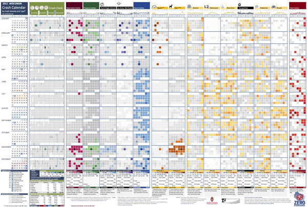
I love this infographic design!  Designed by Joni Graves, a Program Director at the University of Wisconsin-Madison Department of Engineering Professional Development (that’s a mouthful!).  I highly recommend downloading the PDF version and taking a closer look on your own.

The original version and a few variations are available on a couple different official sites:

The Wisconsin Bureau of Transportation Safety (BOTS) uses printed copies of the infographic calendar at meetings around the state with various groups to generate discussions about what causes crashes and how to interpret what the data shows.

This design is a great example of how visualizing the data allows the readers to see patterns in the data and much more easily understand the stories behind the data.  The color coding makes it easy to compare the data subsets, and the consistent layout to match a traditional paper calendar is very easy to follow.

There are so many findings you can quickly see in the big dataset.  Some are obvious, but many are surprising.  For example, you can clearly see…

  • Alcohol-related crashes happen primarily on weekends, and fairly consistently throughout the year.
  • Deer Season is clearly identified in Oct-Nov.
  • There was something special about July 1st…
  • Motorcycle, Work Zone and Bicycle crashes occur during the Summer months.
  • Ice, Snow, Wet Road crashes are highest in Jan-Feb, but what happened on April19th?  Late Winter storm?
  • Speed related crashes are primarily reported in the Winter months.
  • Fatal crashes are evenly spread throughout the year

Joni was also willing to answer some interview questions about this project and her design process:

Cool Infographics: What software applications did you use to create the Crash Calendar?

Joni Graves: EXCEL 2010 using Pivot Tables. Presentation advancements incorporate Microsoft’s PowerPivot using SharePoint.

Cool Infographics: Was the design created in cooperation with the Wisconsin Transportation Information Center, or was it an independent project? 

Joni Graves: I’m a Program Director at the UW-Madison Department of Engineering Professional Development and part of the WI LTAP (FHWA’s Local Transportation Assistance Program) / Wisconsin Transportation Information Center (TIC).

Cool Infographics: How long did the design take you to create?

Joni Graves: It’s a longer story, if you’re interested, but the skinny is that I started working on the Crash Calendar format in mid-April and previewed it at a meeting the end of the month. I had a learning curve with some of the intricacies, and spent about 200 hours on it during that two weeks! Since then it’s taken on a life of its own — and I am delighted by that!

Cool Infographics: Would you describe your design process?

Joni Graves: I would be happy to elaborate on this but, as an inveterate designer / tinkerer, I’ll confess that I’m always discovering some new way of formatting / displaying the data, and disappointed that there’s never enough time to do the new ideas justice …

Cool Infographics: What’s the most interesting thing you learned from the data?

Joni Graves: I’ve certainly enjoyed the design process! More importantly, it’s been incredibly satisfying to see people engage w/ the data using this intuitive representation, or to read their comments, because it’s apparent that it helps make the data far more accessible! And I have loved the comments / responses.

Cool Infographics: What was the hardest part behind designing the Crash Calendar?

Joni Graves: As I noted, there’s been a fascinating learning curve. But the hardest part has been stopping! As noted above, I’m always trying to “improve” it — and always running out of time.

Cool Infographics: What should we expect from future versions of the design?

Joni Graves: We currently have a multi-year version, a web-demo site, and a working 2012 version. I’m very excited about incorporating choropleth maps. Although it’s a very interesting “historic” document, the real goal is to provide a resource that is far more timely and potentially predictive for local users. 

I’m really excited about our plans to webize it, because the real idea is to expand it as a national project — using multi-year FARS data, WI data, and data from other interested states — and we really want to “unleash” it for others to actively use. 

Cool Infographics: Challenges?

Joni Graves: There’s been a wonderful response — and we are trying to figure out how to actually fund an expanded project w/ enhancements!

One additional thing to note was that Joni was inspired to create the whole design project by Nathan Yau’s post on Vehicles involved in fatal crashes in 2010 (which I posted about here earlier this year), and I think she has done a great job building Nathan’s initial visualization into some something much more powerful and effective.

Thanks to Joni for sharing!

Monday
Aug202012

ROI = Return On Infographics

ROI Return On Infographics


Infographics about infographics are always fun.  Return on Infographics by Bit Rebels and NowSourcing takes a look at some of Bit Rebels’ own data from releasing infographics as part of their marketing.

The impact of an infographic can be measured on many levels, which makes it all just a little bit more complex and complicated to present. With the help of NowSourcing, we have been able to produce an infographic that will compare the traffic and social action impact of an infographic post with a traditional post that does not involve an infographic. It’s through social media analytics that a clear image slowly emerges to tell a story that for some has just been a question without an answer.

They’re pretty clear about this, but remember that this design is completely based on internal data from Bit Rebels.  It may be a good indicator of infographics in general, but we don’t know for sure.

Bit Rebels has shared some fantastic data from their internal tracking, which will be of interest to the you, the readers of Cool Infographics.  However, the design makes a few mistakes, and we’re all here to learn how to make infographics designs better.

  • One of my pet peeves, the design messed up the size of the circles in the comparison table.  Based on the full-size infographic they released at 975 pixels wide, the smaller circle for 243 Actions is about 55 pixels in diameter.  Doing the match for the area of a circle, the diameter of the larger circle for 1,091 Actions should be about 117 pixels wide.  In the design, it’s actually about 256 pixels wide!  So instead of visually showing a shape roughly 4x larger, it’s actually showing a circle about 22x larger!  This is a “false visualization” and mis-represents the data.
  • Are these comparison data points an average or a total of the 500 posts?
  • How many infographic posts are compared to how many traditional posts?
  • Love the use of the actual logos from the social networks in the comparison table, and they should have continued that with the rest of the design instead of just text later in the design.
  • The blue bars behind the higher comparison value look like bar charts, but obviously don’t match the data.  They just fit the text, and have no visual relevance to the data.  An indicator icon or highlighting the entire column width would have been better than the bars.
  • Are the Top 6 Social Networks in rank order?  LinkedIN is the top social network for infographics???
  • The circles near the end of the design are also incorrect.  Instead of showing a 10x comparison to match the dollar values, the circles show an over 100x comparison!

Found on WebProNews, MediaBitro’s AllTwitter, and Visual.ly.  Thanks to everyone that also submitted it and tweeted links to it!

Wednesday
Aug152012

Which Countries were Successful at the Olympics?

Which Countries were Successful at the Olympics? infographic

A personal infographic design project by Paulo Estriga, Which Countries were really the Most Successful in London 2012? compares the Top 10 medal winning countries with a normalized set of data showing the number of medals per one million people in the population of each country.

The official standings are reached by counting the number of gold medals obtained by each country, using silver and gold [bronze? - Randy] medals to break ties.  By this method, the USA was the most successful country, followed by China in second and Great Britain in third.

However, most of these countries have many millions of people to pick from, which naturally generates a large number of quality athletes making it to the Olympics.  What happens when we take population numbers into account?  Which are really the most successful countries in getting the most gold medals out of the fewest people?

This design is clear, easy-to-read, and does a great job of showing how normalizing the data with population gives you a very different result.  He clearly cited his sources, included a copyright statement and the URL to his site.  I would have preferred the URL to be directly to the infographic.

Paulo’s structure of the overall infographic is a great example of the 3-part story format!  The introduction visualizes the traditional way of measuring countries based on their gold medal counts, by showing medal icons.  The Main Event is the visualization of the new, normalized for population chart that shows something new and unexpected to the reader.  Finally, a conclusion wraps up the design describing where the traditional Top 10 countries fall in the new ranking.

Outstanding job Paulo!

Wednesday
Jul112012

Strata Conference NY Oct 23-25 - 20% Discount Code

If you have any thoughts of attending the 2012 Strata Conference + Hadoop World, the discount code “COOL20” will cut 20% off the registration price for readers of Cool Infographics!  Big data, visualization, privacy, science and business!  What’s not to love?!?

This is an expensive conference, so the 20% discount is a BIG deal; saving hundreds of dollars!  The 2012 conference will run from October 23-25, 2012 in New York, NY.  If you can register early…

Best Price Registration ENDS Thursday, July 19th!  [EDITED]

 Now in its second year in New York, the O’Reilly Strata Conference explores the changes brought to technology and business by big data, data science, and pervasive computing. This year, Strata has joined forces with Hadoop World to create the largest gathering of the Apache Hadoop community in the world.

Strata brings together decision makers using the raw power of big data to drive business strategy, and practitioners who collect, analyze, and manipulate that data—particularly in the worlds of finance, media, and government.

Get the nuts-and-bolts foundation for building a data-driven business—the latest on the skills, tools, and technologies you need to make data work—along with the forward-looking insights and ahead-of-the-curve thinking O’Reilly is known for. The future belongs to those who understand how to collect and use their data successfully.  

And that future happens at Strata.

Check out some of the videos from the earlier Strata Conference in California from February 2012!

Friday
Jun152012

200+ Infographic Resumes, an escalating trend

Pinterest Board of Infographic Visual ResumesPinterest Board of Infographic Resumes

Back in January of 2010, I posted 16 Infographic Resumes, A Visual Trend that highlighted the start of the trend of infographics and data visualization moving into resumes.  Why 16?  Because that’s how many good examples I could find at the time on the Internet to showcase the concept.  Two and a half years later, that post continues to be one of the most viewed blog posts on Cool Infographics with an average of 3,500 views every month.  A 2.5 year-old blog post!

Since then, the idea of infographic visual resumes has exploded.  I have continued to gather links to infographic resumes, and my collection is now over 200 examples of infographic resumes that have been published online.  Instead of trying to post them here on the blog like I did in 2010, I’m experimenting by creating a Pinterest Board dedicated to sharing Infographic Visual Resumes.  I will continue to add resumes and grow the board, so follow the board if you want to see new ones as they are addded.  If you know of any that I should include, add the link in the comments or send a link through the Contact form with “Infographic Resume” in the Subject line. 

The Cinderella Story example is the Chris Spurlock resume shown below.  The story is that Chris was a graduating Journalism major at Missouri School of Journalism in early 2011, and created his infographic resume because he wanted to pursue data journalism as a career.  It was posted on the J-School blog, but quickly went viral on the Internet.  As a result, he was hired as an Infographic Design Editor for the Huffington Post!

Chris Spurlock infographic resume

I haven’t made any distintion between good and bad designs on the Pinterest board, because all of the designs can give you good ideas about types of data visualizations you can include in your own design.  The only distinction I have made is that they have to include some type of data visualization to be considered infographic.  There are many, many great graphic designer visual resumes that aren’t “infographic” so they aren’t included on the board.

Also, I have attempted to link each design back to the original owner’s site (like Chris’ resume above), but for many the public posting is on a portfolio site like Behance or Visual.ly.  If any of these should be linking to a different location, please send me a note through the Contact page, and I’ll get them linking to the correct places.

It’s definitely worth mentioning that there are a whole bunch of new online sites launching to capitalize on this growing trend.  The service they offer is to create an automatic infographic resume for you, usually based on your LinkedIN profile.  Vizualize.me, re.vu, Kinzaa, ResumUP and cvgram.me all create an infographic resume for you using their pre-designed templates.  I’ve tried to only include a couple examples from each service because 50 resumes based on the same template won’t provide you more inspiration to design your own.  My opinion is that these sites and templates are currently new enough to help your resume stand out, but very quickly the risk is that the templates will become recognized (like PowerPoint templates).

I’m planning a separate, future post about the best practices when designing your own infographic resume, but I wanted to shared the Pinterest Board with you as a resource for inspiration.

Please add a comment with your thoughts about the future of infographic resumes!

Page 1 ... 1 2 3 4 5