About
Randy Krum
President of InfoNewt.
Data Visualization and Infographic Design

Infographic Design

Infographics Design | Presentations
Consulting | Data Visualizations

DFW DataViz Meetup

Join the DFW Data Visualization and Infographics Meetup Group if you're in the Dallas/Fort Worth area!

Search the Cool Infographics site

Custom Search

Subscriptions:


Feedburner

The Cool Infographics® Gallery:

How to add the
Cool Infographics button to your:

Cool Infographics iOS icon

- iPhone
- iPad
- iPod Touch


Read on Flipboard for iPad and iPhone

Featured in the Tech & Science category

Flipboard icon

Twitter Feed
From the Bookstore

Caffeine Poster

The Caffeine Poster infographic

Entries in Visualization (49)

Thursday
Aug142014

Coolness Graphed

Coolness Graphed


Coolness Graphed

Coolness Graphed.com has a collection of bar graphs that describes when certain actions are deemed “cool” or “uncool”. The three shown here are just a few examples from the website.

Coolness Graphed.com brings normal events together with a humorous flare by rating them in a “cool”/”uncool” bar graph. The bar graph works well with the events as a visual ranking system. No real values are needed.  Data visualization used brilliantly!  It only takes seconds for the audience to understand each one, and they are highly sharable in social media.

The site has been running for more than two years now, and keeps getting funnier!  Thanks to Jones for sending in the link!

Now also available in a book!

Tuesday
Aug122014

The Vizzies Challenge

The Vizzies Challenge

A partnership between Popular Science and the National Science Foundation (NSF) have started a new data visualization contest for 2014 called The Vizzies Challenge.  They are accepting entries up until September 30, 2014.

Here at Popular Science, we’re big fans of visualizations—those often beautiful and always illuminating intersections of science and art. So we’re thrilled to announce a new partnership with the National Science Foundation called The Vizzies.

Do you love animating data, creating science apps, or taking macrophotographs? In the 2014 Visualization Challenge, sponsored by the National Science Foundation and Popular Science, your handiwork can receive its due glory and win you cash prizes.

The Vizzies is the newest iteration of the NSF’s annual International Science and Engineering Visualization Challenge, which has honored some amazing stuff in the past. They’ve hosted the contest for more than a decade, and this year we’ve joined forces with them so that you, dear reader, will have the opportunity to enter. Macrophotography, animations, data visualizations, even science games—we want them all! A panel of experts will judge the entries, and the winners in each of five categories will be featured in the pages of Popular Science (oh, and you’ll also get cash).

Visualization Challenge participants can submit their entries in one or more of five categories: Photography, Video, Illustration, Posters & Graphics and Games & Apps. The Experts’ Choice winner in each category will be awarded $2,500, and a People’s Choice prize of $1,000 goes to the best overall entry.

If you are designing data visualzations or using visuals to communicate any scientific research, they want you to enter your designs into the challenge.  The visuals can be videos, photos, games, apps or graphics.

Thanks to  for posting about the challenge in the Visual Thinking group on Linkedin!

Tuesday
Jun242014

HelpMeViz: DataViz Community Feedback for Your Charts

HelpMeViz: DataViz Community Feedback for Your Charts

Have you ever struggled with which type of chart to use in your presentation? Or how to get Excel to display the chart the way you want it to appear?  Or don’t know what software will create the data visualization you would like to use?

Jon Schwabish is a data visualization specialist, and in 2013 he launched a new website to help everyone become better at data visualization called HelpMeViz.  The HelpMeViz site invites you to submit your data visualization projects to get feedback from the community.  The community is encouraged to offer suggestions, critiques and debate ideas about chart formats, software tricks, visual applications and visualization methods that can be valuable feedback to make your data more understandable and impactful.


The data visualization community consists of people who use data and design to tackle a variety of issues and challenges. Outside of a few specific blogs and tutorials however, there isn’t a place where that community can provide in-depth comments and criticism on data visualization projects. This site is designed to facilitate discussion, debate, and collaboration from the data visualization community.

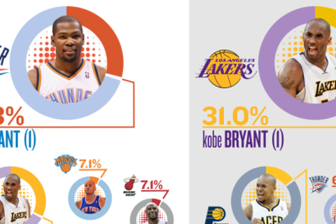
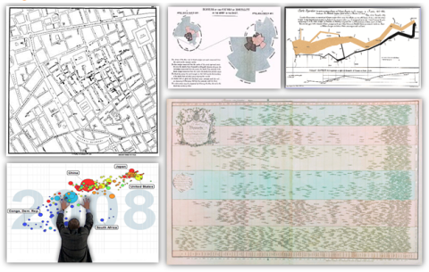
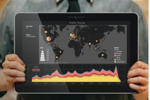
The site is open to anyone who is searching for feedback on their visualization designs, from seasoned designers and data visualization specialists to individual analysts searching to improve their graphic displays. All types of visualizations are welcome: simple, single line or bar charts to full-blown infographics to interactive visualizations.

If you have a chart that just isn’t working, or getting your message across to your audience, you can upload it to the site, and get really useful, actionable advice from the Community.

Mapping Program Participation by State

Jon is currently the Senior Researcher and Data Visualization Expert at the Urban Institute in Washington, DC, and he took some time to answer a few interview questions from me about the HelpMeViz site:

Cool Infographics: Who is the target audience of the site?

Jon Schwabish: The site was created for anyone—truly anyone—to seek feedback or submit comments. I want anyone to be able to use the site—from the data visualization expert to the experienced JavaScript programmer to the research assistant using Excel. To attract that broad audience, I decided against using established tools or sites like Flickr, Pinterest, Behance, or Dribbble. Many of those sites require users to create an account, or have some other barrier to easy entry and I wanted to avoid those types of barriers. Additionally, I felt that sites like Stack Overflow and GitHub appeared too difficult for the everyday user. So, although it’s often said that you should refine your audience, I wanted to go broad here to make it as accessible as possible.


Cool Infographics: How often do people post new visualization questions to HelpMeViz.com?

Jon Schwabish: To date, I’ve posted at least one visualization per week. There have been a few weeks when I’ve been able to do more. Interactive visualizations and ones that have a unique design question—for example, how to create something in Excel—generate the most interest.


Cool Infographics: Are you having success getting the audience to engage and recommend design ideas?

Jon Schwabish: For the most part, I haven’t had to engage the audience much on my own; community members have taken most of the initiative to engage with the content, making light work for me on that end. I’d like to see more requests on the design side—questions about font or color or layout. To date, requests have been primarily about tools and creation of the visualization. But I think a lot of people would benefit from asking basic design-style questions.


Cool Infographics: Does it take much of your own time to participate and keep the site running?

Jon Schwabish: It doesn’t take too much of my own time, but that will change, I hope, as the amount of content increases. I oftentimes have to rewrite the text to clarify the challenge or goal. Sometimes I need to tweak an image or extract an image from a larger document. I rarely fiddle with the data—if the person who submitted the visualization could use it to create the graphic, then it’s probably close enough for others to use. I’ll usually correspond with the submitter once or twice to make sure he or she is okay with my edits and then I post the submission.


Cool Infographics: What are the best examples of successful projects posted to the site?

Jon Schwabish: There have been a number of interesting challenges.

Perhaps the thing I’m most excited about for the site right now is the live Hackathon that will be held on Saturday, June 28, with Bread for the World Institute. We are inviting 25 coders, designers, and data scientists to help the Institute with two data visualization challenges. I will be live blogging the event and will make the data available on the HelpMeViz site so that anyone around the world can join the discussion and provide his or her own visualization suggestions.

This site is truly made for everyone, and I encourage you to check it out.  The feedback can range from Excel charting tips to visualization programming code.  You can upload your own charting challenges, offer recommendations on other people’s charts or just lurk and learn from the advice of other experts.

If you’re in the DC area, be sure to check out the HelpMeViz Hackathon event on Saturday, June 28th! HelpMeViz will bring together coders, data scientists, and data visualizers in Washington, DC, to help Bread for the World Institute with two data visualization challenges for its 2015 Hunger Report, which focuses on why women’s empowerment is essential to ending global hunger.

Thanks to Jon for creating this incredible resource, and taking the time to answer a few questions!

Friday
May092014

Comics That Ask "What If?"

Randall Monroe, author of my favorite web comic XKCD, gave a great TEDTalk about answering science and math questions with his comics.  One of the best parts of this video, and the web comic series in general, is that he uses hand-drawn data visualizations and illustrations to answer them, which makes them easier to understand.

Web cartoonist Randall Munroe answers simple what-if questions (“what if you hit a baseball moving at the speed of light?”) using math, physics, logic and deadpan humor. In this charming talk, a reader’s question about Google’s data warehouse leads Munroe down a circuitous path to a hilariously over-detailed answer — in which, shhh, you might actually learn something.

Pre-order or watch for his new book, “What If?” to be released in September 2014!

Friday
Apr252014

Every Job In America

Every Job In America infographic

Every Job In America is a treemap data visualization design from Quoctrung Bui at NPR based on the data that the U.S. government collects for the monthly Jobs Report.  I think I probably fit somewhere in the Services-Professional and Technical Services-Specialized Design section.

Whatever Friday’s monthly jobs report says, it won’t change the big picture. There are roughly 137 million jobs in this country. About two-thirds of those jobs are in private-sector services; the remaining third are split between goods-producing jobs (mainly manufacturing and construction) and government work (mostly at the state and local level).

Here’s a closer look, drawn from the same data that the government collects for the monthly jobs report.

Notes: 
*The data come from the government’s non-farm payroll report — which, as the name suggests, does not include farm jobs. Update: The report also excludes military personnel, government intelligence employees and some self-employed workers.

There isn’t much I would change about this design.  The treemap visualization is well done, and carefully organized to allow for the color coding rectangles.  Titles are missing from any rectangle that was too small to hold the text, but a smaller font could have been used, or a reference to a list at the bottom.

Even though this is part of an article posting, the infographic image itself has a title for easy sharing without the rest of the article.  Including a few other elements in the image file like the data sources and the URL to the landing page would be very helpful.

This is the type of project where I think a link to a public spreadsheet with the numbers used would be helpful.  The article links to the U.S. Bureau of Labor Statistics press releases, but then someone would have to dig through the reports.

Tuesday
Mar182014

The Power of ACC Basketball

The Basketball Staff at CBS Sports has put together a handful of really good data visualizations showing the 29-year history of the NCAA Tournament since the field expanded to 64 teams.  The chart above shows Most Wins won in the Tournament by conference, color-coded by round.  These aren’t complicated designs, but the story they tell is very powerful.

Go N.C. State Wolfpack!  Fantastic win over Xavier tonight!  The Big East looks pretty strong too, but there’s nothing like ACC Basketball.  These data visualizations tell that story much better than text and numbers.  In Texas (Big 12), they just don’t seem to understand the importance of basketball.  Football is what you play in the off-season!  They have it reversed here in Texas, where football is much more important.

Here is that same data shown as a color-coded table that spells out the Most Tournament Wins by Year by year.  This looks like it could have been designed with Conditional Formatting in Microsoft Excel, but it’s done very well.  The simple color-coding adds context and makes the entire table easier to understand.

As an infographics design, the PNG image file itself should include a little more information, in case it gets shared online without the rest of the article (like this blog post).  It should list CBS Sports as the publisher/designer and the URL back to the original article.  I also would have used the conference logos along the y-axis instead of text.

Here’s their chart of overall NCAA Championship Wins over that same 29 year period.


Monday
Mar172014

The State of Infographics at SxSW 2014

The State of Infographics at SxSW 2014

I post all types of infographics and data visualizations from designers all over the world here on Cool Infographics, and as a recap, I wanted to take stock of the state of infographics and data visualization at this year’s SxSW Interactive conference in Austin, TX.

I’ve been going to SxSW for a few years now, and infographics have been a growing presence in the Interactive portion of the conference every year.  You can find hidden sessions about data visualization, visual communication and infographics in different portions of the conference like the new SXsports, Health and Business sessions.

Check the links and search the presentation hashtags on Twitter to find more information and audience comments from each event.  I know I didn’t catch everything, so send me links to anything (Events, notes, slides, etc) I missed through the Contact page or the comments and I’ll add appropriate ones into the post!

*Sessions I was able to attend

Official Events:


Unofficial Sessions:


  • The Attention Economy with Walter, book signing by Ekaterina Walter @Ekaterina, co-author of The Power of Visual Storytelling
    • “Attention is the new commodity. Visual storytelling is the new currency,” say co-authors Ekaterina Walter and Jessica Gioglio in their new book The Power of Visual Storytelling.  The first 100 attendees for Ekaterina’s signing will get a copy of her book. Come chat with Ekaterina about the visualization revolution and her thoughts about SxSW Interactive 2014.
    • Hosted by Vocus @Vocus
    • http://www.eventbrite.com/e/wtf-sxsw-visualize-a-powerful-future-tickets-10822280733
  • FH Black Box lounge at the Four Seasons (#FHBlackBox)
  • Column Five announced the release of Visage
  • Cool Infographics Meetup
    • Special thanks to the team at the Fleishman Hillard Black Box Lounge!  They allowed me to host the Cool Infographics @Coolinfographic meetup event after my book signing on Monday for anyone that wanted to hang out.  It was also an opportunity to meet fans and sign books for people that didn’t have official SxSW badges.


Please help add anything I missed by posting in the comments below or sending me a note through the Contact page.  I’ll add new content into the post above.


Monday
Feb032014

The Beautiful Flow of Pi

Flow Of Life Flow Of Pi data visualization poster

Flow Of Life Flow Of Pi.  Cristian Ilies Vasile designed this visualization of the first 1,000 digits of the mathematical constant pi using Circos to plot the sequence of digits…in a circular pattern of course!.  You can buy a print copy of the poster for $22 from Fine Art America.  Cristian has create a few different varieties of the artwork that you can see on his page.

Starting with the first digit “3”, a connecting arc is drawn to each subsequent digit (3.14159265358979323846…).  Since the sequence is theorized to be a random sequence, it creates a beautiful visualization that appears evenly distributed among the digits.  Check out this explanation by Martin Krzywinski along with some of his own artwork.  He demostrates the sequence with this visualization of just the first five digits 3.14159…

I had not heard of Circos before, so I have now added a link to it on the Cool Infographics Tools page.

Thanks to Matt Baker for posting on Google+

Tuesday
Jan282014

2013 Airline Scorecard Best to Worst

2013 Airline Scorecard; Ranking of Major Carriers in Key Operational Areas, Best to Worst infographic

Traveling by airplane can be a stressful situation. Choosing the correct airline can make all the difference. Check out how your favorite airline scores on the 2013 Airline Scorecard; Ranking of Major Carriers in Key Operational Areas, Best to Worst infographic and article from The Wall Street Journal

In the Middle Seat’s annual scorecard of airline service, tracking seven different key measures of airline performance, Alaska Airlines performed best in 2013 among major carriers. At the top with Alaska was Delta, which for the past two years has posted far better operational results than big competitors. Worst among big airlines? United Airlines and American Airlines, again. 

By assigning each airline a specific color, it allows the viewer to clearly distinguish each airline throughout the scorecard. The lines connecting the columns also gives the whole graphic a sense of connectivity and flow, causing the eye to follow each airline.

Even though this visualization is part of a larger article, they did a good job of including the relevant information in the image file itself.  This is a big help when the scorecard image gets shared online.  It has a clear title, data sources and credit to the WSJ.  The URL back to the article would be very helpful, but they didn’t include that in the image.

Found on http://ilovecharts.tumblr.com


Friday
Jan242014

Famous Movie Quotes as Charts - the Poster

Famous Movie Quotes as Charts infographic poster

Dr. Nathan Yau, PhD from FlowingData.com has charted the 100 most memorable quotes from American movies, as selected by the American Film Institute, into a data visualization series called Famous Movie Quotes as Charts.  He had designed the first handful of them a few years ago, but only recently got back into the project and completed all 100.  

These have now been compiled into a beautiful 24”x36” poster available for a limited time before the one-and-ONLY print run for $19.00.  Pre-order your copy this week here!

This 24” by 36” poster is printed on 80lb cover with a matte finish, each signed and hand-numbered.

There’s only going to be one printing, so take advantage of the special pre-order price while it lasts.

Shipping February 2014.

Each chart is a clear visualization of the movie quote, and easy for the audience to understand.  They are beautiful in their simplicity and can be very funny in their interpretation.

Famous Movie Quotes as Charts Jaws Chart

Here’s a link to the big version for all of the detail.