About
Randy Krum
President of InfoNewt.
Data Visualization and Infographic Design

Infographic Design

Infographics Design | Presentations
Consulting | Data Visualizations

DFW DataViz Meetup

Join the DFW Data Visualization and Infographics Meetup Group if you're in the Dallas/Fort Worth area!

Search the Cool Infographics site

Custom Search

Subscriptions:


Feedburner

The Cool Infographics® Gallery:

How to add the
Cool Infographics button to your:

Cool Infographics iOS icon

- iPhone
- iPad
- iPod Touch


Read on Flipboard for iPad and iPhone

Featured in the Tech & Science category

Flipboard icon

Twitter Feed
From the Bookstore

Caffeine Poster

The Caffeine Poster infographic

Tuesday
May152018

Evolution of the English Alphabet

Evolution of the English Alphabet infographic

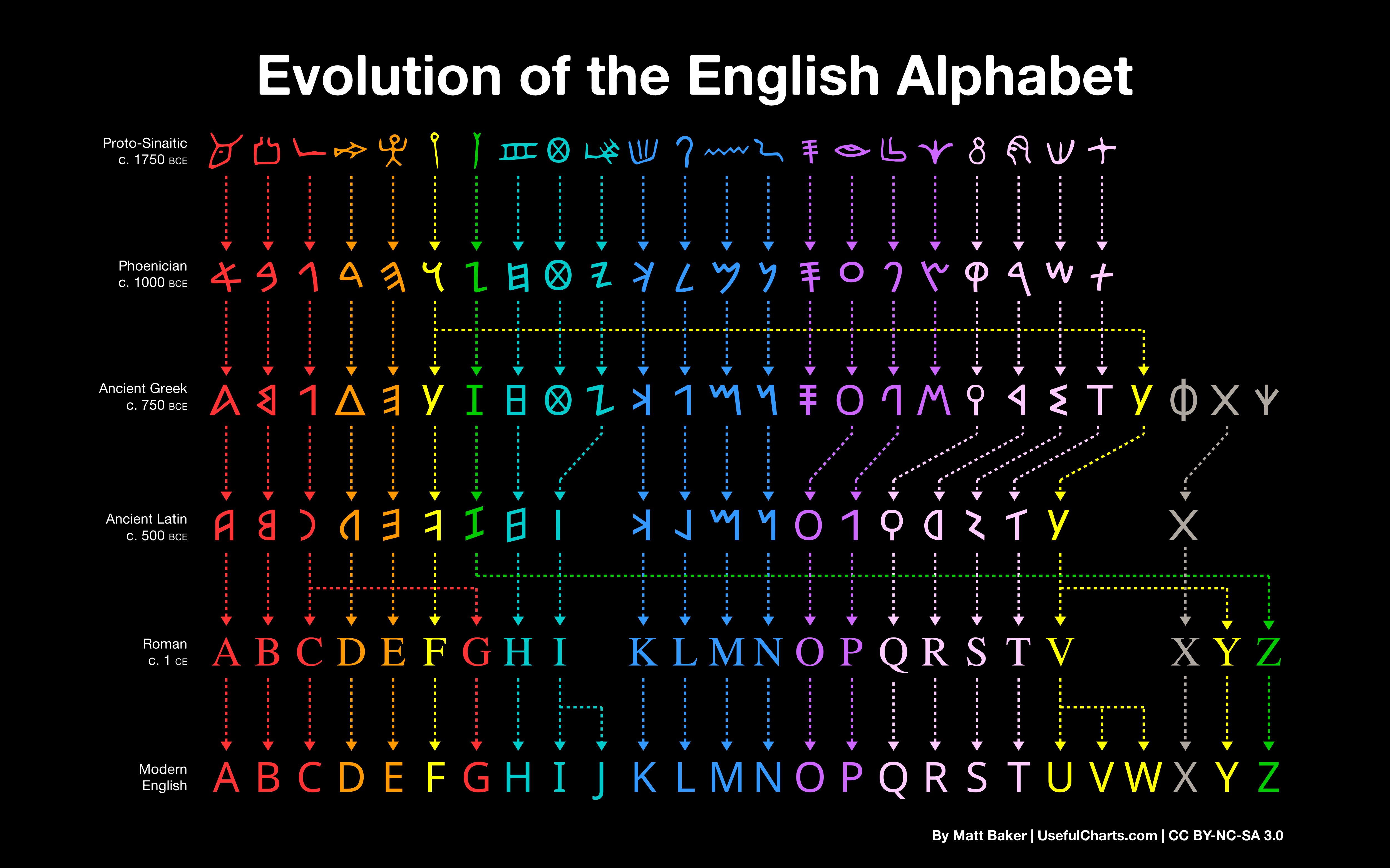
Matt Baker, the creater of the Evolution of the English Alphabet chart, traced the English alphabet all the way back to Proto-Sinaitic in 1750 BCE. This chart is a simplified version of his complete work called Writing Systems of the World and both can be found on UsefulCharts.com.

I made this chart last year as a bonus award on Kickstarter but am now making it available as a free download. Just right click on the above image (or long press on your mobile) and then select save.

UPDATE: I shared this on Twitter and it's my first tweet to reach over 10k RT's! Anyway, here's a few comments based on the feedback I've received:

  • If you want to print it, here's a high-res versionEnglish title | Latin title
  • You're free to use the chart however you like so long as you don't sell it and so long as you give credit to either me (Matt Baker) or this website (UsefulCharts.com). I'm releasing it under a Creative Commons license.
  • Fyi, the above chart was actually just a simplified promo for a much larger chart - a Writing Systems of the World poster. So, if you're concerned about the fact that thorn, wynn, or any other letters are missing, rest assured that they were indeed included on the main chart.
  • If you have questions about why certain letters evolved the way that they did, I actually did a YouTube video on the topic. As for why so many of the letters flipped, it's because they used to be written in both directions. But with the introduction of ink, left to right eventually became standard (less smudging if you're right-handed).
  • The fonts used include ProtoSinaitic (free), Alphabetum (commercial; used for the Ancient Greek/Latin lines) and Google Noto (free; used for Phoenician).
  • "Shouldn't you have titled this 'Evolution of the Latin Alphabet?'" Well, yes, that would have been correct as well. But it's also not incorrect to refer to an "English alphabet". Obviously, many European languages use the same Latin script. But some use a slightly different number of letters. When one is referring to the set of Latin letters used for a particular language, it's ok to refer to that set as the "[language name] alphabet". (Update: I've included a version above with the title "Latin Alphabet" for those who would prefer it.)
  • Many linguists provided feedback throughout the project, including Peter T. Daniels, one of the world's foremost experts on writing systems. You can find the full list of contributors here.
  • I support a charity that does great educational work in rural Sri Lanka. If you're looking for a way to say thanks, consider making a donation. Or, if you purchase any of my other charts (including the Writing Systems of the World poster), a $1 donation will automatically be made.


Found on UsefulCharts.com

Wednesday
Apr182018

Animated Visualization of First Leaf Appearance

Animated Visualization of First Leaf Appearance

Spring is coming! Jeremy White at the NY Times has animated data from the USA National Phenology Network showing the average dates of "first leaf" across the U.S.

In some cases, an animated data visualziation is better at communicating the data to the audience than a static design. This animation clearly shows the progression of Spring across the country and you can understand the data within seconds.

Friday
Apr132018

Creating Clickable Social Cards

Creating Clickable Social Cards infographic

The How to Create Clickable Social Cards infographic walks you through the process of using the AnyImage.io site to create social media cards for any of the major social media platforms, such as Facebook, Twitter, Google+ and LinkedIn.

AnyImage is a unique web-based tool that enables you to transform regular images into clickable social cards, linking to any web page of your choice. The cards can be shared on a number of social platforms including Facebook, Twitter, LinkedIn and Google+ 

study by Facebook themselves reported that users were able to increase traffic from the platform by a whopping 250%, simply by using clickable social cards. Thanks to AnyImage, you can begin creating your own cards in just a matter of seconds (for free). 

We’ve created this useful infographic (below) to explain exactly how AnyImage works. Enjoy! 

This is a fantastic use of an infographic as How-To explanation for a company's product or service! Most products have at least a small learning curve, and a clear infographic design can help get your customers over that initial hurdle using your service.

Monday
Apr022018

The Most Successful US State for Sporting Wins

The Most Successful US State For Sporting Wins infographic

The Most Successful US State for Sporting Wins infographic shows which state's professional teams have the most wins within the "Big Four" sport leagues. The "Big Four" consists of Major League Baseball, the National Basketball Association, the National Hockey League, and the National Football League. To find these statistics, PlayUSA researched the winners from the sports leagues since each competition began, then divided the winning teams by their state of origin.

Go Big Four or Go Home

Studying the wins of each state within the big four leagues across the decades, the research ranks all states who have had at least one win within these leagues and ranks them from most to least successful. To accompany this, PlayUSA have tapped into the loyalty of sports fans across the USA, delving into their views regarding politics on the pitch, and which sports Americans typically support outside of the Big Leagues.

Whilst the big leagues dominate U.S. sporting news and viewership, are they the be all and end all? The survey revealed that this might not be the case.

22% of men surveyed said they also follow Major League Soccer, although only 10% of women do the same. Another contender for fandom is college level sport, as 41% prefer watching this compared to the Big Four. In the Southeast, this stat is even higher, at 52%, compared to 33% of Northeastern respondents. However, when analysing the results by league, 72% of NFL fans from the Southeast favoured the Big League over the college level equivalent.


Thanks to Jessica for sending in the link!

Friday
Mar162018

Where Constituent Input Ends Up


Where Constituent Input Ends Up infographic


Have you ever tried to reach out to Congress? There are multiple ways to contact them, but with the high volume of constituent input, there has to be a way to filter it. Where Constituent Input Ends Up flowchart from Flowing Data tells the story of how they organize and reply to the input they recieve. 


When you have input to send Congress, you have a number of communication options available to you: phone, email, social media, etc. Many of the bigger issues have dedicated sites that help automate some of the process, which of course leads to a large volume of input that lands in a congressperson’s voicemail, inbox, and notifications tab. Where does it all go?

The OpenGov Foundation looked into it and produced the From Voicemails to Votes report. The flowchart above is part of the report. Full version here.


Found on Flowingdata.com/

Wednesday
Mar072018

Which Sci-Fi Movie Should I Watch?

Which Sci-Fi Movie Should I Watch flow chart

Which Sci-Fi Movie Should I Watch flow chart from Fish 4 Parts is a reccomendation of a Sci-Fi films based on your genre of choice. 

If you’re wondering which film to watch tonight or this weekend, there’s a few we’d like to recommend. According to your taste, of course! We’ve focused on the best of Sci-Fi. If you fancy some Sci-Fi horror, comedy, action or something a bit different, but don’t know what to watch, take a look at this graphic!

Thanks to Dave for sending in the link!


Friday
Mar022018

The Texas Infographic

The Texas Infographic

Happy Texas Independence Day! March 2, 1836 was when when sixty delegates signed the Texas Declaration of Independence. This event marked Texas’ independence from Mexico.

The Texas Infographic was a joint project between History.com and NeoMam Studios as a summary of the major facts about Texas.

The layout is a little jumbled for my taste, but the key facts are all included. I prefer a clear story path so the readers know where to look to follow the information.

Wednesday
Feb212018

16 SEO Myths You Should Ignore Completely

16 SEO Myths You Should Ignore Completely infographic

SEO or Search Engine Optimization can be a tricky subject. The 16 SEO Myths You Should Ignore Completely infographic from My Biz Niche gives some clarity to some popular misconceptions.

From the very beginning, the world of SEO has been rife with myths that have somehow managed to pass themselves off as facts and fool a whole generation of webmasters and even SEO practitioners. After proving itself indispensable in increasing traffic and achieving prime rankings in the SERPs, SEO should be free of these myths by now. But several Google algorithm updates have passed, and these myths still stand and continue to mess with the heads of webmasters and SEO practitioners alike.

This is a very text-heavy topic and design. There's no data to visualize, but the descriptions are short, and easy to understand. If readers want more information, that's available on the website.

Found on Rocks Digital!

Tuesday
Feb202018

Aflac Brunch Commercial #BadDataViz Error

Pancakes ≠ Eggs!

This commercial really bugs me! When you visualize information, you need to get the data visualization right! Don't tell people that Aflac is like the pancakes, and then highlight the eggs in the data visualization!

This comes from the shortened version I've seen through the CBS app of this longer commercial, which doesn't make this error. The long commercial is fine.

Whoever shortened this commercial, just didn't care enough to get it right!

Tuesday
Feb062018

The ICO Explosion of 2017

4 Years of ICO Activity infographic

ICO, or Initial Coin Offering, is a method of fundraising that doesn't sell equity of the company, but selling things called "tokens" or new forms of cryptocurrency. The method has been around for years, but the actual boom didn't start until mid 2017.The 4 Years of ICO Activity infographic from The Next Web shows a summary of the investments made. The video version below gives a more detailed timeline of when and where the companies obtained their investments.


Token sales and initial coin offerings (ICO) were certainly the hottest buzzwords of the year for thousands of recreational cryptocurrency enthusiasts and seasoned investors alike. But have you ever wondered precisely how much money was poured into this trend this year? There’s a visualization that can give you an idea.

Cryptocurrency startup Elementus has compiled a nifty animated visualization that shows every token sale that has successfully raised at least $100,000 since 2014. The graph also displays the entire cashflow that went into these ICOs, with detailed month-by-month information for the past four years.

As you will notice in the video below, following some minor activity for the first three years, all hell breaks lose around May 2017. You can see tens of ICOs kick off around the same time, securing millions in financial backing from cryptocurrency enthusiasts and investors.

To put all of this data together, Elementus went straight to the source and collected this information first-hand, gleaning the figures directly from the Ethereum and Bitcoin blockchains.

We searched for every token, crowdsale, and multisig wallet we could find,” wrote Elementus founder and UPenn adjunct lecturer Max Galka. “We then identified the corresponding owners and added up the total amount of contributed funds – taken either from the blockchain itself or as reported by the fundraiser.”

Found on thenextweb.com