About
Randy Krum
President of InfoNewt.
Data Visualization and Infographic Design

Infographic Design

Infographics Design | Presentations
Consulting | Data Visualizations

DFW DataViz Meetup

Join the DFW Data Visualization and Infographics Meetup Group if you're in the Dallas/Fort Worth area!

Search the Cool Infographics site

Custom Search

Subscriptions:


Feedburner

The Cool Infographics® Gallery:

How to add the
Cool Infographics button to your:

Cool Infographics iOS icon

- iPhone
- iPad
- iPod Touch


Read on Flipboard for iPad and iPhone

Featured in the Tech & Science category

Flipboard icon

Twitter Feed
From the Bookstore

Caffeine Poster

The Caffeine Poster infographic

Entries in infographics (33)

Friday
Oct102014

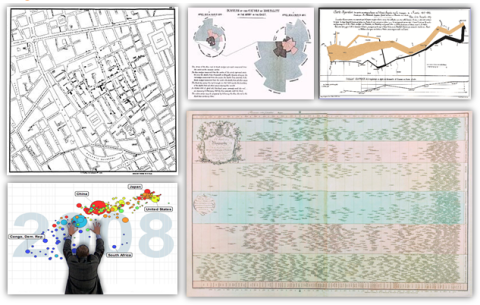
5 Great Online Tools for Creating Infographics

Professional infographic designers rely primarily on a core vector graphics software program to create their infographics designs. The main advantage is that all the icons, charts, images, illustrations, and data visualizations are treated as separate objects that can be easily moved, resized, overlapped, and rotated. No matter where you create the individual design elements, the final infographic design is usually put together in a vector graphics program.

Creating infographics using online tools has never been easier. In the last few years a number of online tools have emerged that allow anyone to create great visual content.  Whether you are working on a project for work, personal use, or social media, each new project starts with a template. With the dimensions laid out for you, you can focus your attention on quickly creating effective designs. Search, drag, and publish - it can be that simple.

These new tools are vector graphics applications that run in your browser as a replacement for using an expensive professional desktop application like Adobe Illustrator to put your infographic design together.  Each one offers different tools, image libraries, charts, fonts and templates as a starting point.  None of these have the full capabilities of a professional desktop application, but you probably don’t need that much power to create a simple infographic.

In this article, we take a quick look at 5 of the best online tools for creating infographics: Visme, Canva, Easel.ly, Piktochart, and Infogr.am. All of these tools are evolving quickly, and this is just a snapshot of their current capabilities.
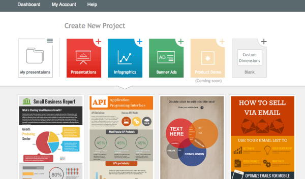
 

Visme screenshot

1) Visme (visme.co)

Visme allows you to create interactive presentations, infographics and other engaging content. With tons of templates, and huge library of free shapes & icons to choose from, Visme has you creating awesome visual content right away.

The templates are set up simply and beautifully. If you wanted, you could just edit the placeholder text, insert your own, and publish your infographic.

One of the greatest aspects of this service is changing percentages within the charts. All you have to do is click on the graphic you would like to change, enter a new number, and the chart changes to reflect the new information automatically. Saving you hours of frustration trying to do it on your own.

Pros:

  • Creates infographics, presentation, animations, ad banners, and custom layouts.

  • Insert and edit chart objects directly by changing the data values.

  • Large library of icons and images.

  • Embed YouTube videos directly into designs.

  • Special pricing for students & teachers.

Cons:

  • The basic free version is limited.

    • Only 3 projects.

    • Must include the Visme logo.

    • Limited access to charts and infograph widgets.

  • JPG download is still in Beta, with a few bugs.

Price: Basic version is free with pricing plans available


Canva screenshot

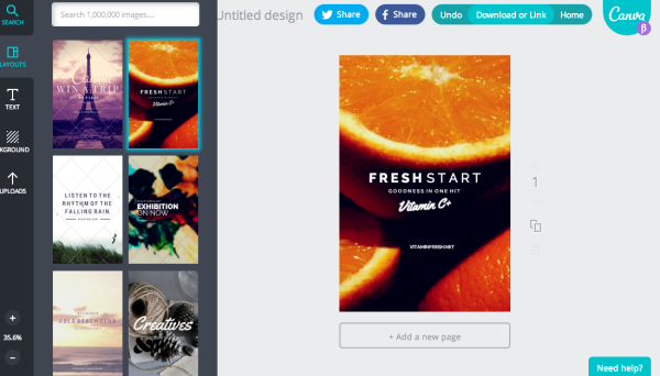
2) Canva (canva.com)

Canva just celebrated their 1-year anniversary last month, and has made a big splash in the online design space.  Your experience kicks off with a great "23 Second Guide to Beautiful Design," where they walk you through a brief introduction to their design program.

After finishing the brief tutorial, you can start a new design. Canva is filled with options, whether you are working on a project for work, personal, or social media. Each new project comes with a template for the project you choose to work on. With the dimensions done for you, you can focus your attention on creating beautiful designs in seconds.

Pros

  • Excellent (and short) intro tutorial to get you started, and many more on advanced concepts.

  • Templates for social media, blogs, presentations, posters, business cards, invitations, and more.

  • Easy and intuitive to use.

  • Large library of images to choose from.

Cons

  • No editable chart objects. You need to import your own data visualizations as images.

  • Have to pay for different image assets individually, instead of a monthly subscription.

Price: Free, but you have to pay for Pro quality design assets individually


Easelly screenshot

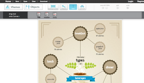
3) Easel.ly (www.easel.ly)

Easel.ly is a great program, but lacks some of the guidance, and features, that come standard in other programs.

Easel.ly lacks a "How-To" introduction section to their program, and just kind of throws you into the design process right away. Their focus seems to be primarily based on infographic design. Whereas other programs offer a plethora of design project options.

If you're just looking to design an infographic, this program will work well. If you want more variety, you'll have to utilize one of the other programs in this list.

Pros:

  • Free.

  • Very basic design layouts and assets.

  • New charts feature allows some basic editable charts in your design.

  • Easy downloads for JPG and PDF versions.

Cons:

  • Not a very large selection of themes, called “Vhemes”.

  • Small library of image assets. You’ll want to upload your own images and icons.

Price: Free


Piktochart screenshot

4) Piktochart (piktochart.com)

Piktochart is one of the best looking programs on this list. All the information you need to get started is provided in their tour.

Their program is easy to use, and offers tons of freedom in building and editing your infographic using their simple graphic tools. They have categorized icons, resizable canvas, design-driven charts, and interactive maps to utilize.  

Their intuitive user interface is where Piktochart truly excels. All the tools you need to create are laid out intelligently, making your new job as a "designer" so much easier.

One of the coolest aspects of this program is that they show how versatile infographics are for different projects. Whether you're creating for a classroom, office, website, or social media setting - Piktochart gives you the heads up on how to use infographics effectively.

Pros:

  • Themes and templates are of high design quality.

  • Intuitive. Allows you to edit anything and everything with ease.

  • Create infographics, reports, banners and presentations.

  • Embed videos from Youtube and Vimeo in your design.

Cons:

  • Limited selection of free templates. Higher quality templates are available with a Pro account.

  • $29 per month is a high subscription price compared to the others.

Price: Start for free with pricing packages available


Infogram screenshot

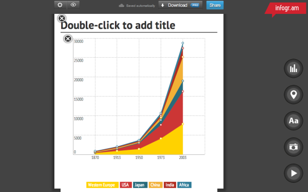
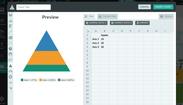
5) Infogr.am (infogr.am)

Infogr.am has got the best charts. For illustrating data, there are more than 30 different types of charts to choose from. Anything from bubble charts and tree maps to simple pie charts.

Editing data can be easily done in Infogr.am's built-in spreadsheet, or you can import your own XLS, XLXS and CSV files.  Once your infographic has been edited and beautifully designed, you can save it to your computer as a PNG or PDF file with a paid subscription.

Pros:

  • Ability to create and edit great charts by changing data

  • Built-in Spreadsheet. Can also import your XLS, XLXS and CSV files

  • Widest variety of available chart types

  • Educational and Non-profit pricing plans available

  • Embed videos from Youtube and Vimeo in your design.

Cons:

  • Only creates infographics and charts

  • Small selection of infographic templates

  • No image library, you must upload your own image assets

  • Download options require paid subscription

  • The White Label subscription service is the most expensive options of the group

Price: Basic version is free with pricing plans available


Which design sites have you tried? Which tools are your favorites? Post in the comments.

Friday
Aug292014

False Visualizations: Sizing Circles in Infographics

Accuracy is the most important aspect of an infographic design!

Last week, the article The Truth about the Ice Bucket Challenge by Julia Belluz on Vox Media included the infographic, Where We Donate vs. Diseases That Kill Us, that used proportionally sized circles as its data visualization. The problem with this design is that the circle sizes don’t match the values shown. This is a false visualization and significantly over exaggerates the smaller amounts of money contributed to each charity and the deaths attributed to each cause.

This causes problems because readers often just look at the visuals without reading the actual numbers. They start with the assumption that a visualization accurately represents the data. The Vox Media story and infographic already have over 12,000 shares on Facebook, and this is a great case study for designers to understand how important it is to visualize data accurately.

As readers, we see the area of two-dimensional shapes on the page to represent the different values, but design software only allows width and height adjustments to size shapes. Designers make the mistake of adjusting the diameter of circles to match the data instead of the area, which incorrectly sizes the circles dramatically. It takes some geometry calculations in a spreadsheet to find the areas and then calculate the appropriate diameters for each circle. To demonstrate, I created this corrected version of the infographic.

False Visualizations: Sizing Circles in Infographics Revised

My Google Docs spreadsheet of the correct circle area and diameter calculations is available here.

Assuming this was a design mistake, and there was no intent to deceive the audience, this is a common mistake that many designers make.  So many designers, that I included an entire section on this topic in the Cool Infographics book to help designers understand how to size the area of circles.

I made one other improvement to the corrected design above by removing the color legend and listing the charities and causes of death right next to the appropriate circles. This makes the whole visualization easier for the audience to read by eliminating the need to look back-and-forth from the circles to the color legend to figure out what each circle represents.  Placing the text next to each circle keeps the information in the reader’s field of view which minimizes eye movement.

Sticking with the circles data visualization style, I wanted to take the design a little bit further. I would recommend one of two alternate improvements.  First, adding colored connecting lines is one way to make it easier for the audience to find the related circles in the columns sorted in descending order.

False Visualizations: Sizing Circles in Infographics Revised Lines

A second alternative would be to sort the lists to line up the related circles.  This makes it much easier for the audience to see the direct comparisons between charitable contributions and death rates related to the same cause.

False Visualizations: Sizing Circles in Infographics Revised Descending Sort

I’m passing over any discussion about whether using proportionally sized circles (a bubble chart) is the best visualization method for this data. If a designer makes the choice to use sized shapes, my point is that the data visualizations in the infographic must match the numbers using area.  David Mendoza published a good analysis worth reading and designed an alternative way to visualize the data in his article, This Bubble Chart Is Killing Me.

How else would you improve this design?

NOTE: I was able to contact the designer who created the infographic at Vox Media, and he had already realized his error after the infographic had been published. As I had guessed, he had mistakenly adjusted the diameter of the circles instead of the area. He told me that he’s working on updating the official infographic design in the article, but it hasn’t been published on the Vox Media site yet.


Monday
Aug112014

12 Reasons Your Business Needs to Get Visual

12 Reasons Your Business Needs to Get Visual infographic

If we’ve said it once, we’ve said it a million times… but once more wont hurt! Visuals are important!!! This infographic from re:DESIGN attempts to summarize the reasons why in 12 Reasons Your Business Needs to Get Visual.

The shift to the visual is evident everywhere we look, in all media — the infographic explains why.

A good, strong visual married to a good concept — with the right strategy and the right words — wins every time, especially in today’s busy, noisy media world. One thing is clear: visuals and all that traditional creative expertise brings to the table has never been more important for capturing eyeballs, expanding brand influence, and getting people to act.

Love the message and most of the points included.  Good choice of images for each section. However, big fonts are not data visualizations and the infographic looks like it’s pushing the use of bigger fonts instead of visuals. Data shown in a big font does not provide the audience with any context, not do they make the data easier to understand.

I also noticed the popular false statistic included in the design: “Visual data is processed by the brain 60,000 times faster than text.”  It’s a statistic often quoted in presentations and infographics about the value of visual information, but it’s not true.  I’d love for this statistic to be real, but no one has been able to track down the original research.  It was used decades ago in some 3M marketing materials for transparencies used with overhead projectors (yes, that long ago).  It’s quoted so often now that everyone believes it.

If this topic interestes you, check out Chapter 1 of my book, Cool Infographics, called The Science of Infographics.  There I cover the research and data behind why visual information is more effective and why infographics are so popular.  You can download a free sample PDF of the chapter on the BOOK page.

Found on re:DESIGN

Monday
Jul282014

Viral Sharing Tactics of an Infographic

  Viral Sharing Tactics of an Infographic infographic

Making a cool infographic is one thing, sharing it and making it go viral is another. Luckily, the Viral Sharing Tactics of an Infographic infographic published by Piktochart gives some tips on how to make your cool infographic a hit!

Making your carefully crafted infographic go viral isn’t a dark science. It doesn’t just happen miraculously. You have to make it happen.

The key to a successful viral infographic lies not just in the content. Apart from designing a very good infographic, what you do with it after that plays a big role in making it go viral. You have to go the extra mile to publicize and enable others to publicize your infographic for you. There are many available platforms and tools to accelerate your viral campaign.

There’s some really good information included in here, and many of the tactics listed here are included in my Infographic Release Strategy from the Cool Infographics book.  Designing a good infographic isn’t enough.  You need to publicize and promote your design so people can find it and share it.

I would have liked to see more statistics behind their recommendations.  The only data included in the design is the Google Trends chart of searches for the word ”infographic”, which is a very impressive trend!  The design should have also included a copyright, and the URL to the infographic landing page on the Piktochart site.  I love the “Click to Tweet” pre-written sharing element on the landing page!

Piktochart is an online infographic design tool, similar to a vector graphics software application.  You can find this tool listed along with others on the Cool Infographics Tools page.  I love to see that they used their own tool to design this infographic!

Thanks to Rachel for sending in the link! 

Thursday
Apr242014

Smart Ways to Combine Content Marketing With SEO

Smart Ways to Combine Content Marketing With SEO infographic

The Smart Ways to Combine Content Marketing With SEO infographic is essentially a big list of the most popular online services in a number of different categories.  Published by blogmost, it’s meant as a reference tool for Marketers to help plan out their content strategies.

Trying to build High Quality Links without paying anyone? This infographic reveals techniques to build them and complete details of good website + mentioned Great SEO & SMO tools for better Marketing.

No data or numbers, the most prominent sites and companies are shown for 26 different online service categories.  The randomness of circle sizes appears to visualize some type of information, but there’s no data behind them.  It’s just the designer sizing them to fit the different logos and icons.

The design does a fantastic job of using logos and icons in place of text.  This makes the overall design faster and easier for the audience to read through.  It’s a much more enjoyable experience than reading the text name of all the different companies, brands and sites.

Some description at the top would be helpful to describe how the sites were chosen for readers that find the infographic on other sites.  The URL of the infographic Landing Page on the blogmost site in the footer would also be helpful for the readers to be able to find the original full-size version and associated text.

Found on Visual.ly

Monday
Mar172014

The State of Infographics at SxSW 2014

The State of Infographics at SxSW 2014

I post all types of infographics and data visualizations from designers all over the world here on Cool Infographics, and as a recap, I wanted to take stock of the state of infographics and data visualization at this year’s SxSW Interactive conference in Austin, TX.

I’ve been going to SxSW for a few years now, and infographics have been a growing presence in the Interactive portion of the conference every year.  You can find hidden sessions about data visualization, visual communication and infographics in different portions of the conference like the new SXsports, Health and Business sessions.

Check the links and search the presentation hashtags on Twitter to find more information and audience comments from each event.  I know I didn’t catch everything, so send me links to anything (Events, notes, slides, etc) I missed through the Contact page or the comments and I’ll add appropriate ones into the post!

*Sessions I was able to attend

Official Events:


Unofficial Sessions:


  • The Attention Economy with Walter, book signing by Ekaterina Walter @Ekaterina, co-author of The Power of Visual Storytelling
    • “Attention is the new commodity. Visual storytelling is the new currency,” say co-authors Ekaterina Walter and Jessica Gioglio in their new book The Power of Visual Storytelling.  The first 100 attendees for Ekaterina’s signing will get a copy of her book. Come chat with Ekaterina about the visualization revolution and her thoughts about SxSW Interactive 2014.
    • Hosted by Vocus @Vocus
    • http://www.eventbrite.com/e/wtf-sxsw-visualize-a-powerful-future-tickets-10822280733
  • FH Black Box lounge at the Four Seasons (#FHBlackBox)
  • Column Five announced the release of Visage
  • Cool Infographics Meetup
    • Special thanks to the team at the Fleishman Hillard Black Box Lounge!  They allowed me to host the Cool Infographics @Coolinfographic meetup event after my book signing on Monday for anyone that wanted to hang out.  It was also an opportunity to meet fans and sign books for people that didn’t have official SxSW badges.


Please help add anything I missed by posting in the comments below or sending me a note through the Contact page.  I’ll add new content into the post above.


Thursday
Jan302014

Cool Infographics: Best Practices Group on LinkedIn

Cool Infographics LinkedIn Group

I am excited to announce the launch of a new LinkedIn Group, Cool Infographics: Best Practices. I have personally been a part of many great discussion groups over the years and believe that this group fills an unmet need.  Please accept this invitation to join the group to share your own experiences and wisdom.

There are many groups that share infographics, but I felt that a discussion group dedicated to the craft of infographics and data visualization was missing.  This group will feature questions and case studies about how companies are leveraging infographics and data visualization as a communication tool.  Any posts that are just links to infographics will be moderated to keep the focus on engaging discussions.  Topics and questions from the Cool Infographics book will also be discussed.

Join us in a professional dialogue surrounding case studies and strategies for designing infographics and using them as a part of an overall marketing strategy.  We welcome both beginning and established professionals to share valuable tactics and experiences as well as fans of infographics to learn more about this growing field.

-Randy


Saturday
Nov302013

Cool Infographics 30% Off at Amazon This Weekend ONLY!

Cool Infographics 30% Off at Amazon This Weekend ONLY!

This weekend ONLY, Amazon is offering 30% Off any one print book, and you can use this deal to get Cool Infographics at the lowest price yet!  The deal ends December 1st at 11:59pm PST.  Use the promo code “BOOKDEAL“ at checkout under the “Gift cards & promotional codes” section.

You can read the details and Terms & Conditions here.

When I looked on Saturday, Amazon’s retail price was listed at $25.08 (it changes daily), and with this discount you could get Cool Infographics for only $17.56.  That’s the lowest price I’ve seen anywhere!

Monday
Oct282013

The Cool Infographics Book is Now Available! #coolinfobook

unboxing Cool Infographics book

The Cool Infographics book is now shipping!  I received my own printed copies on Friday for the first time, and they look fantastic!  It’s a special feeling to hold the physical result of 12 months of hard work in my hands.  The publisher, Wiley, did an awesome job printing them.

I know that people who pre-ordered the book have begun to receive their copies.  Everyone that pre-ordered copies should get their shipment shortly.  If you’re interested in an ebook version, I believe the Amazon Kindle version is now available, and other book sites will have an ebook version available in a couple weeks.

As I posted last week, I’ve made a free sample chapter excerpt available.  Use the online form to request the link to download the PDF sample chapter.

DON’T MISS OUT!  Time is running out to take advantage of the discount code “CINFO” to get 40% off list price on the Wiley publisher site.  The discount code is still good through the end of October (10/31/13).  Last time I checked all of the book retailer sites (yesterday), this was the best price online to get the book for only $23.99.

Friday
Oct252013

Download A Free Sample Chapter from the Cool Infographics Book #coolinfobook

Cool Infographics Book Sample Chapter

The Cool Infographics book comes out next week!

I now have a sample chapter available for download as a PDF file for FREE.  Fill out the form on the request page, and you’ll get an automated email with the link to download the sample chapter.

The sample chapter excerpt includes 30 pages from the first chapter, and covers the following topics:

  • Chapter 1: The Science of Infographics
    • Infographics vs. Data Visualizations
    • The Explosive Growth of Infographics
    • The Rise of the Informavore
    • The Rise of Big Data
    • Why Infographics Work
    • The Art of Storytelling

DON’T MISS OUT!  Time is running out to take advantage of the discount code “CINFO” to get 40% off list price on the Wiley publisher site.  The pre-order discount code is only good through the end of October (10/31/13).  Last time I checked all of the book retailer sites (yesterday), this was still the best deal online to get the book for only $23.99.

Cool Infographics Book