About
Randy Krum
President of InfoNewt.
Data Visualization and Infographic Design

Infographic Design

Infographics Design | Presentations
Consulting | Data Visualizations

DFW DataViz Meetup

Join the DFW Data Visualization and Infographics Meetup Group if you're in the Dallas/Fort Worth area!

Search the Cool Infographics site

Custom Search

Subscriptions:


Feedburner

The Cool Infographics® Gallery:

How to add the
Cool Infographics button to your:

Cool Infographics iOS icon

- iPhone
- iPad
- iPod Touch


Read on Flipboard for iPad and iPhone

Featured in the Tech & Science category

Flipboard icon

Twitter Feed
From the Bookstore

Caffeine Poster

The Caffeine Poster infographic

Entries in design (479)

Thursday
Sep032015

The Psychology of Colors in Marketing

The Psychology of Colors in Marketing infographic

The Psychology of Colors in Marketing infographic is a comprehensive guide to what a colors means in marketing materials. The infographic, created by Homestead, not only covers the meanings of the colors but how to use contrast and the intensity as well. The last bit gives examples of how big corporations use the colors to their advantage.

Do you feel inexplicably calm when surrounded by a sea of blue water or a forest of green trees? Perhaps you feel a slight agitation when looking at a red stop sign or stop light?

The reality is that color has a powerful psychological impact - and that this affect can be harnessed by webmasters and digital marketers alike to promote different buyer behaviors online. To learn more, check out our new "The Psychology of Colors in Marketing" infographic:"

The infographic is a little text heavy, but does a good job of using black text and icons for the descriptions so the colors only appear when they are meant to convey meaning in the infographic as an example.

The footer should include a copyright (or Creative Commons) license statement and the URL web page address directly to the infographic landing page so readers can find the original full-size version when bloggers repost the infographic without a link. I always include a link back to the original but most do not.

Found on http://www.digitalinformationworld.com

Tuesday
Sep012015

How to Think Visually

How to Think Visually Using Visual Analogies infographic

How to Think Visually Using Visual Analogies infographic from Anna Vital gives a great variety of examples for anyone to use when you create your own graphics. It begins with the most recognizable visuals, circle graphs and diagrams. Further down are abstract analogies. They are reminiscent of physical objects, but they are simplified and abstract. Next, we have regular analogies that look like the physical objects you are familiar with. The final category are allegories. These are stories, or a series of analogies. The key is that these stories are familiar enough that we don’t have to retell them, but we should analogize every part of them.

Most research in cognitive science explores how we see things but little research is done on how we understand what we see.

Understanding is the ultimate test of how good your visualization is. So how can you make people understand? Show something familiar and analogize. If you know nothing else about visualization but pick the right analogy you are more than half way there. This is what a professional designer does - and there is no substitute for analogies.

How do you choose the right analogy? In this grid I organized analogies from the abstract down to the more detailed. I grouped them by similarity in shape. The goal is to enable you to quickly see the possibilities and “try them on” your information. With time you’ll be able to do all of this in your head. But for now this is a shortcut. 

As part of the infographic landing page, Anna has included a text description of each visual analogy. For the story on each graphic, read more at anna.vc

Thanks to @DR4WARD for sharing on Twitter!

Friday
Aug212015

Visual Storytelling: The Big Trend for SXSW 2016

It’s only August, but voting is already underway for the March 2016 South By Southwest (SxSW) Interactive conference. Long thought of as the breeding ground for new ideas and creative technologies, we can gleam industry insights from the SXSW Interactive Festival. This year, I decided not to wait until the conference to delve into the veritable buffet of groundbreaking panels vying for festival space. This year’s PanelPicker interface received more than 4,000 proposals, which is an all-time record!

While a quick search of infographics yields only 11 results, a mere TWO actually have the word “Infographics” in the title. The industry discourse has shifted away from “how-to” models to “how to do it right.” Infographics have become a key format of the larger conversation: Visual Storytelling.

A quick search for “Visual Storytelling” yields over 200 talks in PanelPicker, along with hundreds more for “data visualization” and “visual content”.  Infographics are now used as one of many effective tools in the Marketer’s toolbox, and an accepted part of the larger conversation happening in the content marketing industry.

Visual storytelling is vital to content marketing success. The following types of visual content are at the forefront of the proposals for next year’s SXSW Interactive Festival.

1.    Animated GIFs

Source: Animagraffs by Jacob O'Neal

The social media world has been slow to adopt GIFs, with Facebook only just embracing the truncated clips this year. The average human attention span in 2015 is 8.25 seconds, so these bite-sized animations are the perfect for telling a complete story in a short amount of time. The motion in the image also captures attention on an already crowded news feed.

Check out these GIF-centric presentations, “Why GIFs are turning into the New Emojis on Mobile” and “Visual Storytelling - GIFs, Graphs, and Napoleon.


2.    Visual Presentations

Slideshare and other presentation-style platforms provide a visual and interactive way to share lots of information. With millions of visitors per month, Slideshare is an easy way to have your presentations seen by a large audience.

Perfect your visual presentations with “Sucking Less When Presenting Creative” and “The Power of Poise: Chi for Pitch and Presentation.”     


3.     Real-time storytelling

Real-time storytelling has increased in popularity with the rise of live feed social platforms like Periscope and Meerkat. The ease of execution and the sheer scope of the audience made these two platforms instantly successful. While Meerkat took the prize for most buzzed app at last year’s SXSW, Periscope has the weight of Twitter behind it and has become the more successful of the two.

Use these two tools to live broadcast your events, host a Q&A, or even share professional tips to a larger audience. Perfect your live-streaming with the “Live Streaming Killed Cable TV Star” and “Igniting Creativity with Periscope” PanelPicker proposals.

Twitter Periscope

Source: AdWeek


4.    Infographics

I couldn’t get through my list without mentioning infographics. Still one of the best ways to convey complex information in a shareable and visually appealing format, infographics should be worked into your content marketing strategy. While they are no longer the only way to tell a visual story, they remain a marketing industry staple.

Round out your visual storytelling prowess with great infographics. Learn how to rock your next infographic with my own proposal, “7 Deadly Sins of Infographics Design and How to Fix Them.

The Process of Designing an Infographic


Source: Visme 

Buzzword or not, visual storytelling is something we’ve all been doing since we first snapped a picture with a polaroid camera, we’re just getting better at it. Judging by PanelPicker entries alone, the 2016 SXSW Interactive Festival will be another great year for the content marketing industry.

Monday
Aug172015

I Need Your Votes for SxSW 2016

7 Deadly Sins of Infographics Design and How to Fix Them

7 Deadly Sins of Infographics Design and How to Fix Them


SXSW 2016 Interactive PanelPicker voting is now open, and I need your votes! My talk proposal entitled "7 Deadly Sins of Infographics Design and How to Fix Them" will explore examples of the top seven mistakes designers often make, and more importantly, offer design tips to overcome these common design blunders. Follow the steps below to vote:

Step 1: Go to PanelPicker to view my proposal.
Step 2: Log in or create an account.
Step 3: Give my proposal the thumbs up to vote!
Step 4: Post a comment (SXSW loves this).
Step 5: Share with your friends on social media.


I've only given this talk once before at the Malofiej Infographics World Summit in Spain, and I'm scheduled to present it at the Big Design Dallas conference in September. (Come join me if you're in the Dallas area!)

Community voting is a large part of the PanelPicker process, so I'm reaching out to you for your support. Please vote before September 4th!

For more information on my talk, please visit Slideshare for a preview.

Thanks for your help!

Tuesday
Jun162015

Visme 3.0 Design Platform Launches Improved User Interface

Visme Infographic Templates

Visme is an online design platform, and can be used to create infographics, presentations, banners, reports, and even resumes. With over 200,000 users, Visme is being used by many as a replacement for expensive desktop applications like Microsoft PowerPoint and Adobe Illustrator.

"Visme epitomizes everything we strive for. At the core we are a visualization tool and our mission is to simplify the ability for anyone to easily transform their thoughts and ideas into engaging visual content," - Founder Payman Taei

In April 2015, the team at Hindsite Interactive launched Visme 3.0, a complete redesign, moving to a cleaner, easy-to-use user interface. The redesign has made a major move towards flatter design elements that help users focus on the content they are creating without being distracted by the interface tools.

Visme Flat Design Interface Updates

If you’re not a professional designer that can invest in a high-end hardware and software setup or don’t have the time or budget to hire a professional, Visme is a great platform to create eye-catching visual content with minimal effort. You can start with one of the many professional templates, and then customize your design by changing colors, rearranging the layout, uploading your own images, inserting video, building simple data visualizations using the Graph Tool, or use any of the millions of free icons and images from the huge built-in library.

Specifically for infographics design, the built-in Graph Tool and Infograph Widgets can be very helpful. Although you may import more complex data visualizations created elsewhere, the Graph Tool let’s you build simple charts directly in your design by entering the data and editing the chart settings. This is a huge advantage over many other online design tools that only provide chart shapes and objects that you have to adjust manually to match your data. Accuracy of your data visualizations in an infographic is crucial!

Visme Graph Tool

Here you can see a simple area chart created with the Visme Graph Tool. Over 600 data points were uploaded to create this simple data visualization. Because it was built with the Graph Tool, the chart is editable as the data set continues to grow in the future. The design has been inserted here using the embed code created by the Visme platform to display the chart. As future updates are made to the chart on the Visme site, the most current version will always be displayed here. For infographics, you can update the data in your design, and every site that uses the embed code will always display the latest version of your design.

Original: http://my.visme.co/projects/growth-of-infographics-in-search-613ce1

 Personally, I’d like to see the Graph Tool expand into more visualization styles, and give the users more ability to customize the charts it creates. It’s pretty good with the simple charts, but I hope this is only the starting point for the Visme team. I hear that improvements to the Graph Tool are in the plan for release later this year.

Infographics are made to be shared, and the Visme tool gives you plenty of options. In addition to embed code for both animated and static sharing, you can also download your design as a static image file (JPG or PNG) or a PDF file for easy distribution.    You can also download as HTML5 version which would retain all interactivity of your live version and open locally in any browser without third party software or plugins.

Two other advantages of designing your infographics in Visme. First, you can keep your designs private, and only allow those that have the link to view your design. You can even password protect your design so only those with the link and the password can view your design. Second, you can see the analytics for your design in one place. This is a real challenge for tracking infographics online, and seeing the combined statistics of views and visits to your infographic is a fantastic feature. For everyone that shares your infographic on their own using the embed code, those viewer statistics are all gathered together in your Visme analytics dashboard.

Visme Analytics


Visme is free to everyone to try with many of the basic design tools. Paid plans start at just $6/month to unlock premium templates, along with the ability to manage privacy, download content, analytics and collaboration tools.

Special for readers of Cool Infographics, use the discount code VISME3 to get a lifetime 25% discount on any subscription.


Monday
Jun152015

Infographics Are Evolving into Many Formats

The internet is full of noise, and your job is to break through that wall of information with something that resonates with your target audience. When you are communicating any message, you want to ensure that your audience will understand and remember the valuable takeaways about your products or services. You want your communication to be clear and concise. This is where infographics come in.

Infographics are your opportunity to convey complex ideas and information in a simple and easily digestible manner. Simply put, our brains love visual information. Infographics can make your marketing and advertising stand out in the crowded world of visual content.

As the Internet, our computing devices and out screen sizes continue to evolve and change, infographics need to evolve as well. Moving past the original static images, infographic storytelling with data visualizations and illustrations can now be found in a number of different formats.

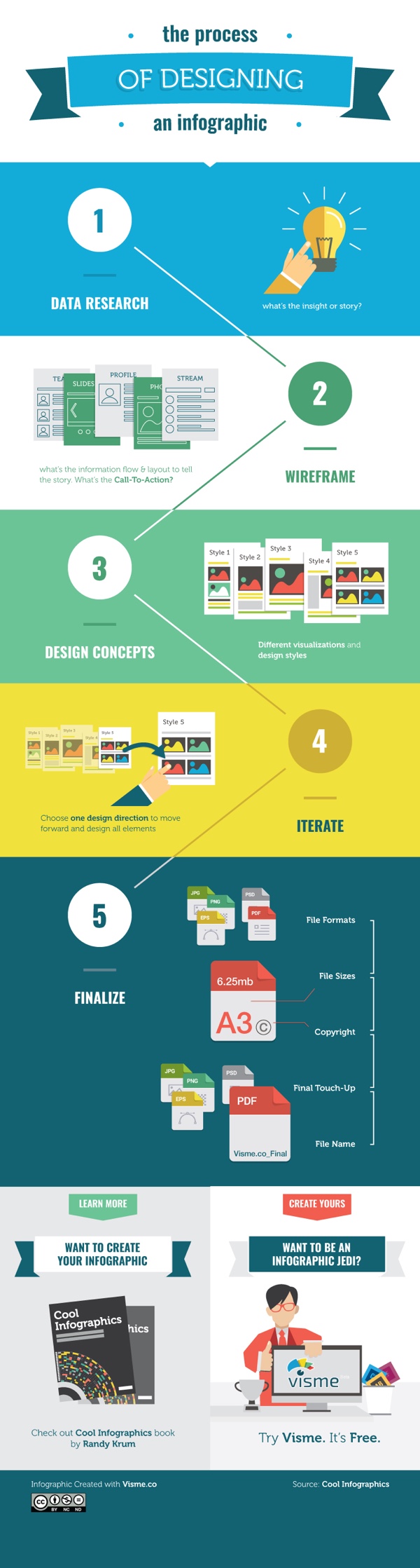
Below, are great examples of different ways to leverage the five different types of infographics to make your product or services more memorable.


1. Static Infographics - Kitchen Conversion Guide

Static infographics are the most simple and most common infographic format out there. They are usually saved as an image file to be easily distributed and consumed (JPG or PNG format). Static infographics are easily shared using email and social media since there are no moving parts to consider.

The Common Cook’s How-Many Guide to Kitchen Conversations

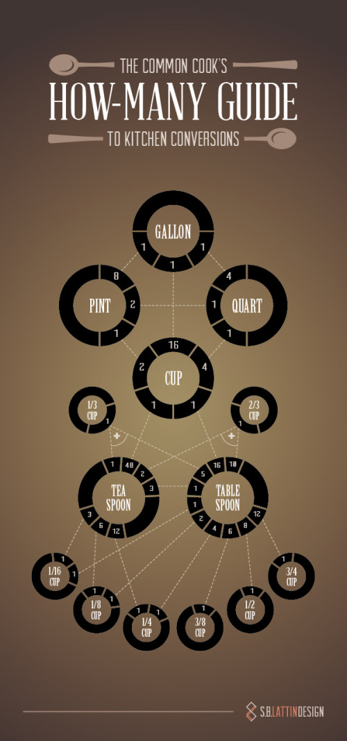
Source: https://shannon-lattin.squarespace.com/how-many-guide/

This type of infographic is also easily split up into segments in order to focus on one piece at a time. This is ideal for giving presentations or sharing on social media.


2. Interactive Infographics - Daily Dose of Water

Interactive infographics are great to utilize when you want people to move beyond simply looking at the information. Ideally your audience should get intimate with the facts you’re presenting by following a specific storyline told through your data. By giving your audience something to interact with, they are engaging more of their attention with the data, and will become more immersed in the information.

For example, this infographic from Good.is and Levi’s walks users through their typical routine and calculates how much water is used for each task. This allows a personalized experience for each person that views the infographic, creating a stronger connection to the information being shared.

Your Daily Dose of Water

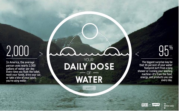
Source: http://awesome.good.is/transparency/web/1204/your-daily-dose-of-water/flash.html


3. Video Infographics - The Fallen of WWII

Video infographics have been gaining popularity over the years in part for a lot of the same reasons static infographics work: the ease of sharing and the ability to embed it almost anywhere.

In this video infographic that has recently gone viral, the creator uses data visualization to make a powerful statement about the sacrifice soldiers made during World War II. Data visualization is used in such a way to show the stark juxtaposition between the Second World War and more modern conflicts.  Check out this quick motion graphic titled, The Fallen of World War II from Austin-based developer Neil Halloran. His use of sound and motion brings the information to life.

The Fallen of World War II from Neil Halloran on Vimeo.


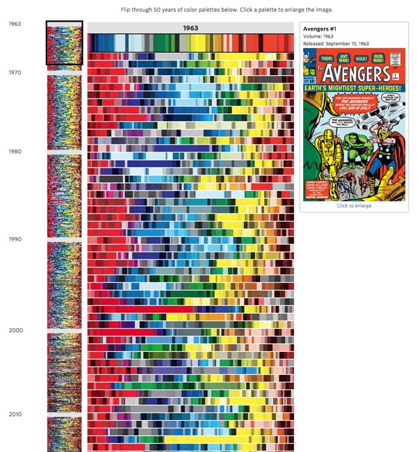
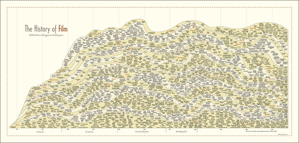
4. Zooming Infographics - The History of Film

Some infographic topics tackle a large amount of information, and a larger design is required to display all of its information. This infographic from Historyshots is a great example of a zooming infographic:

The History of Film

Source: http://www.historyshots.com/products/history-of-film

The History of Film plots out the most important films of the last 100 years into a beautiful, flowing timeline that visually separates the films into 20 different genres. As can be seen above, if this infographic was just left as a static image, it would be difficult to read everything because it is so detailed and complex. In the web browser, a large design is reduced in size so that the entire design can be viewed all at once on the screen, and the zooming controls are made available to the reader to view the small details clearly.


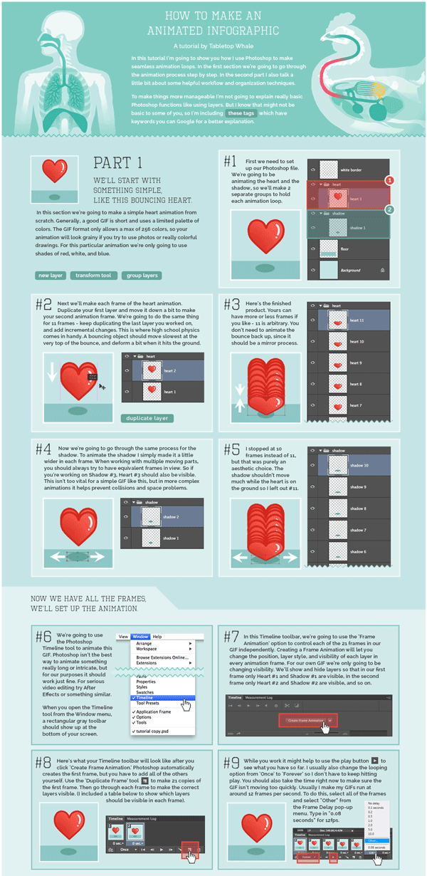
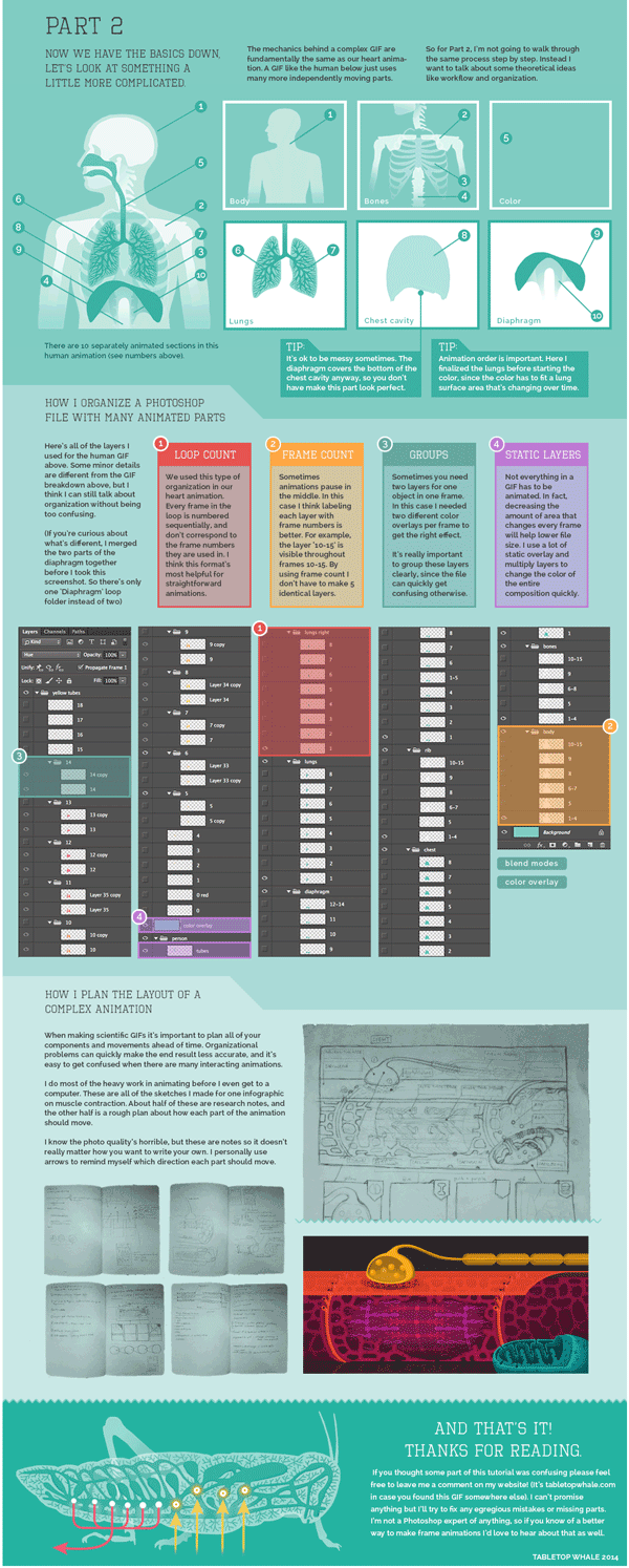
5. Animated Infographics - Flight Videos Deconstructed

Some topics for infographics are best created to feature motion, none more so than one that shows the the flight patterns of an Egyptian Fruit Bat, Dragonfly, Canada Goose, Hawk Moth, and Hummingbird. Flight Videos Deconstructed is an animated infographic about flight patterns within the animal kingdom. Covering five winged animals the and the motion their wings use while taking flight, this animated graphic uses vibrant colors and geometric shapes to convey the beauty and simplicity of flight.

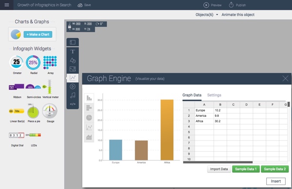
Animated infographics create some motion or change in the design as the reader watches. It might be the bars in a bar chart growing, a color change, or (in the case of these winged animals) an animated character. These are differentiated from the video infographics because these are not video files. These are animated with HTML code or an animated GIF image file format to create the animation but can exist as a stand-alone object on a web page.


Flight Videos Deconstructed

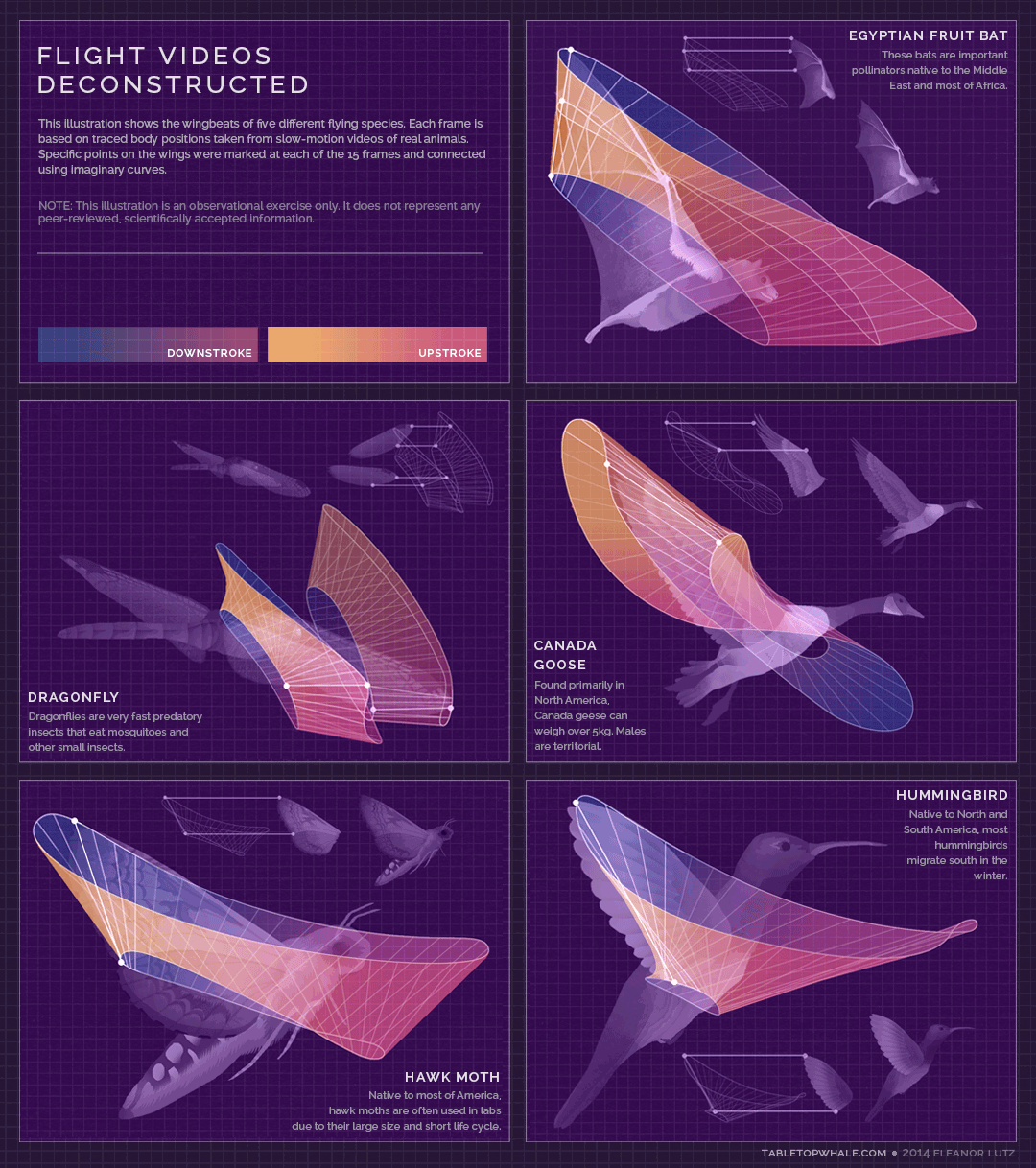
Source: http://tabletopwhale.com/2014/09/29/flight-videos-deconstructed.html


With so many new and different formats of infographics available to today’s marketers, providing your audience with a story that conveys your message has never been more exciting. Sharing the key takeaways from your product or services can be done in an expertly designed way that appeals to your audience and leaves them wanting more. 

Monday
Jun082015

The Process of Designing an Infographic

The Process of Designing an Infographic

The Process of Designing an Infographic is an interactive design that outlines my own infographic design process. My data visualization and infographics design company, InfoNewt, uses this process when designing infographics for clients, and I teach this process in my workshops and classes. The team at Visme.co created an interactive infographic version of it using the Visme design platform. Visme.co is a fantastic online design platform for infographics, presentations, reports and more.

Most of my designs follow this 5-step process:

  1. Data Research - Start with the data. What's the insight or story?
  2. Wireframe - Wireframe your story before you start any design work 
  3. Design Concepts - Experiment with design ideas by creating rough concepts that visualize your data in a handful of different ways
  4. Iterate - Choose one design direction or combine a few different ideas from your concepts.
  5. Finalize - The final step is to finalize your design with the appropriate Copyright or Creative Commons license, and export the final design to a few different file formats as necessary. 

One of the advantages of using Visme as the platform to design your infographic is that you can create interactive elements in your design. In this case, you can see the original interactive version on the Visme site, that includes additional information when you mouse over each process step. This is built in Javascript, and anyone can share the interactive version by using the embed code on their own website.

You can embed the interactive infographic on your own site by using this HTML code:


Tuesday
May122015

How to Make an Animated GIF Infographic

How to Make an Animated GIF Infographic Part 1

How to Make an Animated GIF Infographic Part 2

Eleanor Lutz has done some amazing design work with her company Tabletop Whale. She is known especially for her work creating animated infographics using animated GIF files. She has posted How to Make An Animated Infographic as a 2-part explanation that lays out her process in Photoshop (as an animated GIF file of course!).

Recently I’ve been getting a lot of emails asking for a tutorial on how to make animations. So this week I put together a quick explanation for anyone who’s interested. I archived it as a link on the menu bar of my website, so it’ll always be easy to find if you need it.

This is just a run-through of my own personal animation workflow, so it’s not a definitive guide or anything. There are plenty of other ways to make animations in Photoshop and other programs.

I’ve never tried making a tutorial about my own work before, so sorry in advance if it’s confusing! Let me know if there’s anything I wrote that didn’t make any sense. I’ll try to fix it if I can (though I probably don’t have room to go into detail about every single Photoshop function I mention).

I’m seeing more infographics as animated GIF image files online. Their advantage is that they are a self-contained image file that’s easy to share. No need for embed code or Javascript for readers to share the animation on other sites or social media.

I met Eleanor recently at the Malofiej Infographics World Summit, where she gave an amazing talk about her animated designs, her process, and even some discussion about when not to use animation. Check out the video interview with Eleanor by Visualoop at the conference:

Also found on VizWorld

Friday
May012015

Food Poisoning Outbreaks Digested

Food Poisoning Outbreaks Digested infographic

The Food Poisoning Outbreaks Digested infographic is the static graphic winner for the Food Poisoning challenge put on by Kantar Information is Beautiful Awards. Designed by Andrew Park, the infographic ranks the number of food outbreaks within different categories like specific cuisine or the toxin/pathogen. 

Using a Sankey diagram, the visualisation charts the percentage breakdown for food poisoning outbreaks by national cuisine, food type, pathogen/toxin and contributing factor where the cuisine type was known.

The diagram concludes with the “most lethal combination”, highlighting the top factors that led to an outbreak.

I thought it would add context to frame the Sankey diagram in a human body, as though it was being eaten and spreading through the body like a disease.

I really like this approach to a Sankey Diagram that breaks the original total into four different categories of data.

Tuesday
Apr282015

Avengers Comic Book Cover Colors Data Visualization

Avengers Comic Book Cover Colors Data Visualization

Jon Keegan at the Wall Street Journal has created a fascinating interactive data visualization of the last 50 Years of ‘Avengers’ Comic Book Covers Through Color

When Marvel’s “Avengers: Age of Ultron” opens in theaters next month, a familiar set of iconic colors will be splashed across movie screens world-wide: The gamma ray-induced green of the Hulk, Iron Man’s red and gold armor, and Captain America’s red, white and blue uniform.

How the Avengers look today differs significantly from their appearance in classic comic-book versions, thanks to advancements in technology and a shift to a more cinematic aesthetic. As Marvel’s characters started to appear in big-budget superhero films such as “X-Men” in 2000, the darker, muted colors of the movies began to creep into the look of the comics. Explore this shift in color palettes and browse more than 50 years of “Avengers” cover artwork below. Read more about this shift in color.

Each cover illustration is broken down into its own color band that displays the amount of each color used.

The data visualization is a fantastic display of how the color use has changed over the last 50 years. The left column has the full waterfall of colors, and the center column displays the color breakdown of each specific color. You can see each cover illustration by hovering over any specific color band.

Here’s the whole 50+ years in the full color waterfall. I can see the overall trend has moved to darker colors and more black in the cover illustrations.