About
Randy Krum
President of InfoNewt.
Data Visualization and Infographic Design

Infographic Design

Infographics Design | Presentations
Consulting | Data Visualizations

DFW DataViz Meetup

Join the DFW Data Visualization and Infographics Meetup Group if you're in the Dallas/Fort Worth area!

Search the Cool Infographics site

Custom Search

Subscriptions:


Feedburner

The Cool Infographics® Gallery:

How to add the
Cool Infographics button to your:

Cool Infographics iOS icon

- iPhone
- iPad
- iPod Touch


Read on Flipboard for iPad and iPhone

Featured in the Tech & Science category

Flipboard icon

Twitter Feed
From the Bookstore

Caffeine Poster

The Caffeine Poster infographic

Tuesday
Mar112008

Steve Jobs photo mosaic from Apple products


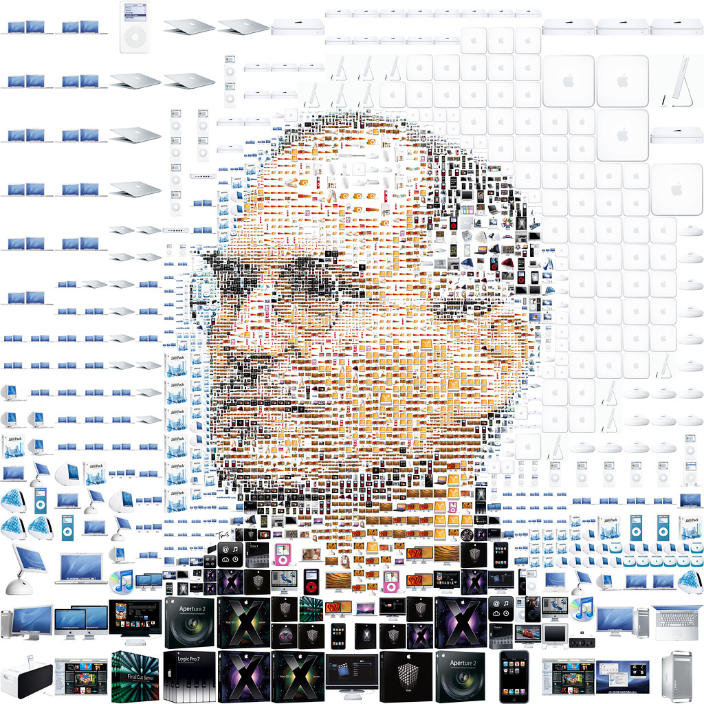
This one is just fun. Steve Jobs portrait photo mosaic made from Apple products and icons from OS X. Another version of this from the same artist was used in the March 17, 2008 issue of Fortune magazine.

Found on digg.com

Tuesday
Mar112008

Tribute to Gary Gygax


From the nytimes.com

Saturday
Mar082008

See the World in Words

I thought this was really cool!

Thursday
Mar062008

Design Journal interview


Design Journal is the magazine for members of The Society of News Design (SND). The Editor, Jonathon Berlin, approached me a while back for a quick interview to include in an upcoming issue. The interview was just published in the Winter 2008 issue (#105), which has a whole theme about data and graphics.

Unfortunately, the magazine is for members of SND only. However...


...Jonathon also published most of the interview on the SND Update blog, so you can read the interview online.

Jonathon, thank you very much for the visibility and the press!

Monday
Mar032008

The Calculators of HP poster


From the The Hewlett Packard Calculator Page.

This poster shows every HP calculator made starting with the famous HP-35. Each calculator is displayed with it's production start and end data, and it's project codename.
It's amazing how many of these I have actually used. This is similar to the Evolution of Apple Design...but with more buttons.

Sunday
Mar022008

What if...


Craig Robinson, from flipflopflyin.com, has created a graphic showing many of the different paths/branches his life could have taken. Clicking on each character icon reveals text describing the event or deviation from actual events.

Who hasn't at one time or another wondered how their life could've gone in other directions if different events had occurred or different choices been made? These are the ways my life could've deviated from its actual path (the top row).
" Craig dies at the age of 34, killed by an angry swan" I found incredibly funny.

Found on NiXLOG.

Saturday
Mar012008

Lance's Last Tour


I found two good newspaper infographics from 2005 covering Lance Armstrong's last Tour de France on newsdesigner.com where you can get larger PDF files that make good posters. Both are two-page graphics (doubletrucks). The first is from The Oregonian (above), and the second is from the St. Pete Times (below).


Found on NiXLOG.

Thursday
Feb282008

Classifying Experiences


Stephen Anderson is an "experience architect" at Sabre Travel Network, and has created a poster to communicate how people Sort, Classify, and Label Experiences. Read Stephen's blog post explaining his efforts.

Found on NiXLOG.

Tuesday
Feb262008

Infographics for Advocacy


I got a note from John Emerson, the author of Visualizing Information for Advocacy, and I wanted to share that his booklet on using infographics for NGO's and advocacy organizations is now available online as a free PDF (6.9MB) at apperceptive.com. Although geared to advocacy groups, the information is definitely relevant to everyone.

John also has a blog post up on Social Design Notes.

Outstanding job John!

Sunday
Feb242008

Conquest of Mount Everest


Cool infographic poster from historyshots.com showing the many expeditions leading up to the 1953 successful team to make it to the top of My. Everest.

Every major expedition before the successful climb of Mount Everest is detailed on the left side of the print. The circles provide an easy to view key into the history of each expedition including expedition length, type and height achieved. The flow of climbers from one expedition to another is tracked with graceful lines.

The right side of the print is devoted to the successful 1953 assault. The entire expedition is mapped showing the exact climbing history by altitude of each of the main phases of the assault. In addition, the weather for each day is provided.