About
Randy Krum
President of InfoNewt.
Data Visualization and Infographic Design

Infographic Design

Infographics Design | Presentations
Consulting | Data Visualizations

DFW DataViz Meetup

Join the DFW Data Visualization and Infographics Meetup Group if you're in the Dallas/Fort Worth area!

Search the Cool Infographics site

Custom Search

Subscriptions:


Feedburner

The Cool Infographics® Gallery:

How to add the
Cool Infographics button to your:

Cool Infographics iOS icon

- iPhone
- iPad
- iPod Touch


Read on Flipboard for iPad and iPhone

Featured in the Tech & Science category

Flipboard icon

Twitter Feed
From the Bookstore

Caffeine Poster

The Caffeine Poster infographic

Entries in medical (18)

Thursday
Oct202016

Electrocardiography Basics

Electrocardiography Basics infographic science illustration poster

Electrocardiography Basics is a new infographic science illustration poster design by Eleanor Lutz at TabletopWhale.com for Nerdcore Medical. You can purchase the printed poster for $19.99 from Nerdcore Medical.

This week’s collaboration with Nerdcore Medical was a fun chance to try a more simple style than I usually use. For this poster I wanted to show 11 different kinds of heartbeat EKGs in a colorful design.

I wanted to highlight the unique shapes of each EKG wave as the focal point of the poster. After trying a few different things, I decided to try and make a digital heartbeat “sunrise,” where each of the EKG waves defined a specific colorful section of the poster. I thought it would show off the simple shape of the waves, and also work as a practical way to section off the different descriptions.

I ended up designing each line in Illustrator, and then importing the shapes to Photoshop to add textured shadows, color overlays, and text. More... 

Eleanor followed up this design with a behind-the-scenes blog Rough Drafts and Sketches post about what went into her design process, and specifically the color palette selection process (a beautiful infographic design itself!).


Thursday
Jun022016

Diabetes: The Silent Scourge

Diabetes: The Silent Scourge infographic

Diabetes: The Silent Scourge is a great 2-page spread infographic designed by Adolfo Arranz for the Today newspaper in Singapore. A worldwide growing health issue!

An estimated 422 million adults globally were living with diabetes in 2014, compared with 108 million in 1980. The global prevalence (age-standardised) of diabetes has nearly doubled since 1980, rising from 4.7 per cent to 8.5 per cent in the adult population. This reflects an increase in associated risk factors such as being overweight or obese. Over the past decade, diabetes prevalence has risen faster in low- and middle-income countries than in high-income countries. Infographic spread page for Today newspaper.

Diabetes: The Silent Scourge infographic newspaper photo

Notice the creative use of half-circles proportionally sized to match the "By Region" data. This accurately represents the data, but only take half the space on the page!

The use of many different visualization methods also helps the readers understand that there are many different data sets being shown. Slopegraphs, rose diagrams, colored map, bar charts, stacked bar charts and the half-circles all shown different facts about the diabetes epidemic.

Great work Adolfo!

Wednesday
Nov052014

How Well Do You Know Your Shit?

How Well Do You Know Your Shit? infographic

Poop is not a pleasant thing to talk about. And studying it in your toilet after you excrete it is probably not part of your normal routine. However, the How Well Do You Know Your Shit? infographic from Health Works enlightens us about what our poop can tell us about our health.

With its less than enticing scent, and unattractive physique, nobody wants to give their poop a second glance. The general rule when it comes to poop is – you do the deed quickly, and flush immediately.

While it’s no bed of roses, the next time you’re in the toilet doing the Number 2, take a look at your work of art before you flush. The brown blob in the toilet bowl can divulge little secrets about your health condition, since it’s the product of the waste from your body.

You might curse us for coming up with this cute little infographic, but you really should know your sh*t better. Enjoy:

This is a really good informational infographic about a topic no one likes to talk about. A perfect topic choice from a health information site.

Thanks to Wen for sending in the link!

Thursday
Sep112014

A Comprehensive Look at the Ebola Virus

A Comprehensive Look at the Ebola Virus infographic

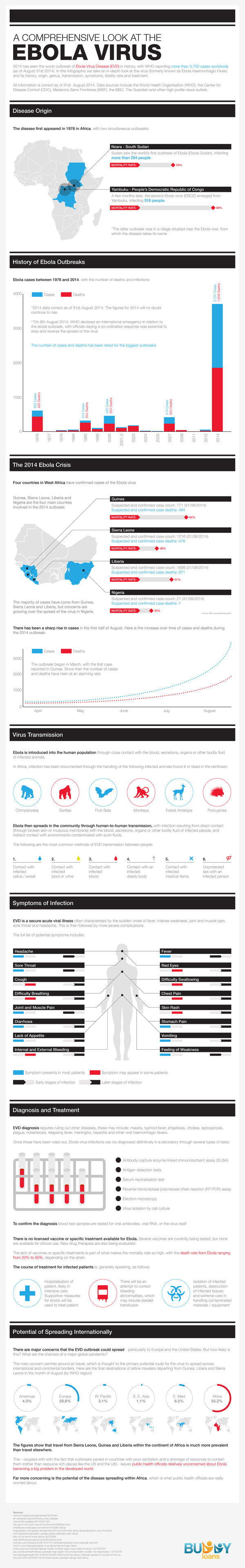
The newest outbreak of Ebola virus caused a lot of panic due to the lack of public knowledge of the disease. Buddy Loans has created A Comprehensive Look at the Ebola Virus infographic to increase (or maybe in this case decrease) the public’s exposure to the disease.

2014 has seen the worst outbreak of Ebola Virus Disease (EVD) in history, with WHO reporting more than 1,700 cases worldwide (as of August this year). In this infographic we take an in-depth look at the virus (formally known as Ebola Haemorrhagic Fever) and its history, origin, genus, transmission, symptoms, fatality rate, and treatment.

All information is correct as of mid-August 2014. Data sources include the World Health Organisation (WHO), the Center for Disease Control (CDC), Medecins Sans Frontieres (MSF), the BBC, The Guardian, and other high profile news outlets.

Infographics that explain anything health or medical related tend to be a little word heavy, due to their job of thoroughly and explaining complex information. This is a very clean design that implies authority and credibility, and uses a very simple red-blue color scheme. 

The chart in the History of Ebola Outbreaks section is interesting. They chose to only include the data of the biggest outbreak years instead of including every year on the timeline. This is a good method to use when you have a lot of specific data you want to highlight in a small space. If this infographic was focusing on a comparison between the good years and the bad years of Ebola, then including the data sets from smaller years would be appropriate.

The stacked bar chart is also a little tough to understand, and might have worked better as a clustered bar. The blue bar is the total number of reported cases, and the red bar is the portion of those cases that resulted in death. Not the normal way that people use a stacked bar chart.

I like that each section uses a different visualization method (bar chart, map, doughnut chart, etc.).  That makes it easier for the audience to read through clear separations between the sections.

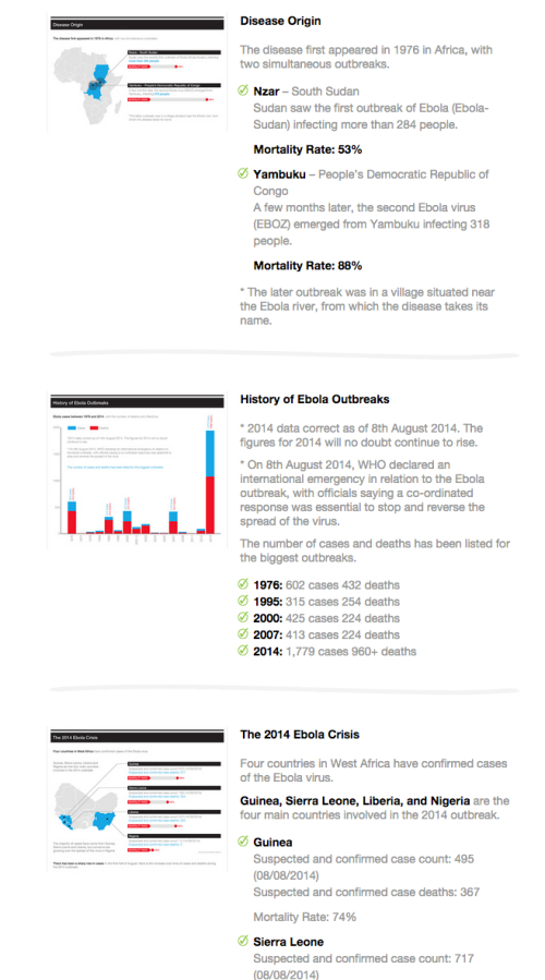
The infographic landing page is also worth noting. On the original landing page, they correctly included some intro text, the full infographic, social sharing buttons and embed code for anyone that wants to post the infographic on their own site. They added a longer text description with more information about each data visualization. This gives reads additional incentive to view the original web page and provides additional text for the search engines to associate with the infographic.

Thanks to David for sending in the link!

Monday
Aug112014

The State of AIDS

The State of AIDS infographic

The four states in the US that have the highest number of cases of HIV and AIDS cases are California, New York, Florida, and Texas. The State of AIDS infographic shows the increase in cases from the 1980’s to the 2000’s and was designed by Alan Bui.

An Info-Graphic produced using statical reports from the CDC to represent visually the Four State in the US that have the highest cases of HIV/AID’S cases. The Info-Graph also shows disparity from the first reported case of HIV/AIDS in the 1980’s to the 2000’s.

Good data visualization that tells one story really well.  You can clearly see the number of reported cases increases dramatically each decade. 

Thanks to Alan for sending in the link!

Friday
Aug012014

Cold or the Flu? How to Spot the Difference

Cold or the Flu? How to Spot the Difference infographic

Getting sick is NOT fun and trying to figure out what you have is even worse. The Cold or Flu? How to Spot the Difference infographic from Vaccine Hub highlights some key points to help you tell the difference. Get well soon!

What is influenza?
Influenza, or the flu, is caused by a highly contagious virus that infects your nose, throat and lungs. Symptoms develop quickly and last around one week. The flu is seasonal and in Australia tends to occur between June and August.

Read more information at Vaccine Hub.

Determining if you have a cold or the flu is always difficult. This infographic does a good job of choosing one topic and telling its story well without adding too much information.  Visualizing the few statistics they included would make the side-by-side comparison more effective, and the treatment section could benefit from a few graphics to break up word usage.

The infographic is missing it’s URL address to the infographic landing page that should be included at the bottom of the graphic to locate the original.

Thanks to Ellie for sending in the link!

Thursday
Dec122013

How To Boost Recovery After An Injury

How To Boost Recovery After An Injury infographic

How To Boost Recovery After An Injury from BodyHeal.com.au is a visual explanation infographic that uses illustrations and icons to explain the R.I.C.E. injury treatment process.

R.I.C.E. treatment is an acronym for: rest, ice, compression, elevation. It is commonly used to speed up healing and reduce pain and swelling caused by mild-to-moderate injuries, such as sprains, strains, and bruises.

The design uses a good combination of text explanations, character illustrations, icons and story layout to educate the audience about injury treatment.  Short text explanations effectively keep the information consumption quick and easy.

Some of the text is too small when reduced to fit on a blog (like this one), so the design should have included the URL back to the infographic landing page so readers can easily find the full-size original version.


Tuesday
Oct012013

What Are Anxiety Disorders?

What Are Anxiety Disorders? infographic

What Are Anxiety Disorders? is a very detailed infographic from Global Medical Education to help people understand the history, issues and treatments of anxiety disorders.

Anxiety disorders are the commonest psychiatric illnesses globally. There is no test for anxiety disorders like panic disorder, PTSD,OCD or social anxiety disorder and the diagnosis is based on a good history and examination. The signs and symptoms of anxiety disorders are often missed or explained away. Anxiety disorders are also commonly comorbid with other psychiatric disorders particularly mood disorders.

There is no cure for anxiety disorders but very effective treatments are available with a good evidence base. The treatments for anxiety disorders include medications like benzodiazepines, SSRIs or SNRIs or other new generation antidepressants, atypical antipsychotics, as well as augmentation therapies.  Several proven therapies are also efficacious in patients with anxiety disorders. These include cognitive behavior therapy, relaxation training, and prolonged exposure therapy. Yoga and meditation have also demonstrated benefits.

There is a lot of information in this design.  It’s all good, but packing this much information into one infographic is a risk.  On one hand, all of the major information in included in one place.  On the other hand, an infographic this big with this much text will discourage many readers that are looking for a fast and easy explanation.  The overall design can be intimidating to readers that are evaluating the amount of time they would need to invest in understand the information before they start reading.  Many will leave before reading any of the infographic.

Thanks to David for sending in the link!

Tuesday
Jul092013

What Is Autism?

What Is Autism? from Global Medical Education is a long, informational infographic that covers the symptons, signs, types, treatments and history of diagnosing autism.

Autism Spectrum Disorder is very common. About 1 in 50 school aged children had parent reported ASD in 2011-2012. There have been changes in DSM-5 with the category of Autism Spectrum Disorder being introduced  which includes Autistic disorder, Asperger’s disorder, Rett’s disorder and Pervasive Developmental Disorder-NOS from DSM-IV. Researchers have studied several important questions in this disorder.

This is a big design with a bunch of good information.  However, I think it’s way too much text for an infographic.  Infographics should make information easier to understand, and most readers won’t stick around to read this much information.  In fact, many readers won’t read any of the information because that much text is intimidating and implies an investment of time and attention by the reader.

The information is fantastic, and should have been broken up into multiple infographics to cover the different topics.  This would make the information easier to digest, and would also spread out links and views to the hosting site over a longer period of time.

Thanks to David for sending in the link!


Monday
May202013

Common Causes of Tummy Aches in Children

Common Causes of Tummy Aches in Children infographic

Common Causes of Tummy Aches in Children from Tummy Calm is guide for all parents, because all kids get unexplained stomach aches at some point.   The infographic does a good job of clearly walking the audience through the potential symptoms, causes and remedies.

A tummy ache can be a frustrating symptom to understand in small children.  While it’s a common problem, there are a wide variety of potential causes.  This infographic reviews many potential causes of stomach ache and offers pros and cons to potential remedies.

Designed by InfoNewt, this infographic is much more visual explanation and less data visualization.  Health-related topics are also designs that you need to be careful with.  You want to provide good information to the audience, but you don’t want to be interpretted as advising medical care.  The design was carefully worded to be helpful to parents, but also reviewed by a pediatrician to make sure the information presented didn’t cross the line into providing medical advice.