About
Randy Krum
President of InfoNewt.
Data Visualization and Infographic Design

Infographic Design

Infographics Design | Presentations
Consulting | Data Visualizations

DFW DataViz Meetup

Join the DFW Data Visualization and Infographics Meetup Group if you're in the Dallas/Fort Worth area!

Search the Cool Infographics site

Custom Search

Subscriptions:


Feedburner

The Cool Infographics® Gallery:

How to add the
Cool Infographics button to your:

Cool Infographics iOS icon

- iPhone
- iPad
- iPod Touch


Read on Flipboard for iPad and iPhone

Featured in the Tech & Science category

Flipboard icon

Twitter Feed
From the Bookstore

Caffeine Poster

The Caffeine Poster infographic

Entries in gadgets (11)

Wednesday
May112016

The Growth of the Internet of Things

Growth in the Internet of Things Infographic

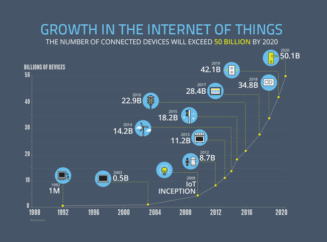
The current projection data from Cisco is that the IoT (Internet of Things) will reach 50 Billion devices by the year 2020! Visualized by the NCTA (National Cable & Telecommunications Association) as the Growth in the Internet of Things.

Today’s Internet is driven by wired and wireless networks, keeping us connected throughout our daily lives. With the advent of new digital devices that constantly link us to the Internet, these networks have become much more than just a simple vehicle for information and communications. They now enable us to track our daily habits, monitor our health, manage home energy use and track nearly any other data we can imagine. These devices make up what we call the Internet of Things – a web of connected objects that are linked via networks that can interact with each other and with us.

The Internet isn’t merely developing, it’s exploding, and the numbers prove it. Take a look at our graphic below — it shows the advancing surge of connected devices using the Internet.

Today, there are more connected devices than there are human beings on the planet. This expansion isn’t just from cell phones, tablets and computers – it’s thanks to toothbrushes, stovetops and millions of other devices that now have IP addresses. Estimates show that there will be over 50 billion connected devices by 2020.

Fast, ubiquitous Wi-Fi and increasing home broadband speeds will drive the Internet of Things and the ever-expanding web.

A clean and simple line chart tells this story very well. Notice that the chart was designed with many of the principles for storytelling in data visualization we discuss every day.

  • No chart legend. The data is shown directly in the chart
  • Minimal gridlines to simplify reading the chart and clean up the visual noise gridlines create
  • No separate data table. The relevant numbers are shown directly in the chart
  • Minimal axis labels (you don't need to show every year)
  • Use of visual icons to help communicate each milestone. 

Suggestion: I would move the icons and data much closer to the actual data points on the chart. There are too many connecting lines.

Thanks to Heather for sharing on Linkedin!

Thursday
Mar122015

Apple Product Flops Timeline #Fail

Apple Fail infographic

Not all ideas are good ones. Apple has had it’s own fair share of ideas gone wrong. The Apple #Fail infographic from 7 Day Shop is a compiled list of Apple’s not so successful inventions.

Behind All Successes Are a Series of Failures

When starting your own business, you should be ready for some failures along the way – but the most successful firms learn from their mistakes. As author C.S Lewis once said: “Failures are finger posts on the road to achievement.”

Take Apple. The Cupertino-based tech giant may be known for the runaway success of the iPhone and Ipad. But as our Infographic shows, Steve Jobs suffered a number of epic fails over the years.

Some misses like the Apple III and the Macintosh Portable, almost put them out of business!

Never Giving Up

But they didn’t give up – even when their machines were tipped for success, but failed to appeal to the tech market. Take the PowerPC processor for example. It could be used as a games console and a word processor, but consumers weren’t bothered.

The same can be said for Apple’s U2 iPod and the U2 album giveaway “Songs of Innocence”. Both failed, but perhaps because of the music churned about by the Irish rock band more than the marketing idea.

And FireWire’s inability to displace the USB, encouraged Apple to develop the Lightning Cable, which is now the standard iPhone charger cable. Even some good ideas did catch on. What about the Power Mac G4 Cube? A shiny monitor in an acrylic glass enclosure with upgradeable video – surely, that had to work! The idea was magic in a box, or as Apple might say, it was genie-us. Consumers didn’t think so. It failed.

Thanks to Kunie for sending in the link!

Wednesday
Dec182013

The 100 Most Influential Cameras in History

The 100 Most Influential Cameras in History infographic poster

Another great infographic poster from the team at Pop Chart Lab!  A Visual Compendium of Cameras lines up the 100 most influential cameras in history in Chronological order.

A meticulously illustrated catalog of 100 landmark cameras, culled from over a century of photographic history, depicting both professional and consumer models and tracing photography’s history from the first models to today’s digital wonders.

Available unframed for $28 from the Pop Chart Lab Store.

Found on Fast Company Design!


You can see this one and many other infographic posters collected on the Cool Infographic Posters page or my Infographic Posters board on Pinterest!

Monday
Jan072013

Can You Protect Yourself from Hackers at CES?

Can You Protect Yourself from Hackers at CES? infographic

Are you headed to CES in Las Vegas this week?  Do you know how to protect your electronic devices?  The Is Your Device Safe at CES? infographic from Novell shows us some heartbreaking stats.

The Numbers Don’t Lie

You don’t think it will ever happen to you, do you? Well, think again. With a laptop or tablet being stolen every 53 seconds you can literally lose your mobile device at any minute. Oh, and by the way, you’re losing a lot more than that precious device: sensitive company documents, passwords, credit card information, etc. So what are you doing to protect that phone/iPad/laptop? Apparently very little as only 4% of smartphones have Mobile Device Management security installed on them. Take a look at a few of the scary numbers and some ideas you could implement to protect your device and your precious content.

This design is long, but there’s a lot of information to share.  I like the simple color scheme, and there’s some really good data included in here.  However, most of the statistics are shown in text only, which is disappointing.

I’ve said it many times here on Cool Infographics.  Big fonts are not data visualizations.  You want your readers to comprehend and remember the numbers you are showing them in your infographic design.  To be successful at that you need to put the numbers into context for the reader, by visually comparing them to another value or showing them the scale of the value.

Thanks to Mat for sending in the link!


Tuesday
Sep182012

How Does A Touchscreen Phone Work?

How Does A Touchscreen Phone Work? infographic

This is the reason why your iPhone won’t work with gloves but your Samsung U600 will! The How Does A Touchscreen Phone Work? infographic from mycricket.com compares phones with the three different types of touch screens. 

Ever wonder why some touch screen phones cost more than others? Or why you can’t seem to get the touch screen on your smartphone to work if you’re wearing a glove? Most people don’t know that there are three different types of touch screen technologies available: resistive, capacitive, and infrared. Learn about the different benefits and capabilities to make sure you get the touch screen phone you’re looking for.

This is a really good comparison infographic design.  Each feature is clearly illustrated for the reader, the text descriptions are minimal and it’s very easy to read top-to-bottom.

I had trouble finding the original because the URL link to the original landing page was not included at the bottom of the design (always include the URL!), and there should be some type of copyright or Creative Common license.  Not really a problem, but I’m surprised the design doesn’t include any mention of the Cricket Wireless brand or logo.

Thanks to Sam for sending in the link!

Monday
Sep102012

BYOD: The Good, the Bad and the Ugly

 BYOD: The Good the Bad the Ugly infographic

“BYOD” Bring Your own Device. A great idea that can easily turn messy. Biztech has introduced the BYOD: The Good, the Bad and the Ugly infographic asking you to answer 6 easy but important questions before you launch into a BYOD situation. 

If your company is considering allowing employees to bring their own devices to work, make sure you have a game plan in place.

BYOD has freed up many enterprises from the responsibility of exclusively purchasing and maintaining computing devices, such as notebooks, tablets and smartphones, but companies still need to have policies set in place to make things work.

BizTech magazine has put together an infographic that highlights six core questions every company should consider before moving forward with BYOD:

  1. Who buys the devices?
  2. What’s the right policy?
  3. What’s the employee’s role?
  4. What’s the impact on IT?
  5. How do we tackle security?
  6. How about apps?

For each of these questions, we’ve outlined a good answer, which we’d advise you to follow; a bad answer, which probably isn’t the best way to handle things; and an ugly answer, which should be avoided at all costs. Hopefully, this will help your company remain on the pleasant side of this growing workplace trend.

The organization in this design is really well done.  After explaining the concept of BYOD, the infographic walks the reader through six questions and provides some stats and information about each aspect.  The text is short, the illustrations are relevant and entertaining and the information is valuable to companies.

One of the data visualizations is hard for the readers to understand.  Highlighting 72% of employers as six people icons is very odd (Use 10 icons for percentages), but then they correctly used 10 icons when visualization 70% of Cisco employees.  At the bottom of the infographic image, it’s missing a URL to the original infographic landing lage, and a copyright statement.

Thanks to Ricky for sending in the link!

Wednesday
Jun132012

Digital Anatomy of the Affluent Male

Digital Anatomy of the Affluent Male infographic

Busy busy busy! The affluent male is always searching online! The Digital Anatomy of the Affluent Male from iprospect.com describes who the affluent male is and what he searches for.

There are 19 million affluent males on the Interent and they are shopping online and spending more than ever before.  Forty percent of them are shopping online 2x a week or more and spending over $30k annually.

I really like the design style and the colors on this one.  The correctly-highlighted map in his pocket and the cowboy boot are a nice touch.

The data visualizations do a good job, but there are a bunch of statistics that aren’t visualized and are left just in text.  Visually, this makes these other statistics less important because they didn’t warrant being visualized.  The favorite brands could use the actual logos, and the “What he’s searching for” could use some icons.

From an SEO perspective, the URL at the bottom really should be the landing page address, and once you get to the landing page, there aren’t any social sharing buttons so you are left to your own to figure out how to share it.

Also available as a PDF download.

Thanks to Douglas for sending in the link!

Thursday
Apr052012

The Fiction to Reality Timeline

The Fiction to Reality Timeline infographic from attsavings.com brings all of cool gadgets from the future in movies into the present.  Anything is possible!

Do you remember “Star Trek” and all the great gadgets the crew members used in each episode? Or the fancy gizmos from “The Jetsons” or “Minority Report?” Ever wonder when, or if, we’ll invent technology like what we’ve seen in the fictional universe? Satisfy your craving for fictional tech with The Fiction to Reality Timeline.

Although I disagree that some of their actual technology references are the first time certain technologies have appeared in the modern world, the overall message is clear.  Things like Heads-Up Displays have been around in fighter cockpits for much longer, and the iPad wasn’t the first portable display device, just the first mainstream commercially successful device.

I couldn’t figure out if the line colors had any meaning.  Are they color-coded to match some type of category?

Where’s my flying car?!?

Thanks to Ryan for sending the link!

Friday
Mar162012

Client Infographic: Streamlining your Digital Life with the new iPad

With the Apple event last week announcing the release of the new iPad, the Streamlining your Digital Life with the new iPad infographic from NextWorth takes a look at the history of the electronic devices that the iPad has replaced in our lives.  A true multifunctional device, the iPad has replaced many of our separate gadgets.

The digital world is converging on a revolutionary all-in-one device, the powerful, brand-new iPad. These are the iconic portable devices that led to (and are to some extent being replaced by) Apple’s innovation.

The lines are color coded to connect the types of devices in the timeline, and show any devices that had multiple functions of their own (like the Eee PC 701).  Using a treemap in the iPad image, it also shows the amount of time spent using the different functions on the iPad from average consumers.  The use of illustrations instead of photographs of all these devices keeps the design simple and focused on communicating the data.

Finally, using their own internal data, an assortment of prices are shown of the current maximum values that consumers can get by trading in their now-obsolete gadgets.  With a handful of the right gadgets, you could easily get enough money back to pay for a brand new iPad!

All of the essential information is included in the design: data sources, brand logo, URL of the original high-resolution infographic landing page, company logo, copyright statement and even a mention of the designer (nice job Jeremy!).

This was an infographic design from my own company, InfoNewt, and of course, the team at NextWorth was fantastic to work with!

Monday
Feb272012

iPad3: USA in anticipation of the new iPad

Anticipation is building strong momentum expecting the release of the next iPad from Apple in the near future.  Ask You Target Market (AYTM.com) is an online survey service, and they gathered data from a couple of their own surveys to compile the iPad3: USA in anticipation of the new iPad infographic.

The rumor is that the iPad 3 announcement will come in the first week of March, but doesn’t specify when it will be released. For reference, the iPad 2 was announced on March 2nd of last year, and available on the 11th.

There are some significant changes expected and to gain a better understanding on the current state of the American consumers’ current iPad usage and anticipation of the iPad 3, AYTM conducted DIY market research utilizing our online consumer panel and survey tool. The highlights of our discoveries are encapsulated in this infographic:

This Infographic is based on a survey of 2000 Americans who don’t own an iPad (request full stats report by e-mailing us: support [at) aytm.com) and another survey of 500 iPad owners (open full stats report) that we’ve collected for you on aytm.com in February 2012.

A few thoughts about the design:

  • I like the idea to that each fingerprint on the iPad to represents 100,000 people, but because it’s a data visualization, the different sizes of the fingerprints makes you think that the size has meaning when it really doesn’t.  It was so subtle, I initially missed the number 3 reversed in the fingerprints.
  • In the “What could Apple do” section, the illustrations do help give meaning to each of the statistics, but because the numbers are all in the text, their impact is lost.  These values should have been visualized.
  • The model distribution is clear, and easy to understand.  For the Models breakdown, I really like the use of the pie chart to represent two levels of data.  Primary is the size, and the secondary level is the WiFi vs. 3G split.
  • I really like the 3G satisfaction breakdown.  Very easy to understand.
  • Great use of the logos and colors in the Carrier split data.  Orange isn’t in the AT&T logo, but is a very dominant color on their website, and Verizon got a red bar to match their logo and primary website color.
  • The Family trees are hard to understand and the 1.7x visualization isn’t clear.
  • I’m not sure why they picked area charts for the apps visualizations.  That’s really the wrong type of visualization for the data since these are all supposed to add up to 100% of users.
  • The male vs. female bar charts work well, and are easy to understand.  I appreciate that they were consistent with the female number always first, and of course the color-coding work perfectly.
  • “Where iPads are used” is really just an illustration, and doesn’t visualize the percentages at all.  I simple stacked bar under the illustrations (like the carriers above) would have worked nicely.
  • Surpirisingly, I really like the use of word clouds here.  You don’t need the specific numbers, and the word cloud visualization makes the point well because the top responses are so overwhelming.
  • I love that they gave credit to the designer, Lev Mazin!  It doesn’t hurt that he’s the CEO and Co-founder of AYTM.com, but happens to also be a graphic designer.

Only one thing missing at the bottom: the URL to find the original infographic.

Found on Mashable