About
Randy Krum
President of InfoNewt.
Data Visualization and Infographic Design

Infographic Design

Infographics Design | Presentations
Consulting | Data Visualizations

DFW DataViz Meetup

Join the DFW Data Visualization and Infographics Meetup Group if you're in the Dallas/Fort Worth area!

Search the Cool Infographics site

Custom Search

Subscriptions:


Feedburner

The Cool Infographics® Gallery:

How to add the
Cool Infographics button to your:

Cool Infographics iOS icon

- iPhone
- iPad
- iPod Touch


Read on Flipboard for iPad and iPhone

Featured in the Tech & Science category

Flipboard icon

Twitter Feed
From the Bookstore

Caffeine Poster

The Caffeine Poster infographic

Entries in cars (11)

Saturday
Mar042017

Planes, Trains & Automobiles of U.S. Presidents
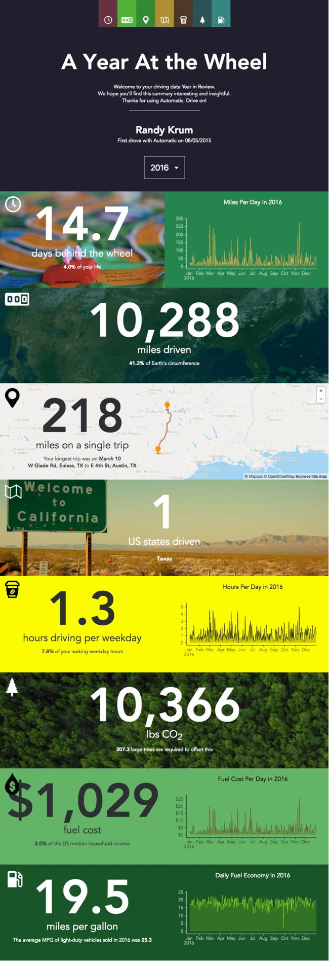
Official Vehicles of the President of the United States – TitleMax.com – Infographic

Official Vehicles of the President of the United States is an infographic from TitleMax showing the evolution of the vehicles used by Presidents throughout our history.

When the POTUS (President of the Unite States) has to get around, he usually does it in style. And if he’s not in style, at least we know that he’s often surrounded by millions of dollars’ worth of security detail.

Yes, for the U.S. president, cars and vehicles have always been expensive, as has been Air Force One. History has put a spotlight on the presidents’ one-of-a-kind planes: mobile White Houses, with all of the protections therein.

This information is much better shown visually like this infographic than a text bullet list. I would like to see them placed on a timeline to better line them up and show where their use overlapped.

The infographic itself is missing a copyright statement, a citation of sources, and the URL for readers to be able to find the origial full-size infographic published by TitleMax.

Found on Infographic Journal

Friday
Feb172017

A Year of Driving 2016

A Year of Driving by Automatic infographic

A Year At The Wheel. If you are an owner of an Automatic connected car adapter, they create a personalized infographic with your own custom data.

A number of companies have started creating personalized data visualizations and infographic for their customers, which is a trend that I really like. As part of Automatic Labs, the Year In Review graphics give you insights into your own personal driving history data that you couldn't see anywhere else. One of many ways they are experimenting making your personal big data useful.

Big fonts are not data visualizations! My biggest critique is that there are sections that just show the data value in a big font. They were too lazy to create visualizations for the comparisons. For example, they took the time to calculate that 10,366 lbs of CO2 would require 207 large trees to offset, but a visual of 207 tree icons would be way more impactful!

Wednesday
Jun222016

Venn Diagram shows Tesla-SolarCity-SpaceX overlap

Venn Diagram shows Tesla-SolarCity-SpaceX overlap

Yesterday (June 21, 2016) Tesla Motors offered to acquire SolarCity for $2.8 billion in stock. Unless you pay close attention, you may not realize that these are both companies headed by Elon Musk. The Wall Street Journal (subscription required) has visualized the shared investors and board members with this clear Venn Diagram showing the overlap between his three companies: Tesla, SolarCity and SpaceX.

The graphic helps put the merger news into context for the readers. The best infographics and data visualizations make complex information more approachable and understandable for the audience, and this one does that very well.

Found on TechCrunch, where you can see the design.

Monday
May112015

History of the Batmobile

History of the Batmobile infographic

Batmobile Feature infographic

Comic Book Resources has added 3 Batmobile infographics to reveal some interesting trivia. In 75 years, there have been many different Batmobiles over the years. These infographics show past designs, a feature comparison between the 1966 and 2005 model, and final a cost comparison chart ranging from the $13,000s to $4.5 Million.

After 75 years of omnipresence, one can make a very strong case that the Batmobile is the most iconic automobile in all of pop culture history. Since Batman’s debut back in 1939’s “Detective Comics” #27, the caped crusader has always relied on a car — usually a stylish, feature-loaded one — to get him from his cave to crime scenes. As a crucial part of the Bat-mythos, the Batmobile — dubbed such in 1941’s “Detective Comics” #48 — has appeared in everything from comics and cartoons to films and video games. Wherever you see Batman, odds are the Batmobile is parked just a few blocks away. 

Zack Snyder Shares Partial Look at New Batmobile

With the Batmobile poised to make it’s eighth big-screen appearance in 2016’s “Batman v Superman: Dawn of Justice,” former CBR editor Steve Sunu set about researching the most intimidating car on DC Comics’ streets. Did you know that the original Batmobile was red? Or that the “Batman ‘66” version had an “emergency bat-turn parachute”? Or that you could buy almost three “Dark Knight” tumblers for the cost one one Lamborghini Veneno Roadster? Graphic artist and COMICS SHOULD BE GOOD contributor Sonia Harris brought all these facts together in the three infographics below, designed to get you up to speed on the fiction’s most notable car.

Peruse CBR’s three Batmobile infographics and broaden your knowledge of comics’ most famous car — and feel free to share and discusses these infographics on social media with #CBRBatmobile!

I would have put all three of these together into one infographic, but the smaller, separate designs might be easier to share in social media. In the Cost Comparison bar chart, I would like to see images or silhouettes of the different cars represented.

Thanks to Mike Wirth for sharing on Facebook.

Tuesday
Jan272015

2012 Statistics: Pennsylvania Crashes

2012 Statistics: Pennsylvania Crashes infographic

This infographic is a very detailed look into the 2012 Statistics of Pennsylvania Crashes. Solnick & Levin, a law firm that works on cases of personal injury due to accidents, released the infographic to help potential clients understand where their case may fall in the overall state statistics.

The charts and visualizations in this infographic design are clear and very easy for the readers to understand.

However, I frequently talk about the differences between showing statistics with a data visualization versus showing them in text-alone. This is a great example, where some stats are visualized where others are not. Any of the stats shown as only text are generally considered to be secondary information by the readers because they weren’t important enough for the designer to spend the time to visualize.

My recommendation is that you should carefully choose to only include the important statistics that support the overall story in any particular infographic design.  If a data point makes the cut and is picked to be included, the designer should take the time to visualize it to make it more easily understood by the readers.

Thanks to James for sending in the link!

Monday
Nov032014

Filmography Print Series Posters

 Filmography Print Series Posters infographics

The Filmography Print Series was created by Cathryn and are all available for purchase at Calm The Ham. The Filmography of Guns (above), the Filmography of Cars, and the Filmography of Aircraft show a collection of popular icons from film and TV shows. Also available are book versions of the prints.

My name is Cathryn, and I’ve created the Filmography print series. Through the illustration of iconic items from film and television I wanted to create artwork for fans of popular culture, like myself. 


Each gun was sketched by hand with meticulous attention to every detail. It was then converted to a digital illustration. By drawing each gun at a large size (approx 12” x 18”) the detail of the weapon remains crisp when reduced in scale on the print.


The Filmography of Cars which illustrates popular cars from TV and film.


The Filmography of Aircraft, which illustrates 100 years of aviation in film.


Congratulation to Cathryn for her most recent project being funded on Kickstarter!

Wednesday
Jun042014

How to Buy a Used Car: 12 Things You Didn’t Know About Car Buying


How to Buy a Used Car: 12 Things You Didn’t Know About Car Buying infographic

For some buying a used car is fun, for others troublesome. The How to Buy a Used Car: 12 Things You Didn’t Know About Car Buying infographic from Toyota Certified gives some interesting facts and tips on buying a used car.

Whether you’re in the market for a family SUV, or a sporty little two-seater just for you, buying a used car is something that most of us do at least once in a lifetime. Toyota recently did a fascinating survey that outlines 12 Things You Didn’t Know About Car Buying and found that 26% of us find the experience fun and interesting… and 52% of buyers have no idea what model they want until they step into the dealership! Check out this fun infographic that takes a closer look at America’s car buying experience and you may discover some interesting facts you didn’t know… and some helpful tips about buying your next used vehicle, as well.

Good design, and I love that Toyota Certified (the used car division of Toyota) is sharing some of their internal customer information publicly.  They definitely need to do a better job citing the sources of the data, but some of these statistics are clearly based on Toyota sales numbers.  Others like the “Top Brand Loyalty” that shows Toyota as #1 are suspect because no source is listed.

A few of the percentage statistics could be better visualized.  A percentage is always comparing the statistical value to the total possible of 100%.   So numbers like “53% of buyers prefer their first dealer interaction to be online” should be shown as a stacked bar totaling 100%.  Others like “80% of people used the Internet in their car research” weren’t visualized at all, which makes them feel less important and secondary information to the audience.

Data visualization errors like the doughnut chart of the “Most Popular Colors” just hurt the brand credibility.  You can’t have a pie chart or a doughnut chart that only adds up to 88%.  They must total 100%!

Thanks to Belinda for sending in the link!

Monday
Jan132014

What Does the Colour of Your Car Say About You?

What Does the Colour of Your Car Say About You? infographic

If you think picking a car color was hard before, this infographic could make your decision easier or even harder. The What Does the Colour of Your Car Say About You? infographic published by Motor Click gives meaning to your choice in car color.

The wide variety of colors available has some questioning whether consumers make their selection based on simple preference, or whether or not the color of their vehicle somehow reflects their psychology. Whatever the reason, it cannot be denied that color plays a huge role in sales.

This is a good infographic design that takes information from the following text-only article and makes it visual: The Psychology Behind the Color of Your Car.  This design tells one story really well, and only takes a few seconds for the reader to understand.  Designed by Attwood Digital.

A couple issues with this design.  Obviously from a car company in the UK, the spelling of color/colour is oddly mixed throughout the design.  Also the data is a little bit questionable.  The article referenced isn’t the original source of information, and that article includes claims and quotes from additional sources.  Definitely take this information with a grain of salt.  There may be underlying credibility issues.

The footer should include the URL link back to the infographic landing page so the audience can find the original full-size version when they come across it shared on other sites.  For example, it’s had over 5,000 views on the Visual.ly site so far, but that submission does not link back to the original on the MotorClick site. So, all of that good traffic to view the infographic is not benefitting the original publisher at all.

Found on Visual.ly

Monday
Oct212013

Cars of the Silver Screen

Cars of the Silver Screen infographic

Cars of the Silver Screen infographic by moneysupermarket.com.

Looking for car insurance can be a time consuming and expensive business. However, if you were trying to insure some of these film treasures you might expect a few extra zeros on the end of your premium! From the Ford Mercury that James Dean famously drove in his last film, Rebel Without a Cause, to the brand new Audi R8 e-tron that Tony Stark drives in Iron Man 3, cars have played a massive part in iconic film history.

However, it is not always the ultra-cool cars that steal the limelight in blockbuster movies. Quite often the most memorable cars are the most unlikely. Take, for instance the Cadillac ‘Ecto-1’ that the Ghostbusters used to get around the busy New York streets, or the Volkswagen Beetle that got into so many scrapes in the Herbie movies.

To celebrate these unlikely heroes, we’ve taken a look at the timeline of great cars of the silver screen.

Interesting topic choice for Money Super Market.  For successful infographics, choosing a relevant topic with related keywords and search criteria can make a big difference.  Good link bait brings views and links from readers that are interested in the topic, and ideally even raises awareness with potential customers.

I’d like to hear your opinion.  Is this infographic about cars from movies relevant to a site that helps people find car insurance?  Leave your thoughts in the comments.

Thanks Paul for sending in the link!

Thursday
Jun062013

Most Reliable Cars

Most Reliable Cars infographic

Are you looking for a new car? The Most Reliable Cars infographic from MoneySupermarket rates how reliable the manufacturers are as well as specific car models. The lower the score, the more reliable the car is. If your current car isn’t on the list. Maybe it is time to get a new one.

It is never a pleasant experience to find yourself stranded next to a broken down vehicle at the side of the road, particularly during the winter. Breakdown cover can help to reduce the pain somewhat, but it is still worth making sure that you pick the most reliable car available.

MoneySupermarket.com has therefore teamed up with Warranty Direct to put together the following lists which highlight the most reliable cars on the road. This is decided upon by taking into account overall reliability and the average cost of repairs for these manufacturers and models – coming up with an overall Reliability Index (RI) score. Just for reference- the average RI is 100, and the lower the score the better.

We’ve broken this down by both car make and by individual vehicle models to come up with a definitive list which could prove invaluable to you during the car buying process.

This is a really good use of bar charts.  The company logos or car photos and the relevant data is built directly into the chart so there is no need for a chart legend.  Very easy to read and understand.

Thanks to Mark for sending in the link!