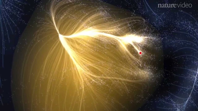
Very cool new visualization of Laniakea: Our Home Supercluster, which is the supercluster of galaxies that includes the Milky Way. Check out the video and article from Nature.com.
This is potentially the most detailed map of the universe to date, and spans more than 500 million light-years and contains more than 100,000 galaxies. The lines shown in the visualization the paths of motion of the individual galaxies.
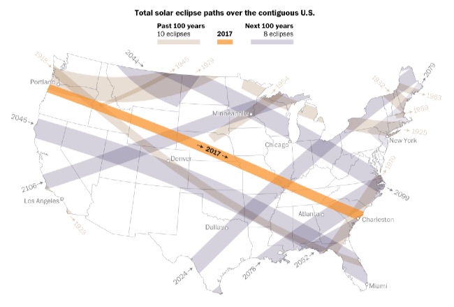
On Aug. 21, a total solar eclipse will be visible from the contiguous United States. It’ll be the first to traverse coast to coast in nearly a century. There will be 69 total solar eclipses visible from somewhere on the planet in the next 100 years, but only a few will be visible from North America. See how many total solar eclipses are left in your lifetime:
The path of totality for the eclipse in August stretches from coast to coast — passing over Oregon in the west and moving all the way across the country to South Carolina in the east. This is a rare event; it’s the first time the path of totality will eclipse only over the contiguous United States.
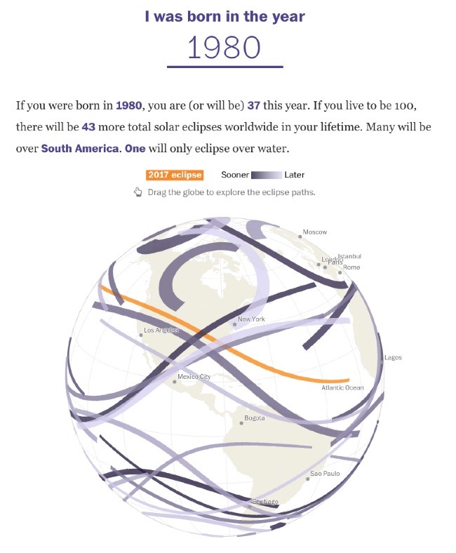
The interactive globe visualization is fascinating. Enter your birth year, and it plots all of the solar eclipses that have occurred and will occur during your expected lifetime across the globe.
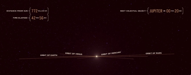
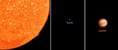
We think of the speed of light as incredibly fast, but in the video Riding Light, by Alphonse Swinehart, we ride along with light as it starts in our Sun and moves out past Jupiter in our solar system. The video is 45 minutes long and helps show both how large our solar system is, and that it still takes light a long time to travel these large distances.
In our terrestrial view of things, the speed of light seems incredibly fast. But as soon as you view it against the vast distances of the universe, it's unfortunately very slow. This animation illustrates, in realtime, the journey of a photon of light emitted from the surface of the sun and traveling across a portion of the solar system, from a human perspective.
I've taken liberties with certain things like the alignment of planets and asteroids, as well as ignoring the laws of relativity concerning what a photon actually "sees" or how time is experienced at the speed of light, but overall I've kept the size and distances of all the objects as accurate as possible. I also decided to end the animation just past Jupiter as I wanted to keep the running length below an hour.
During the course of the video, I also love the data visualziations shown during the flight, like how large the orbits of different planets appear to us as we move outward.
Today (Nov 14th) will be a total eclipse of the Sun, and the Solar Eclipses infographic from turu does a great job with visually explaining eclipses and sharing the statistics from prior eclipses.
The total solar eclipse of 2012 is set to be a spectacular event. Occurring just after sunrise on November 14 (local time), the eclipse will be best viewed from Cairns in Australia. Already a popular tourist destination, the 2012 eclipse is expected to flood the coastal city with thousands of domestic and international visitors.
The infographic provides a definition of a solar eclipse as well as information on the Australia 2012 eclipse. It offers an insight into past solar eclipses, noting duration of totality and effects on local tourism.
With a number of events scheduled such as the Solar Eclipse Marathon and the Eclipse 2012 Festival, Cairns aims to cater to this expected influx of tourists. Renowned for its sunshine, Cairns is expected to be a prime location to view the 2012 eclipse. The next opportunity to view a total eclipse in Australia will be in the year 2028, making this year’s event truly special.
A good design that tells a good story. In the footer should be a Copyright statement, and the URL to the infographic landing page so readers can find the origial full-size version.
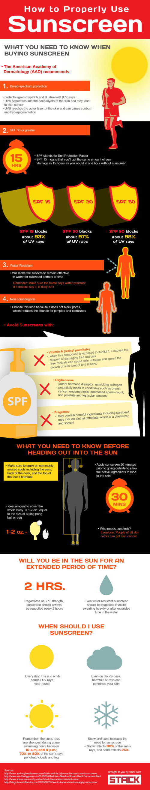
How-to topics are popular infographic designs, and How To Properly Use Sunscreen is a great topic to cover. From STACK.com. It’s over 100°F (over 37°C) here in Texas this week, so this is a very appropriate topic to share.
Most people know they should use sunscreen to protect themselves from the sun’s harmful rays. Unfortunately, few are fully aware of how to properly use sunscreen. This is particularly true of athletes who train and compete in the sun throughout the summer.
If you’re spending long hours in the heat this summer, sunscreen could become your most important piece of training equipment. Check out the graphic below to learn how to select the right SPF, understand application and find out how different conditions impact the need to use and reapply sunscreen. Don’t find yourself sunburned on the sideline this summer because you failed to educate yourself on how to properly use sunscreen.
As strong as the topic is, I see a number of design improvements that could be made:
The stats need to be visualized! The definition of SPF would have been a great data visualization comparing one hour in the sun without sunscreen to 15 hours in the sun with SPF 15.
I love the varying degrees of transparency in the shadows behind the shield illustrations for the different levels of SPF
Overall, there’s too much text. More than a normal reader will take the time to read.
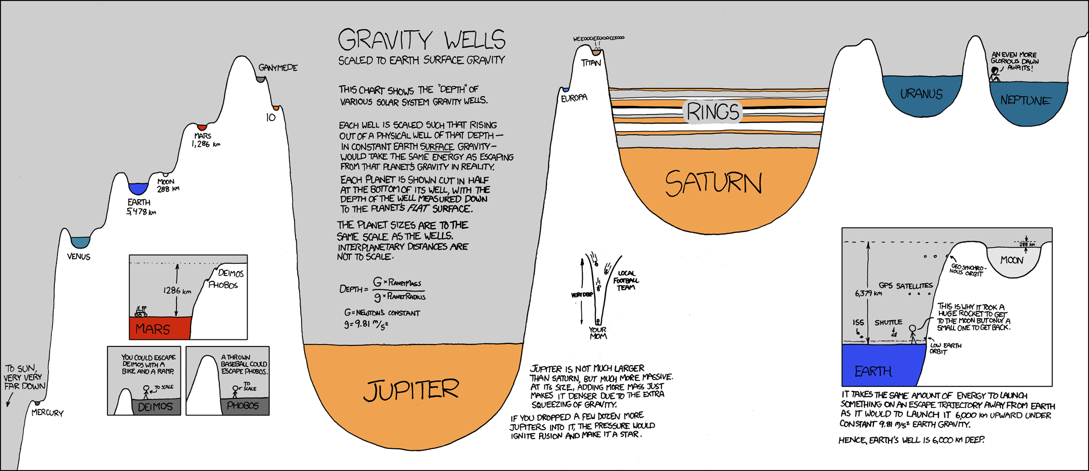
Another great new infographic comic from xkcd.com. A mix of real science and humor, this one plays on the words “gravity well” by visualizing the strength of each planets gravity as the depth of a crater scaled to Earth’s surface gravity.
The chart shows the “depth” of various solar system gravity wells.
Each well is scaled such that rising out of a physical well of that depth - in constant Earth surface gravity - would take the same energy as escaping that planet’s gravity in reality.
Click on the image to go to the xkcd.com site to see the high-resolution version.
Two videos from Bill Nye the Science Guy showing the size and scale of the planets and the Sun. He may have done similar examples, but these are the two I know about. The one above (Planets & Moon) starts at about 4:00 into the video, and the one below (Outer Space) starts at about 2:00. "Outer Space is HUGE!"
The Scale Model of the Solar System (from phrenopolis.com) shows both the relative sizes of the planets and the Sun as well as representing the distances from the Sun on the same scale. This image is huge (just over half a mile wide), and as you can imagine mostly black.
This page shows a scale model of the solar system, shrunken down to the point where the Sun, normally more than eight hundred thousand miles across, is the size you see it here. The planets are shown in corresponding scale. Unlike most models, which are compressed for viewing convenience, the planets here are also shown at their true-to-scale average distances from the Sun. That makes this page rather large - on an ordinary 72 dpi monitor it's just over half a mile wide, making it possibly one of the largest pages on the web. This means you'll have to do a bit of scrolling if you want to find the planets, but don't despair. They are reasonably bright and labeled, so you can probably catch them flashing by in the blackness even if you are scrolling fairly fast.
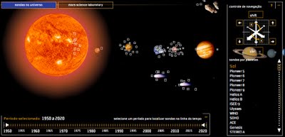
Space Probes is a very well-done interactive graphic about all of the space probes we have launched, visually placing the probes in orbit around the object they are observing. You can move around the 3-D space with the keyboard controls, change the date range with the sliders on the bottom or go directly to a particular probe from the list on the right that is group by planet or object they are around. When you mouse-over a particular probe you get more details and an image.
The article and the infographic are in Portuguese from Brazil, so I took the liberty of using the Google Translator for a little help.
The infographic "Space Probes" Super, produced by the team of Internet Editora Abril Jovem, took the silver medal in the category Online Malofiej, top prize in the world of computer graphics.
Thanks to Daniel for the link and a little more information:
It won Malofiej's silver medal (first place, no gold medal) this year.
It's an infographic about all space probes launched until the date it was published (except Earth probes, which are too many). The info has information about each probe, including the organization(s) that sent it, the target planet(s) (or moons, asteroids, comets and the sun), launch date and mission details, as well as pictures for most of them. User can navigate through our Solar System using the mouse and/or keyboard. It's also possible to know the details of Mars Science Laboratory, the next NASA probe to visit the red planet. The info is in Portuguese, but anyone can understand it's features and learn a little bit about space exploration so far.
Check out Planets, an interactive solar system visualizer. It lets you change the focal point so you can see the planetary motions as if you were standing on any of the planets. A great way to understand retrograde motion.


 Randy
Randy