About
Randy Krum
President of InfoNewt.
Data Visualization and Infographic Design

Infographic Design

Infographics Design | Presentations
Consulting | Data Visualizations

DFW DataViz Meetup

Join the DFW Data Visualization and Infographics Meetup Group if you're in the Dallas/Fort Worth area!

Search the Cool Infographics site

Custom Search

Subscriptions:


Feedburner

The Cool Infographics® Gallery:

How to add the
Cool Infographics button to your:

Cool Infographics iOS icon

- iPhone
- iPad
- iPod Touch


Read on Flipboard for iPad and iPhone

Featured in the Tech & Science category

Flipboard icon

Twitter Feed
From the Bookstore

Caffeine Poster

The Caffeine Poster infographic

Entries in Digg (13)

Tuesday
Apr122011

The Current State of Social Networks #infographic

From ignite, a social media agency, comes The Current State of Social Networks.

It goes without saying that Facebook is the network du jour, but even though the reigning champion’s user stats keep soaring, social networking as a whole might be leveling off. Nevertheless, there are still scores of other highly competitive social sites that are waxing and waning; and different networks and apps are more popular in specific geographic areas, with certain genders or age groups, and even among various social classes.

For example, Plaxo is the network with the most users over the age of 65. Facebook is more popular with women, but Digg and Reddit tend to be more popular with men. LinkedIn is the “richest” social network, but Plurk outranks it when it comes to well-educated users who have graduate degrees.

They have a ton of traffic data to work with, and this infographic does a good job of summarizing some of the key findings at the top level. 

Found on Mashable and Social Media Graphics

Wednesday
Jul232008

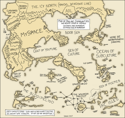
Map of Online Communities

Greetings from the Blogipeligo!

A fun infographic from xkcd.com that uses a map image to communicate the relative sizes of the different types of online communities.  I was impressed that I at least recognized most of them, and actually participate in some of them.

Friday
Jul182008

Who Owns the West?


Found on digg.com, this map was posted on strangemaps.com.  The portion of each state shows the amount of land in each state owned by the Federal Government, but not the specific location.  It's centered in each state just to show the relative size.


This map appeared as an illustration to ‘Can the West Lead Us To A Better Place?‘, an article in Stanford Magazine, a periodical for and about alumni from that university.

Monday
Apr212008

The Fall of Tech on digg.com


From readwriteweb.com, an area chart showing the decline of Tech stories made popular on digg.com. Although initially the front page of digg.com was totally dominated by Tech stories and the primary users were tech geeks, the World & Business category is now the reigning king with the most stories made popular.

To put this into context, on 1 January 2006 tech stories made up 78% of the total popular stories (i.e. stories that made it onto the digg frontpage). By end of March 2008, that percentage had dropped to 18-20%.


Here you can see the same information charted as total number of stories made popular instead of percentages.


Wednesday
Apr162008

Quake Family Tree

From Wikipedia, the Quake Family Tree shows the history of the Quake computer game engine and all of the other games that were built from each version using a mind map.

Found on digg.com

Wednesday
Apr022008

Who Owns the Organic Food Companies?


Great chart by Phil Howard from Good Magazine showing which of the large food processing companies own some of the most popular organic food brands. Pepsi owns Naked Juice?

Found on digg.com after I heard about it on the diggnation podcast.

Thursday
Mar132008

The Eisenhower Interstate System


What a fantastic way to simplify the U.S. interstate system into an easy to understand graphic. From Chris Yates on chrisyates.net. Style looks like a subway map.

Found on Digg.

Thursday
Jan102008

Digg These Pics


Really cool new feature over on Digg.com. Back in late 2007, they added an Images category so users could digg their favorite pictures. Now they've added an interactive image viewer in the Digg Labs that lets you see new images and pictures being dugg in real-time.

The only thing I don't like is that it doesn't let you add any search terms. You have to see all of the activity, and can't narrow it down it all.

Monday
Jan072008

The Software Wars

Found originally on Digg Images, this one is hosted on Steven Hilton's website (the author).


I guess you could call this a Mind Map style, but it's more like a Battlefield style infographic. I really like how it shows the products that multiple competitors are challenging Microsoft with and the associated product on the Microsoft side that is being challenged.

Wednesday
Dec122007

NodeTrix: A Hybrid Visualization of Social Networks


NodeTrix was a study of social networks by Nathalie Henry, Jean-Daniel Fekete, and Michael J. McGuffin from France and Canada. Natalie presented their results at the InfoVis conference in Sacramento, CA in November.