About
Randy Krum
President of InfoNewt.
Data Visualization and Infographic Design

Infographic Design

Infographics Design | Presentations
Consulting | Data Visualizations

DFW DataViz Meetup

Join the DFW Data Visualization and Infographics Meetup Group if you're in the Dallas/Fort Worth area!

Search the Cool Infographics site

Custom Search

Subscriptions:


Feedburner

The Cool Infographics® Gallery:

How to add the
Cool Infographics button to your:

Cool Infographics iOS icon

- iPhone
- iPad
- iPod Touch


Read on Flipboard for iPad and iPhone

Featured in the Tech & Science category

Flipboard icon

Twitter Feed
From the Bookstore

Caffeine Poster

The Caffeine Poster infographic

Entries in statistics (21)

Tuesday
Oct232018

Smartphone Etiquette 2018

Smartphone Etiquette 2018 infographic

It is 2018 and our phones have become intricate to our daily lives. The Smartphone Etiquette 2018 infographic shows the results of a survey done by socilamediatoday.com to see what American's attitudes and behaviors are towards smartphones.

Smartphones have become a key part of our everyday interactive process, offering the entire internet, and our social sphere, at our fingertips at any given moment.

But just how much are you using your mobile device, and how immersive has it become? KDM Engineering interviewed a group of 2,000 Americans to find out, asking questions on how often people check their phones, how they use their devices in the workplace and what's acceptable mobile behavior in public. 

The responses will no doubt come as little surprise, though it's certainly impactful to see some of those behavioral trends highlighted in hard data.

You can check out the full results in the infographic below - and of particular note for marketers, look at which notification types users respond to most urgently.

A lot of good statistics here, but way too many of them are just shown as big numbers in text. That doesn't put the information into context for the readers.

Found on socialmediatoday.com

Monday
Apr022018

The Most Successful US State for Sporting Wins

The Most Successful US State For Sporting Wins infographic

The Most Successful US State for Sporting Wins infographic shows which state's professional teams have the most wins within the "Big Four" sport leagues. The "Big Four" consists of Major League Baseball, the National Basketball Association, the National Hockey League, and the National Football League. To find these statistics, PlayUSA researched the winners from the sports leagues since each competition began, then divided the winning teams by their state of origin.

Go Big Four or Go Home

Studying the wins of each state within the big four leagues across the decades, the research ranks all states who have had at least one win within these leagues and ranks them from most to least successful. To accompany this, PlayUSA have tapped into the loyalty of sports fans across the USA, delving into their views regarding politics on the pitch, and which sports Americans typically support outside of the Big Leagues.

Whilst the big leagues dominate U.S. sporting news and viewership, are they the be all and end all? The survey revealed that this might not be the case.

22% of men surveyed said they also follow Major League Soccer, although only 10% of women do the same. Another contender for fandom is college level sport, as 41% prefer watching this compared to the Big Four. In the Southeast, this stat is even higher, at 52%, compared to 33% of Northeastern respondents. However, when analysing the results by league, 72% of NFL fans from the Southeast favoured the Big League over the college level equivalent.


Thanks to Jessica for sending in the link!

Tuesday
Aug092016

Comparing Presidential Election Forecasts

Comparing Presidential Election Forecasts

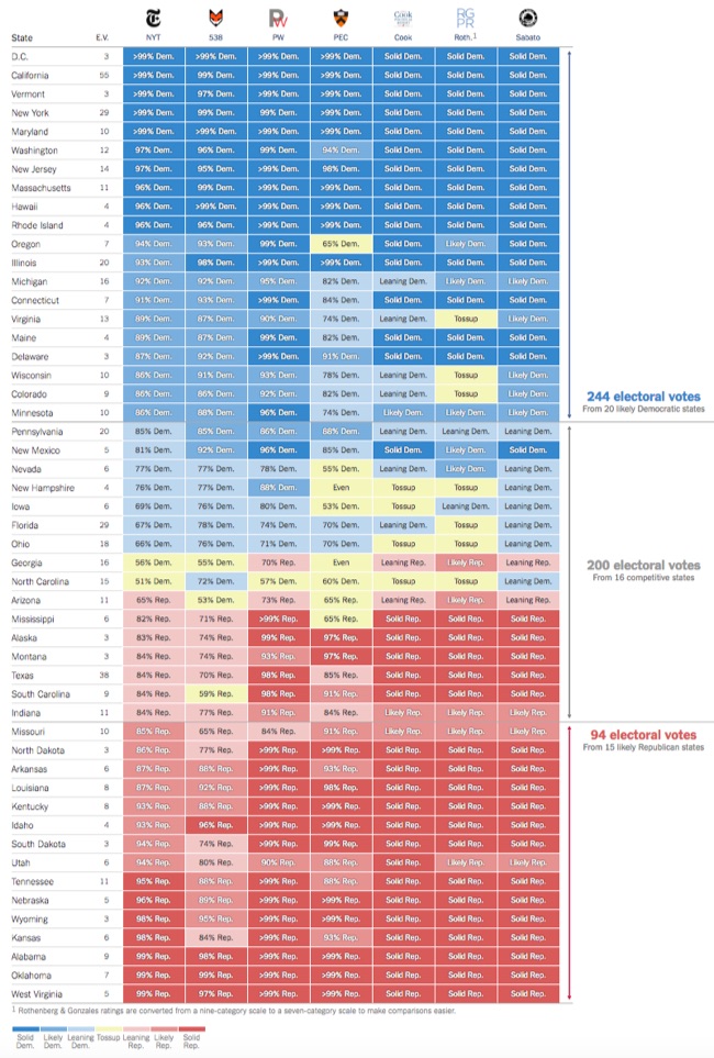
In addition to their own forecast, the NY Times maintains a great graphic Comparison of Presidential Election Forecast Models showing the current results from of seven different election forecasts based on statistical models, expert predictions and even betting markets. The results are updated daily, so check the NY Times site for the most current information!

How Other Forecasts Compare

The New York Times is one of many news organizations to publish election ratings or forecasts. Some, like FiveThirtyEight or the Princeton Election Consortium, use statistical models, as The Times does; others, like the Cook Political Report, rely on reporting and knowledgeable experts’ opinions. PredictWise uses information from betting markets.

We compile and standardize these ratings every day into one scoreboard for comparison.

Each organization’s state-by-state ratings. Viewed together, the differences between the models become much clearer.

They also publish this simple complete prediction comparison showing the total predictions from each group:

Although they have built this in HTML5 on the website, anyone could create a similar comparison graphic style using Conditional Formatting in Excel. This is a great way to highlight differences and outliers in a table of data!

Wednesday
Aug032016

Very Few Americans Nominated Trump and Clinton

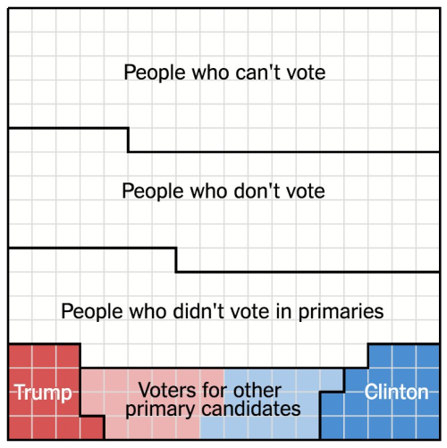
Designed by Alicia Parlapiano and Adam Pearce for the New York Times, this short series of data visualizations tell a very clear story about how Only 9% of America Chose Trump and Clinton as the Nominees For the 2016 Presidential election.

The United States is home to 324 million people. Each square here represents 1 million people.

103 million of them are children, noncitizens or ineligible felons, and they do not have the right to vote.

88 million eligible adults do not vote at all, even in general elections.

An additional 73 million did not vote in the primaries this year, but will most likely vote in the general election.

The remaining 60 million people voted in the primaries: about 30 million each for Republicans and Democrats.

But half of the primary voters chose other candidates. Just 14 percent of eligible adults — 9 percent of the whole nation — voted for either Mr. Trump or Mrs. Clinton.

Mr. Trump and Mrs. Clinton will be working to win the votes of these three groups. Polls suggest they will be separated by just a handful of squares.

If you follow the news headlines, you might think a majority of Americans are in favor of one of our two Presidential nominees, but that would be a misunderstanding of election and population statistics.

This is a fantastic example of storytelling with data, and walking the audience through the data insight step-by-step.

Found on FlowingData


Monday
Dec212015

The Data Science Industry: Who Does What?

The Data Science Industry: Who Does What? infographic

Where's the "Data Visualizer"?!? The data science occupation is a very popular new career field that many companies are hiring; however, many of these titles are mistakenly used interchangeably. The Data Science Industry: Who Does What? infographic from The Data Camp Blog introduces some of the positions in this upcoming field.

In this infographic we compare the roles of data scientists, data analysts, data architects, data engineers, statisticians and many more. We have a look at their roles within companies and the data science process, what technologies they have mastered, and what the typical skill set and mindset is for each role. Furthermore, we look at the top employers that are currently hiring these different data science roles and how the average national salaries of these roles map out against each other.

Good, thorough source reference links. Needs a copyright statement and the URL to the infographic landing page on the DataCamp site so readers can find the original full-size version.

Found on MarketingProf

Thursday
Oct222015

Murderers of Marvel


Morph Costumes has created the Murderers of Marvel infographic to show who is the deadliest comic character of Marvel.

Who is the deadliest character in the Marvel Universe? Wolverine? The Hulk? Deadpool?

We’ve had furious debates over this in the MorphCostumes office, pitting characters against one another in imaginary fights to the death.

This month, we decided to settle the argument once and for all. We combed our comic archives and ranked the deadliest Marvel characters, based on the number of people they’ve killed. From dangerous and deadly to downright lethal, here are the biggest killers in the main Marvel universe!

I'm actually surprised by the number of kills based on how easily comic book characters seem to survive or come back to life.

I like the color coding, and the consistent use of the grid of squares to visualize the data. The footer should include a copyright (or Creative Commons) license statement, and the URL to the infographic landing page so readers can find the original, full-size version.

Thanks to PJ from Big Apple Comics for sending in the link!

Tuesday
Jan272015

2012 Statistics: Pennsylvania Crashes

2012 Statistics: Pennsylvania Crashes infographic

This infographic is a very detailed look into the 2012 Statistics of Pennsylvania Crashes. Solnick & Levin, a law firm that works on cases of personal injury due to accidents, released the infographic to help potential clients understand where their case may fall in the overall state statistics.

The charts and visualizations in this infographic design are clear and very easy for the readers to understand.

However, I frequently talk about the differences between showing statistics with a data visualization versus showing them in text-alone. This is a great example, where some stats are visualized where others are not. Any of the stats shown as only text are generally considered to be secondary information by the readers because they weren’t important enough for the designer to spend the time to visualize.

My recommendation is that you should carefully choose to only include the important statistics that support the overall story in any particular infographic design.  If a data point makes the cut and is picked to be included, the designer should take the time to visualize it to make it more easily understood by the readers.

Thanks to James for sending in the link!

Friday
Nov072014

The Most Detailed Maps from the Midterm Elections

The Most Detailed Maps from the Midterm Elections North Carolina infographic

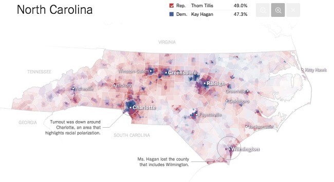
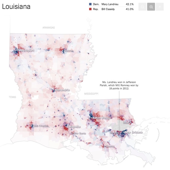
The team at the NYTimes has published these fantastic Most Detailed Maps from the Midterm Elections.

Why are we so confident these are the most detailed maps you’ll ever see from the 2014 Senate elections? Precincts are the smallest level of geography for publicly-reported election results. There were more than 175,000 precincts in the United States in 2012, fifty times the number of counties. The maps here show precinct-level results, where available, from some of the closest Senate races.

Maps exclude early votes in counties that do not report them by precinct. Some precinct boundaries are approximate.

I would call these Pop-Up Infographics, where the map is static, but additional details are shown in a pop-up frame when you hover over each voting precinct.

The Most Detailed Maps from the Midterm Elections Louisiana Infographic

Found on Flowing Data, and thanks to Mike Wirth for posting on Facebook!

Thursday
Nov062014

Top 100 DJ's of 2013


Top 100 DJS of 2013, by Data infographic

Top 100 DJ’s of 2013, by Data, created by by Topple Track, takes a different approach to coming up with a top 100 DJ list. Instead of the traditional voting method, they took a more data driven approach.

We partnered with our friends over at JustGo.com to compile a list of ’100 DJ’s’ that is driven by data. (Data that is available to anyone who obtains an API key to the applicable social platform).

Our goal with list was to create an alternative view to the existing lists. This doesn’t mean there isn’t value in a traditional voting poll or we’re questioning it’s validity, this is our attempt at taking data, consumption weighted, algorithmic approach.

The biggest names in EDM command big money, for promoters it’s a numbers game. For many, social data is a huge barometer for who to book and who not to book.

Our methodology is made up of the following weighting (as mentioned in the infographic):

  • 60% Total Fans
  • 30% 2013 Fan Growth
  • 10% Buzz & Piracy

The data started on January 1, 2013 and ran through nearly all of 2013. It’s clear we have room from improvements, such as spotting the ‘next big thing’ through trends (a la Martin Garrix’s absence from the current poll) and tweaking weighting of certain platforms as usage permits.

*Editors Note – We did exclude 3 DJ’s that we deemed at least 75% or more of their social following was purchased.

Clean, colorful design that does a good job of changing the visualization method each time you move down from one section to the next. Pie-Doughnut to Doughnut to Line to bar chart to list.

Thanks to Brandon for sending in the link!

Monday
Oct272014

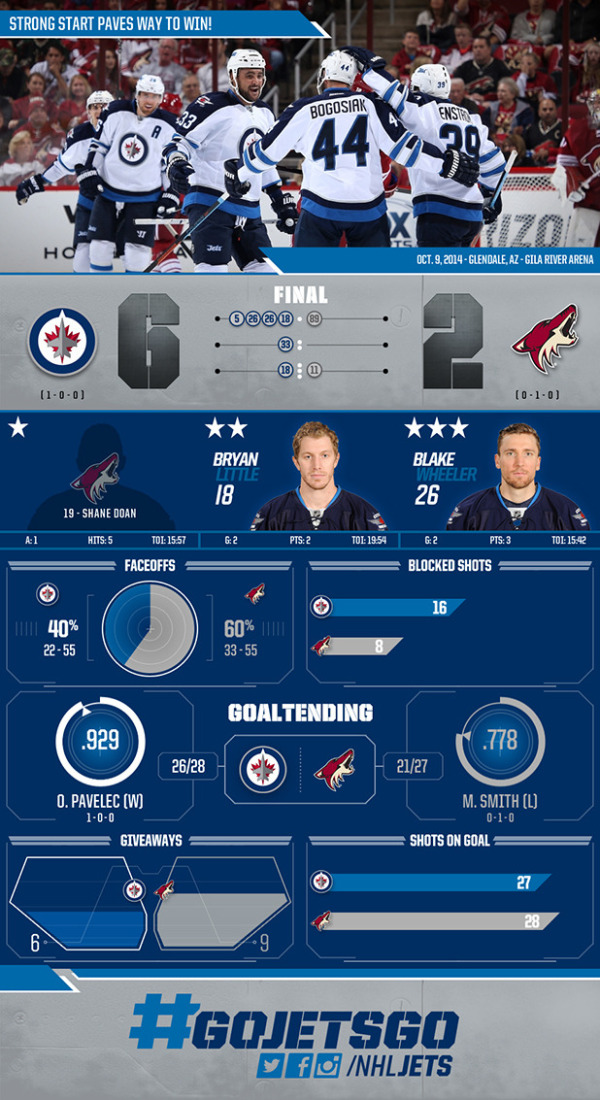
Winnipeg Jets Beat Arizona Coyotes Infographic

Winnipeg Jets Beat Arizona Coyotes Infographic

Jets Down Arizona 6-2 infographic from the Winnipeg Jets (Jets.NHL) gives an infographic summary of the October 9, 2014 NHL game between the Jets and the Coyotes. Sports statistics are ripe for data visualization and infographics, but are so rarely used.

The design does a great job of using a few simple visualizations to communicate data about the game. They don’t just show the score, but visualize when the goals were made by using the numbers of the scoring players shown in each period. Other visualizations cover statistics like Face-off results and Goal Tending percentages.

I don’t understand the visualization for the Giveaways. I get that the filled area is supposed to represent the number, but the’re shown in a shape I don’t recognize. Is that a car door? There’s no way the designer accurately calculated the area shown of that odd shape to get the visualization right.

Thanks to Reid Parker for posting the link!