About
Randy Krum
President of InfoNewt.
Data Visualization and Infographic Design

Infographic Design

Infographics Design | Presentations
Consulting | Data Visualizations

DFW DataViz Meetup

Join the DFW Data Visualization and Infographics Meetup Group if you're in the Dallas/Fort Worth area!

Search the Cool Infographics site

Custom Search

Subscriptions:


Feedburner

The Cool Infographics® Gallery:

How to add the
Cool Infographics button to your:

Cool Infographics iOS icon

- iPhone
- iPad
- iPod Touch


Read on Flipboard for iPad and iPhone

Featured in the Tech & Science category

Flipboard icon

Twitter Feed
From the Bookstore

Caffeine Poster

The Caffeine Poster infographic

Entries in iPad (13)

Thursday
Oct152015

iOS Version Release Date History

iOS Version Release Date History

iOS Version Release Date History is a data visualization that shows how long each version of iOS has gone through beta versions. I really like this visualization by Will Hains and posted on his site Thinky Bits.

The design is still a work-in-progress, and it still requires me to go in and edit it every time a new beta is released, but it’s much less work than it used to be. And now, with the magic of Google’s Charts API, it’s interactive as well. The chart is 100% generated by Javascript in the browser, producing slick SVG images on-the-fly.

The stacked bar style clearly shows how long each version spend in the development process, and specifically shows how fast iOS 9.1 is being pushed through the system.

You can also see how long each version was the official current version in the wild, and the general trend to update iOS more frequently in Will's 2nd chart.

iOS Final Version Release Date History

Thursday
Aug132015

Android Fragmentation Visualized

Android Fragmentation Visualized

This one data visualization can demonstrate why mobile responsive web design is important: Android Fragmentation Visualized. OpenSource published a number of data visualizations, both static and interactive, that show the tremendous market fragmentation in the market of Android phones and devices. This treemap shows market share by device.

Fragmentation is both a strength and weakness of the Android ecosystem, a headache for developers that also provides the basis for Android’s global reach. Android devices come in all shapes and sizes, with vastly different performance levels and screen sizes. Furthermore, there are many different versions of Android that are concurrently active at any one time, adding another level of fragmentation. What this means is that developing apps that work across the whole range of Android devices can be extremely challenging and time-consuming.

Despite the problems, fragmentation also has a great number of benefits – for both developers and users. The availability of cheap Android phones (rarely running the most recent version) means that they have a much greater global reach than iOS, so app developers have a wider audience to build for. Android is successfully filling the gap left behind by the decline of Nokia’s Symbian – and in this report we look at the different shape of fragmentation in countries from different economic positions, as a way of showing that fragmentation benefits Android much more than it hurts it. Android is now the dominant mobile operating system and this is because of fragmentation, not in spite of it.

Here you can see the same treemap reorganized into brand clusters, still sized by market share:

Android Fragmentation Visualized

The hundreds of different Android screen sizes can be seen in this visualization:

In contrast, Apple currently only has FIVE devices and screen sizes for phone and tablets, but uses the same screen resolution on a couple of them:

Found on Business Insider

Wednesday
Sep172014

The Evolution of iOS from iOS 1 - iOS 8

The Evolution of iOS from iOS 1 - iOS 8 infographic

On iOS 8 launch day, The Evolution of iOS from iOS 1- iOS 8 infographic is a timeline of the iOS systems from 7 Day Shop. The infographic shows the evolution of the home screen, app icons, and the most noteworthy features.

This week saw the launch of the highly anticipated iPhone 6, iPhone 6 Plus and iWatch. Apple also announced that iOS 8, the operating system that will run both of the new iPhones will be made available for download on September 9th, 2014.

In light of the evolutionary change of the iOS, we decided to dig a little deeper to the first ‘iPhone OS’ right through to it’s latest iteration iOS 8. It’s development both in the hardware and software front over just only 6 years is beyond remarkable.

We have charted the evolution of the home screen, app icons and the most noteworthy features of each iOS.

It’s a tall design with a lot of information, but the visuals help out tremendously.  There’s way too much text in this design, and they chose to make the font size too small to fit it all in.  For the new features added with each major upgrade I would remove the text descriptions, and just keep the titles.  Keep the design simple.

This is a good example of an informative infographic capitalizing on a hot trending topic. There’s no hard sales pitch or even a call-to-action. This makes people more willing to share the infographic, and 7DayShop.com just put their logo in the footer to claim credit and build their overall awareness and credibility. They should have included the URL link to the original infographic on their site to help readers find it. Especially on a design this big, because most blog and social shares will post a smaller thumbnail version.

Are the new features compelling you to upgrade to iOS 8? Did you order the new iPhone 6? Let me know in the comments!

Thanks to Kunie for sending in the link!

Friday
Nov082013

Apple Release Patterns

Apple Total Release Patterns infographic

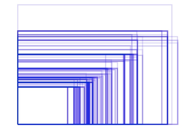
Apple Release Patterns is a new personal project of mine, and you can find the full-size original versions on a new, dedicated landing page on the InfoNewt.com site.  Every few months Apple releases a new product update or redesign, and the rumors start flying about what the upcoming product will be during the preceding weeks.  For better or worse, those speculations are often based on what was released in the same timeframe the prior year.

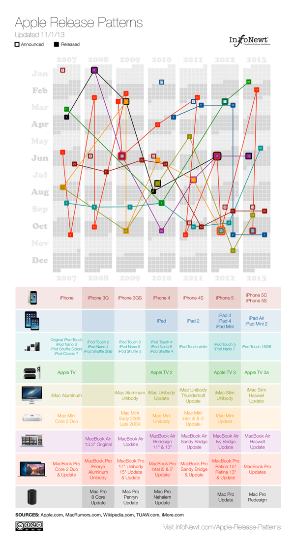
This data visualization lines up vertical columns for each year, starting with 2007.  I decided that anything further back wasn’t really relevant to Apple’s current practices.  Each product release is then mapped onto the calendar, showing a pattern (or lack of pattern) to the product releases.  If the product announcement was separate from the actual release date, I mapped that date as well.

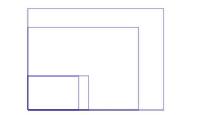
This data was ripe for a visualization.  When I tried to look at the historical dates of product releases, the information was scattered across multiple sites, confusing and difficult to gather.  Some information was contradictory, which required further investigation.  So, the data topic itself was a good target for a clear, easy-to-understand visualization.  However, the design with all of the products was too complicated visually to perceive any defining patterns.  So, I created separate versions that break out the products into 3 categories, and those are much easier for readers to see the patterns.

Apple iOS Release Patterns infographic

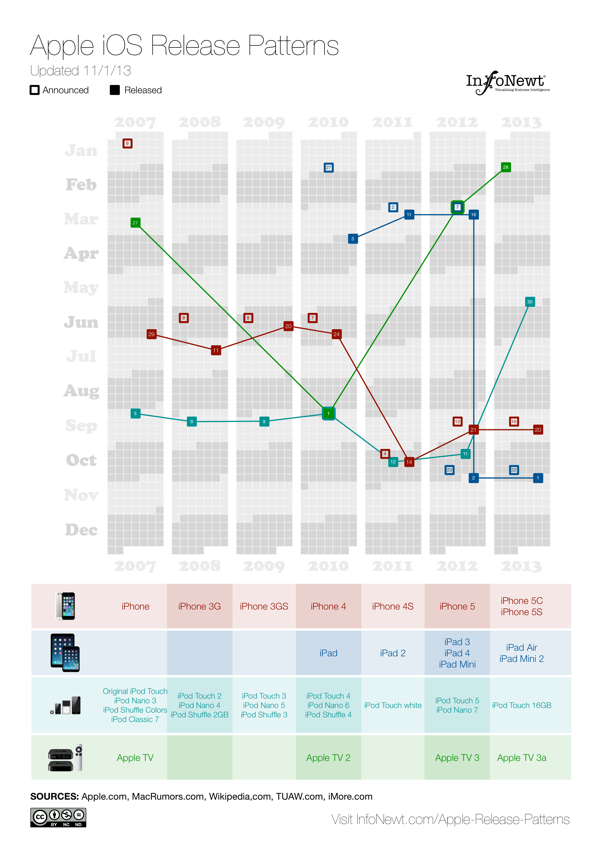
For iOS devices (iPod, iPad, iPhone and AppleTV) you can see the pattern shift in 2011 for most of the products to a Fall timeframe.  You can also see a recently consistent announcement date with the product release the following Friday.

Apple MacBook Release Patterns infographic

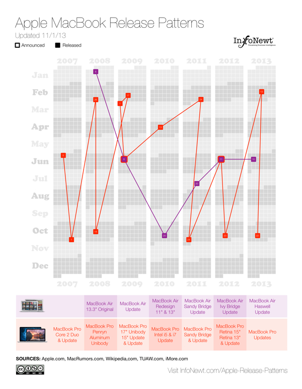
For Apple’s laptop line, the MacBooks, you can see the MacBook Air has become a regular release during the Worldwide Developers Conference (WWDC) in June, and the MacBook Pro gets fairly regular updates twice a year, usually just to update the internal specifications.

Apple Desktop Mac Release Patterns infographic

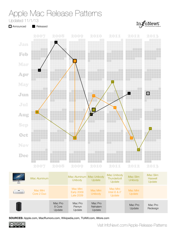
The desktop Mac line doesn’t seem to show much pattern at all.  They might get an update each year, but the timing is erratic.  Sometimes they are part of WWDC, sometimes part of the Fall iOS events, and sometimes completely on their own.

I’m going to keep updating these on the landing page as Apple releases new products in the future (upcoming iPad Mini 2 Retina and Mac Pro still need to start shipping this year).  I want these to become a valuable resource every time the Apple rumor mill heats up about the next product announcement.  If you use the embed code on the Apple Release Patterns landing page, your site will also display the updates automatically as they become available.

This is version 1.0.  I have some ideas and improvements I want to make in future versions, but I would love to hear your thoughts as well.  Post any suggestions or feedback in the comments below.

Monday
Jul292013

A #Sworcery Infographic


A Sword and Sworcery Infographic

Two years ago Superbrothers: Sword and Sworcery EP was one of the first great games released that was designed specifically for the Apple iPad. Designed by Capybara Games, the game was also later released on iPhone, Android, Windows PC, Linux and Mac based on the huge success of the iPad version.

To celebrate the 2nd anniversary, Capybara Games released the Sword and Sworcery Infographic, and that’s cooler than a Trigon Trifecta!  (Also available on the SwordAndSworcery.com site)

From the Capybara Games site:


On March 24th, 2011 Superbrothers: Sword & Sworcery EP launched on iPad. The first hours after its release were exciting, stressful, celebratory and even terrifying (as game-centric twitter feeds exploded). We watched as the game hit the top 10 paid games chart before we were even featured. Leading up to launch we knew we had made something cool. After launch we knew there was an audience that appreciated it.

Over the next 2+ years, we brought the game to PC, Mac & Linux. We collaborated with the amazing folks from 8-4 to create a version specifically for Japan. With the help of Apportable, we brought the game to Android. We joined our close friends in the most successful Humble Indie Bundle of all time, and joined a great Android Bundle as well.

With over 1.5 million copies sold, it’s pretty obvious that #Sworcery has been a resounding success. And we’d like to share a few details of that success with you. There’s not that many titles out there that began on iOS and made their way to this many other platforms over time, so we hope that this info is helpful in some way/shape/form.


From such a visual game design, I would have liked to see the chart labels as icons of the companies instead of just text labels. Even better as 8-bit icons similar to the design of the game.


As I mention about many infographic designs, the URL to the original infographic landing page should be included in the footer of the design so readers can find the full-size version of the infographic. I had to shrink the infographic image to fit on the blog, like many people, and I always try to link back to the original source. Not everyone is good about linking, and you want the readers to be able to find their way back.

As a bonus mini-infographic, they also released some of the stats behind the music by rockstar & critically acclaimed composer Jim Guthrie soundtrack, Sword & Sworcery LP - The Ballad of the Space Babies, also available on the iTunes store.

Jim Guthrie Stats infographic

Found on The Verge and Daring Fireball.

Monday
Jul012013

How Apple Are You?

How Apple Are You? infographic

Do you think you’re Apple’s number one fan? Take the test on the How Apple Are You? infographic from mackeeper.com to see how you match up! Fancy a new tattoo soon? How about an Apple?

You think you know everything about Apple? Would you call yourself an Apple Fan? How about checking the level of Apple in your blood, would you be up for that? Check out our awesome info-graphics and find out how Apple you are! Make sure you share this with your buddies!

I’ll admit I scored a 155, so I’m a fairly hardcore Apple fan.

Where’s the URL to the original infographic landing page?!?

Thanks to Shelli for sending in the link!

Tuesday
Sep182012

How Does A Touchscreen Phone Work?

How Does A Touchscreen Phone Work? infographic

This is the reason why your iPhone won’t work with gloves but your Samsung U600 will! The How Does A Touchscreen Phone Work? infographic from mycricket.com compares phones with the three different types of touch screens. 

Ever wonder why some touch screen phones cost more than others? Or why you can’t seem to get the touch screen on your smartphone to work if you’re wearing a glove? Most people don’t know that there are three different types of touch screen technologies available: resistive, capacitive, and infrared. Learn about the different benefits and capabilities to make sure you get the touch screen phone you’re looking for.

This is a really good comparison infographic design.  Each feature is clearly illustrated for the reader, the text descriptions are minimal and it’s very easy to read top-to-bottom.

I had trouble finding the original because the URL link to the original landing page was not included at the bottom of the design (always include the URL!), and there should be some type of copyright or Creative Common license.  Not really a problem, but I’m surprised the design doesn’t include any mention of the Cricket Wireless brand or logo.

Thanks to Sam for sending in the link!

Monday
Apr302012

Just How BIG Is Apple?

Watch out New York! There’s a new Big Apple in town! The Just How BIG Is Apple? infographic from bestcomputersciencedegrees.com illustrates how important Apple really is to us.  Pardon me while I check a text on my iphone and post this with my Mac…

It is the first company to successfully pivot from computer maker to device maker. And its devices are now ubiquitous, its annual new product releases are among the most anticipated in the world and it recently announced it would begin issuing a dividend to its stock owners expected to generate $10 billion in the first year alone. There is also speculation that Apple will enter into the payments market in the near future (allowing its handheld products to serve in the same fashion as a credit card). This alone would turn them into a trillion dollar company.

Love this clean, easy-to-read design.  I understand the sized red bars surrounding the world map, but the GDP values are so close to each other that this visualization makes it very hard to compare between countries.  A rose diagram behind the world map might have worked much better.

I love the use of the company logos to make the bar chart more visual.  The work “billion” could have been removed from each of the values, and made into the chart scale.  There’s one bar between Google and P&G that is missing it’s company logo.  The bar chart makes this very easy for the reader to compare values between the companies, and it should identify the date these market capitalizations were gathered since these values change every day.  It also needs a copyright statement, and the URL of the origianl infographic post so readers can get back to the original high-resolution infographic. 

Found on Infographic Journal

Friday
Mar162012

Client Infographic: Streamlining your Digital Life with the new iPad

With the Apple event last week announcing the release of the new iPad, the Streamlining your Digital Life with the new iPad infographic from NextWorth takes a look at the history of the electronic devices that the iPad has replaced in our lives.  A true multifunctional device, the iPad has replaced many of our separate gadgets.

The digital world is converging on a revolutionary all-in-one device, the powerful, brand-new iPad. These are the iconic portable devices that led to (and are to some extent being replaced by) Apple’s innovation.

The lines are color coded to connect the types of devices in the timeline, and show any devices that had multiple functions of their own (like the Eee PC 701).  Using a treemap in the iPad image, it also shows the amount of time spent using the different functions on the iPad from average consumers.  The use of illustrations instead of photographs of all these devices keeps the design simple and focused on communicating the data.

Finally, using their own internal data, an assortment of prices are shown of the current maximum values that consumers can get by trading in their now-obsolete gadgets.  With a handful of the right gadgets, you could easily get enough money back to pay for a brand new iPad!

All of the essential information is included in the design: data sources, brand logo, URL of the original high-resolution infographic landing page, company logo, copyright statement and even a mention of the designer (nice job Jeremy!).

This was an infographic design from my own company, InfoNewt, and of course, the team at NextWorth was fantastic to work with!

Monday
Feb272012

iPad3: USA in anticipation of the new iPad

Anticipation is building strong momentum expecting the release of the next iPad from Apple in the near future.  Ask You Target Market (AYTM.com) is an online survey service, and they gathered data from a couple of their own surveys to compile the iPad3: USA in anticipation of the new iPad infographic.

The rumor is that the iPad 3 announcement will come in the first week of March, but doesn’t specify when it will be released. For reference, the iPad 2 was announced on March 2nd of last year, and available on the 11th.

There are some significant changes expected and to gain a better understanding on the current state of the American consumers’ current iPad usage and anticipation of the iPad 3, AYTM conducted DIY market research utilizing our online consumer panel and survey tool. The highlights of our discoveries are encapsulated in this infographic:

This Infographic is based on a survey of 2000 Americans who don’t own an iPad (request full stats report by e-mailing us: support [at) aytm.com) and another survey of 500 iPad owners (open full stats report) that we’ve collected for you on aytm.com in February 2012.

A few thoughts about the design:

  • I like the idea to that each fingerprint on the iPad to represents 100,000 people, but because it’s a data visualization, the different sizes of the fingerprints makes you think that the size has meaning when it really doesn’t.  It was so subtle, I initially missed the number 3 reversed in the fingerprints.
  • In the “What could Apple do” section, the illustrations do help give meaning to each of the statistics, but because the numbers are all in the text, their impact is lost.  These values should have been visualized.
  • The model distribution is clear, and easy to understand.  For the Models breakdown, I really like the use of the pie chart to represent two levels of data.  Primary is the size, and the secondary level is the WiFi vs. 3G split.
  • I really like the 3G satisfaction breakdown.  Very easy to understand.
  • Great use of the logos and colors in the Carrier split data.  Orange isn’t in the AT&T logo, but is a very dominant color on their website, and Verizon got a red bar to match their logo and primary website color.
  • The Family trees are hard to understand and the 1.7x visualization isn’t clear.
  • I’m not sure why they picked area charts for the apps visualizations.  That’s really the wrong type of visualization for the data since these are all supposed to add up to 100% of users.
  • The male vs. female bar charts work well, and are easy to understand.  I appreciate that they were consistent with the female number always first, and of course the color-coding work perfectly.
  • “Where iPads are used” is really just an illustration, and doesn’t visualize the percentages at all.  I simple stacked bar under the illustrations (like the carriers above) would have worked nicely.
  • Surpirisingly, I really like the use of word clouds here.  You don’t need the specific numbers, and the word cloud visualization makes the point well because the top responses are so overwhelming.
  • I love that they gave credit to the designer, Lev Mazin!  It doesn’t hurt that he’s the CEO and Co-founder of AYTM.com, but happens to also be a graphic designer.

Only one thing missing at the bottom: the URL to find the original infographic.

Found on Mashable