iPad3: USA in anticipation of the new iPad
Anticipation is building strong momentum expecting the release of the next iPad from Apple in the near future. Ask You Target Market (AYTM.com) is an online survey service, and they gathered data from a couple of their own surveys to compile the iPad3: USA in anticipation of the new iPad infographic.
The rumor is that the iPad 3 announcement will come in the first week of March, but doesn’t specify when it will be released. For reference, the iPad 2 was announced on March 2nd of last year, and available on the 11th.
There are some significant changes expected and to gain a better understanding on the current state of the American consumers’ current iPad usage and anticipation of the iPad 3, AYTM conducted DIY market research utilizing our online consumer panel and survey tool. The highlights of our discoveries are encapsulated in this infographic:
This Infographic is based on a survey of 2000 Americans who don’t own an iPad (request full stats report by e-mailing us: support [at) aytm.com) and another survey of 500 iPad owners (open full stats report) that we’ve collected for you on aytm.com in February 2012.
A few thoughts about the design:
- I like the idea to that each fingerprint on the iPad to represents 100,000 people, but because it’s a data visualization, the different sizes of the fingerprints makes you think that the size has meaning when it really doesn’t. It was so subtle, I initially missed the number 3 reversed in the fingerprints.
- In the “What could Apple do” section, the illustrations do help give meaning to each of the statistics, but because the numbers are all in the text, their impact is lost. These values should have been visualized.
- The model distribution is clear, and easy to understand. For the Models breakdown, I really like the use of the pie chart to represent two levels of data. Primary is the size, and the secondary level is the WiFi vs. 3G split.
- I really like the 3G satisfaction breakdown. Very easy to understand.
- Great use of the logos and colors in the Carrier split data. Orange isn’t in the AT&T logo, but is a very dominant color on their website, and Verizon got a red bar to match their logo and primary website color.
- The Family trees are hard to understand and the 1.7x visualization isn’t clear.
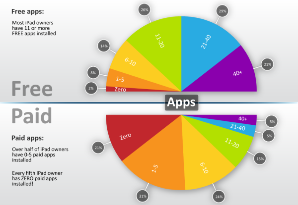
- I’m not sure why they picked area charts for the apps visualizations. That’s really the wrong type of visualization for the data since these are all supposed to add up to 100% of users.
- The male vs. female bar charts work well, and are easy to understand. I appreciate that they were consistent with the female number always first, and of course the color-coding work perfectly.
- “Where iPads are used” is really just an illustration, and doesn’t visualize the percentages at all. I simple stacked bar under the illustrations (like the carriers above) would have worked nicely.
- Surpirisingly, I really like the use of word clouds here. You don’t need the specific numbers, and the word cloud visualization makes the point well because the top responses are so overwhelming.
- I love that they gave credit to the designer, Lev Mazin! It doesn’t hurt that he’s the CEO and Co-founder of AYTM.com, but happens to also be a graphic designer.
Only one thing missing at the bottom: the URL to find the original infographic.
Found on Mashable
 Randy
Randy
After some discussion with the designer, Lev, in the comments section, he redesigned the area charts into two half-circle pie charts, shown here:
I think this works much better to accurately show the data as portions of a whole 100%, and still effectively show the inverse comparison between high numbers of Free Apps, and low number of Paid Apps.
What do you think of the design changes?


Reader Comments (5)
I tried your suggestion in the Apps section. What do you think?
http://aytm.com/press/IG/iPad3_IG_modification.png
Cheers,
Lev
Here's my reaction, but I'm curious to hear other opinions from readers as well.
For purposes of being true to the data, I like the new 180 degree half-pie charts, but now that I see it, I think it isn't as effective at showing the opposite nature of the data between the Free and Paid Apps. A wider gap between the two charts to clearly differentiate them and brighter colors might make the differences stand out.
Other thoughts?
Great suggestion. Please check out the latest modification:
http://aytm.com/press/IG/iPad3_IG_modification1.png
Cheers,
Lev
Kavita, it looks fantastic on my iPad2, what kind of issue are you having?