About
Randy Krum
President of InfoNewt.
Data Visualization and Infographic Design

Infographic Design

Infographics Design | Presentations
Consulting | Data Visualizations

DFW DataViz Meetup

Join the DFW Data Visualization and Infographics Meetup Group if you're in the Dallas/Fort Worth area!

Search the Cool Infographics site

Custom Search

Subscriptions:


Feedburner

The Cool Infographics® Gallery:

How to add the
Cool Infographics button to your:

Cool Infographics iOS icon

- iPhone
- iPad
- iPod Touch


Read on Flipboard for iPad and iPhone

Featured in the Tech & Science category

Flipboard icon

Twitter Feed
From the Bookstore

Caffeine Poster

The Caffeine Poster infographic

Entries in survey (12)

Thursday
Dec062018

What's Your Opinion? The Cool Infographics Website Survey

The Cool Infographics website is headed for a complete redesign and relaunch at the beginning of 2019, and I would really like to hear from you! Would you please answer 10 short questions on the Cool Infographics Website Survey? It should only take a couple minutes.

Survey must be completed by Wednesday, December 12, 2018.

Tuesday
Oct232018

Smartphone Etiquette 2018

Smartphone Etiquette 2018 infographic

It is 2018 and our phones have become intricate to our daily lives. The Smartphone Etiquette 2018 infographic shows the results of a survey done by socilamediatoday.com to see what American's attitudes and behaviors are towards smartphones.

Smartphones have become a key part of our everyday interactive process, offering the entire internet, and our social sphere, at our fingertips at any given moment.

But just how much are you using your mobile device, and how immersive has it become? KDM Engineering interviewed a group of 2,000 Americans to find out, asking questions on how often people check their phones, how they use their devices in the workplace and what's acceptable mobile behavior in public. 

The responses will no doubt come as little surprise, though it's certainly impactful to see some of those behavioral trends highlighted in hard data.

You can check out the full results in the infographic below - and of particular note for marketers, look at which notification types users respond to most urgently.

A lot of good statistics here, but way too many of them are just shown as big numbers in text. That doesn't put the information into context for the readers.

Found on socialmediatoday.com

Thursday
Jul072016

Which Foods Are Really Healthy?

Is Sushi ‘Healthy’? What About Granola? Where Americans and Nutritionists Disagree

After surveying nutritionists and Americans, the NY Times has plotted the results, showing some surprising disagreements. Is Sushi ‘Healthy’? What About Granola? Where Americans and Nutritionists Disagree charts the differences in opinion, but where do you stand?

We surveyed Americans and a panel of nutrition experts about which foods they thought were good or bad for you.

Is popcorn good for you? What about pizza, orange juice or sushi? Or frozen yogurt, pork chops or quinoa?

Which foods are healthy? In principle, it’s a simple enough question, and a person who wishes to eat more healthily should reasonably expect to know which foods to choose at the supermarket and which to avoid.

Unfortunately, the answer is anything but simple.

The results suggest a surprising diversity of opinion, even among experts. Yes, some foods, like kale, apples and oatmeal, are considered “healthy” by nearly everyone. And some, like soda, french fries and chocolate chip cookies, are not. But in between, some foods appear to benefit from a positive public perception, while others befuddle the public and experts alike. (We’re looking at you, butter.)

They also created some supporting graphs that highlight the major differences. This one shows the largest differences where many more nutrition experts consider these foods to be healthy than the general public.

Foods considered healthier by experts than by the publicThanks to Karen for sharing on Facebook!

Tuesday
Aug182015

The State of the Social Marketing Team

The State of the Social Marketing Team infographic

The State of the Social Marketing Team is an infographic from a survey that SimplyMeasured put together and shared in the full 2015 State of Social Marketing report. This is the right way to use an infographic as the visual summary of deeper content hidden behind a registration wall.

Many companies are still trying to figure out how to tackle social media. They’re constantly asking themselves questions like, “Where should social media live in our organization?,” “How big should my team be?,” or “How should our social media team be built?”

To help address this common issue, we surveyed over 350 social media marketers about their team structures and compiled our findings into this infographic! More information from the survey (as well as a separate look at the pain points these marketers face), download a complimentary copy of our 2015 State of Social Marketing Report.

This is a really good infographic. Packed with good information and keeps the design simple and to the point. My only issue with the design is that some of the text is small and in light colors that are hard to read against the white background.

I noticed that SimplyMeasured posted the original infographic on SlideShare and then posted it in their blog by using the SlideShare infographic wrapper for sharing. SlideShare introduced the Infographics Player in 2013, but I haven't seen many people using it. The potential advantage is that most of the view metrics from mutliple sites are combined together in SlideShare. The potential disadvantge is that people go to SlideShare to view your infographic and never make it to your website. 

Found on MarketingProfs

Friday
Jan172014

Where in the World are the Best Schools and the Happiest Kids?

The Best Schools and the Happiest Kids infographic

The best test scores don’t always mean the happiest kids at school.  The Best Schools and the Happiest Kids visualizes the results from a worldwide survey of over 500,000 15-year-olds globally.

The Organisation for Economic Co-operation and Development’s triennial international survey compared test scores from 65 countries. Happiness was ranked based on the percentage of students who agreed or disagreed with the statement “I feel happy at school.” Test scores were ranked based on the combined individual rankings of the students’ math, reading, and science scores.

I can’t tell for sure, but it appears that Jake Levy, Data Analyst at BuzzFeed created this data visualization based on the data from OECD survey results.  Infographics like these often get shared without the rest of the article, so it’s important to include all of the necessary framing information in the graphics itself.  Title, descriptive text, sources, URL, publishing company, copyright, etc.

Thanks to Ron Krate on Google+ for posting

Thursday
Aug292013

Consumer Attitudes to SMS Marketing and Texts Alerts

Consumer Attitudes to SMS Marketing and Texts Alerts infographic

The Consumer Attitudes to SMS Marketing and Texts Alerts infographic is the results of a survey done by Text Marketer. The survey was conducted to find out the consumers’ view on receiving text alerts from companies. 

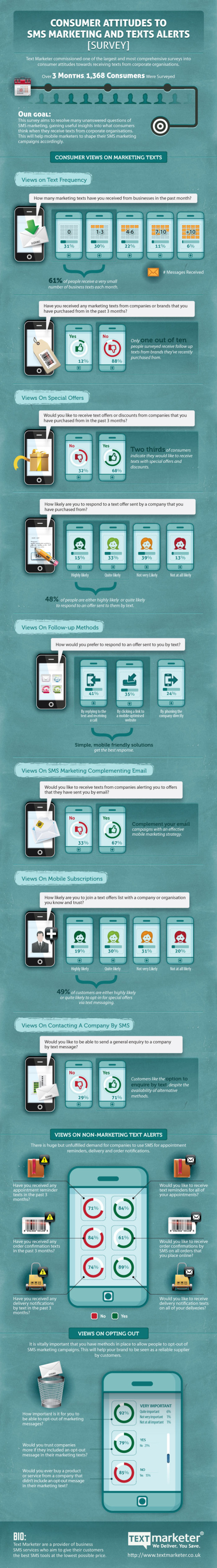
The infographic is based on an exclusive survey of over 1,350 consumers in to their attitudes to SMS marketing. 

The results highlight that 84% of customers want to receive appointment reminders, 61% want order confirmations and 89% would like delivery notifications via text; showing there are a lot of ways to market through this channel that customers love. 

48% of consumers are also likely to respond to a text from a company they have previously purchased from. Consumers love special offers by text and like to be able to ask questions to companies via text messages.

Since the data is from their own survey research, there are no additional data sources cited.  The purpose of the first section is to establish the credibility of the data, but the total number of respondents alone isn’t enough.  Surveys like this target specific consumers, and use screener questions to target a specific portion of the population.  What type of consumers were surveyed for this report?

The visualizations of the data are clear, and the iPhone illustrations for the results of each question break apart the data nicely.  It’s a little hard for readers to understand that the lineup of iPhones is meant to add up to the total of 100% of respondents for each question.

The footer should include a copyright notice, and the URL back to the original infographic landing page so readers can find the full-size version if a link is not available.  A link to the source data would increase the credibility of the data too.  Instead, the landing page has a link to the home page of Text Marketer as the data source link, which means public access to the numeric data is not available.

Thanks to Mike for sending in the link!

Tuesday
Aug062013

It's Time to Empower Moms

It's Time to Empower Moms infographic

The verdict is out; Support mother’s decisions on how they raise their children. Based on the StrongMoms Empower, The National Motherhood Decisions Survey from Strong Moms Empower, many mothers make decisions on how to raise their kids to avoid criticism!

In conjunction with the StrongMoms Empower program, the National Motherhood Decisions Survey was conducted to gauge how moms feel supported or judged. This infographic illustrates the survey findings, which include: 95 percent of moms have felt judged or criticized; one in three moms makes parenting decisions to avoid criticism; nine out of ten moms notice a positive impact on kids when they feel supported. For more information please visit StrongMomsEmpower.com

Good design.  The key message is very clear.  You don’t have to read the whole infographic to understand that the infographic wants you to support moms in a positive way.  Also, a very clear call-to-action at the end with the link to signing an online petition.

Found on http://visual.ly

Monday
Jul012013

How Apple Are You?

How Apple Are You? infographic

Do you think you’re Apple’s number one fan? Take the test on the How Apple Are You? infographic from mackeeper.com to see how you match up! Fancy a new tattoo soon? How about an Apple?

You think you know everything about Apple? Would you call yourself an Apple Fan? How about checking the level of Apple in your blood, would you be up for that? Check out our awesome info-graphics and find out how Apple you are! Make sure you share this with your buddies!

I’ll admit I scored a 155, so I’m a fairly hardcore Apple fan.

Where’s the URL to the original infographic landing page?!?

Thanks to Shelli for sending in the link!

Monday
Feb272012

iPad3: USA in anticipation of the new iPad

Anticipation is building strong momentum expecting the release of the next iPad from Apple in the near future.  Ask You Target Market (AYTM.com) is an online survey service, and they gathered data from a couple of their own surveys to compile the iPad3: USA in anticipation of the new iPad infographic.

The rumor is that the iPad 3 announcement will come in the first week of March, but doesn’t specify when it will be released. For reference, the iPad 2 was announced on March 2nd of last year, and available on the 11th.

There are some significant changes expected and to gain a better understanding on the current state of the American consumers’ current iPad usage and anticipation of the iPad 3, AYTM conducted DIY market research utilizing our online consumer panel and survey tool. The highlights of our discoveries are encapsulated in this infographic:

This Infographic is based on a survey of 2000 Americans who don’t own an iPad (request full stats report by e-mailing us: support [at) aytm.com) and another survey of 500 iPad owners (open full stats report) that we’ve collected for you on aytm.com in February 2012.

A few thoughts about the design:

  • I like the idea to that each fingerprint on the iPad to represents 100,000 people, but because it’s a data visualization, the different sizes of the fingerprints makes you think that the size has meaning when it really doesn’t.  It was so subtle, I initially missed the number 3 reversed in the fingerprints.
  • In the “What could Apple do” section, the illustrations do help give meaning to each of the statistics, but because the numbers are all in the text, their impact is lost.  These values should have been visualized.
  • The model distribution is clear, and easy to understand.  For the Models breakdown, I really like the use of the pie chart to represent two levels of data.  Primary is the size, and the secondary level is the WiFi vs. 3G split.
  • I really like the 3G satisfaction breakdown.  Very easy to understand.
  • Great use of the logos and colors in the Carrier split data.  Orange isn’t in the AT&T logo, but is a very dominant color on their website, and Verizon got a red bar to match their logo and primary website color.
  • The Family trees are hard to understand and the 1.7x visualization isn’t clear.
  • I’m not sure why they picked area charts for the apps visualizations.  That’s really the wrong type of visualization for the data since these are all supposed to add up to 100% of users.
  • The male vs. female bar charts work well, and are easy to understand.  I appreciate that they were consistent with the female number always first, and of course the color-coding work perfectly.
  • “Where iPads are used” is really just an illustration, and doesn’t visualize the percentages at all.  I simple stacked bar under the illustrations (like the carriers above) would have worked nicely.
  • Surpirisingly, I really like the use of word clouds here.  You don’t need the specific numbers, and the word cloud visualization makes the point well because the top responses are so overwhelming.
  • I love that they gave credit to the designer, Lev Mazin!  It doesn’t hurt that he’s the CEO and Co-founder of AYTM.com, but happens to also be a graphic designer.

Only one thing missing at the bottom: the URL to find the original infographic.

Found on Mashable

Thursday
Dec012011

The Designer's Toolkit: The Most Popular Design Tools

BestVendor.com recently released The Designer’s Toolkit, an infographic showing the results of a survey with 180 design professionals about the software they use to perform their magic.

What are the most popular tools and apps used by designers? We were curious, so we pulled together data based on 180 design and creative professionals who use BestVendor. Below is an infographic showing results across a range of product categories, from invoicing to wireframing. We also included a few design tools considered hidden gems and rising stars among this audience. One observation: Designers’ powerhouse tools like the Adobe Suite remain on the desktop, but more than half of their favorite apps are in the cloud.

Although 180 designers isn’t enough to be quantitative, statistically accurate results, I really like the overall design layout and the stacked bar style with the most used software on top of each chart.  Easy to read and compare between categories.  However, I don’t understand the color choices (shouldn’t they be related to each software brand color?), and I think it would have looked better with the application icons in the chart.

If you’re interested, you can see the software I use on BestVendor here.

Found on FastCo Design