About
Randy Krum
President of InfoNewt.
Data Visualization and Infographic Design

Infographic Design

Infographics Design | Presentations
Consulting | Data Visualizations

DFW DataViz Meetup

Join the DFW Data Visualization and Infographics Meetup Group if you're in the Dallas/Fort Worth area!

Search the Cool Infographics site

Custom Search

Subscriptions:


Feedburner

The Cool Infographics® Gallery:

How to add the
Cool Infographics button to your:

Cool Infographics iOS icon

- iPhone
- iPad
- iPod Touch


Read on Flipboard for iPad and iPhone

Featured in the Tech & Science category

Flipboard icon

Twitter Feed
From the Bookstore

Caffeine Poster

The Caffeine Poster infographic

Entries in chart (27)

Friday
Jan262018

Top Reasons Startups Fail

The Top Reasons Startups Fail infographic

It takes more than just a good idea for a startup to succeed. Forbes analyzed 101 failed startups and found that The Top Reason Startups Fail, was the lack of need for their product. Launching a startup takes a lot of preparation and research. Make sure you are fully prepared before starting your own.

Down through the years, some startups really struck gold. When Accel Partners invested $14.8 million in a website called "thefacebook.com" back in 2005, they made a return of $5.6 billion - 378 times their original outlay. More often than not, however, startups tend to fail brutally. According to CB Insights, 70 percent of upstart tech companies fail, usually about 20 months after first raising financing. The failure rate is even worse for consumer hardware startups with 97 percent of seed crowdfunded companies failing or turning into "zombies".

CB Insights delved into a compilation of startup failure post-mortems by founders and investors to shed light on why many ventures grind to a halt. The following infographic shows the top-20 cited reasons for failure with products or services that do not serve a market need in first position. Not all startups are lucky enough to attract financial backing as lucrative as Accel Partners' investment in Facebook; in 29 percent of cases, they simply run out of cash. Having the right people onboard from the outset can make a massive difference when it comes to success and ploughing ahead without the right team is the third most frequently cited reason for a startup ending in failure.

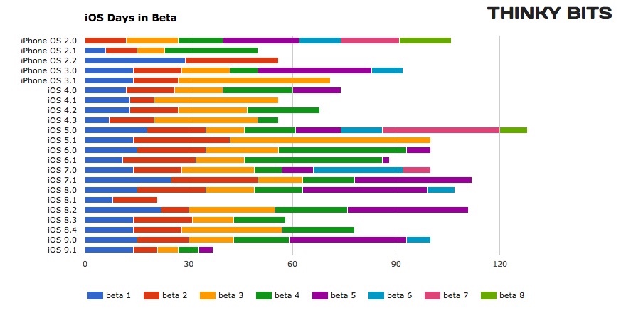
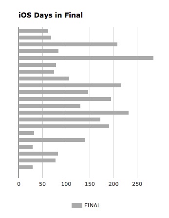
For a good infographic, sometimes all you need is a nice clean chart. This design uses a simple bar chart to clearly visualize the data. No gridlines. No axis titles. No value axis labels. No chart legend! It's a horizontal bar chart to allow room for the text labels to be easily read by the audience. All of the information needed is displayed directly in the chart itself.

Found on Forbes.

Friday
Jan192018

Ikigai - Visualizing the Japanese Concept of Life's Purpose


Ikigai is a Japanese concept that explains how a person can enjoy life. To illustrate this concept, a 4-sided Venn diagram was created by Dan Buettner (below), showing what it takes for one to discover their own. However, David Mccandless saw the original diagram and found it flawed. Above, we have his version of Ikigai- Japanese concept to enchance work, life & sense of worth diagram where he has theorized what should be inserted in the missing gaps, as well as giving the sections different sizes to more accurately represent the importance of each.

Ikigai is an interesting self-development concept from Japan, a prism for potentially seeing how to bring satisfaction, happiness & meaning to life. The direct translation is the “happiness of being busy.”

The original diagram was created by British community activist Marc Winn in 2014 from a TED Talk on Longevity by writer Dan Buettner.
 

Sadly, pedantically, the four-way Venn in the diagram is broken, from a technical POV. If you look closely, two sectors – love & paid for, good at & world needs – don’t intersect uniquely.

So I fixed that and theorised what those missing sectors might contain, while making a few other tweaks.

Got stuck a bit with “what the world needs” category which has a touch of entrepreneurial zeal about it. Not everyone can impact ‘the world’. But couldn’t come up with a variation that worked.

What’s interesting is that two intersections make something positive – passion, mission etc. But three intersections create a discomforting pinch point i.e. if you good at something, it’s what you love and what the world needs, but doesn’t earn you money, you’re “struggling”.


Found on Information is Beautiful

Thursday
Jun092016

The U.S. Baby Bust

The U.S. Baby Bust fertility rate

The U.S. Baby Bust is shown in 5 line charts by the Wall Street Journal. Sometimes a clean & simple line chart is the best way to show your data.

The general fertility rate fell in 2015 to tie the lowest level on record. Fertility, defined as the number of live births per 1,000 women ages 15-44, has never been lower than the rate recorded last year and in 2013.

It’s no surprise that Americans are having fewer babies than in the years after World War II, when there was an incredible baby boom. And it’s of course well known that people generally have smaller families today than in the past. Add the severe economic recession that began in 2007 to the picture, and you have the elements to push the birth rate to record lows.


The U.S. Baby Bust age groups of mothers

In this second chart showing the various age groups, the rainbow of colors is a little distracting. One way to tell a specific story with this chart would be to only color the lines that have increased over time, and make the rest shades of gray. That would tell the story that the women in their 30's are the dominant growth age groups.

A separate chart highlighting the lines for teens and 20's would better tell the story of women putting off having children until they are older.

Go check out the WSJ article for the other observations they made from the data.

Wednesday
May112016

The Growth of the Internet of Things

Growth in the Internet of Things Infographic

The current projection data from Cisco is that the IoT (Internet of Things) will reach 50 Billion devices by the year 2020! Visualized by the NCTA (National Cable & Telecommunications Association) as the Growth in the Internet of Things.

Today’s Internet is driven by wired and wireless networks, keeping us connected throughout our daily lives. With the advent of new digital devices that constantly link us to the Internet, these networks have become much more than just a simple vehicle for information and communications. They now enable us to track our daily habits, monitor our health, manage home energy use and track nearly any other data we can imagine. These devices make up what we call the Internet of Things – a web of connected objects that are linked via networks that can interact with each other and with us.

The Internet isn’t merely developing, it’s exploding, and the numbers prove it. Take a look at our graphic below — it shows the advancing surge of connected devices using the Internet.

Today, there are more connected devices than there are human beings on the planet. This expansion isn’t just from cell phones, tablets and computers – it’s thanks to toothbrushes, stovetops and millions of other devices that now have IP addresses. Estimates show that there will be over 50 billion connected devices by 2020.

Fast, ubiquitous Wi-Fi and increasing home broadband speeds will drive the Internet of Things and the ever-expanding web.

A clean and simple line chart tells this story very well. Notice that the chart was designed with many of the principles for storytelling in data visualization we discuss every day.

  • No chart legend. The data is shown directly in the chart
  • Minimal gridlines to simplify reading the chart and clean up the visual noise gridlines create
  • No separate data table. The relevant numbers are shown directly in the chart
  • Minimal axis labels (you don't need to show every year)
  • Use of visual icons to help communicate each milestone. 

Suggestion: I would move the icons and data much closer to the actual data points on the chart. There are too many connecting lines.

Thanks to Heather for sharing on Linkedin!

Monday
Mar282016

BallR: Interactive NBA Shot Charts

BallR: Interactive NBA Shot Charts

BallR: Interactive NBA Shot Charts is a tool built by Todd W. Schneider that takes the NBA's Stats API data and creates a visual representation of an NBA player's season. You can pick any NBA player and season to create the shot chart. The above infographic is an example of a hexagonal chart of Stephen Curry's Field Goal Percentage (FG%) relative to the league average within each region of the court during the 2015–16 season.

The NBA’s Stats API provides data for every single shot attempted during an NBA game since 1996, including location coordinates on the court. I built a tool called BallR, using R’s Shiny framework, to explore NBA shot data at the player-level.

BallR lets you select a player and season, then creates a customizable chart that shows shot patterns across the court. Additionally, it calculates aggregate statistics like field goal percentage and points per shot attempt, and compares the selected player to league averages at different areas of the court.

Hexagonal charts, popularized by Kirk Goldsberry at Grantland, group shots into hexagonal regions, then calculate aggregate statistics within each hexagon. Hexagon sizes and opacities are proportional to the number of shots taken within each hexagon, while the color scale represents a metric of your choice, which can be one of:

  • FG%
  • FG% vs. league average
  • Points per shot

Scatter charts are the most straightforward option: they plot each shot as a single point, color-coding for whether the shot was made or missed. Here’s an example again for Stephen Curry


Heat maps use two-dimensional kernel density estimation to show the distribution of a player’s shot attempts across the court.

Anecdotally I’ve found that heat maps often show that most shot attempts are taken in the restricted area near the basket, even for players you might think of as outside shooters. BallR lets you apply filter to focus on specific areas of the court, and it’s sometimes more interesting to filter out restricted area shots when generating heat maps. For example here’s the heat map of Stephen Curry’s shot attempts excluding shots from within the restricted area (see here for Curry’s unfiltered heat map).

Built using R's Shiny framework, I really like this interactive dataviz. The code designed to create this was also published on GitHub so anyone can check it out and try your own modifications. Very cool!

Found on Flowing Data.

Thursday
Oct152015

iOS Version Release Date History

iOS Version Release Date History

iOS Version Release Date History is a data visualization that shows how long each version of iOS has gone through beta versions. I really like this visualization by Will Hains and posted on his site Thinky Bits.

The design is still a work-in-progress, and it still requires me to go in and edit it every time a new beta is released, but it’s much less work than it used to be. And now, with the magic of Google’s Charts API, it’s interactive as well. The chart is 100% generated by Javascript in the browser, producing slick SVG images on-the-fly.

The stacked bar style clearly shows how long each version spend in the development process, and specifically shows how fast iOS 9.1 is being pushed through the system.

You can also see how long each version was the official current version in the wild, and the general trend to update iOS more frequently in Will's 2nd chart.

iOS Final Version Release Date History

Tuesday
Sep012015

How to Think Visually

How to Think Visually Using Visual Analogies infographic

How to Think Visually Using Visual Analogies infographic from Anna Vital gives a great variety of examples for anyone to use when you create your own graphics. It begins with the most recognizable visuals, circle graphs and diagrams. Further down are abstract analogies. They are reminiscent of physical objects, but they are simplified and abstract. Next, we have regular analogies that look like the physical objects you are familiar with. The final category are allegories. These are stories, or a series of analogies. The key is that these stories are familiar enough that we don’t have to retell them, but we should analogize every part of them.

Most research in cognitive science explores how we see things but little research is done on how we understand what we see.

Understanding is the ultimate test of how good your visualization is. So how can you make people understand? Show something familiar and analogize. If you know nothing else about visualization but pick the right analogy you are more than half way there. This is what a professional designer does - and there is no substitute for analogies.

How do you choose the right analogy? In this grid I organized analogies from the abstract down to the more detailed. I grouped them by similarity in shape. The goal is to enable you to quickly see the possibilities and “try them on” your information. With time you’ll be able to do all of this in your head. But for now this is a shortcut. 

As part of the infographic landing page, Anna has included a text description of each visual analogy. For the story on each graphic, read more at anna.vc

Thanks to @DR4WARD for sharing on Twitter!

Monday
Aug242015

The Spectrum of User Experience Design

The Spectrum of User Experience Design

The Spectrum of User Experience Venn Diagram came up again recently in a discussion with a client, and looking back I realized I had never posted it here on Cool Infographics. Designed in 2009 by Oliver Reichenstein at iA (Information Architects), this is one of those everlasting designs that is even more relevant and popular today than when it was designed.

Oliver posted about it's origins here

Can’t we just all get along? Or leave each other alone? We can’t. The product, the interface and the communication build on the tension between the economic, the technological and the design force.

The business department and the engineers need to agree on a product definition that guarantees high performance; engineers and designers need to work together to make the interface as simple as possible; and designers need to team up with the business folks to get the communication consistent.

Six years later and I still love it!

Wednesday
Dec172014

An Illustrated Guide To The Galaxy Of Women's Shoes

An Illustrated Guide To The Galaxy Of Women's Shoes infographic

An Illustrated Guide to the Galaxy of Woman’s Shoes is the all knowing cheat sheet to any shoe that a woman could wear. Created by Pop Chart Lab, the color coding around the shoes d distinguishes the categories that each shoe falls under.

Can’t tell the difference between a slingback espadrille wedge and a peep-toe ankle strap platform wedge? The prolific infographic design studio Pop Chart Lab has you covered. The Charted Collection of Contemporary Footwear is a handy, color-coded cheat sheet of the many shoes the modern woman might go sauntering—or, in some cases, teetering—out of the house wearing.

It just boggles my mind.

Found on http://www.fastcodesign.com/

Thursday
Aug142014

Coolness Graphed

Coolness Graphed


Coolness Graphed

Coolness Graphed.com has a collection of bar graphs that describes when certain actions are deemed “cool” or “uncool”. The three shown here are just a few examples from the website.

Coolness Graphed.com brings normal events together with a humorous flare by rating them in a “cool”/”uncool” bar graph. The bar graph works well with the events as a visual ranking system. No real values are needed.  Data visualization used brilliantly!  It only takes seconds for the audience to understand each one, and they are highly sharable in social media.

The site has been running for more than two years now, and keeps getting funnier!  Thanks to Jones for sending in the link!

Now also available in a book!