About
Randy Krum
President of InfoNewt.
Data Visualization and Infographic Design

Infographic Design

Infographics Design | Presentations
Consulting | Data Visualizations

DFW DataViz Meetup

Join the DFW Data Visualization and Infographics Meetup Group if you're in the Dallas/Fort Worth area!

Search the Cool Infographics site

Custom Search

Subscriptions:


Feedburner

The Cool Infographics® Gallery:

How to add the
Cool Infographics button to your:

Cool Infographics iOS icon

- iPhone
- iPad
- iPod Touch


Read on Flipboard for iPad and iPhone

Featured in the Tech & Science category

Flipboard icon

Twitter Feed
From the Bookstore

Caffeine Poster

The Caffeine Poster infographic

Entries in home (8)

Monday
Sep172018

Animated History of Home Siding Materials


Fixr has published their research of How the Use of Home Siding Materials Has Changed Over 40 Years as this animated data visualization changing the proportions over time.

It's a little odd to watch because it starts out looking like a bad pie chart with cute rounded corners. This is really a simple version of a voronoi diagram where the area of each section represents the proportional values.

The video above was created using the results from the census on exterior finishes of single-family homes. It looks at the historical use of wood, brick, stucco, vinyl, fiber and ‘other’ options starting in 1977 and ending in 2017. The census accounts for up to 1.6 million houses each year and includes homes across the U.S.A., so provides a broad look at how finishes have risen and fallen in popularity over the full period. These changes in popularity not only account for aesthetic fashionability but also availability, cost and practicality. From a trend perspective, each finish dominated a specific decade, in terms of houses completed in that finish. Brick dominated the 70s, wood dominated the 80s, vinyl, which only became available in the 90s, dominated that decade, and stucco and fiber cement dominated the 2000s. ‘Other’ materials also saw their highest use during the late 80s and 90s.

Tuesday
May172016

Election Exodus - Moving to Canada?

Election Exodus - Moving to Canada infographic

Frustrated by the U.S. Presidential candidates? Ready to just pack up and move the Canada? The Election Exodus infographic from SpareFoot looks closer at what it would take for Americans to move North to Canada.

Trump or Clinton.

The prospective of either of these presidential frontrunners emerging victorious in November is too much for many Americans to bear.

A shocking number of U.S. citizens would consider a move to Canada—15 percent if Hillary Clinton is elected and 20 percent if Donald Trump is elected, according to recent polls.  (To be fair, we’re willing to bet there would be plenty of supposed defectors under President Sanders or Cruz as well.)

The question remains: How serious are these people? And how hard is it to move to Canada?

The answers to these questions and more lie below:

Designed by NowSourcing, this is a visually busy take on the side-by-side comparison style of infographic. A lot of text, and many of the statistics are not visualized, which makes it harder for readers to understand all of the information.

Thanks to Brian for sending in the link!

Wednesday
May112016

The Growth of the Internet of Things

Growth in the Internet of Things Infographic

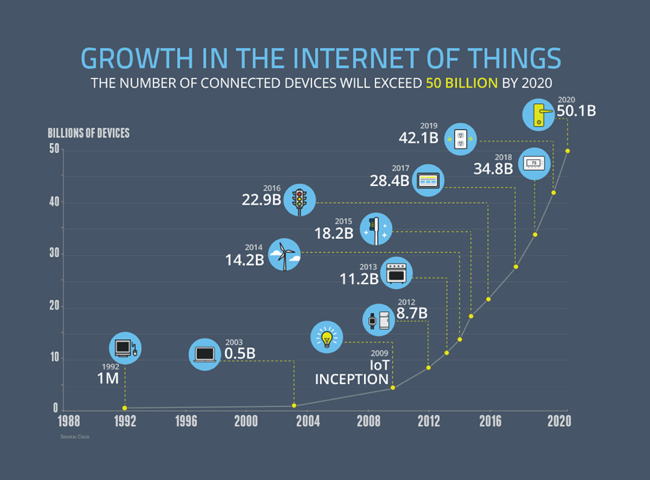
The current projection data from Cisco is that the IoT (Internet of Things) will reach 50 Billion devices by the year 2020! Visualized by the NCTA (National Cable & Telecommunications Association) as the Growth in the Internet of Things.

Today’s Internet is driven by wired and wireless networks, keeping us connected throughout our daily lives. With the advent of new digital devices that constantly link us to the Internet, these networks have become much more than just a simple vehicle for information and communications. They now enable us to track our daily habits, monitor our health, manage home energy use and track nearly any other data we can imagine. These devices make up what we call the Internet of Things – a web of connected objects that are linked via networks that can interact with each other and with us.

The Internet isn’t merely developing, it’s exploding, and the numbers prove it. Take a look at our graphic below — it shows the advancing surge of connected devices using the Internet.

Today, there are more connected devices than there are human beings on the planet. This expansion isn’t just from cell phones, tablets and computers – it’s thanks to toothbrushes, stovetops and millions of other devices that now have IP addresses. Estimates show that there will be over 50 billion connected devices by 2020.

Fast, ubiquitous Wi-Fi and increasing home broadband speeds will drive the Internet of Things and the ever-expanding web.

A clean and simple line chart tells this story very well. Notice that the chart was designed with many of the principles for storytelling in data visualization we discuss every day.

  • No chart legend. The data is shown directly in the chart
  • Minimal gridlines to simplify reading the chart and clean up the visual noise gridlines create
  • No separate data table. The relevant numbers are shown directly in the chart
  • Minimal axis labels (you don't need to show every year)
  • Use of visual icons to help communicate each milestone. 

Suggestion: I would move the icons and data much closer to the actual data points on the chart. There are too many connecting lines.

Thanks to Heather for sharing on Linkedin!

Tuesday
Feb162016

London’s Expected House Price Gain

London’s Expected House Price Gain from Freehold Sale looks at the dramatic price increases expected in the London, UK, housing market.

London is an exciting place to live. Pick the right borough and you can enjoy the best of both worlds – the buzz of the city and access to amazing jobs, plus large open green spaces, top schools and an excellent quality of life.

It’s no wonder that property in our capital city remains in high demand, driven by an innate desire to live in and around the capital. It’s an investment goldmine – we hear almost daily how London’s property market outpaces the remainder of the country and will continue to do so for years to come. Real estate group, CRBE forecast prices in London could rise more than 30 per cent over the next five years.

Essentially, it could be a good gamble, but whereabouts should you look? If you have a sizeable deposit rubbing a hole on your wallet and fancy purchasing a freehold in London, here are the expected price rises for the next five years:

Color coding can be a tricky way to visualize data. The readers have to refer back to the color key frequently to understand the design, especially when it takes scrolling to look back and forth.

The footer should include the URL back to the infographic landing page so readers can find the original full-size version of the design when they come across smaller versions posting on blogs and social media.

Thanks to David for sending in the link!

Thursday
Feb112016

Power Hungry: The Rise & Fall of Electricity Consumption

Power Hungry: The Rise & Fall of Electricity Consumption infographic

Power Hungry is an infographic timeline showing the dramatic rise in energy consumption for average American homes and the recent change to a decline from energy efficient technologies and home automation. From The Home Depot and published on Inhabitat.

While the U.S. still has a long way to go with alternative energy, a new statistic has given us incredible hope for the future. For the first time in a century, energy consumption in U.S. homes has dropped. Since electricity first entered the home in the 1910’s, residential energy use has been steadily on the rise, but thanks to new developments in alternative technologies, our dependence on electricity is becoming more sustainable than ever before. From small changes, like the rise of circuit breakers and panels, to huge innovations like solar panels and home automation, the road to a cleaner, greener future has been a long — but worthwhile — process. Check out this fascinating infographic below to see how energy consumption has changed over the years.

I love my Nest thermostat and Philips Hue lights!

Tuesday
Jun042013

Home Energy Savings

Home Energy Savings infographic

70% of electricity in the US is generated from non-renewable sources.  The Home Energy Savings infographic provided by Accent Building Products tells us how to have an energy efficient home without sacrificing comfort.

Today it is more important than ever to make our homes more energy efficient without sacrificing home comfort. An energy-efficient home will keep your family comfortable while saving you money. Unfortunately, a lot of energy is wasted through leaky windows or ducts, old appliances, or inefficient heating and cooling systems. You can use many tips to save money and energy! This infographic details many different money saving tips and shows how we spend the money on our homes.

Infographic provided by Accent Building Productsa direct distributor of the industry’s top accent home and building products.  All products are shipped to you directly from the manufacturers’ factory.

It’s interesting from an online marketing and SEO perspective that I can find the infographic on gallery sites like Infographics Showcase, Infographics Inspiration, and Visual.ly but I was unable to find the original anywhere on the Accent Building Products website or blog.  This means that any popularity in terms of links and visitors to the infographic itself will benefit the gallery sites, but not Accent Building Products.  Only indirectly will Accent get any benefit if readers separately visit their site, but they would have to manually type in the URL because none of the infographics have a link back to the site.

This is a fun visual explanation design.  The illustrations clearly put the suggestions and data into context of the areas in the house.  There is a lot of text, but the small callouts make it easy to read.  It would have been more effective to visualize the pieces of data that are included in the design.

Thanks to Chris for sending in the link!

Tuesday
Jun042013

The Makings of a Modern Home

The Makings of a Modern Home infographic

Keeping up with technology is always a full time job. Now even your home can have technology upgrades. The Makings of a Modern Home infographic from In Style Modern helps keep all of us current with information on updating your home with the newest technology.

There isn’t a text description on the landing page, or even in the infographic itself.  The reader is left to determine if these are real, current technologies or a forecast of what’s coming.  Personally I think it walks the line between the two.  The Nest Thermostat is very real, but self driving cars aren’t available to the public yet.

This design would have been better in landscape orientation, where the information could have connected more easily with the locations shown in the isometric house illustration.  I understand why they chose to use the Tall Format though, to make the display on the blog and in services like Pinterest easier.

Thanks to Therese for sending in the link!

Friday
Oct292010

Halloween Home Improvements [infographic]

Click to enlarge

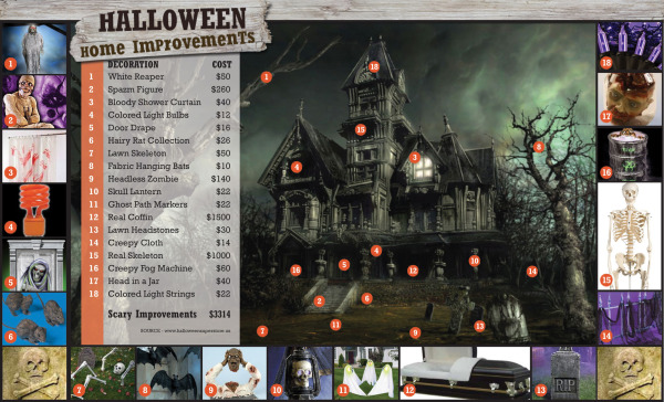
Halloween Home Improvements gives you 18 inexpensive ideas to improve your outside house decorations for Halloween, and make your house the most memorable in your neighborhood.

Looking to scary up your home? Well, here are some ideas for Halloween home improvements that will make your house a boo-tiful abode (see what I did there with boo-tiful? That kind of instinct for wordplay can’t be taught …).

From BuildDirect.com.