About
Randy Krum
President of InfoNewt.
Data Visualization and Infographic Design

Infographic Design

Infographics Design | Presentations
Consulting | Data Visualizations

DFW DataViz Meetup

Join the DFW Data Visualization and Infographics Meetup Group if you're in the Dallas/Fort Worth area!

Search the Cool Infographics site

Custom Search

Subscriptions:


Feedburner

The Cool Infographics® Gallery:

How to add the
Cool Infographics button to your:

Cool Infographics iOS icon

- iPhone
- iPad
- iPod Touch


Read on Flipboard for iPad and iPhone

Featured in the Tech & Science category

Flipboard icon

Twitter Feed
From the Bookstore

Caffeine Poster

The Caffeine Poster infographic

Entries in art (93)

Wednesday
Mar292017

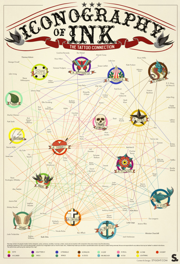
Iconography of Ink

Iconography of Ink infographic

Iconography of Ink, created by Stylight.com, maps out 90 celebrity tattoos and their connections to one another. You can find other interesting facts and tips about tattoos at Stylight.com.

Tattoos—originating from the Tahitian word ‘tatau’—have decorated the skins of endless cultures, spanning thousands of years. Both Polynesian tribes and Italian monks donned such skin art, not to mention, world-traveling sailors and European monarchs.

Fast-forward to today and tattoos are common practice amongst all socioeconomic classes. Scan PopSugar, Huffington Post or Vogue magazine and you’re sure to find tattooed musicians, actors and models alike. The celebrity tattoo craze isn’t just a sign of the times, but an entertaining melodrama.

From bad ass Cambodian tigers (read: Angelina Jolie) to ill-advised dedications to spouses (we’re looking at you Melanie Griffith), watching the evolution of Hollywood tattoos rivals even the most absorbing of reality tv shows.

Thanks to Elisa for sending in the link!

Wednesday
Feb042015

The Evolution of Spawn

The Evolution of Spawn infographic

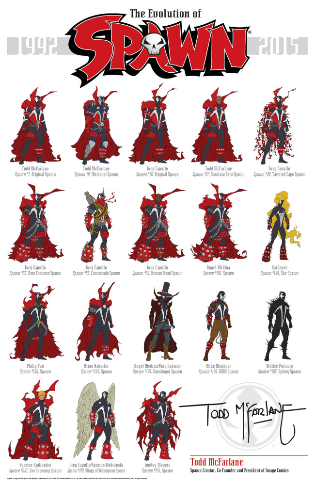
The Evolution of Spawn infographic is a fantastic design. Not fan art, this official infographic was designed by Todd McFarlane, Creator of Spawn and Co-Founder and President of Image Comics!

From Todd’s Facebook post:

THE EVOLUTION OF Spawn!!!!!

With Spawn issue #250 coming up at the end of the month…. I thought it would be COOL to put together all the different costumes Spawn has had over the years.

And if you’re doing the math, that’s 24 YEARS. TWENTY-FOUR!!!!!!!! It’s cool to look back and see how things have changed since 1992….it’s hard to believe we’re already coming up on our #250th issue.

Thanks for all your support over the years!!! I’ll be doing a giveaway with these, soon.

TODD

P.S.- There have been a few requests for a downloadable poster (and higher res)… You should be able to download the poster from this link: https://flic.kr/p/qKcR9q

Found on GeekTyrant

Monday
Feb032014

The Beautiful Flow of Pi

Flow Of Life Flow Of Pi data visualization poster

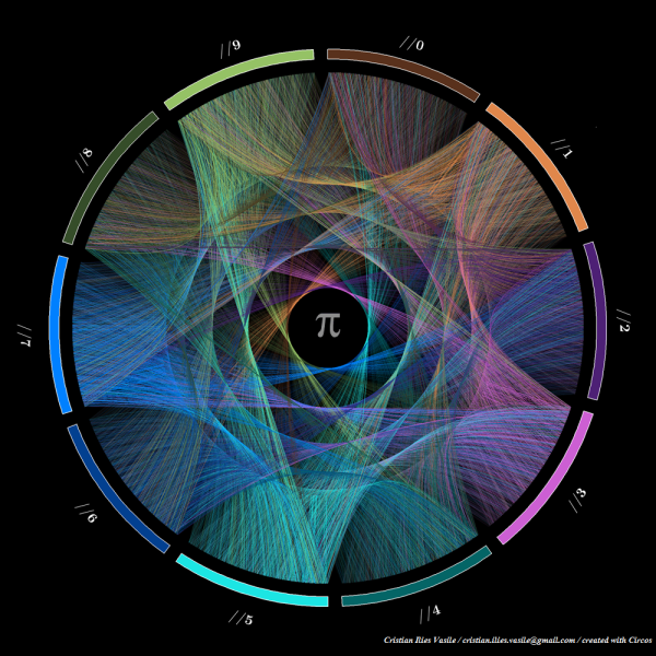
Flow Of Life Flow Of Pi.  Cristian Ilies Vasile designed this visualization of the first 1,000 digits of the mathematical constant pi using Circos to plot the sequence of digits…in a circular pattern of course!.  You can buy a print copy of the poster for $22 from Fine Art America.  Cristian has create a few different varieties of the artwork that you can see on his page.

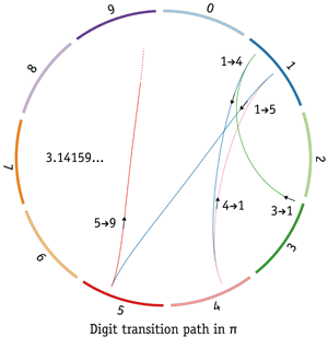
Starting with the first digit “3”, a connecting arc is drawn to each subsequent digit (3.14159265358979323846…).  Since the sequence is theorized to be a random sequence, it creates a beautiful visualization that appears evenly distributed among the digits.  Check out this explanation by Martin Krzywinski along with some of his own artwork.  He demostrates the sequence with this visualization of just the first five digits 3.14159…

I had not heard of Circos before, so I have now added a link to it on the Cool Infographics Tools page.

Thanks to Matt Baker for posting on Google+

Thursday
Aug292013

Comic Tribute to Bill Watterson (Calvin & Hobbes)

Comic Tribute to Bill Watterson

Calvin & Hobbes is easily my all-time favorite comic, and Bill Watterson was able to beautifully offer thousands of life lessons through the 10 years of C&H comic strips.  Freelance cartoonist Gavin Aung Than has designed this fantastic Comic Tribute to Bill Watterson, and posted it on his site, Zen Pencils.

The quote used in the comic is taken from a graduation speech Watterson gave at his alma mater, Kenyon College, in 1990. Brain Pickings has a nice article about it. The comic is basically the story of my life, except I’m a stay-at-home-dad to two dogs. My ex-boss even asked me if I wanted to return to my old job.

My style is already influenced by Watterson, but this is the first time I’ve intentionally tried to mimic his work. It’s been fun poring through Calvin and Hobbes strips the past week while working on this comic and it was a humbling reminder that I still have a long way to go.

The quotes I’ve used in the write-up above are taken from the introduction to The Complete Calvin and Hobbes collection, which sits proudly on my desk.

So, why am I posting this on Cool Infographics?  I want to pose the question: Should we consider this to be an infographic?

There’s no numeric data.  No charts.  No data visualizations.  No call to action.

However, there is information.  The information source is Bill Watterson’s speech from 1990, and the illustrations do a great job of communicating the message visually.  The image layout follows the tall infographic style that is easy to share online.

My own opinion is that “Yes” this is an infographic.  What do you think?

Found on LifeHacker


  I miss Calvin & Hobbes…

Thursday
May312012

How Draw Something Blew Up Without Blowing Up

How Draw Something Blew Up Without Blowing Up

Now here is a game for everyone! It doesn’t matter how well you can draw, you can just draw and laugh with your friends at your attempts! This app has become very popular and quite quickly, the How Draw Something Blew Up Without Blowing Up infographic from The Next Web (with help from Couchbase) charts the growing trendiness of this game.

Draw Something was downloaded 50 million times in 50 days. Users created billions of drawings, adding 3,000 new pictures every second. On March 21st, OMPOP, the company behind the game, was bought up by Zynga for more than $200 million. On the first weekend in April, I downloaded the game for my first time and was admittedly addicted for 72 hours.

Today, a company called Couchbase gave us the exclusive on an infographic that charts the app’s viral growth. In case you’ve not heard of Couchbase, it’s the platform that enabled the game to keep up with its NoSQL database technology — from 6 database servers to more than 90 — without a second of game downtime. That’s impressive.

The infographic below charts the amount of user data, drawings per second, number of servers used to keep the game up and going and the number of users over 8 weeks of the game’s mind-blowing growth. The only question now is, will the game’s addictive nature keep fans or will they get over it as quickly as I have?

Intended as a quick summary of Draw Something’s growth, and Couchbase’s success in supporting their database expansion needs, this infographic does a good job.  Simple, easy-to-understand visuals, and use of some hand-sketch illustrations to reinforce how Draw Something works.

Some visualizations in the Billions of Drawings section would have been nice to communicate the immense scale of the growth numbers.  Most readers don’t truly grasp the difference between 10 million and 2 billion by just reading the text numbers.

Tuesday
Dec202011

FREE Infographic Holiday Cards (LIMITED SUPPLY)

As they have for the past few years, our friends at FUNNEL have reserved 50 sets of FREE Infographic Holiday Cards just for readers of Cool Infographics!  (U.S. and Canada addresses only)  This year’s design is called “Snowplowed” (image above), and includes a 4-card pack that are blank on the inside.  You must request your free cards by Wednesday, December 21st!

Funnel’s Holiday Card Packs are ready to ship to clients, friends and fans of information design to show our appreciation. To get your free 4-card pack featuring this year’s illustration “Snowplowed” follow the link to our holiday sign up page at http://www.funnelinc.com/holiday/ (US/Canada only, while supplies last, offer good until 12/21/11). For all our wonderful fans around the world, please enjoy our free wallpapers to dress up your iPhone or monitor. Cheers!

Supplies are very limited, so when you enter your information, make sure you select “Cool Infographics Blog” under “How did you hear about us?” to get some of the cards reserved for you.

While you’re on the FUNNEL site, check out the FREE wallpaper images for iPhones and Monitors!

Thanks to Lin and Lori at FUNNEL for this special treat just for Cool Infographics readers!

Monday
Mar142011

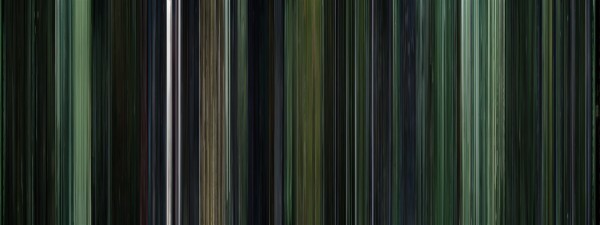
Moviebarcodes: Whole Movies at a Single Glance

Moviebarcodes is a tumblr blog from an unknown author that posts these images generated from different movies.  Each frame of the movie is stretched tall and thin to create this single image from an entire movie.  The one above is from The Matrix, and you can see the green tint they used every time they were “in the Matrix”.

From Wired:

The person behind MovieBarcode, who wouldn’t reveal their identity or what they do for a living, told Wired.co.uk that the creative process can take a few hours on the slightly aged machine they are being processed on, “depending on the length of the movie and the quality of the outcome”.

Movies on the blog are chosen “due to the expected result, not for the movies themselves”. Besides colourful movies, the blog author prefers “movies with long shots such as Kubrick, Hitchcock and Weerasethakul, which can result in unique and interesting moviebarcodes”.

Although, some of them don’t seem to reveal anything interesting, a few of these did give some insights into the movie visuals.

They spent a lot of time at sea in Jaws:


The Dark Knight was a very dark, almost colorless movie:


Kung Fu Panda was very colorful:


You can see the time spent in the digital, neon-blue world of TRON (1982):


Found on Wired.co.uk, VisualJournalism, FlowingData and Chart Porn.

Friday
Mar112011

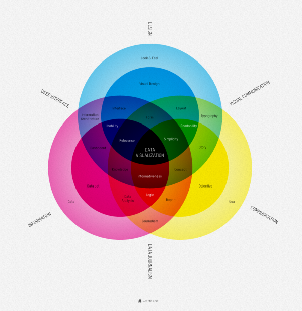
What is Data Visualization?


I love this map of What Is Data Visualization? from Sébastien Pierre, founder of ffunction.  It lays out the different aspects of information design, and acts as a fantastic guide to the vocabulary used in the design community.

ReadQWriteCloud has a good interview article with Pierre on his thoughts behind designing the infographic.

Pierre:

“Will it be interactive or static? Will it be used as a tool or to illustrate something? Depending on how we position the visualization, it will be more demanding on UI aspects or on visual aspects. Dashboards, online reports and interactive web visualizations need a solid understanding of UI design, while infographics and print reports require a strong foundation of typography, layout and visual communication.”

Found on ReadWriteCloud and ChartPorn

Tuesday
Dec282010

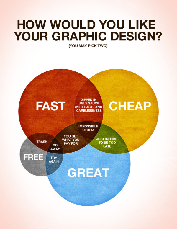
How Would You Like Your Graphic Design? #infographic


Designed by Colin Harman, How Would You Like Your Graphic Design? made me laugh this morning.  Great venn diagram infographic.

There are times when things just need to be explained using a spectacular Venn diagram. I made this last night whilst sitting on a screened in porch by an outdoor fireplace when it was late. Design is a funny thing, not as funny as a Kangaroo jumping on a trampoline, but let’s be honest what is as funny as that? I’ll give you a little hint: nothing.

Anyways, I love design, but it has it’s limitations in the creation process. Hopefully this helps you understand what those are and help you choose how you would like your design work in the future.

Your thoughts?

Although designed as a treatise about graphic design, it applies to infographics as well.

Friday
Dec172010

FREE Infographic Holiday Cards!!!


Once again this year, FUNNEL, Inc. is offering FREE 4-pack mixed sets of Infographic Holiday Cards, but quantities are limited (US & Canada only).  You won’t find them on the main site, because they’re only available on this secret page of their site for Cool Infographics readers.  When you enter your address, make sure you choose “Cool Infographics Blog” in the How did you hear about us? question.  There are 50 packs of cards reserved just for Cool Infographics readers!

This year brings a new infographic called “Delivery” to the mix:


Also on the page are seven infographic holiday desktop backgrounds available for free download.  They have multiple screen resolutions, and the new one even has iPhone versions.


Thanks to Lin and Lori at FUNNEL for this special treat just for Cool Infographics readers!