About
Randy Krum
President of InfoNewt.
Data Visualization and Infographic Design

Infographic Design

Infographics Design | Presentations
Consulting | Data Visualizations

DFW DataViz Meetup

Join the DFW Data Visualization and Infographics Meetup Group if you're in the Dallas/Fort Worth area!

Search the Cool Infographics site

Custom Search

Subscriptions:


Feedburner

The Cool Infographics® Gallery:

How to add the
Cool Infographics button to your:

Cool Infographics iOS icon

- iPhone
- iPad
- iPod Touch


Read on Flipboard for iPad and iPhone

Featured in the Tech & Science category

Flipboard icon

Twitter Feed
From the Bookstore

Caffeine Poster

The Caffeine Poster infographic

Entries in venn diagram (7)

Friday
Jan192018

Ikigai - Visualizing the Japanese Concept of Life's Purpose


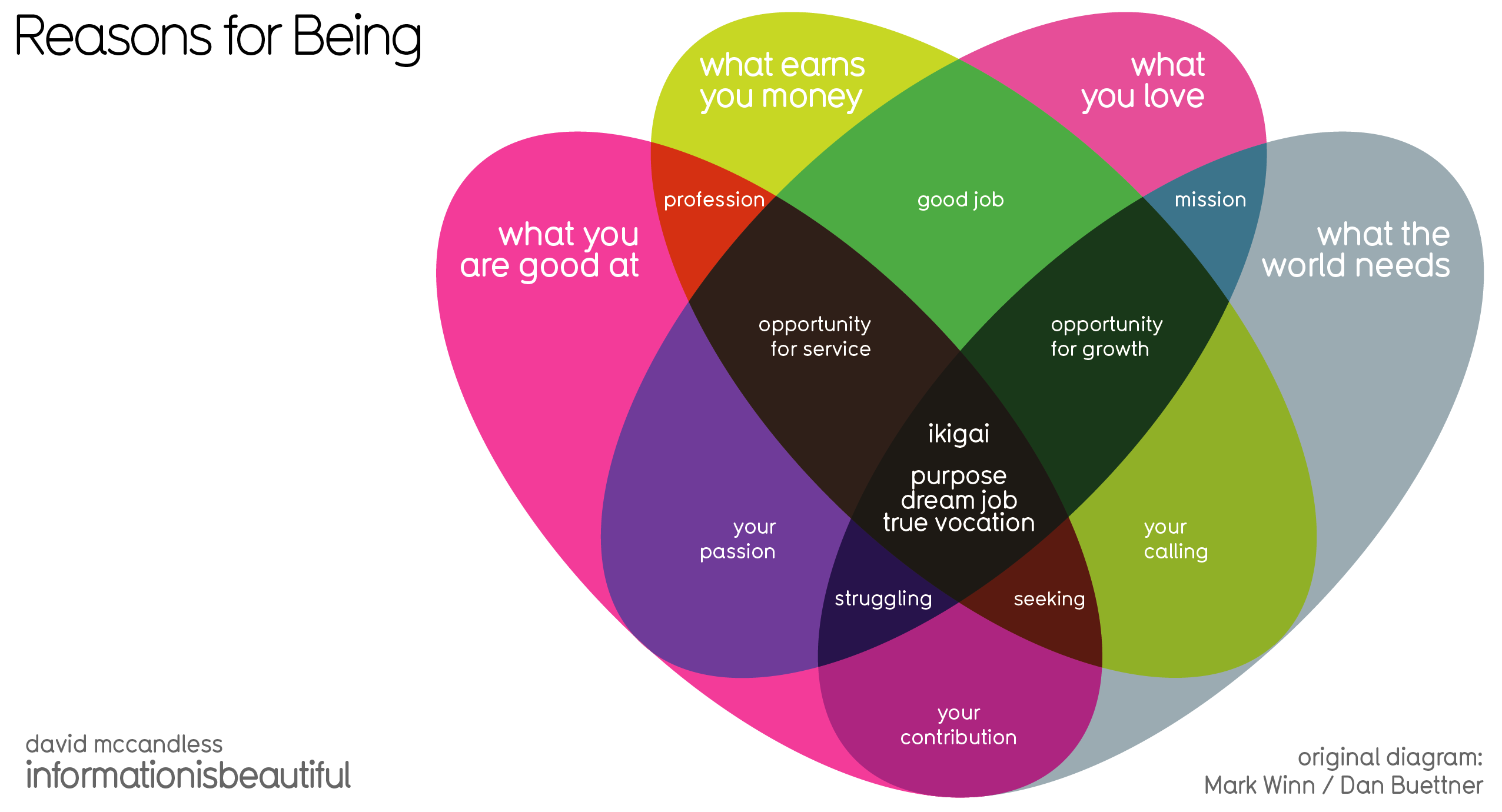
Ikigai is a Japanese concept that explains how a person can enjoy life. To illustrate this concept, a 4-sided Venn diagram was created by Dan Buettner (below), showing what it takes for one to discover their own. However, David Mccandless saw the original diagram and found it flawed. Above, we have his version of Ikigai- Japanese concept to enchance work, life & sense of worth diagram where he has theorized what should be inserted in the missing gaps, as well as giving the sections different sizes to more accurately represent the importance of each.

Ikigai is an interesting self-development concept from Japan, a prism for potentially seeing how to bring satisfaction, happiness & meaning to life. The direct translation is the “happiness of being busy.”

The original diagram was created by British community activist Marc Winn in 2014 from a TED Talk on Longevity by writer Dan Buettner.
 

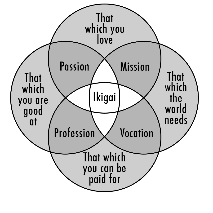
Sadly, pedantically, the four-way Venn in the diagram is broken, from a technical POV. If you look closely, two sectors – love & paid for, good at & world needs – don’t intersect uniquely.

So I fixed that and theorised what those missing sectors might contain, while making a few other tweaks.

Got stuck a bit with “what the world needs” category which has a touch of entrepreneurial zeal about it. Not everyone can impact ‘the world’. But couldn’t come up with a variation that worked.

What’s interesting is that two intersections make something positive – passion, mission etc. But three intersections create a discomforting pinch point i.e. if you good at something, it’s what you love and what the world needs, but doesn’t earn you money, you’re “struggling”.


Found on Information is Beautiful

Friday
Sep162016

Mapping the Disciplines of User Experience Design

Mapping the Disciplines of User Experience Design infographic

Mapping the Disciplines of User Experience Design is an uber-complex Venn Diagram. The original concept by Dan Saffer at KickerStudio was given a clean DataViz overhaul by Thomas Gläser who was with envis precisely at the time.

An infographic approach to visualize all players of the interactive field

. It shows the different areas and how they connect and overlap.

The diagram is based on the work of Dan Saffer

It's a couple years old, but all of the files were published on Github under Creative Commons 3.0 Attribution-ShareAlike so anyone can Adpapt or Improve the design going froward.

You can see the original concept from Dan Shaffer here:

Found on FastCoDesign

Wednesday
Jun222016

Venn Diagram shows Tesla-SolarCity-SpaceX overlap

Venn Diagram shows Tesla-SolarCity-SpaceX overlap

Yesterday (June 21, 2016) Tesla Motors offered to acquire SolarCity for $2.8 billion in stock. Unless you pay close attention, you may not realize that these are both companies headed by Elon Musk. The Wall Street Journal (subscription required) has visualized the shared investors and board members with this clear Venn Diagram showing the overlap between his three companies: Tesla, SolarCity and SpaceX.

The graphic helps put the merger news into context for the readers. The best infographics and data visualizations make complex information more approachable and understandable for the audience, and this one does that very well.

Found on TechCrunch, where you can see the design.

Monday
Aug242015

The Spectrum of User Experience Design

The Spectrum of User Experience Design

The Spectrum of User Experience Venn Diagram came up again recently in a discussion with a client, and looking back I realized I had never posted it here on Cool Infographics. Designed in 2009 by Oliver Reichenstein at iA (Information Architects), this is one of those everlasting designs that is even more relevant and popular today than when it was designed.

Oliver posted about it's origins here

Can’t we just all get along? Or leave each other alone? We can’t. The product, the interface and the communication build on the tension between the economic, the technological and the design force.

The business department and the engineers need to agree on a product definition that guarantees high performance; engineers and designers need to work together to make the interface as simple as possible; and designers need to team up with the business folks to get the communication consistent.

Six years later and I still love it!

Thursday
May022013

Connecting The Dots

Connecting The Dots infographic Habitat for Humanity

Connecting the Dots is a mind map design from Habitat for Humanity.  It was published in the May 2013 edition of their own magazine, Habitat World, and made available online as a PDF download.

Learn more about how Habitat builds homes, communities and hope.

I really like the combination of the Venn diagram in the center and the mind map nodes that extend outward.  The sizes of the circles doesn’t have any meaning, just sized to fit the text.  This is a really good way for Habitat for Humanity to tell their story with a visual explanation.


Tuesday
Dec282010

How Would You Like Your Graphic Design? #infographic


Designed by Colin Harman, How Would You Like Your Graphic Design? made me laugh this morning.  Great venn diagram infographic.

There are times when things just need to be explained using a spectacular Venn diagram. I made this last night whilst sitting on a screened in porch by an outdoor fireplace when it was late. Design is a funny thing, not as funny as a Kangaroo jumping on a trampoline, but let’s be honest what is as funny as that? I’ll give you a little hint: nothing.

Anyways, I love design, but it has it’s limitations in the creation process. Hopefully this helps you understand what those are and help you choose how you would like your design work in the future.

Your thoughts?

Although designed as a treatise about graphic design, it applies to infographics as well.

Tuesday
Mar302010

The Nerd Venn Diagram

Yep…I’m a geek.

From Matthew Mason on his blog, sed contra.


Thanks to Ken (LibertySquare} on TGM for the link!