About
Randy Krum
President of InfoNewt.
Data Visualization and Infographic Design

Infographic Design

Infographics Design | Presentations
Consulting | Data Visualizations

DFW DataViz Meetup

Join the DFW Data Visualization and Infographics Meetup Group if you're in the Dallas/Fort Worth area!

Search the Cool Infographics site

Custom Search

Subscriptions:


Feedburner

The Cool Infographics® Gallery:

How to add the
Cool Infographics button to your:

Cool Infographics iOS icon

- iPhone
- iPad
- iPod Touch


Read on Flipboard for iPad and iPhone

Featured in the Tech & Science category

Flipboard icon

Twitter Feed
From the Bookstore

Caffeine Poster

The Caffeine Poster infographic

Entries in startup (11)

Friday
Jan262018

Top Reasons Startups Fail

The Top Reasons Startups Fail infographic

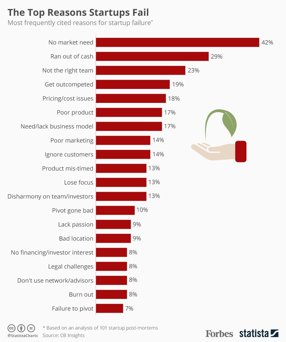
It takes more than just a good idea for a startup to succeed. Forbes analyzed 101 failed startups and found that The Top Reason Startups Fail, was the lack of need for their product. Launching a startup takes a lot of preparation and research. Make sure you are fully prepared before starting your own.

Down through the years, some startups really struck gold. When Accel Partners invested $14.8 million in a website called "thefacebook.com" back in 2005, they made a return of $5.6 billion - 378 times their original outlay. More often than not, however, startups tend to fail brutally. According to CB Insights, 70 percent of upstart tech companies fail, usually about 20 months after first raising financing. The failure rate is even worse for consumer hardware startups with 97 percent of seed crowdfunded companies failing or turning into "zombies".

CB Insights delved into a compilation of startup failure post-mortems by founders and investors to shed light on why many ventures grind to a halt. The following infographic shows the top-20 cited reasons for failure with products or services that do not serve a market need in first position. Not all startups are lucky enough to attract financial backing as lucrative as Accel Partners' investment in Facebook; in 29 percent of cases, they simply run out of cash. Having the right people onboard from the outset can make a massive difference when it comes to success and ploughing ahead without the right team is the third most frequently cited reason for a startup ending in failure.

For a good infographic, sometimes all you need is a nice clean chart. This design uses a simple bar chart to clearly visualize the data. No gridlines. No axis titles. No value axis labels. No chart legend! It's a horizontal bar chart to allow room for the text labels to be easily read by the audience. All of the information needed is displayed directly in the chart itself.

Found on Forbes.

Thursday
Jul142016

Why DFW? 2015

Why DFW? A guide to starting, building, and growing your business in Dallas-Fort Worth

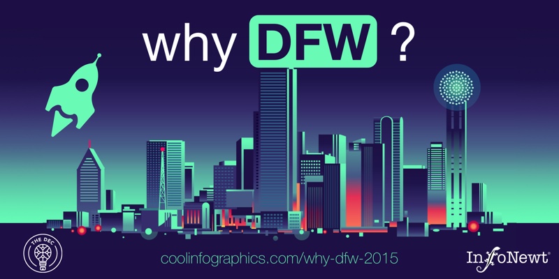
Based on data from 2015, I designed this infographic (InfoNewt) very quickly over a weekend in conjunction with Debra Swersky (@DebraSwersky) and The Dallas Entrepreneur Center (The DEC) co-working space located in downtown Dallas.

I love being a part of the Dallas startup community! It's a growing, vibrant, fully-enagaged community of entrepreneurs, and I have a bunch of ideas for future infographics.

Also created a social graphic with 2:1 Aspect ratio for easy sharing on Twitter and other social media platforms.

Monday
Nov022015

The Increasingly Crowded Unicorn Club

The Increasingly Crowded Unicorn Club infographic

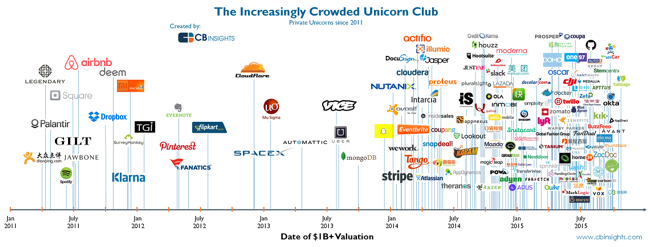
The Increasingly Crowded Unicorn Club is visualized by CB Insights in this chart showing the dates when these 141 companies became unicorns by reaching the $1 Billion valuation mark.

We looked at all still-private unicorns since 2011 and charted them based on when they first joined the unicorn club. While initially the chart shows unicorns being created at a relatively calm pace, the rhythm accelerates noticeably in late 2013 (right around the time Aileen Lee wrote her famous post coining the term unicorn in November 2013). Since then, there has been an explosion in unicorn creation, with over 60 new unicorns in 2015 alone.

The heights of the lines have no meaning, they are just connectors to the company logos.

This is a really good visualization that tells one story really well without crowding it with a bunch of extra information about the companies. Knowing that the image will most often be shared as a stand-alone piece, it would have been teer for them to include the URL back to the original infographic and a copyright statement in the infographic JPG image file itself.


Friday
May302014

Reading Rainbow's Kickstarter Project

Reading Rainbow's Kickstarter Project infographic

Bring Reading Rainbow Back for Every Child, Everywhere.

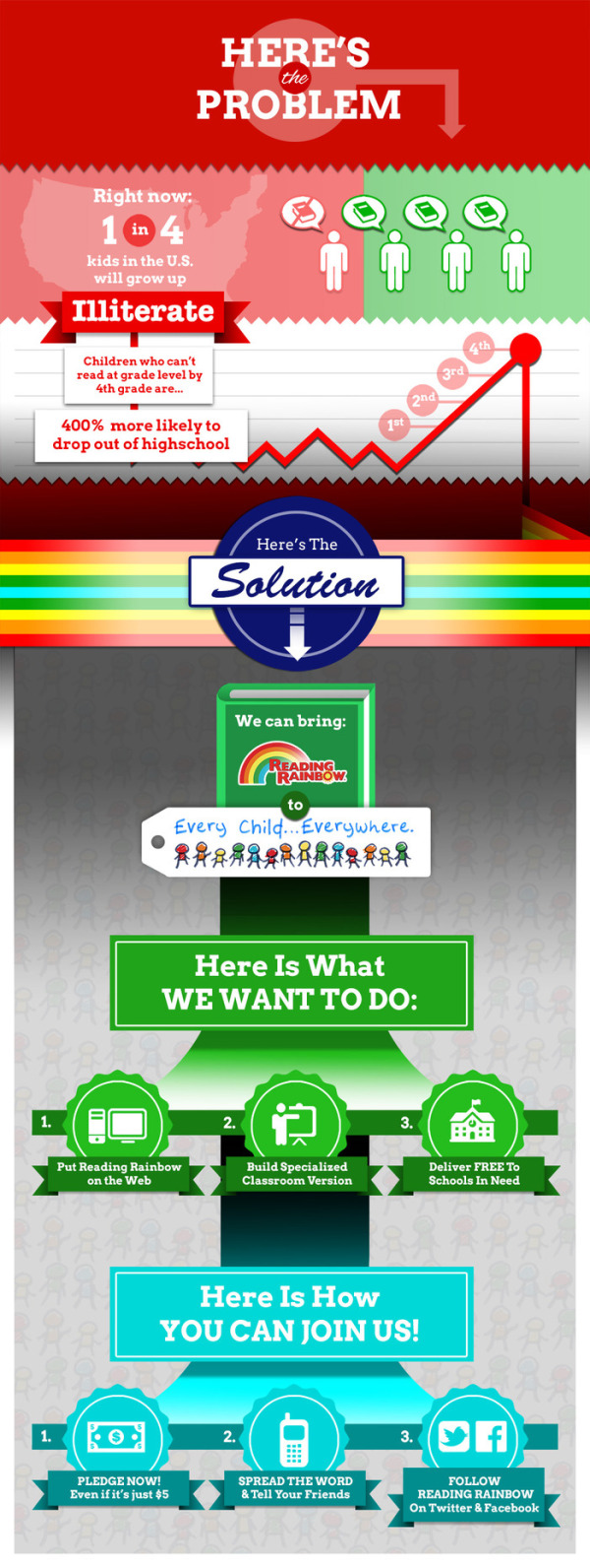
LeVar Burton has a fantastic Kickstarter project running to bring back Reading Rainbow to make it available on multiple internet connected platforms and free to classrooms in need.  The team is using multiple infographics to help explain the project and the support the funding campaign goal of raising $5,000,000.

Hi. LeVar Burton here. You may know me as Kunta Kinte, from ROOTS, or Geordi La Forge, from Star Trek: The Next Generation. 

You also may have grown up with me on Reading Rainbow. 

It was my mother who taught me that, by picking up a book, I could “go anywhere” and “be anything.” Ever since Reading Rainbow began in 1983, I have dedicated myself to fostering a love of reading in children, just as my mother did for me. 

Over the past year, I have watched Kickstarter bring communities together to support artists and inventors. Again and again, I have been inspired by watching like-minded people team up to accomplish impossible dreams, and to change the world. 

Now, I am hoping you will join me on my mission: to bring Reading Rainbow back for every child, everywhere.

The infographic design above could be improved with the knowledge that people may share the infographic image without the rest of the text and information from the kickstarter page.  It should be able to stand alone as an independent asset with a title, and the URL for readers to find their way back to the original infographic on the Kickstarter campaign landing page. 

The visualizations help make a huge amount of information about the project easily accessible and understandable to the audience.  Take for example this simple illustration of the platforms they would like to reach.  Visualizing the multiple devices and operating systems makes the goal super easy to understand.

Reading Rainbow's Kickstarter Project platforms

I think this is an incredibly worthy project, and I hope you join me in contributing:

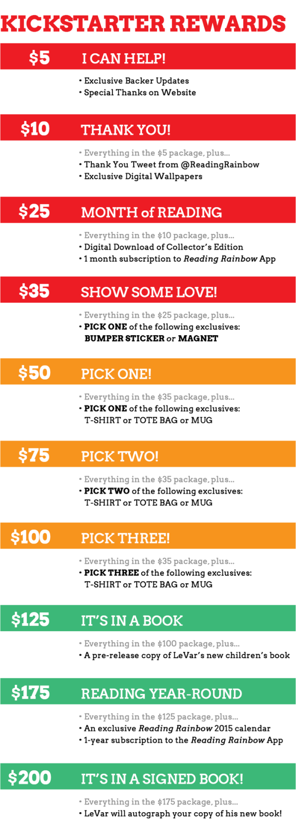
The way Kickstarter works, contributors at different gift amount levels can earn different types of swag merchandise and benefits.  This project is particularly complicated with 24 different funding levels with different swag.  Although mostly text, the visual lists of funding levels help potential contributors choose their amounts.  However, visualizing the swag and benefits with illustrations, icons or photos would have been more helpful.

Reading Rainbow's Kickstarter Project rewards

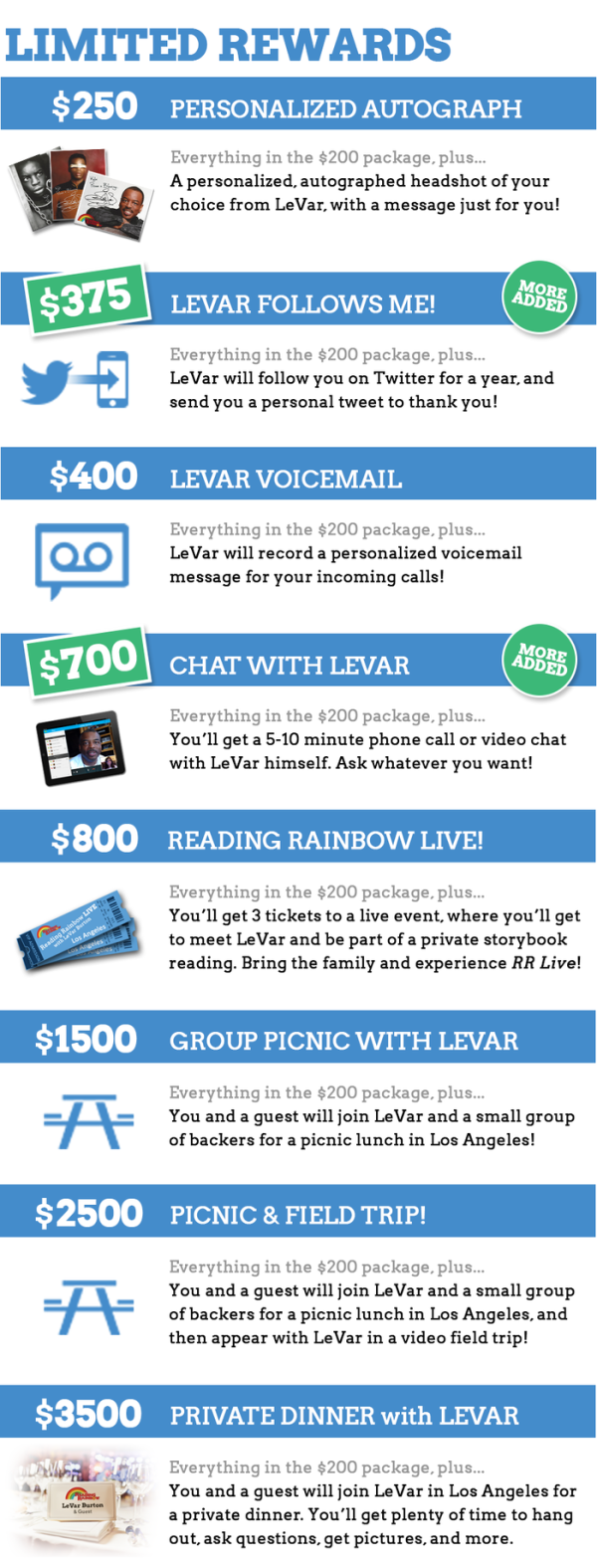
Infographics for the higher levels of contributions and rewards included images, but simple icons for bumper stickers and coffee mugs would make the first list easier to understand.

Reading Rainbow's Kickstarter Project Limited rewards

Infographics have helped make the campaign a huge success, and also made it easier for people to share through social media.

Monday
Jul152013

The Investfographic

Investfographic

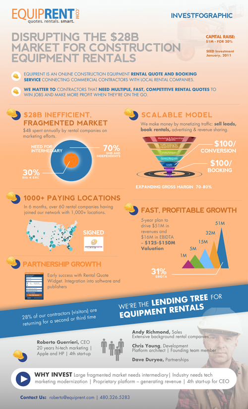
The Investfographic from EquipRent.com is the infographic they designed in-house to share with potential investors. Visual aids and infographics are becoming a valuable tool for companies to communicate with potential investors and shareholders.  Consider this to be a visual elevator pitch.

Using an “InvestFoGraphic” to raise capital

As a serial entrepreneur, I am always looking for an edge that makes a company standout and be noticed during capital raising times.

With the advent of new software tools like Prezi to boost your presentations, we decided to creatively put together a colorful investment infographic handout that completely complied with our goal of keeping our story concise, relevant, and exciting. The typical handout (1-page executive summary) that we had previously given VCs was heavy on words explaining in great detail what our company did and how successful we had been. This new graphic handout was riddled with bold and exciting claims about our company and our industry. The underlying theory behind using the infographic was to hook them first, grab their attention and then be ready to talk business. 

The exciting news is that we are now in final discussions with several investor groups to close our funding. We know the infographic wasn’t the main reason for getting to this final phase, but we do know that differentiating yourself makes you more memorable and shows investors you and your company plan on being different than the massess.

Remember the advice that the great Rod Stewart gave years ago:  Every picture tells a story, don’t it!

The team at EquipRent uses the design as a talking point at investor events.  They found it much easier to point out the visuals and discuss each point with their investors.  They shared with Cool Infographics, a few of the comments made by investors after seeing the design:

  • “I can quickly see what is different about this company than reading a typical one-page executive summary.”
  • “I have never seen anyone use an infographic for investor purposes,  other than to distinguish market trends.”
  • “Definitely sets you a part…like a cool and different resume.”

Thanks to Nate for sending in the link!

Monday
Jul082013

How Startup Funding Works

How Startup Funding Works infographic

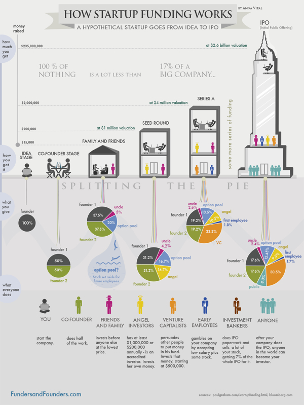
How Startup Funding Works from Funders and Founders co-founder Anna Vital does a great job of visualizing the split of equity at different stages of a company’s life.

A hypothetical startup will get about $15,000 from family and friends, about $200,000 from an angel investor three months later, and about $2 Million from a VC another six months later. If all goes well. See how funding works in this infographic:

Is dilution bad? No, because your pie is getting bigger with each investment. But, yes, dilution is bad, because you are losing control of your company. So what should you do? Take investment only when it is necessary. Only take money from people you respect. (There are other ways, like buying shares back from employees or the public, but that is further down the road.)

This is a great design that uses pie charts correctly and effectively!  This is in contrast to the many designs that use pie charts inappropriately.  This is a great example of a visual explanation that uses a combination of data visualization, illustration and text to tell a clear story.

The color coding is also effective, but for some reason they didn’t color the co-founder icon character green to match his portion of the pies.  The URL link to the original infographic landing page is also missing in the footer, so it makes it hard for readers to find the full-size original version when they see it posted on other sites.  People aren’t always good about creating links back to the original, so the URL should be included in the infographic image file itself.

Tuesday
Jun262012

Client: Avoid the Dip from IPO Lockups

Wealthfront Lockup Avoid the Dip infographic

Avoid the Dip: The Effect of Lockup on Stock Price is a new infographic InfoNewt designed for Wealthfront.

A flood tide of shares is hitting the market in May and June, as a number of the high-profile tech IPOs from the fall emerge from lockup periods, including Jive Software (JIVE), Zynga (ZNGA) and Angie’s List (ANGI).

If you’re one of the employees of the 28 companies whose lockups are expiring in May or June, you’re wondering how to diversify your portfolio and when to sell.

Here’s our research on the question of what to do in the days immediately following the lockup expiration, presented visually to help you see the dip that typically follows the end of the lockup.*

As valuable financial information to many employees of the tech companies going IPO this year, Wealthfront looked back at 254 prior technology company IPOs to chart “The Dip” that consistently have a price dip the first day after the Lockup ends.

Don’t understand what a Lockup is?  That’s explained in the infographic as well.

Thanks to the team at Wealthfront!

Thursday
May312012

How Draw Something Blew Up Without Blowing Up

How Draw Something Blew Up Without Blowing Up

Now here is a game for everyone! It doesn’t matter how well you can draw, you can just draw and laugh with your friends at your attempts! This app has become very popular and quite quickly, the How Draw Something Blew Up Without Blowing Up infographic from The Next Web (with help from Couchbase) charts the growing trendiness of this game.

Draw Something was downloaded 50 million times in 50 days. Users created billions of drawings, adding 3,000 new pictures every second. On March 21st, OMPOP, the company behind the game, was bought up by Zynga for more than $200 million. On the first weekend in April, I downloaded the game for my first time and was admittedly addicted for 72 hours.

Today, a company called Couchbase gave us the exclusive on an infographic that charts the app’s viral growth. In case you’ve not heard of Couchbase, it’s the platform that enabled the game to keep up with its NoSQL database technology — from 6 database servers to more than 90 — without a second of game downtime. That’s impressive.

The infographic below charts the amount of user data, drawings per second, number of servers used to keep the game up and going and the number of users over 8 weeks of the game’s mind-blowing growth. The only question now is, will the game’s addictive nature keep fans or will they get over it as quickly as I have?

Intended as a quick summary of Draw Something’s growth, and Couchbase’s success in supporting their database expansion needs, this infographic does a good job.  Simple, easy-to-understand visuals, and use of some hand-sketch illustrations to reinforce how Draw Something works.

Some visualizations in the Billions of Drawings section would have been nice to communicate the immense scale of the growth numbers.  Most readers don’t truly grasp the difference between 10 million and 2 billion by just reading the text numbers.

Wednesday
Apr182012

Where the Startup Jobs are

Where the Startup Jobs are infographic from StartUphire.com aims to help raise awareness of the lack of qualified people filling technical positions in startups.

StartUpHire, with support from the National Venture Capital Association, is releasing a new infographic today depicting 2011 hiring data for startups.  What’s the biggest take away? While most of the country is still sluggish on job creation, startups face the opposite problem- a glut of open technical jobs.

36 percent of all open jobs at startups last year were engineering or technical jobs. However, those two sectors saw only 15 percent of the overall applicant pool trying to fill those positions.  This supports evidence of an ever-tightening market for specific skills out there, and the need to keep developing and attracting qualified talent to young startup companies remains critical.

I think if the country wants to know who holds the best hope for meaningful economic growth, we need look no further than our own home grown, innovative, and passionate startup ecosystem.

This is an interesting story to tell, and an infographic is a great way to do it.  In a down economy with higher unemployment, there are certain job sectors that still aren’t getting enough qualified candidates!

Obviously, everyone assumes there are startup jobs in California (in Silicon Valley), but the map clearly shows startup positions that have been filled across the country.  Visually, the size of the state callout boxes and text seems to imply how big the numbers or for each state; however, that’s not the case and it’s misleading the reader.  Massachusetts had a higher number of job posts than Texas, but the callout text is much smaller.

The circle sizes in Job Posts by Industry appear accurate, which is where many designs make mistakes.  I also like the Areas of Expertise chart, and how the positions are arranged along the X-axis in order of the disparity between open positions and the number of applicants.  That conveys an additional level of information to the reader.

I was disappointed to see the last couple of statistics in the design didn’t get the data visualization treatment.  Show a visualization of 27% and give the 502 number some visual context to show how big that number actually is.  The URL for the original infographic is included at the bottom, but there should also be a copyright statement in the design.

Thanks to Robin for sending in the link!

Friday
Mar092012

Rock of Ages: The Evolution of SxSW

Rock of Ages: The Evolution of SxSW from Music Festival to Interactive Launch Pad is a new infographic from Rocksauce Studios just in time for SxSW 2012 this weekend.

Since 1987, SXSW has morphed into an interactive, film and music conference and festival that brought together 19,364 attendees in 2011.

Austin-based app development firm, Rocksauce Studios, has created an infographic that dissects the interactive portion of SXSW, and proves why this conference is the new popular techie playground.  

The topics and cited statistics covered in “The Evolution of SXSW from Music Festival to Interactive Launch Pad” include:

- History of SXSW
- 2011 Attendance Demographics
- Top 10 Types of Business of Interactive Registrants  
- Geographic Breakdown of Total Interactive Registrants
- Successful SXSW Startup Launches
- Recent SXSW Web Awards  / Interactive Awards Winners
- Reasons So Many Companies Chose to Launch at SXSW
- The Accelerator

You can read more about the development of the infographic on Silicon Angle

This design does a really good job with the visual basics.  Showing the icons/logos of the startup companies, illustrating the business types, mapping the conference registrants. The overall design tells a good story top-to-bottom to the readers, and it’s easy to follow the flow of information.

Three things stood out to me that could be improved:

  • There are a lot of data values in the text of the timeline that should have been visualized.
  • The three shapes showing the amount of Interactive Conference Participants, Conference Sessions and Interactive Media in Attendance all of different values, but the shapes are not sized to match those values.
  • The last section “The Accelerator” seems to fall apart as all text, even though there are some good data values there that should have been visualized.

Thanks to Kelly for sending in the link!