About
Randy Krum
President of InfoNewt.
Data Visualization and Infographic Design

Infographic Design

Infographics Design | Presentations
Consulting | Data Visualizations

DFW DataViz Meetup

Join the DFW Data Visualization and Infographics Meetup Group if you're in the Dallas/Fort Worth area!

Search the Cool Infographics site

Custom Search

Subscriptions:


Feedburner

The Cool Infographics® Gallery:

How to add the
Cool Infographics button to your:

Cool Infographics iOS icon

- iPhone
- iPad
- iPod Touch


Read on Flipboard for iPad and iPhone

Featured in the Tech & Science category

Flipboard icon

Twitter Feed
From the Bookstore

Caffeine Poster

The Caffeine Poster infographic

Entries in map (184)

Friday
Sep142018

Visualization of Hurricane Florence's Path

Harry Stevens from Axios created a simple but great visualization of Why Hurricane Florence is so unusual — and so dangerous. The DataViz shows what makes the path of Hurricane Florence different than all of the past major hurricanes to hit the Carolinias.

Tuesday
Sep042018

Extremely Detailed 2016 Election Map

The New York Times has published An Extremely Detailed Map of the 2016 Election, and it's fascinating to explore! 

Their full article, Political Bubbles and Hidden Diversity: Highlights From a Very Detailed Map of the 2016 Election, examines some of the more interesting patterns, insights and inconsistencies.

The election results most readers are familiar with are county maps like the ones we produce at The Times on election night. But votes are cast at a much finer unit of geography — in precincts, which may contain thousands of voters but in some cases contain only a handful. Our previous election maps contained results for about 3,100 counties; here we show results for more than 168,000 voting precincts.

The interactivity is really well done, made possible through the integration with MapBox, and you can zoom in to view the data down to the smallest voting precincts. Pop-up information will tell you the exact number of votes at the precinct level.

Here's an animated journey (accelerated) around the country to 14 major cities:

Tuesday
Aug212018

How America Uses its Land

Here's How America Uses its Land infographic

America's land use is very diverse and scattered throughout the states. By using surveys, satellite images and categorizations the U.S. Department of Agriculture divides the U.S. into six major types of land. Bloomberg took that data, and created the How America Uses its Land infographics. The infographics use the map to show both how much of the country is made up of a certain land use, and where the majority of it is located.

Using surveys, satellite images and categorizations from various government agencies, the U.S. Department of Agriculture divides the U.S. into six major types of land. The data can’t be pinpointed to a city block—each square on the map represents 250,000 acres of land. But piecing the data together state-by-state can give a general sense of how U.S. land is used.

Gathered together, cropland would take up more than a fifth of the 48 contiguous states. Pasture and rangeland would cover most of the Western U.S., and all of the country’s cities and towns would fit neatly in the Northeast.


Found on https://5wvelascoblog.com

Tuesday
Oct032017

SwissLeaks: the map of the globalized tax evasion

SwissLeaks: the map of the globalized tax evasion infographic


SwissLeaks: the map of the globalized tax evasion infographic from Martin Grandjean shows the countries that were affected the most by the HSBC "Swiss Leaks" data.

HSBC “Swiss Leaks” data shared by the International Consortium of Investigative Journalists reflect the globalization of tax evasion. While billions of dollars are inconceivable, mapping the origin of bank account holders allows an overview. This map is only a small contribution to the understanding of the Swiss Leaks data.

Why this map?

This map does voluntary not strictly stick to the geographical reality. It is a response to too many maps published in the media these days that are made unreadable by regrettable graphic choices: top-ten limited, overlapping points, colored territories (small countries and islands disappear), etc.

What does it show?

The number of affected countries and their diversity is very important. Note the strong presence of the Caribbean. In proportion to their population, South and East Asia are very poorly represented, while the Middle East is over-represented. The strong presence of “tax havens” is explained by the use of intermediates by the holders of bank accounts.

A great example of using the area of the squares to represent the amounts.

Created by Martin Grandjean

Wednesday
Aug092017

Landslide for the "Did Not Vote" Candidate in the 2016 Election!

From BrilliantMaps, this is the Did Not Vote Election Map, showing the magnitude if all voting-eligible adults that did not actively vote in the 2016 Presidential election. A Presidential candidate needs 270 Electoral College votes to win. The "Did Not Vote" candidate would have have gathered 41% of the total votes from the voting eligible population, and 471 votes from the Electoral College! A Landslide!

The map above shows what the 2016 US Presidential Election results would have been if votes not cast for Hillary, Trump or one of the third party candidates had gone to fictional candidate “Did Not Vote.”

 As a percentage of eligible voters, Clinton received 28.43% (65,845,063) of all votes compared to Trump’s 27.20% (62,980,160) and Did Not Vote’s 44.37%(102,731,399).

Total voter turnout was estimated to be 55.3% of the voting age population and 59.0% of the voting eligible population.

Map created using 270 To Win, based on reddit user Taillesskangaru’s posts here and updated here.

Disclaimer: The map above was accurate as of January 17th, 2017. Totals below were true at the time of writing but may no longer currently be accurate as additional votes and recounts are conducted.

Thanks to Mike Wirth for sharing on Facebook!

Monday
Mar202017

What 770,000 Tubes of Saliva Reveal About America

Yep, it's a Map of America’s Diversity using the genetic data from the analysis of saliva samples. Ancestry.com gathed the data from 770,000 salva samples.

This unique map shows this country’s great migrations, the echoes of our pioneer ancestors in our genes today.

Each color on the map represents a present-day community of individuals tied together through their genetics. And the location of the dots show where each community’s ancestors lived over generations.

People moved east to west, less so north to south. See how the differently colored clusters form distinct horizontal bands? The red, blue, purple, and green dots fan out from right to left. This pattern means DNA confirms the descendants of immigrants to the East Coast moved westward.

While people certainly moved back and forth from the north to south as well, if people had moved in the same volume from north to south, you’d see the bands fanning downward and not just from east to west.

But instead you can see powerful forces pushed people westward, even showing that the Mason-Dixon line separates some of the clusters.

Catherine Ball, chief scientific officer at Ancestry and the leader of the study, commented to Wired“I have to admit I was surprised by that. This political boundary had the same effect as what you’d expect from a huge desert or mountain range.”

And not only can you clearly see the migration patterns westward, you can also see distinct communities of immigrants and their descendants.

Maps were generated with the maps R package using data from the Natural Earth Project (1:50 m world map, version 2.0). These data are made available in the public domain (Creative Commons CC0).

Also from the original study:


Monday
Jan092017

Navigating The Agile Landscape

Navigating The Agile Landscape infographic

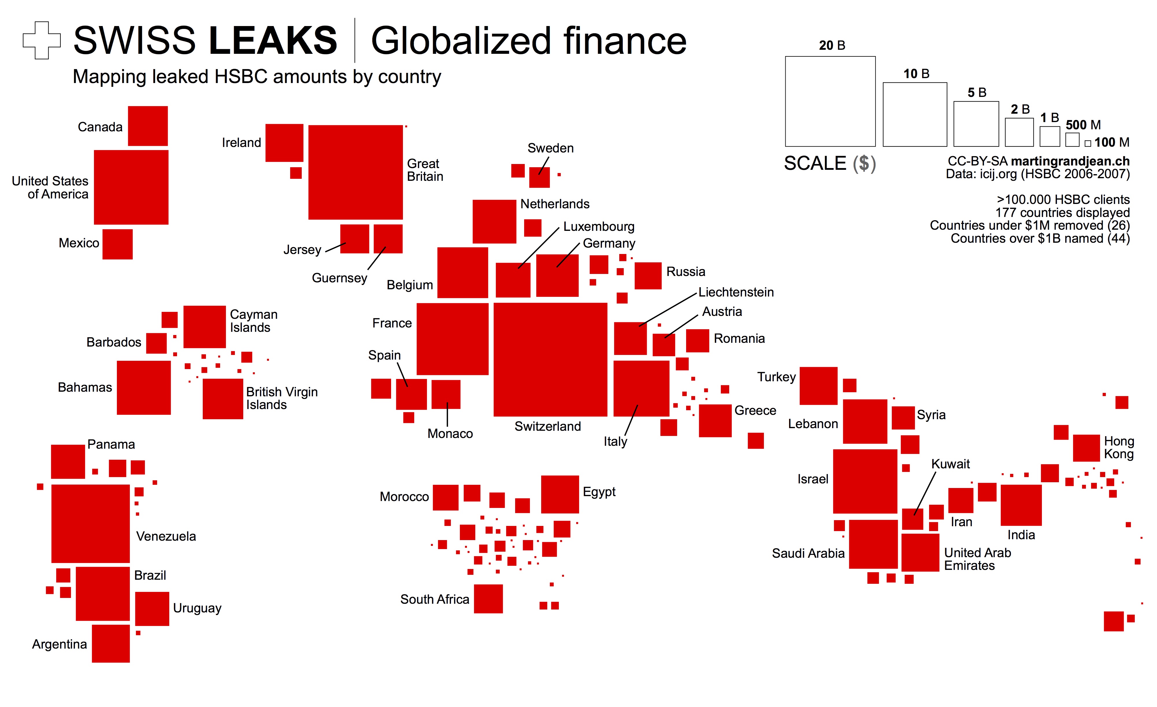
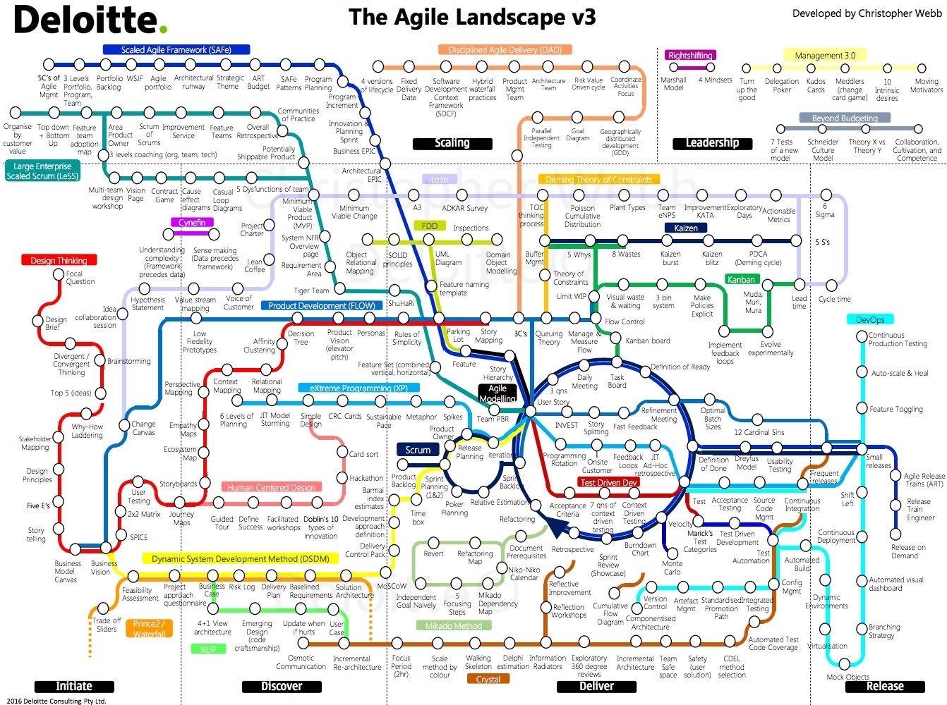
The Agile Landscape v3 is a visualization of many of the methodologies within the Agile Process by Chris Webb from Deloitte that uses the visualization design style of a subway map to group related activites and the show connections. Chris posted a longer description of the design on the Deloitte blog: Navigating the Agile Landscape

Chris Webb:

Being Agile isn’t as simple as following one single methodology. In fact, Agile encompasses a number of different practices and frameworks, often referred to as “the Agile umbrella.” For an organisation to be successful in adopting Agile ways of working, it requires the right technique/method to be used to address the problem or need.

Given there are so many different Agile frameworks, a challenge many organisations or individuals face is deciding which framework to use and in which context. In this post, we use an analogy to help bring some light to this.

We like to conceptualise Agile as a highly interconnected landscape of practices transporting ideas across zones to value. There is no perfect starting point, nor an express line or a direct route suiting all conditions.We’ll leave you to explore the Agile Landscape, and leave you with this:

Do not be afraid to try, learn and adapt practices to your situation. The truth is, no one framework is better than another. Although when it is contextually applied, a framework or selection of practices from multiple frameworks will be best suited.

We are continuously evolving this view to include new practices and ways of working. If you see a framework that is missing and would like to see it added to this view, or if you would like a larger version of the Agile landscape please reach out at chwebb@deloitte.com.au

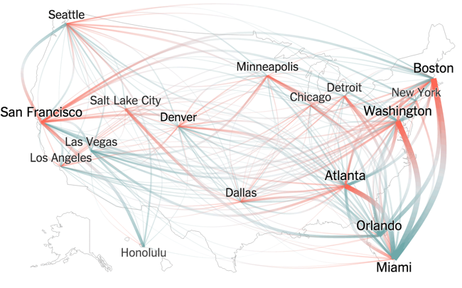
I often teach students to experiment by mixing different data visualization methods with different kinds of data, and good designs like this are often the result.

My criticism of the design would be that the overall feel is way too complicated because many of the paths have unnecessry curves and loops to fit within the constraint of a 4:3 aspect ratio of a presentation slide. The design would be easier to understand and appear more elegant if the paths were staightened out. This would make a larger design, but viewing online or using a 16:9 presentation slide would eliminate the constraint.

Thursday
Dec012016

Thanksgiving Flight Patterns

Thanksgiving Flight Patterns is a cool animated, interactive data visualization from the NY Times TheUpshot that looks at where people traveled to for the Thanksgiving holiday last week. On the interactive version on the NY Times site, you can hover over any included city to see only those connections. There was a huge surge of people headed to Florida!

Thanksgiving is known as a time to return home to family, with the holiday calling to mind images of grandmother’s house. But for many Americans, it’s also now a chance to go on vacation.

This week, Florida will see a surge in the number of people arriving by plane. Las Vegas is another popular destination. Much more than is commonly realized, Thanksgiving is a time to seek out sun (and gambling), in addition to (or possibly instead of) catching up with loved ones.

These conclusions emerge from The Upshot’s analysis of search data from Google Flights. In all, more than 3.6 million Americans — or slightly more than 1 percent of the country’s population — are expected to take a flight for Thanksgiving.

I really like the design choice to change the colors at both ends of each line. It really helps to see the traffic departing a city in comparison to the traffic arriving. 

I think the animation of the dots moving along the flight paths in the interactive version was unnecessary.

Monday
Nov072016

Visual History of US Population

Nathan Yau from FlowingData has created a cool, new animated data visualization, Two Centuries of Population, Animated. The visualization shows the growth and spread of 

You’ve likely seen the population density map of the United States in one form or another. A lot of people per square mile reside in big cities, fewer people reside in suburban areas, and a lot fewer people reside in rural areas. Cities weren’t always cities though. Rural wasn’t always rural. If you look at people per square mile over a couple of centuries, you get a better idea of how the country developed.

The animated map above shows population density by decade, going back to 1790 and up to recent estimates for 2015. The time in between each time period represents a smoothed transition. This is approximate, but it gives a better idea of how the distribution of population changed.

Nerd Notes:


  • Nathan used R to generate the maps and FFmpeg to string the images into a video.
  • Data are originally from the Census Bureau but made much more accessible by NHGIS.


Thursday
Sep292016

Visualizing the Fortune 500

Visualizing the Fortune 500 interactive data visualization

Visualizing the Fortune 500 is an experiment by the team at Fortune magazine. This is an interactive data visualization site that shows the location of each company's headquarters and the size of the circle represents the company's annual revenue.

People visit and revisit the Fortune 500 for lots of reasons, chief among them: job prospects, sales leads, corporate research and investor information. And bragging rights, of course. Below are two visualizations that allow you to explore the Fortune 500. On the map you'll find every one of the U.S. headquarters from the 2016 list, on the line chart below it, you'll see how each of the companies on the 2016 list has moved through the ranks for the past 20 years.

They also show an interactive visualization of how the companies have moved through the ranks over the last 20 year history of the Fortune 500.

Designed by Nicolas Rapp, using map tiles from Stamen Design.