About
Randy Krum
President of InfoNewt.
Data Visualization and Infographic Design

Infographic Design

Infographics Design | Presentations
Consulting | Data Visualizations

DFW DataViz Meetup

Join the DFW Data Visualization and Infographics Meetup Group if you're in the Dallas/Fort Worth area!

Search the Cool Infographics site

Custom Search

Subscriptions:


Feedburner

The Cool Infographics® Gallery:

How to add the
Cool Infographics button to your:

Cool Infographics iOS icon

- iPhone
- iPad
- iPod Touch


Read on Flipboard for iPad and iPhone

Featured in the Tech & Science category

Flipboard icon

Twitter Feed
From the Bookstore

Caffeine Poster

The Caffeine Poster infographic

Entries in interface (67)

Thursday
Jun242010

Adobe Actionscript 3.0 Poster Viewer

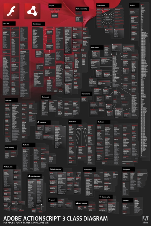
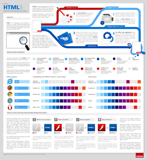
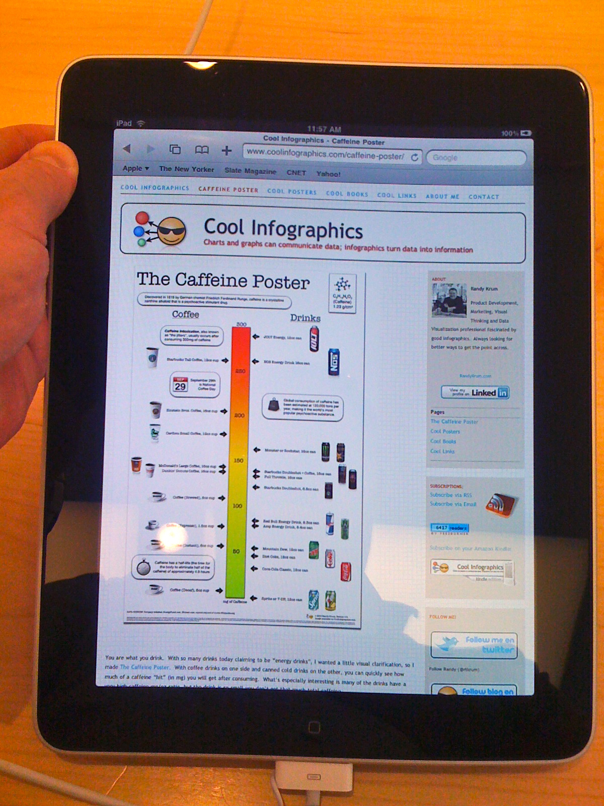
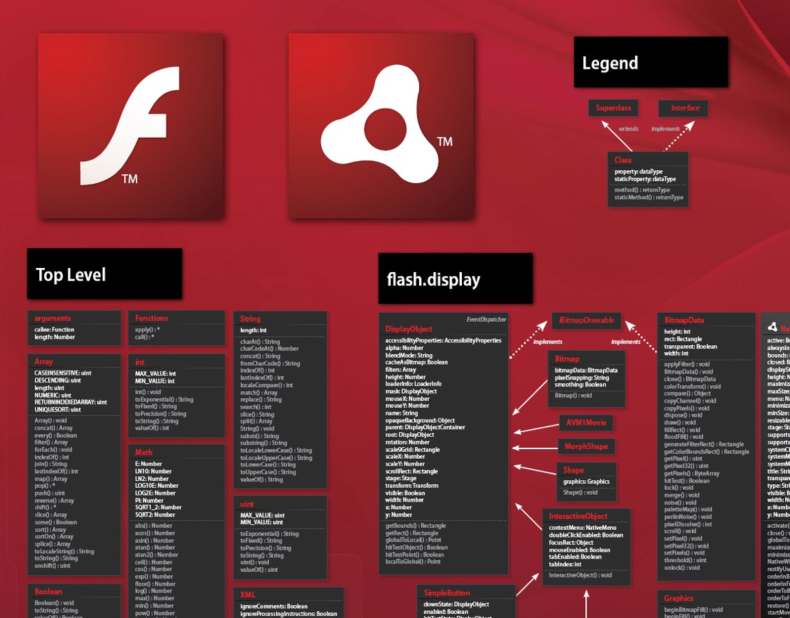
Adobe has published posters like this one before for registered users of their different software packages.  Now you can download the ActionScript 3.0 Diagram Viewer, a zoomable version using Adobe AIR.  This can keep a stand-alone viewer on your desktop (or 2nd monitor) as a reference when you need it.  For some developers, this may be easier than viewing the high-resolution JPG.

With the excellent feature from Zoomify, and the nicely laid out AS 3.0 posters, you are able to zoom and navigate through the entire Flash and Adobe® AIR™ ActionScript 3.0 API.

The AIR app was designed by ShaneHoffa.

Thanks to Julz for the link!

Thursday
Jun242010

Google's History of Communication Infographic

Google posted this infographic, A Modern History of Human Communication, on the Official Google Mobile Blog as part of their opening up the Google Voice service to everyone.  It’s no longer an invite-only service.

To put things in context, we created this infographic to visualize some recent history of human communication and how Google Voice uses the web to help people communicate in more ways than ever before (click the image for a larger version):


Tuesday
Jun082010

WTF is HTML5 and Why Should We Care? (infographic)

From Focus.com, WTF is HTML5 is a cool visual explanation of HTML5, how supported it is by different browsers and how it compares to Adobe Flash.

From an infographic design view, I don’t like the legend for the color codes in the browser matrix.  I shouldn’t have to look back and forth to figure out what feature is missing from a particular browser.

Thursday
Jun032010

Cool Infographics on an iPad at the Apple Store

At the Southlake Apple Store

I was at the Southlake Apple Store today because the battery in my Black MacBook was dying.  In fact, it was swelling up, getting extremely hot and randomly shutting the MacBook down.  That was a problem.  The laptop is 3 1/2 years old, which it puts it 2 years beyond the AppleCare warranty, so I had to buy a new battery.  The Apple genius told me that usually this type of battery last 260 cycles, and mine had lasted 484 cycles.  Not bad.

While I was there, I had to play with one of the new iPads, and of course had to make sure that Cool Infographics was displaying correctly.  Not only was it displaying correctly, but the display on the iPad makes the blog look amazing!

Here’s how to setup an icon on your iPad, iPhone or iPod Touch for the Cool Infographics blog: (screen shots from my iPhone)


Step 1:

View CoolInfographics.com in the Safari app and press the “+” icon at the bottom of the screen.


Step 2:

Press the “Add to Home Screen” button.


Step 3:

Edit the name you want to display, and press “Add”.  (The icon is loaded automatically)


That’s it!  You can move the icon to any of your screens, and always have easy access to the Cool Infographics blog.


Wednesday
Mar102010

What Do You Suggest? A Visual Search Interface

Using a mindmap-style visual interface, WhatDoYouSuggest.com shows you the search results from Google in an easy-to-use interface.  Created by Simon Elvery, the interface returns the top words that Google suggests based on your initial query.  By clicking on the relevant words, the search becomes more relevant, and more words are suggested to narrow your search.

Both the order of words and the thickness of the lines are meaningful.  More detailed information is available on the Simon’s blog.


What Do You Suggest takes a seed from you (or gives you something random) then guides you on a journey through language and the collective lives of Google users.

Using data from Google to make suggetions on where you might like to go next, What Do You Suggest is an experimental and interactive environment designed to explore how we use language and search on the internet.

  • The words that appear first in each set of options are the words Google thinks are most likely to be what people are looking for.
  • The words joined by the thickest lines are ones which will produce the most results if you searched for them on Google.


Of course, I had try see what “infographics” cam up with…

Found on Information Aesthetics and Gizmodo.


Friday
Feb122010

101 Muppets of Sesame Street infographic

Mahna Mahna!  Not always about using new programming languages to plot massive amounts of data, infographics can be fun too.  From the National Post comes the 101 Muppets from Sesame Street.  Who would want to read a boring Cast of Characters list.  Visualizing the information is what makes it fun as you try to recognize some of the more obscure characters.

The muppet who sings Mahna Mahna is in there, can you find him?

Some Muppet faces are more familiar than others, so here’s a handy guide to some of our favorites in celebration of Sesame Street’s 40th year on the air!

In celebration of Sesame Street’s 40th season, Steve Murray created this visual of 101 of the most used characters over the years using data from muppet.wikia.com.  The infographic was made interactive with the help of Rebecca Yanovskaya, so when you mouse over any muppet you get a popup with their name and a little history.

Don’t forget to check out the new Muppet videos on the MuppetsStudio channel on YouTube!

Thursday
Feb112010

Tableau launches FREE Tableau Public today!


Today, Tableau Software launched a data visualization package for websites called Tableau Public.  This package is intended to be used be anyone with a website to embed visualizations on their own sites.

Tableau Software today launched a new product that brings public data to life on the web. Tableau Public, available for free, lets anyone who posts content to the web easily create interactive visualizations and publish them to blogs, web sites, Twitter feeds or anywhere online. Instead of viewing static charts or tables, Tableau Public lets people answer questions and share data interactively on the web. 

The visual above was created using Tableau Public to demonstrate its capabilities, but you’ll notice that I’ve been able to embed it here on Cool Infographics as well.  The visualizations created allow users to share, embed and link to your graphics from anywhere…making them social!

They’re also interactive and linked together.  For example, click on the Bronx in the data above, and all of the visuals will highlight just data related to the Bronx.  The map even adjusts to only focus on the Bronx.

About the NY City Graffiti visual:

Looking borough by precinct across The Big Apple, one can quickly see that there are some differences in how graffiti is handled. For instance, Staten Island has very little graffiti, but the graffiti they do have lingers without cleanup for almost twice the citywide average. On the other side of the spectrum, Manhattan has over 2000 incidents of graffiti, but it is cleaned up in less than 17 days on average.

Look for more features from Tableua Public here in the future as I experiement and play with it.

Thanks to Elissa at Tableau Software for the link and information!


EDIT:  Here’s a news video as part of the announcement.  Thanks Adriana!

Thursday
Jan282010

Circular Browser Statistics using Axiis

Michael VanDaniker posted this Historical Browser Statistics visual as part of the launch of Axiis, including the detail about what it took to develop this visual.  At its root, this is a timeline that starts at the center (January 2002) and works outward to the outer ring that represents the most recent time slice (August 2009).  Each ring is a stacked bar showing the portion of browser usage.

Each of the concentric rings are essentially pie charts showing the percentage of visitors using each browser for a particular time slice, starting with January 2002 in the center and working out to August 2009.  The numbers on W3schools.com don’t quite add up to 100% because they don’t report on browsers that make up less than 0.5% of their visitors.  This results in a gap at the end of each ring.

I don’t know much about Axiis (yet…), but its a new, open source framework for data visualizations.

Thanks to Les (@lesjames on Twitter) for the link!

Thursday
Jan142010

The British History Visual Timeline


The BBC has put up a great interactive, visual British History Timeline.  Each dot represents a signnificant event.  Clicking a color “era” zooms the timeline to just that time period.

Mousing over the individual dots shows the specific event details and timing.


You can also select a particular region of the UK, or search for a specific year or keyword.

Wednesday
Jan062010

Digital Podge 09 - Fantastic infographic website design

A fantastic, infographic website design for Digital Podge 2009.  Digital Podge is an annual, invitation-only lunch in London, UK for only 160 invitees.  The 2009 event was held on December 19th, and since the invite list was fixed at 160, a number of the infographics deal with data about the attendees.  Each attendee has a bar beneath their photo indicating how many connections they have on LinkedIN.

The About page shows a map of where the attendees traveled from to get to the event.

The Menu page show a breakdown of the lunch entree selections made by the attendees.

The Where? page is interactive, allowing the user to add or remove layers to the map that can show restaurants, bus stops, subway stations, parks, etc.

Designed by London digital agency Line, the site employs simple infographics with a touch of tongue-in-cheek humor.

“While simply being invited to Digital Podge is a huge honour in itself, being tasked with developing and carry out all the campaign touch points for the event is an exercise that holds the agency up to the scrutiny of its peers like no other project. It’s probably one of the most demanding briefs in the sector, but our team of designers and developers revelled in the opportunity to use data in a humorous and informative manner that highlights some of the plusses and minuses of a cutting edge industry,” said Ross Laurie, Managing Director at Line.