About
Randy Krum
President of InfoNewt.
Data Visualization and Infographic Design

Infographic Design

Infographics Design | Presentations
Consulting | Data Visualizations

DFW DataViz Meetup

Join the DFW Data Visualization and Infographics Meetup Group if you're in the Dallas/Fort Worth area!

Search the Cool Infographics site

Custom Search

Subscriptions:


Feedburner

The Cool Infographics® Gallery:

How to add the
Cool Infographics button to your:

Cool Infographics iOS icon

- iPhone
- iPad
- iPod Touch


Read on Flipboard for iPad and iPhone

Featured in the Tech & Science category

Flipboard icon

Twitter Feed
From the Bookstore

Caffeine Poster

The Caffeine Poster infographic

Entries in comparison (73)

Wednesday
Nov282018

What Will Kill You in 2040

What Will Kill You in 2040 infographic

What Will Kill You in 2040 infographic takes the top 20 reasons for death in 2016 and compares them to the predicted top 20 reasons for death in 2040. The top 3 aren't predicted to change, however the rest are all over the board!

The infographic was created by Radio Free Europe Radio Liberty. Their source of information came from an article published in The Lancet (a peer-reviewed general medical journal) called Forecasting life expectancy, years of life lost, and all-cause and cause-specific mortality for 250 causes of death: reference and alternative scenarios for 2016-40 for 195 countries and territories. That's a mouth-full for a title!

The orthogonal lines are hard to follow. Straight lines would have turned this into a slope graph, and made it easier to see which causes of death were increasing or decreasing. Categorizing the causes of death into 3 different categories and color coding them really helps break up the text and makes it a little easier to follow the arrows.

Found on Radio Free Europe

Monday
Sep112017

The Super Skin of Superheroes 

The Super Skin of Superheroes infographic is a fun chart showing the different skin of America's comic book heroes. Some are completely invulnerable, while others are just armored. The real uniqueness of the infographic though, is that is was created by Mcdermatology.com a company that is just really into skin. Talk about making a fun connection between your profession and comics!

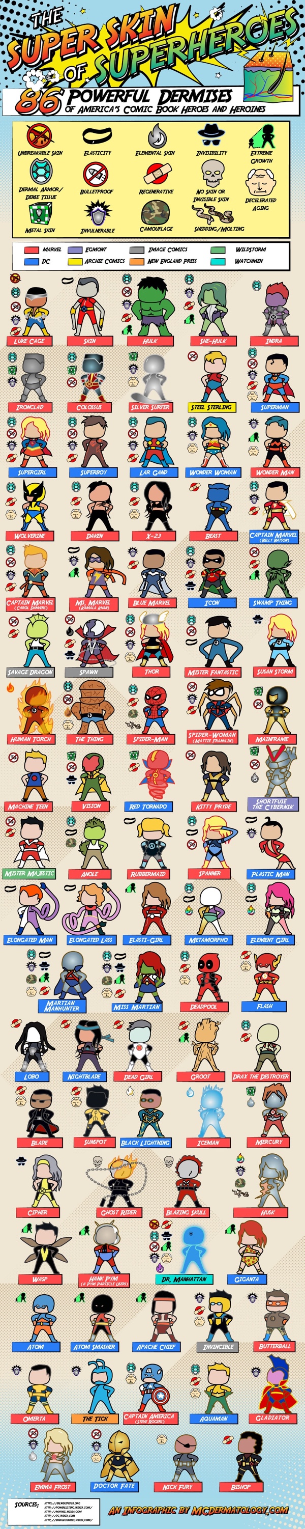
If only our dermises could be invulnerable, unbreakable, elastic, metal, or ... better yet, acne free! (It might not be one of the most well-known superhero powers, but have you ever seen Superman with pimples?) Our list of superheros and their powers contains the specific abilities of the most important organ of the body: the skin! Comic-book heroes with naturally or supernaturally enhanced skin can change color, grow to building-sized heights, go invisible, or just take the beating that so many super-powered humans have to deal with when taking down bad guys. From X-Men to Marvel movie favorites like Captain America to DC heroes like Wonder Woman, here are the top super-powered dermises of the comic-book world!  

Nerdist.com wrote the article below about the infographic

“Who’s tougher: Superman or the Hulk?” remains the playground question of the ages, right alongside “Who’s stronger: my dad or your dad?” Of course, in comic books (and now, comic book movies), superhero toughness is measured in different ways.

The aforementioned Superman and Hulk literally have invulnerable skin, where someone like Wolverine gives the appearance of being invulnerable due to his healing factor and metal skeleton. Then there are heroes like Iceman and Colossus, who create external skins for themselves that act as a kind of armor, but underneath all that get paper cuts just like the rest of us.

Thankfully, all of us superhero devotees now have this handy infographic chart, created by McDermatology.com, to show the differences in the tough hides of almost every major superhero. Called “The Super Skin of Superheroes: 86 Powerful Dermises of America’s Comic Book Heroes and Heroines,” this chart shows us the different ways characters from DC Comics, Marvel, Image and more are able to get beat up over and over again and pretty much never show a scratch.

There are some curious inclusions and omissions on this chart, however. For example, there are a ton of minor X-Men characters that you’ve probably never heard of, and yet there are no Green Lanterns on the list. Surely a Lantern’s ring-created external force field counts as a second skin as much as Iceman’s ice skin, right? And I’ve been reading Marvel Comics my whole life, and even I had to look up who the heck Machine Teen even was. Nevertheless, this is a fun and well made little chart that is pretty darn accurate.


Found on Nerdist.com

Wednesday
Jul192017

Disney Live Action Movies: Best (And Worst)

Disney Live Action Movies: Best (And Worst) infographic

The Disney Dollars infographic from FUN.com compares the total box office revenue for all of Disney's live action movie franchises.

Disney live action films have a long history of wonderful stories, memorable characters, and some big (and by big we mean humongous) box office wins. While the company started in 1923 in animation, quite successfully, they didn’t start making 100% live-action films until the 1950s. Just like the animated films, it didn’t take them long to create a classic (or two or three or four). Remember the frightening steam-punk fantasy of 20,000 Leagues Under the Sea, or the whimsical world of Mary Poppins, or the three-dimensional wizardry of Tron? Even those classics can’t compare to the sheer box office juggernauts of the past two decades. Disney owned the blockbuster with Pirates of the Caribbean, the remakes like Alice in Wonderland and Cinderella, and who could let the holidays go by without a viewing of The Santa Clause…. Of course, with so many films being made, there have been some box office clunkers, as well. Poor Tomorrowland…

This infographic tracks all the live action films that made the top Disney dollar, and lost plenty of Disney dollars, as well.

I understand the overall bar chart design, with bars for the total of each franchise. However, the breakdown of the movies included in each franchise doesn't the distribution of each movies contribution correctly. those are just equal rectangles that span the width of the infographic.  The individual movies should visually show their contribution proportional to the total!

I don't like the scale cheat for the Pirates of the Caribbean franchise. Visually it misleads readers since the franchise has earned almost four times the revenue as the Narnia series.

Also, the length of the Narnia bar is just plain WRONG! Based on the data and the descending order it's supposed to be longer than the Alice in Wonderland bar.

Tuesday
Jul112017

Fictional Travel Times Compared

Fictional Travel Times Compared Infographic

The Fictional Travel Times infographic from TravelMath compares the speeds from many fictional characters and vehicles from comics, TV and movies.

The universe is a big place – being faster than a speeding bullet is a crawling pace when it comes to interplanetary travel. Science fiction authors have needed to bend the laws of physics to create engines that are capable of going faster than light in order to complete these journeys in any reasonable amount of time. For this reason, there are a handful of superheroes who can travel faster than light, and in some cases, back in time.

See how your favorite superheroes and ships stacked up below, and read our methodology at the end to learn more about the science behind these fictional travel times.

What's your opinion on using Log scales in infographics?

Personally, I don't think enough people are data visualizaiton literate enough to visually understand log scales. Many readers will not understand why the bars don't seem to match the numbers, or won't read the numbers and assume the length of the bars is linear.

Thoughts?

Found on CBR.com

Wednesday
Aug172016

The Fastest Men in the Olympics Since 1896

The Fastest Men in the Olympics Since 1896

To put Usain Bolt's 3rd consecutive Olympic Gold Medal for the 100m dash into perspective, the NY Times designed this great graphic showing Usain Bolt and the Fastest Men in the World Since 1896 – on the Same Track.

Usain Bolt’s historic third consecutive gold medal in the men’s 100-meter dash cemented his status as history’s greatest sprinter and the world’s fastest man. He edged out Justin Gatlin, an American, and Andre De Grasse, a Canadian, on his way to the gold.

But how does Bolt compare to the full Olympic field in the 100-meter dash – not just this year, but against every Olympic medalist since 1896? To answer that question, we created a massive (and imaginary) track with 88 lanes – one for every medal awarded in the 100-meter dash in the modern Olympics.

We then pitted these runners against each other in an imaginary race, using their average speeds. We froze all the runners at the moment the winner crossed the finish line.

This is an update to the same graphic they created in 2012 when he broke his own World Record. The 2012 piece also included this great infographic video explaining the significance of his win:

Found on FlowingData

Tuesday
Aug092016

Comparing Presidential Election Forecasts

Comparing Presidential Election Forecasts

In addition to their own forecast, the NY Times maintains a great graphic Comparison of Presidential Election Forecast Models showing the current results from of seven different election forecasts based on statistical models, expert predictions and even betting markets. The results are updated daily, so check the NY Times site for the most current information!

How Other Forecasts Compare

The New York Times is one of many news organizations to publish election ratings or forecasts. Some, like FiveThirtyEight or the Princeton Election Consortium, use statistical models, as The Times does; others, like the Cook Political Report, rely on reporting and knowledgeable experts’ opinions. PredictWise uses information from betting markets.

We compile and standardize these ratings every day into one scoreboard for comparison.

Each organization’s state-by-state ratings. Viewed together, the differences between the models become much clearer.

They also publish this simple complete prediction comparison showing the total predictions from each group:

Although they have built this in HTML5 on the website, anyone could create a similar comparison graphic style using Conditional Formatting in Excel. This is a great way to highlight differences and outliers in a table of data!

Monday
Aug012016

The Battery Life of iPhones

iPhone Usability vs Battery Durability infographic

When your iPhone says 100% battery, what does it really mean? The Battery Life Of iPhones infographic from the iPhone Doctor gives the hours of battery life for each model of iPhone based on how you are using it.

The iPhone packs quite a punch in terms of design, features, functionality and overall sexiness. It’s not much of a stretch to call it practically indispensable for modern life. There is just one inconvenience of the iPhone that leaves many in the lurch all too often – reduced battery life.

Running out of battery just when you need to use your smartphone is a constant source of frustration and annoyance and quite possibly the bane of the modern world. A simple Google search for “how to increase iPhone battery life” brings up nearly 10 million hits. That’s a lot of concerned individuals.

Take a look to see what really drains your iPhone’s charge and find out what you can do to extend its battery life.

A little out of date since it's missing the latest 6S and 6S+, but I really like the visual simplicity of the design.

Thanks to Tony for sending in the link!

Thursday
May192016

Sizing Up Sharks

Sizing Up Sharks infographic National Geographic

The design team at National Geographic has published a beautiful size comparison infographic: Sizing Up Sharks, the Lords of the Sea. The parallax scrolling keeps you, the reference deep sea diver, in frame as a comparison to provide perspective for each of the various types of sharks.

Sharks range in size from largest fish on the planet to the length of your palm. See how you compare to some of these vulnerable predators that are so crucial to the ocean's health.

The tooth Illustrations are not in scale with the fish, but all the teeth are in scale to each other to show relative tooth sizes. For some reason, only a few of the smaller sharks species are shown with both the small end and high end of their size ranges.

Sizing Up Sharks infographic Great White

This engaging infographic tells one story really, really well without adding too much other data that would have cluttered the design. The diver animation and underwater sounds are a nice touch.

Thanks to Chiqui Esteban (@chiquiesteban) for posting the link!

The massive Megalodon!

Sizing Up Sharks infographic Megalodon

Wednesday
Dec232015

Old vs. New Graphic Design

The Ultimate Battle- Old vs New- Graphic Design infographic

The New Media Company has created the infographic The Ultimate Battle: Old vs New Graphic Design to explore 8 different aspects of graphic design and compare how the methods have changed through the years.

Are you an old school or a newbie designer?  

If you have ever worked in a Design Studio you will have experienced the constant conflict between “Old” and “New” Design... 

You know the ones: "Quark is better than InDesign", "We didn't have the internet in my day." Here we take a look back at some of the tools that older designers used to use and compare them to todays modern technologies. 

Fun variation on the side-by-side comparison infographic style.

Thanks to Danielle for sending in the link!

Tuesday
Oct272015

Asteroid ‘Spooky’ Will Flyby Earth on Halloween

National Geographic has published a great data visualization that compares the estimated size of the asteroid "Spooky" discovered only a few weeks ago with the well-known skyscrapers in New York City, Asteroid Called ‘Spooky’ Will Buzz Earth on Halloween

Astronomers from NASA's Near Earth Object Program first spotted the incoming asteroid on October 10, just three weeks before its closest approach. It was too small and faint to detect until it came within the range of large survey telescopes.

Nicknamed Spooky, the asteroid (officially called 2015 TB145) is estimated to be about 950 to 2,100 feet wide (290 to 650 meters). Scientists won't be sure of its exact size until they can do radar measurements—and the most accurate will be on Halloween, when it passes the closest.

This is a perfect way to use data visualization to put the information into perspective for the audience. It would be nice to have more of the building identified.