About
Randy Krum
President of InfoNewt.
Data Visualization and Infographic Design

Infographic Design

Infographics Design | Presentations
Consulting | Data Visualizations

DFW DataViz Meetup

Join the DFW Data Visualization and Infographics Meetup Group if you're in the Dallas/Fort Worth area!

Search the Cool Infographics site

Custom Search

Subscriptions:


Feedburner

The Cool Infographics® Gallery:

How to add the
Cool Infographics button to your:

Cool Infographics iOS icon

- iPhone
- iPad
- iPod Touch


Read on Flipboard for iPad and iPhone

Featured in the Tech & Science category

Flipboard icon

Twitter Feed
From the Bookstore

Caffeine Poster

The Caffeine Poster infographic

Entries in comparison (73)

Wednesday
Jun162010

The Shocking Disparities of Labor Cost (infographic)


From Fixr.com, The Shocking Disparities of Labor Cost visualizes how long it takes to earn the annual U.S. Minimum Wage from countries around the world.

My only criticism is that the change in area of the triangles doesn’t match the increase in time for the different countries.  The scale of the visuals doesn’t match the numbers.

Thanks to Andres for sending in the link!

Tuesday
Dec292009

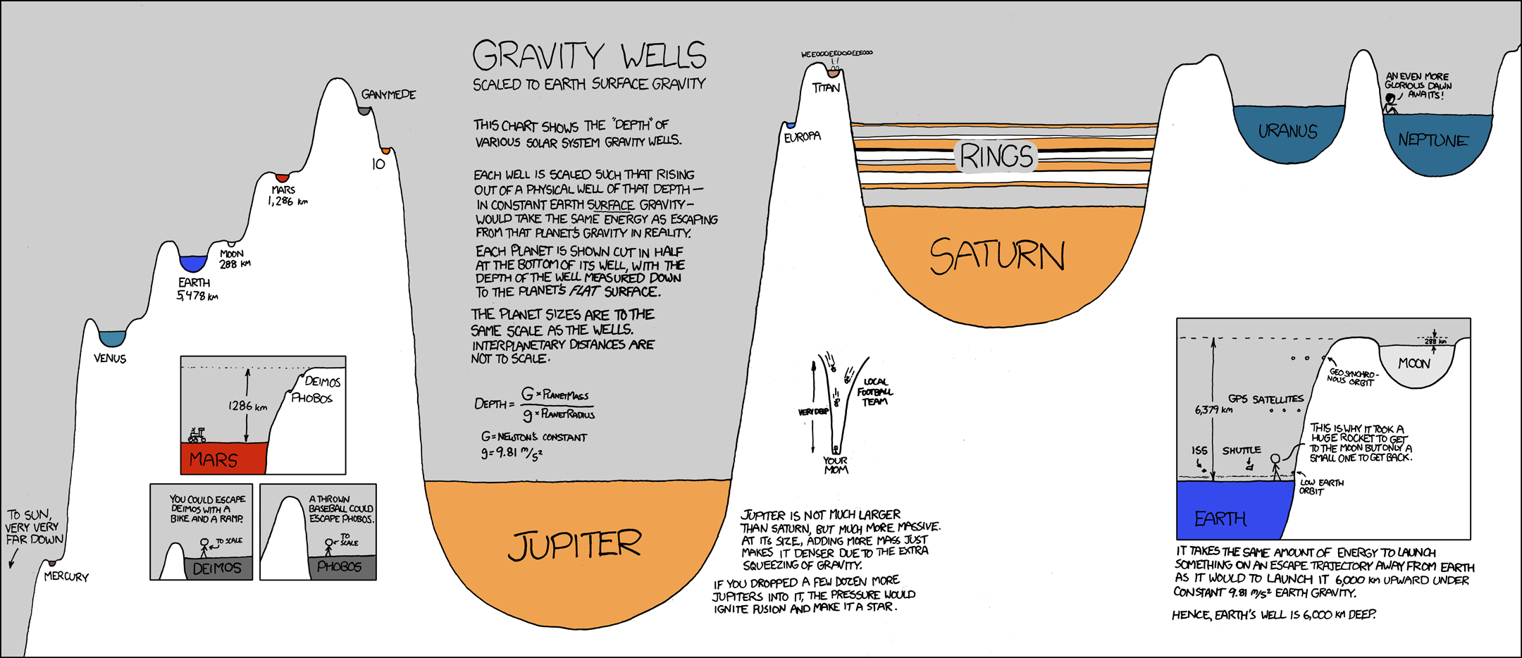
Visualizing Gravity Wells - infographic comic


Another great new infographic comic from xkcd.com.  A mix of real science and humor, this one plays on the words “gravity well” by visualizing the strength of each planets gravity as the depth of a crater scaled to Earth’s surface gravity.

The chart shows the “depth” of various solar system gravity wells.
Each well is scaled such that rising out of a physical well of that depth - in constant Earth surface gravity - would take the same energy as escaping that planet’s gravity in reality.

Click on the image to go to the xkcd.com site to see the high-resolution version.


Thanks for sending in the link Ruben!


Friday
Dec182009

Word Spectrums! The Online Infographic Battleground


On Chris Harrison's site, there are a number of graphics that he calls Word Spectrums.  More like a battleground, Chris is using the enormous amount of data from websites that has been made public by Google.  This is an advanced form of a word cloud that visualizes related words and their relative connections to the two topics.  (FYI, since this is based on raw Google data, foul language does appear in some of them).


Using Google's enormous bigram dataset, I produced a series of visualizations that explore word associations. Each visualization pits two primary terms against each other. Then, the use frequency of words that follow these two terms are analyzed. For example, "war memorial" occurs 531,205 times, while "peace memorial" occurs only 25,699. A position for each word is generated by looking at the ratio of the two frequencies. If they are equal, the word is placed in the middle of the scale. However, if there is a imbalance in the uses, the word is drawn towards the more frequently related term. This process is repeated for thousands of other word combinations, creating a spectrum of word associations. Font size is based on a inverse power function (uniquely set for each visualization, so you can't compare across pieces). Vertical positioning is random.


Chris has created and shared a number of different versions on the Word Spectrum page of his website, and you can see high-resolutions PDFs of each there.

Want to try your own?  Building on Chris' idea, Jeff Clark from Neoformix has created interactive Word Spectrums using either Twitter or News as the source that lets you enter your own terms to compete.  I especially like the idea of pitting two competing brands against one another.


Page 1 ... 4 5 6 7 8